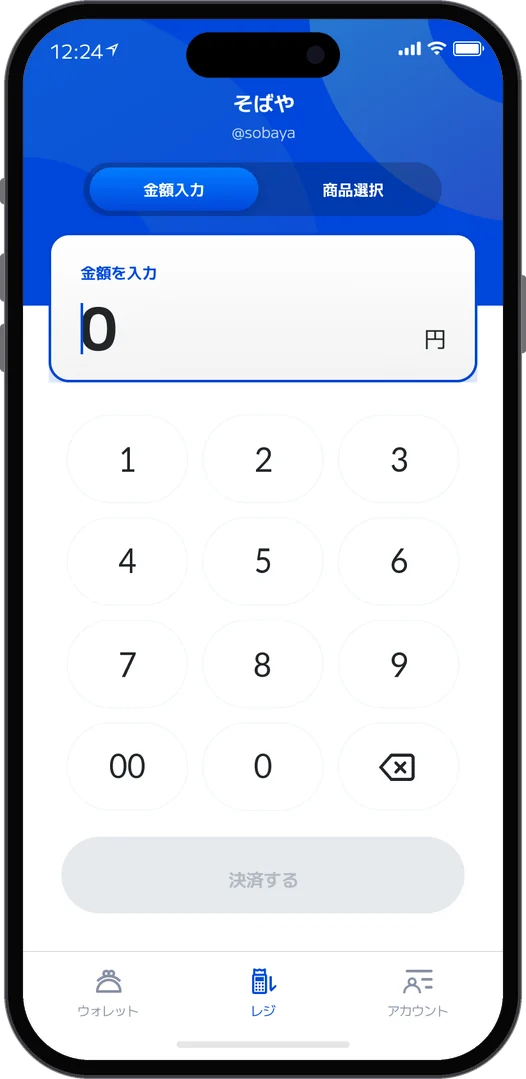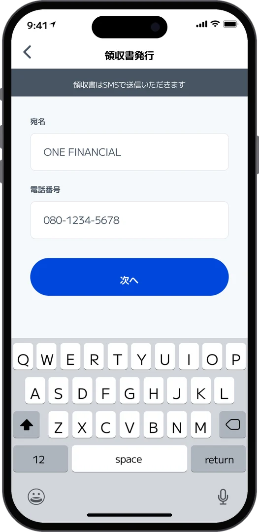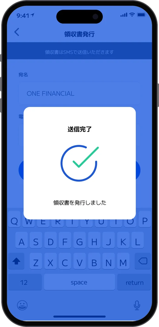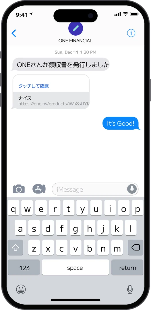



Jeong Jinho

Jeong Jinho · Product Designer, Tokyo

画面ではなく、事業の判断をデザインする。

Designing decisions,not just screens.

사업의 방향을함께 디자인한다.

このポートフォリオは成果の大きさよりも「なぜそう決めたか」を中心にまとめています。This portfolio focuses less on the size of outcomes and more on why I made each call.이 포트폴리오는 성과가 얼마나 컸는지보다 “왜 그렇게 결정했는지”에 초점을 맞췄습니다.

デザイン歴20年以上20+ years designing products디자인 경력 20년 이상

21のケーススタディ、判断の理由まで21 case studies, down to why21개의 케이스 스터디, 결정의 이유까지

シードから大企業までFrom seed startups to large companies시드 스타트업부터 대기업까지

/ これまでご一緒した企業/ Companies I have worked with/ 그동안 함께한 기업들

シードのスタートアップから大企業まで。多様なドメインの企業を経験してきた20年あまり。From seed-stage startups to large enterprises.Twenty-plus years across companies in many domains.시드 단계의 스타트업부터 대기업까지.다양한 도메인의 기업들을 체험했던 20여 년.

ケーススタディ &
ポートフォリオ
Case studies &
Portfolio
케이스스터디 &
포트폴리오

01 / 12
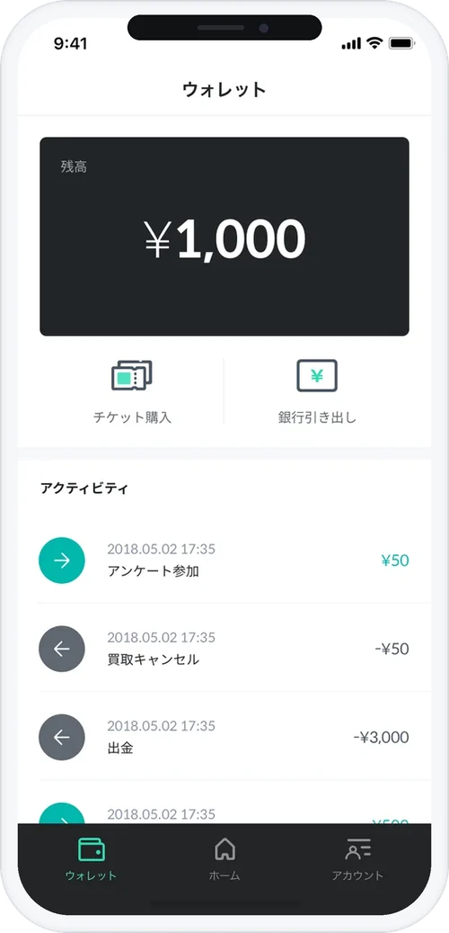
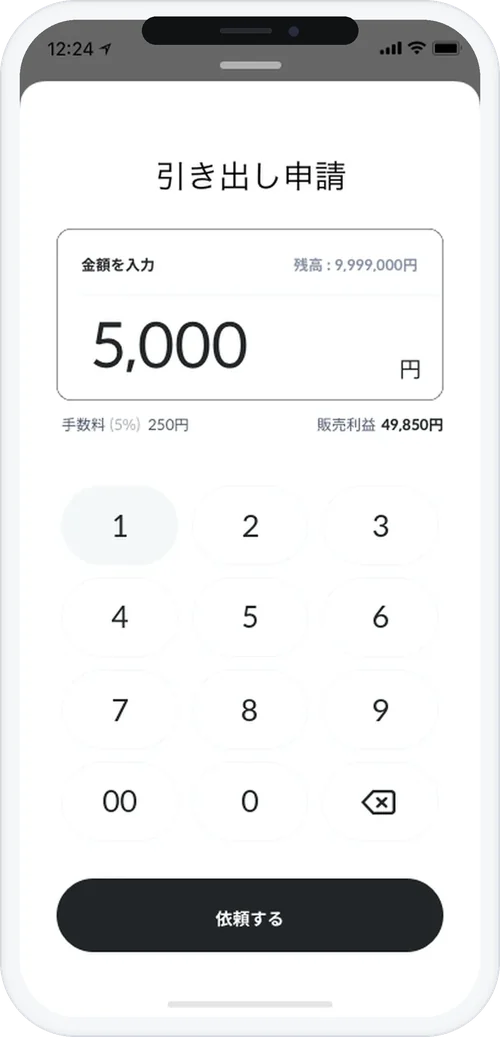
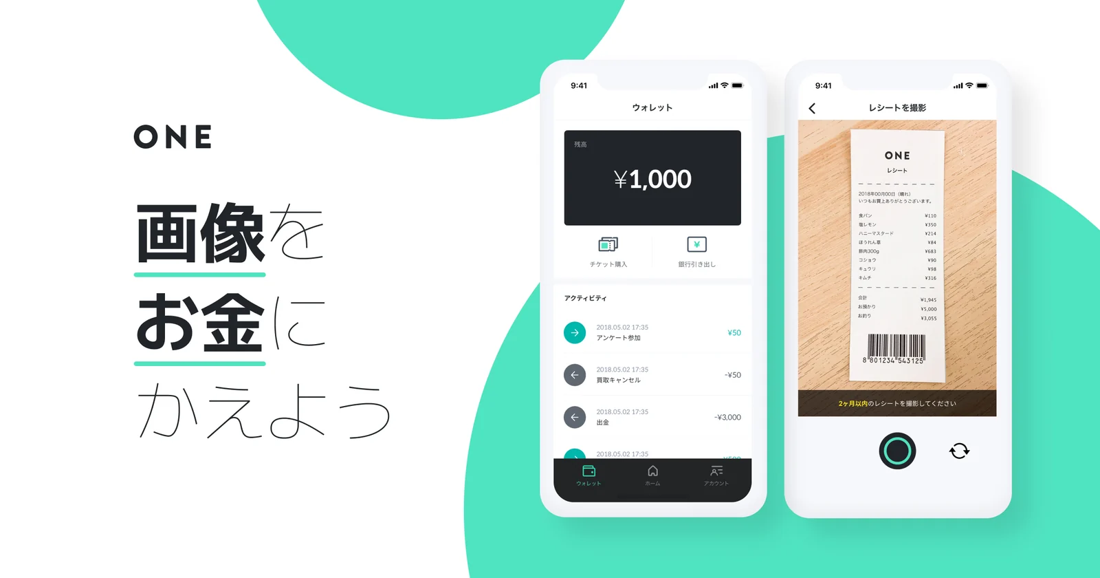
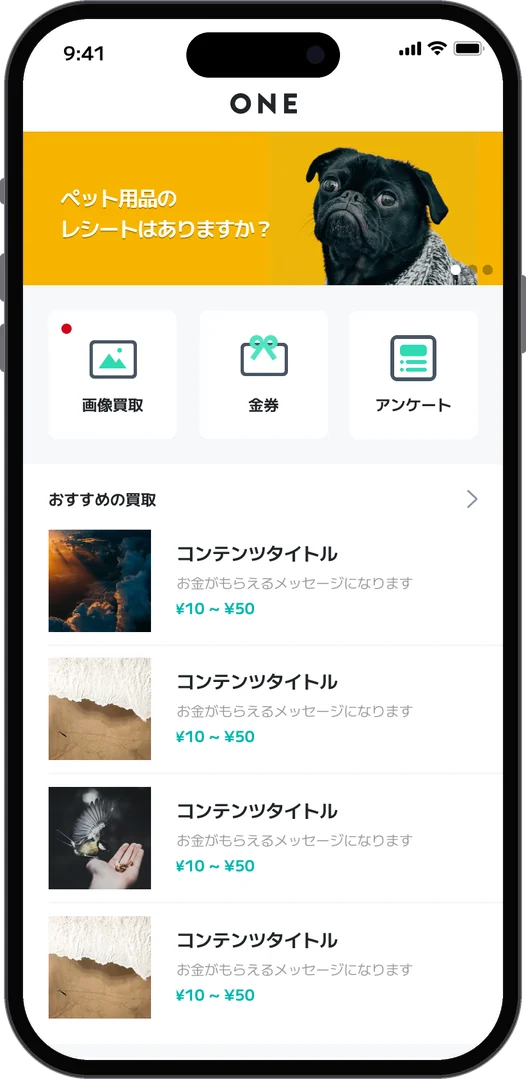
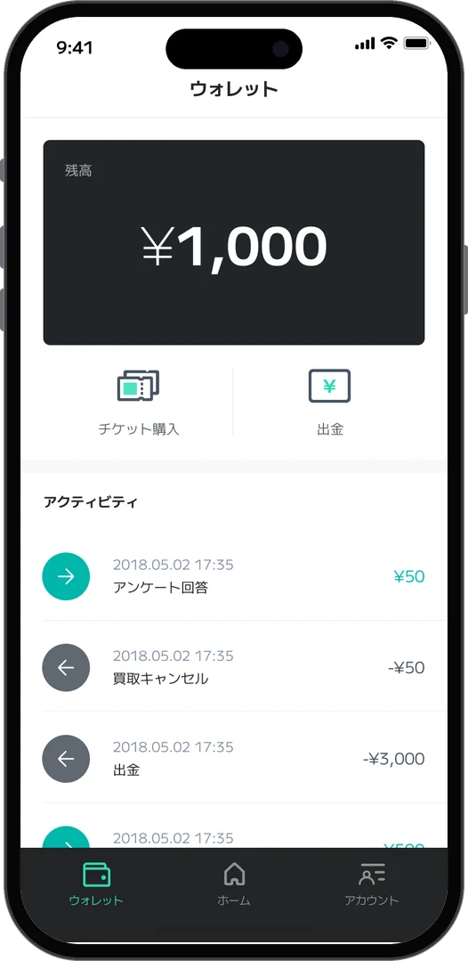
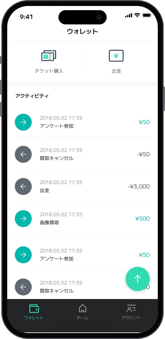
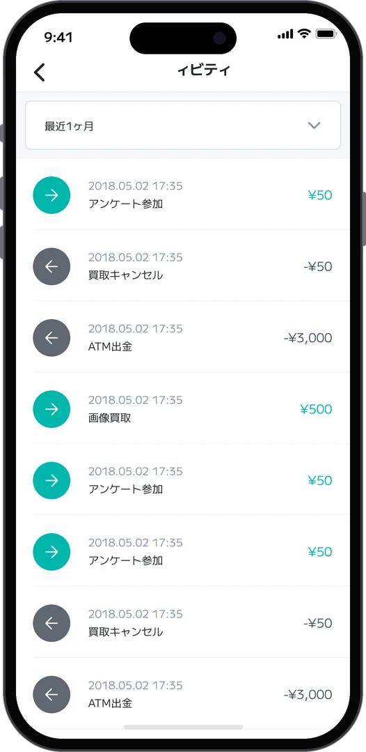
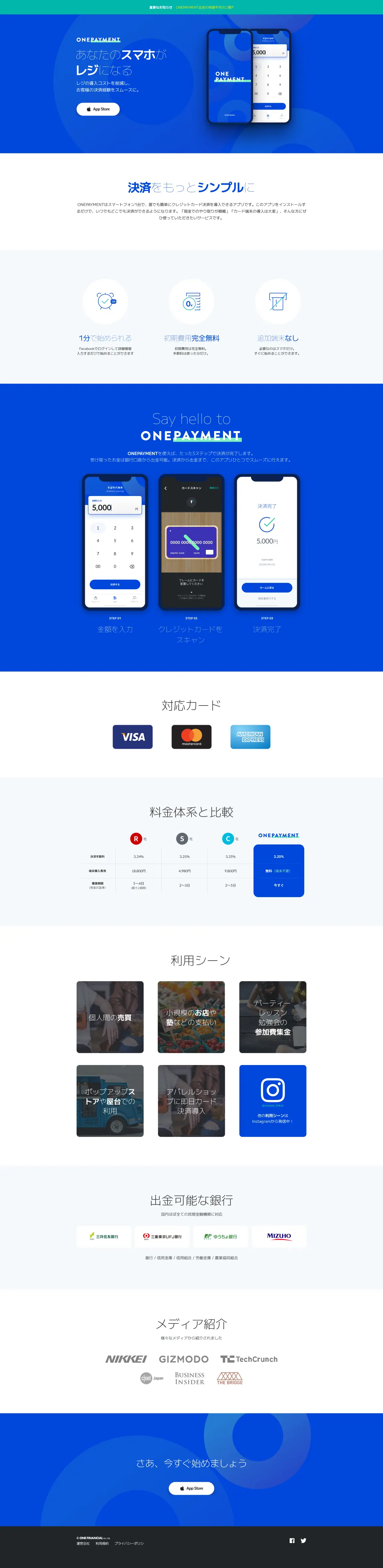
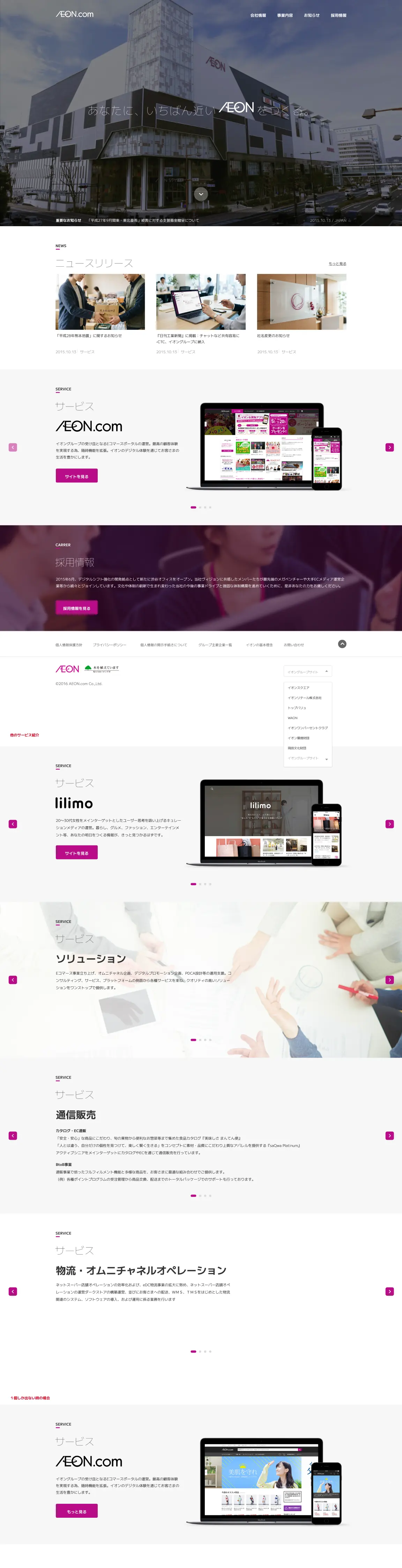
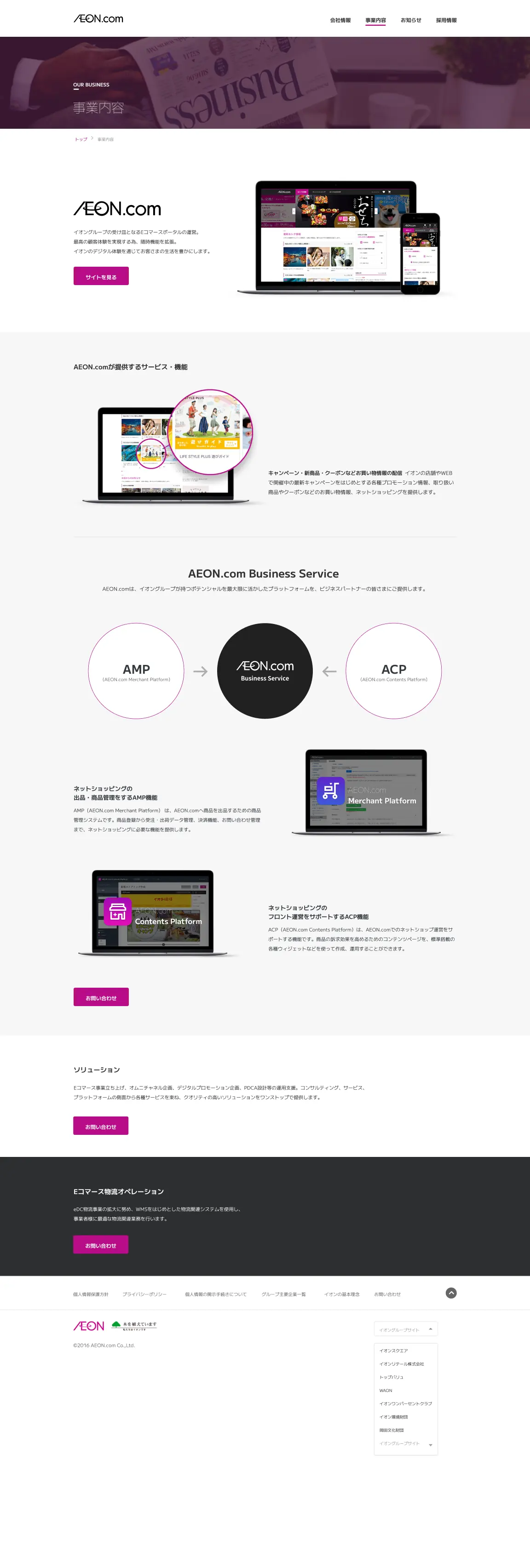
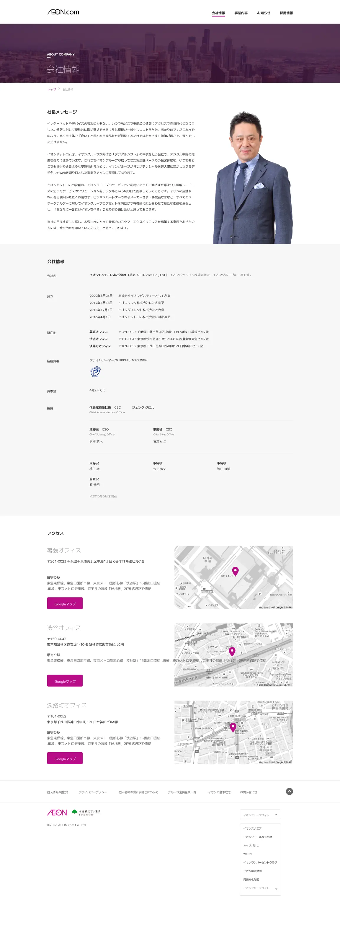
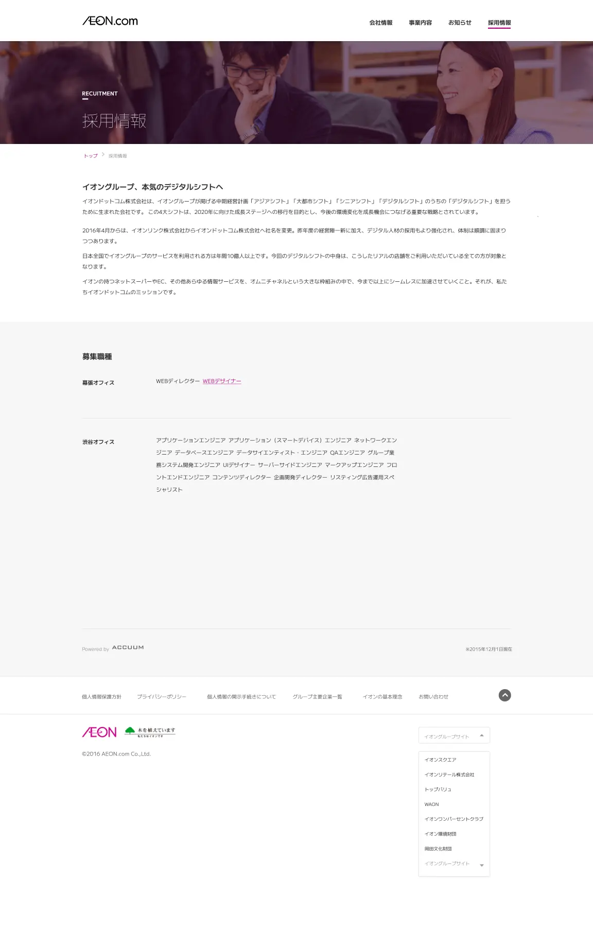
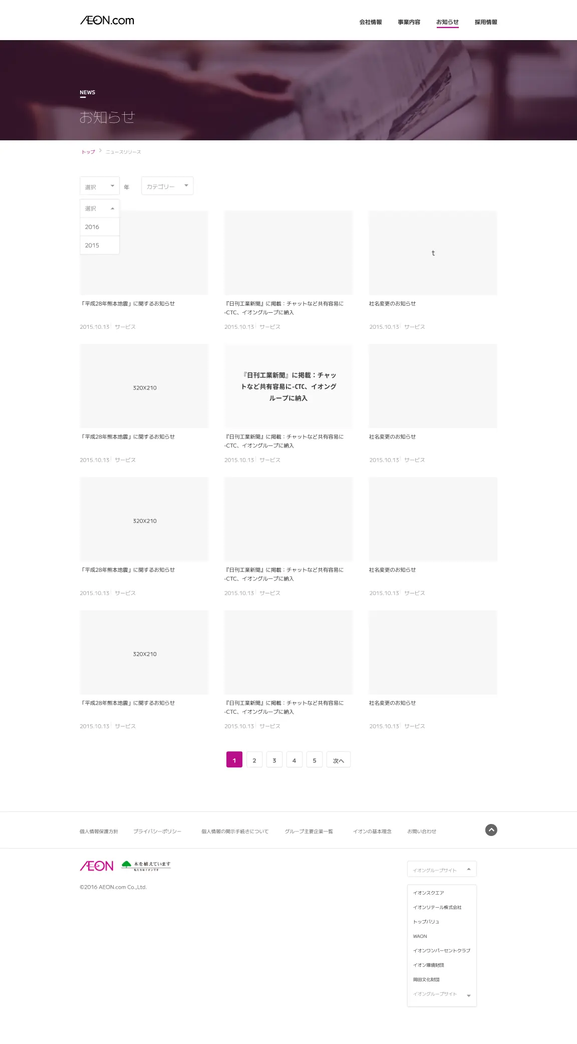
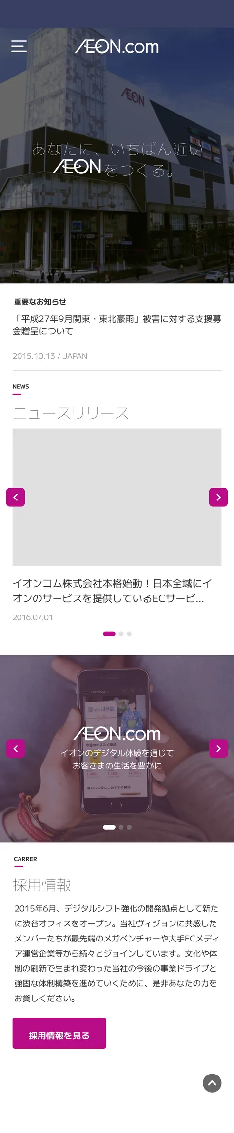
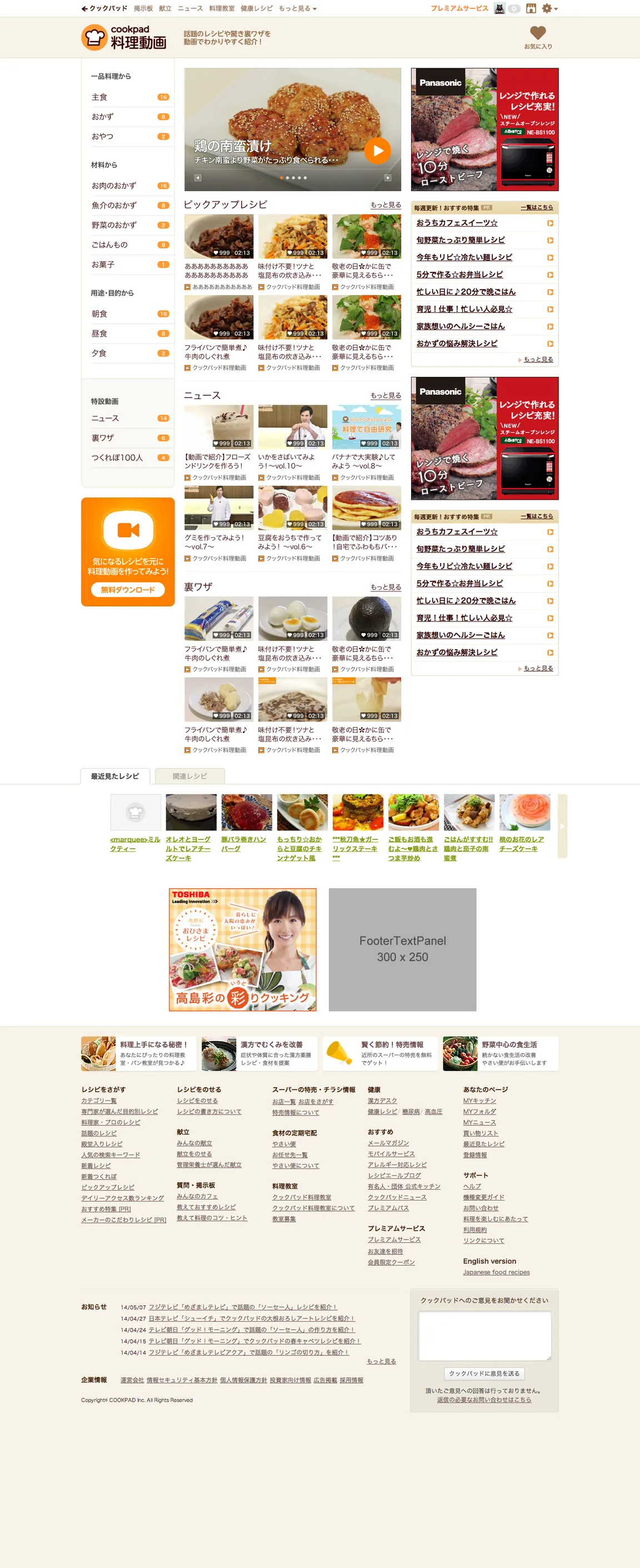
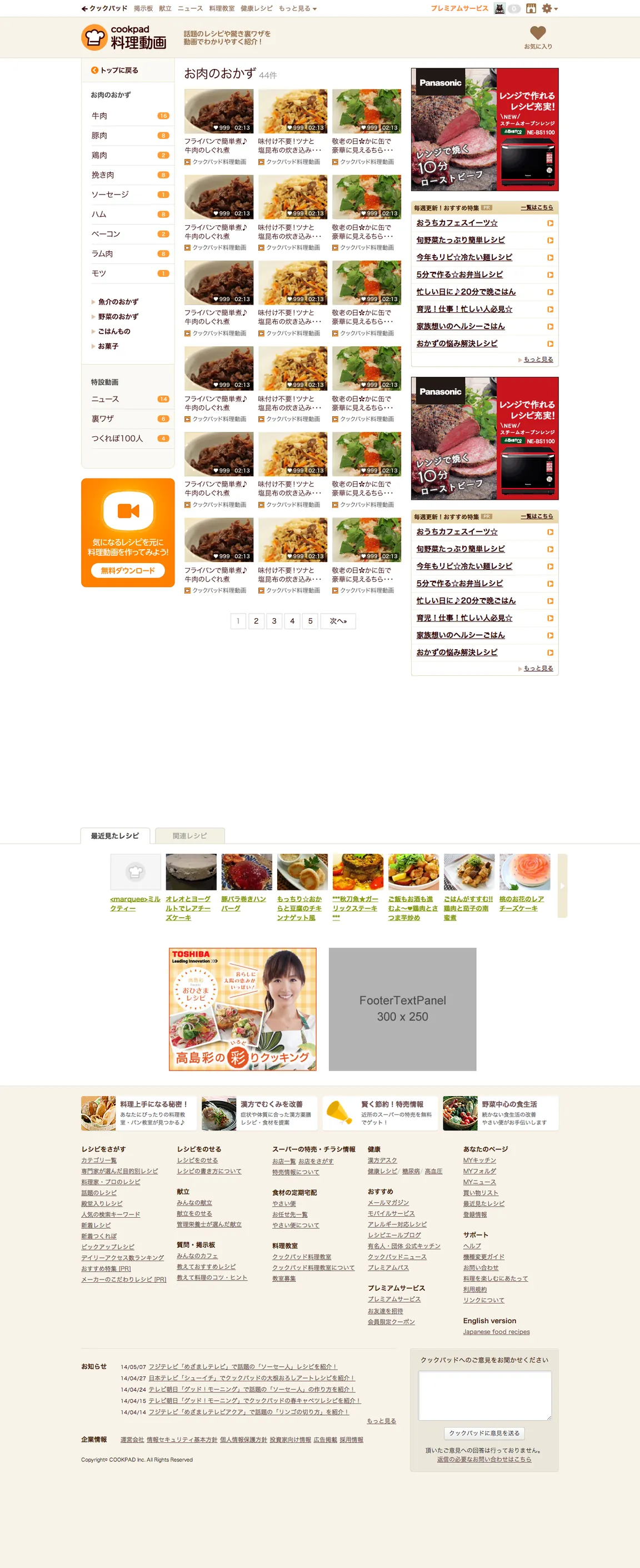
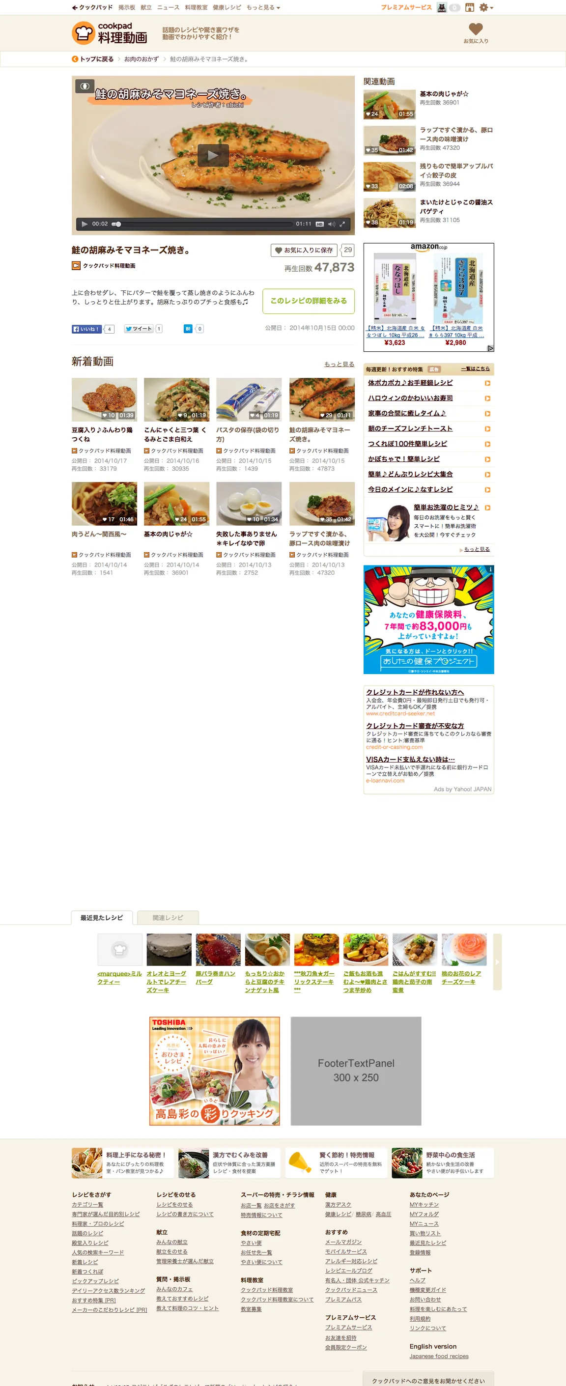
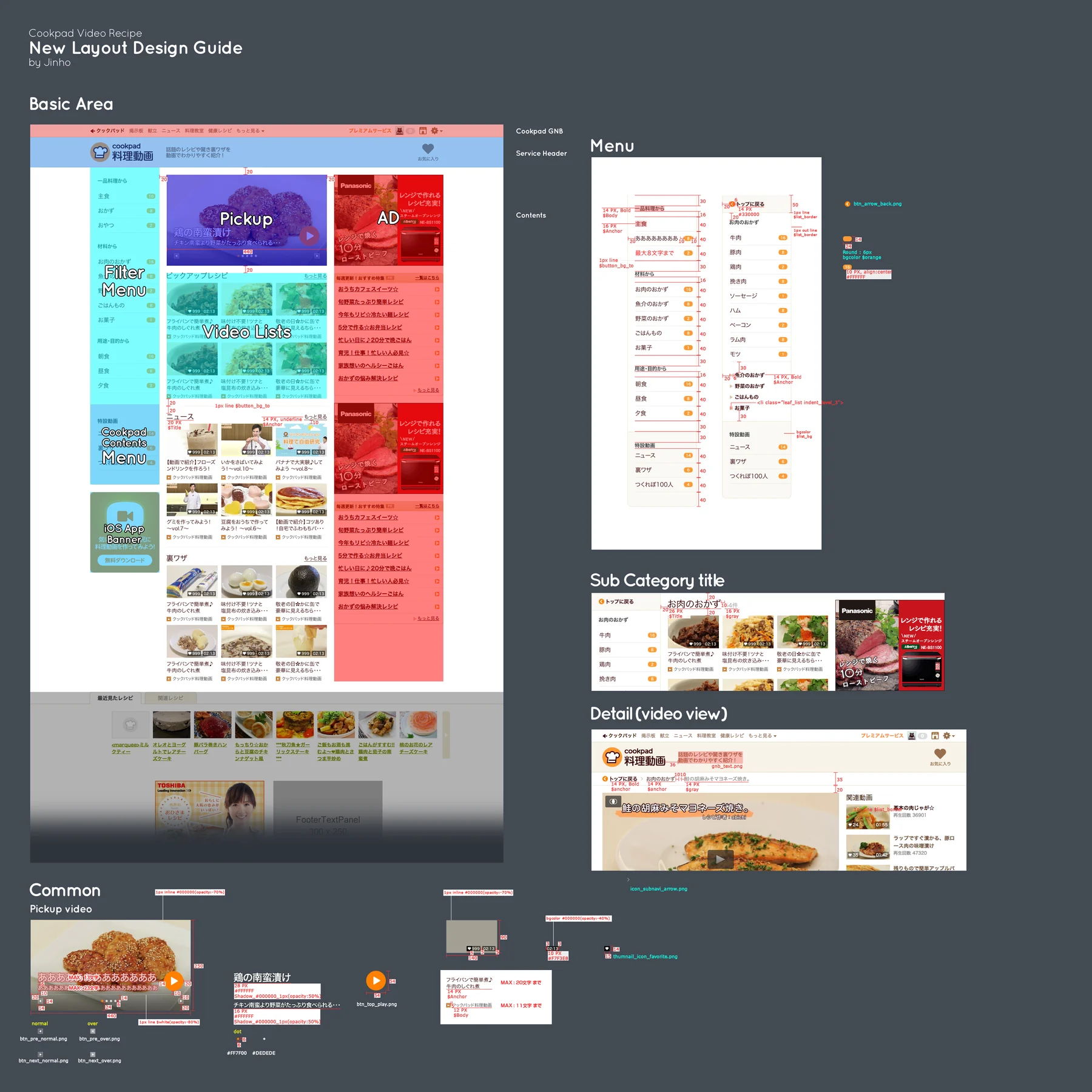
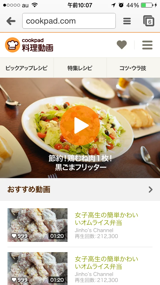
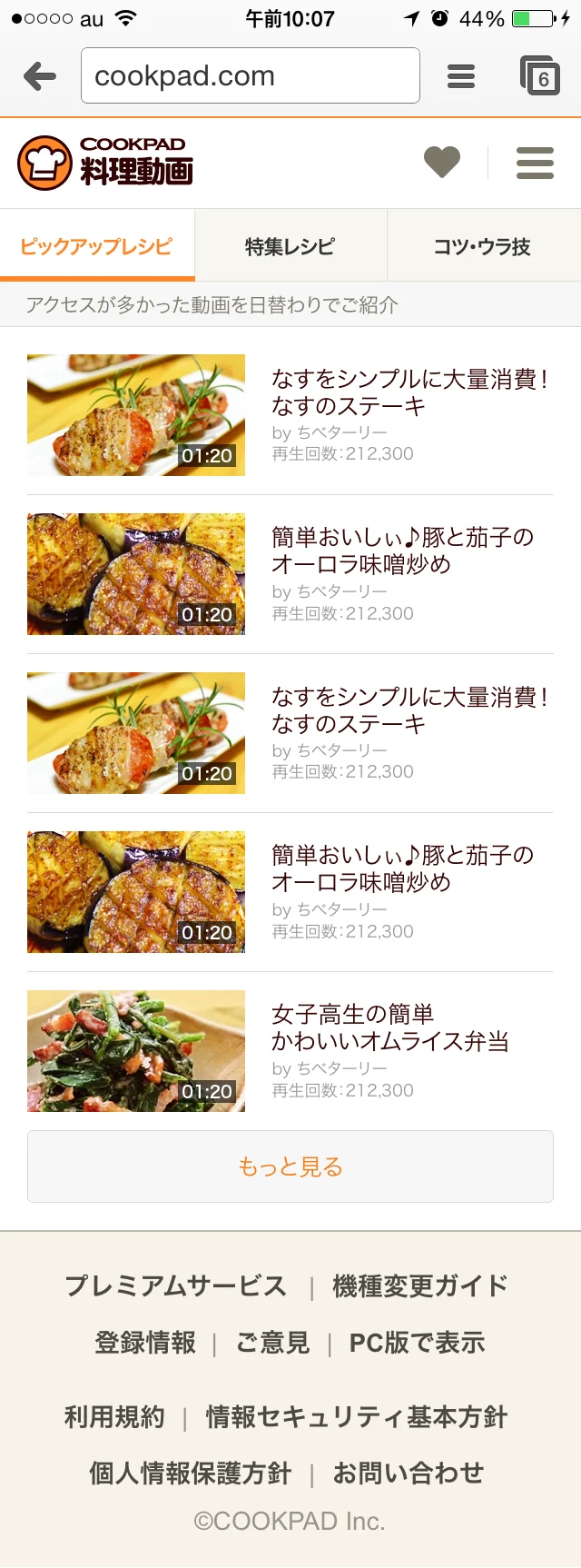
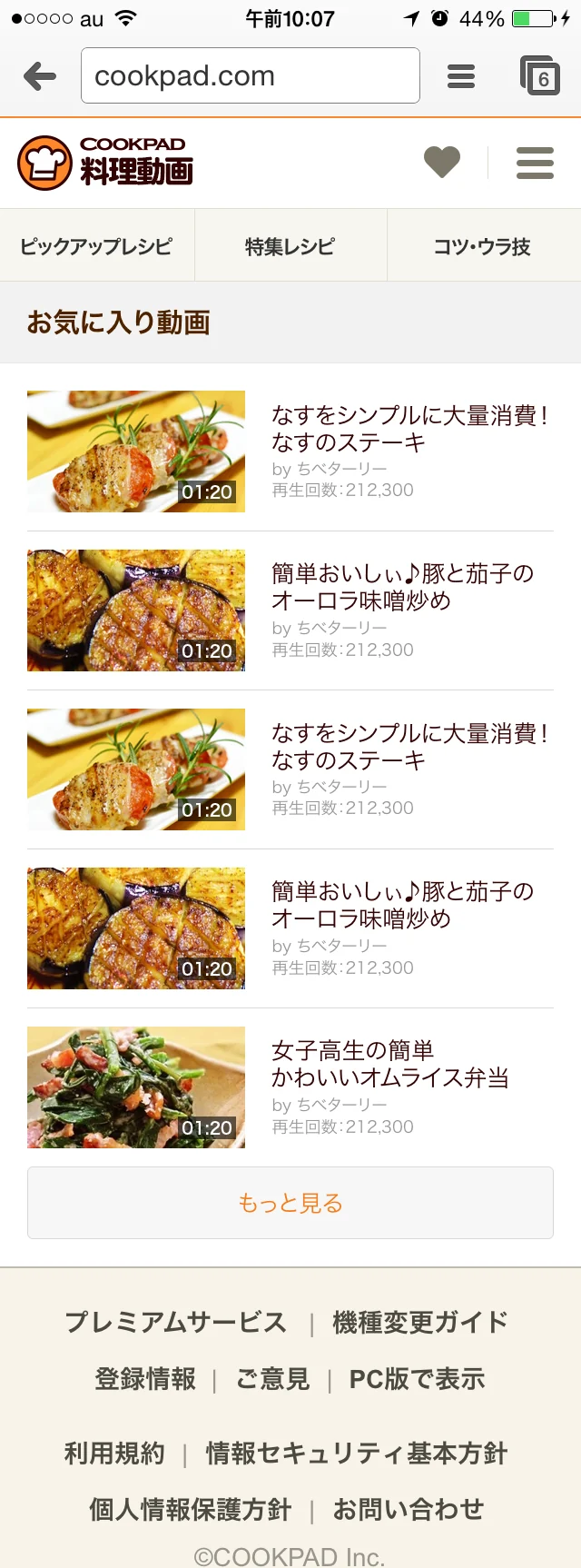
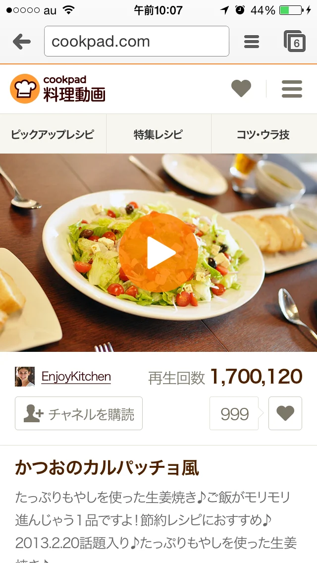
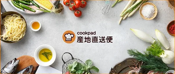
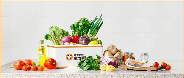
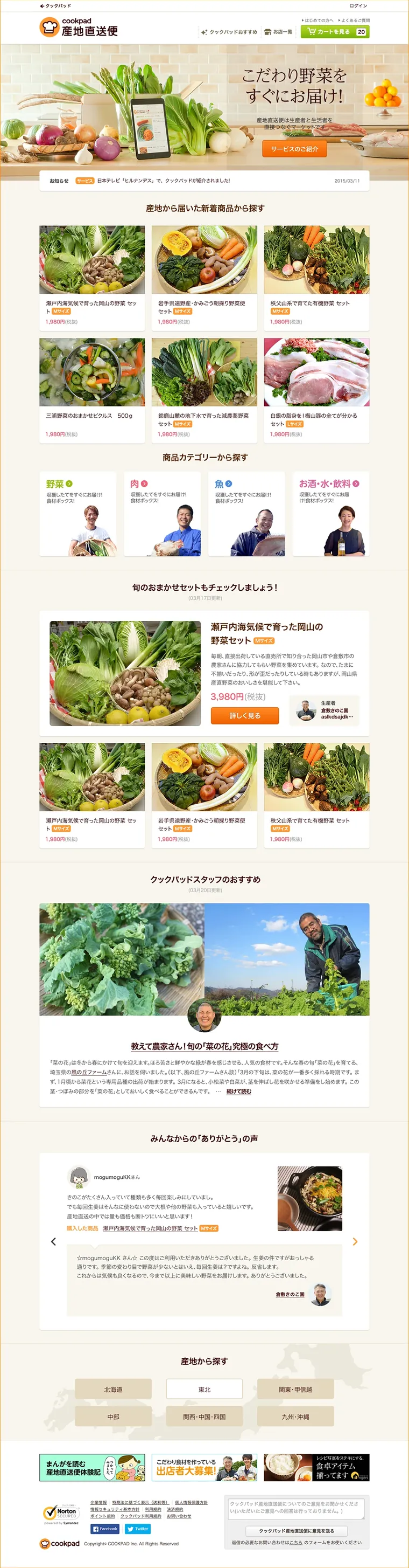
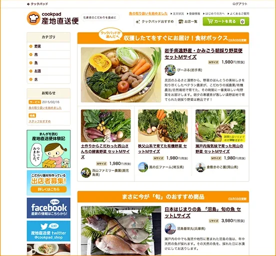
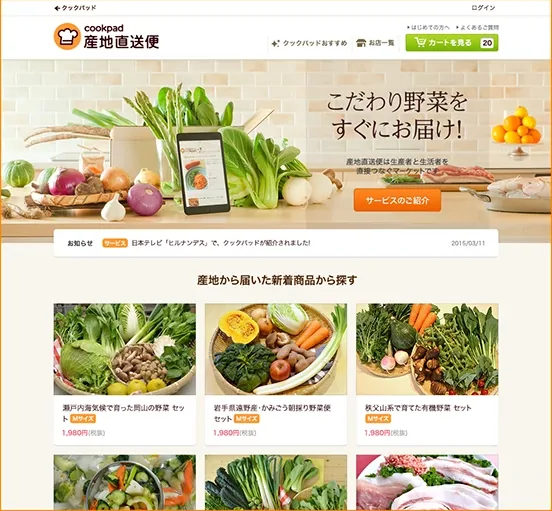
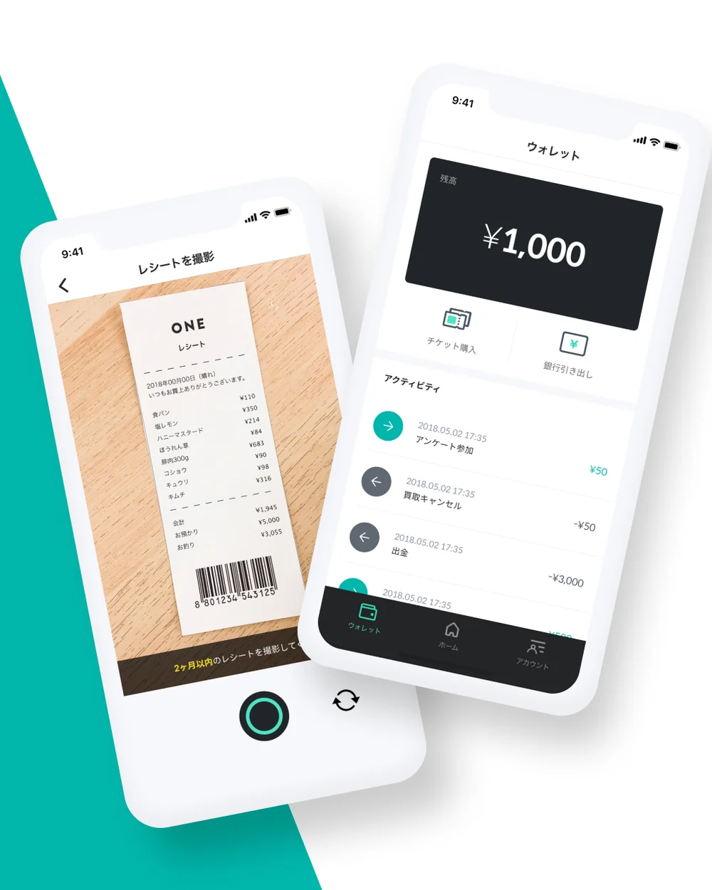
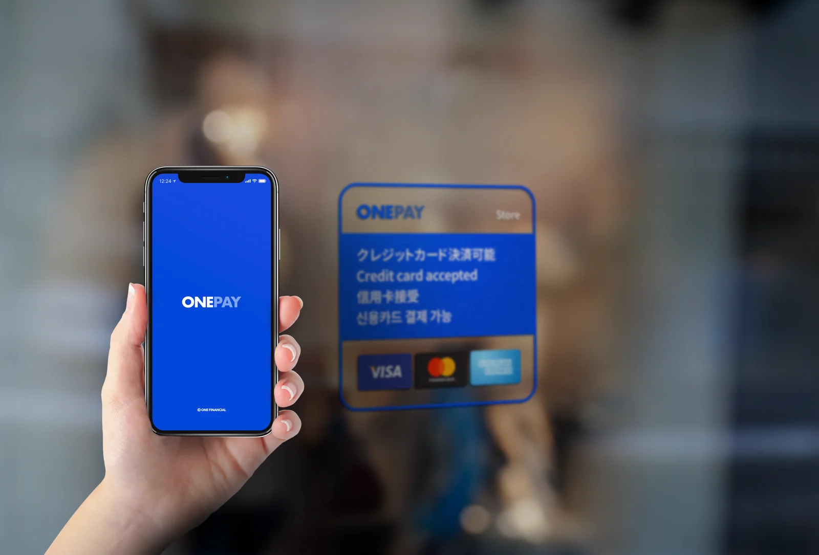
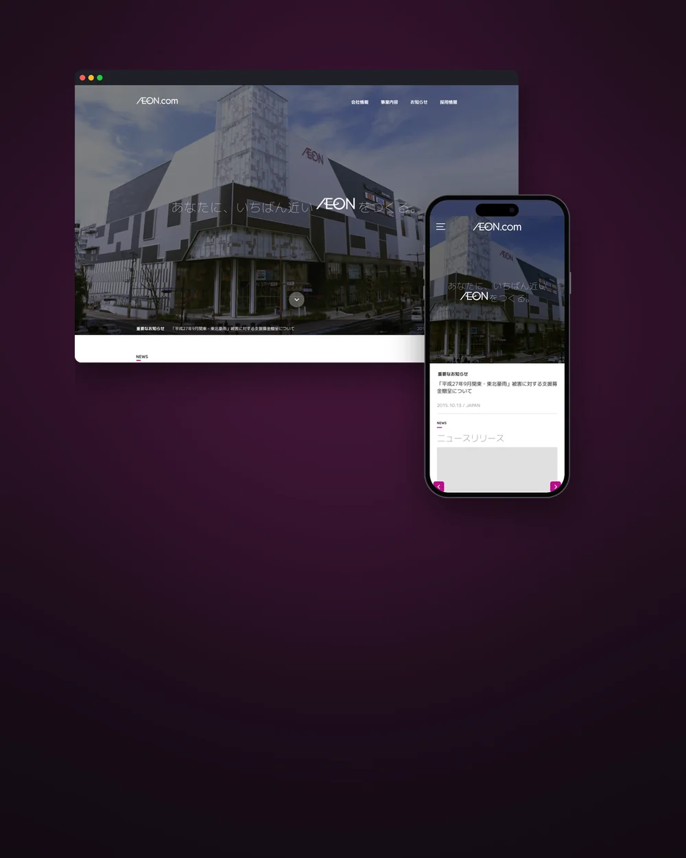
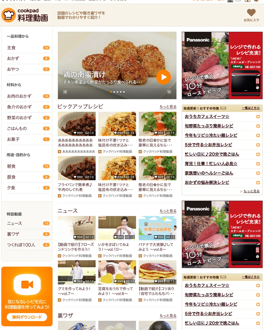
CASE 01 · 2025–Jiffcy知っている友だちだけのクローズドSNS。友だちがゼロの最初の数分を、どう設計するか。A closed social app for friends who already know each other. How to design the first minutes, when you have zero friends.서로 아는 친구끼리만 연결되는 폐쇄형 SNS. 아직 친구가 한 명도 없는 첫 몇 분을 어떻게 설계할 것인가. CASE 02 · 2025RLWRLDロボットの「手」を鍛える基盤モデルの会社に、ピクセルで「根本」を描いたブランドを。A brand drawn in pixels for a company building the foundation model behind robot hands.로봇의 "손"을 학습시키는 파운데이션 모델 회사에, 픽셀로 "근본"을 그린 브랜드. CASE 03 · 2025YOKI「余生」を「ヨキ」と読み替える。アクティブシニアの新しい一日を提案する体験サービスを、ブランドから予約、管理画面まで。Rereading "the rest of life" as YOKI: an experience service that suggests a new day for active seniors, from the brand to booking and admin."여생"을 "요키"로 다시 읽는다. 액티브 시니어에게 새로운 하루를 제안하는 체험 서비스를, 브랜드부터 예약, 관리자 화면까지. CASE 04 · 2024PIKABONペンライトを、アーティストとファンが光で話すための道具に。PIKABONのブランドリニューアルを、コンセプトからガイドラインまで。A light stick as a way for artists and fans to talk in light: PIKABON's brand renewal, from the concept to the guidelines.응원봉을 아티스트와 팬이 빛으로 대화하는 도구로. PIKABON의 브랜드 리뉴얼을 콘셉트부터 가이드라인까지. CASE 05 · 2024ULINE「波」と「次の世代」で「U」をつくる。韓国カルチャーの製品を届けるULINEのロゴとアイデンティティ。A U made of a wave and the next generation: the logo and identity for ULINE, a company bringing Korean culture products to Japan."물결"과 "다음 세대"로 "U"를 만든다. 한국 문화 제품을 전하는 ULINE의 로고와 아이덴티티. CASE 06 · 2024Link30度に傾いた旗で、顧客と一緒に前へ進む。ビジネスパートナー企業Linkのロゴとアイデンティティ。A flag tilted at 30 degrees, moving forward with the client: the logo and identity for Link, a business partner company.30도로 기운 깃발로 고객과 함께 앞으로 나아간다. 비즈니스 파트너 기업 Link의 로고와 아이덴티티. CASE 07 · 2024WORKSPOT美容師のためのスキマバイト。PoC段階で、ブランドから求職者向けの画面、サロン向けの管理画面までを設計。Short shifts for hairdressers: at the proof-of-concept stage, I designed the brand, the screens for job seekers and the admin for salons.미용사를 위한 짧은 아르바이트. PoC 단계에서 브랜드부터 구직자용 화면, 살롱용 관리자 화면까지 설계. CASE 08 · 2024ShuttlePay「貯金」を「チャレンジ」と言い換える。子ども向けキャッシュレス「シャトルペイ」の貯金画面を、ホームからカードデザインまで考え直した提案。Calling savings a "challenge": a proposal that rethinks the savings screens of ShuttlePay, a cashless service for children, from the home screen to the card design."저금"을 "챌린지"로 바꿔 부른다. 어린이용 캐시리스 서비스 "셔틀페이"의 저금 화면을 홈부터 카드 디자인까지 다시 생각한 제안. CASE 09 · 2024Pairs 町友恋愛は少し重い、でも誰かと出会いたい。マッチングアプリ「ペアーズ」に、近くの人と気軽に遊べる「町友」機能を提案。Romance feels a bit heavy, but you still want to meet someone: a proposal for Machitomo, a feature in the dating app Pairs for hanging out with people nearby.연애는 조금 무겁지만 누군가를 만나고 싶다. 매칭 앱 "페어즈"에 근처 사람과 가볍게 놀 수 있는 "마치토모" 기능을 제안. CASE 10 · 2023Taxnap知識がなくても、スワイプで仕分けられる。フリーランスのための確定申告アプリを、公式リリースまでのUI/UXとスタイルガイドから。Sort your expenses with a swipe, no accounting knowledge needed: the UI/UX and style guide of a tax return app for freelancers, up to its official release.지식이 없어도 스와이프로 분류할 수 있다. 프리랜서를 위한 확정신고 앱을, 공식 릴리스까지의 UI/UX와 스타일 가이드부터. CASE 11 · 2023WealthPark買収後、手つかずだった投資サービスの商品詳細を、状態ごとに「いま何ができるか」が伝わる画面に。An investment product page, rebuilt so each state of an offering tells you what you can do right now.인수 후 손대지 못했던 투자 서비스의 상품 상세를, 상태마다 "지금 무엇을 할 수 있는지" 전해지는 화면으로. CASE 12 · 2023WealthPark Lab古いブログを別のサイトで更新し続けていた投資サービスに、雑誌のように読める社外向けメディアを。An outward-facing media site that reads like a magazine, for an investment service whose old blog was being updated somewhere else.오래된 블로그를 다른 사이트에서 업데이트해 오던 투자 서비스에, 잡지처럼 읽히는 사외용 미디어를. CASE 13 · 2023Pokkeいつもの買い物のまま、最安値とポイントを教えてくれる「お得情報チャットボット」。ブランドからLP、ブラウザ拡張、ストア素材まで。A "deals chatbot" that tells you the lowest price and the points to earn while you shop as usual, from the brand and landing page to the browser extension and store assets.평소 쇼핑 그대로 최저가와 포인트를 알려주는 "알뜰 정보 챗봇". 브랜드부터 LP, 브라우저 확장, 스토어 소재까지. CASE 14 · 2022Kyash Widget事業の優先度は低かった。それでも「なぜ作るのか」を言葉にして、残高ウィジェットをリリースした。It was low on the business roadmap. I put "why build this" into words and shipped the balance widget anyway.사업 우선순위에서는 밀려 있었다. 그래도 "왜 만들어야 하는지"를 분명히 해서 잔액 위젯을 출시까지 끌고 갔다. CASE 15 · 2022Croc言葉の壁を越えて、海外の個人販売者と日本の買い手をつなぐ越境EC。ロゴからショップ管理画面まで。A cross-border marketplace that connects overseas sellers with buyers in Japan across the language barrier, from the logo to the shop admin.언어의 벽을 넘어 해외 개인 판매자와 일본 구매자를 잇는 크로스보더 EC. 로고부터 숍 관리자 화면까지. CASE 16 · 2021METAJOBゼロから立ち上げた採用管理SaaSに、ブランドと最初の顧客接点を同時につくった。A brand and a first front door, built together for a recruiting SaaS that started from zero.0에서 시작한 채용관리 SaaS에 브랜드와 첫 고객 접점을 함께 만들었다. CASE 17 · 2018–2019ONEレシートを撮るだけで10円。お金が届くまでの速さを、細部まで削って作ったフィンテック。Snap a receipt, get ¥10. A fintech app where I cut every extra step so the money arrives fast.영수증 한 장을 찍으면 10엔. 돈이 빨리 들어오도록 군더더기를 하나하나 덜어낸 핀테크 앱. CASE 18 · 2017–2018ONE PAYMENTスマホがそのままレジになる。カードリーダーなしで、対面でカード決済を受けられるアプリ。Your phone becomes the register. An app for taking card payments in person, with no card reader.스마트폰이 곧 계산대가 된다. 카드 리더기 없이 얼굴을 마주하고 카드 결제를 받을 수 있는 앱. CASE 19 · 2016AEON.com社名変更と「デジタルシフト」を伝える、イオンドットコムのコーポレートサイトをPCとスマートフォンで。A corporate site for AEON.com, on desktop and smartphone, to announce a new name and the group's digital shift.사명 변경과 "디지털 시프트"를 알리는 이온닷컴의 코퍼레이트 사이트를 PC와 스마트폰으로. CASE 20 · 2014Cookpad 料理動画話題のレシピや裏ワザを、動画でわかりやすく。クックパッドの料理動画サービスを、PCとスマートフォンのレイアウトからデザインガイドまでリード。Popular recipes and kitchen tricks, made easy to follow on video: I led the design of Cookpad's cooking video service, from the PC and smartphone layouts to the design guide.화제의 레시피와 꿀팁을 동영상으로 알기 쉽게. 쿡패드 요리 동영상 서비스를 PC와 스마트폰 레이아웃부터 디자인 가이드까지 리드. CASE 21 · 2014–2015Cookpad 産地直送便「注文までが分かりにくい」という声に、画面の数ではなく「一目で分かる」ビジュアルで応えた。Users said ordering was confusing. I answered with visuals that explain the service at a glance instead of adding screens."주문하기가 어렵다"는 목소리에, 화면을 늘리는 대신 "한눈에 이해되는" 비주얼로 답했다.

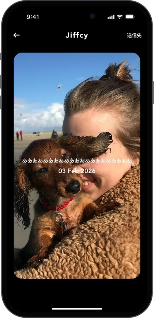
オンボーディング・最初のDotOnboarding · the first Dot온보딩 · 첫 Dot

友だちがいなくても、撮るたびにコラージュが育つNo friends yet, and the collage still grows with every photo친구가 없어도 찍을 때마다 콜라주가 자란다
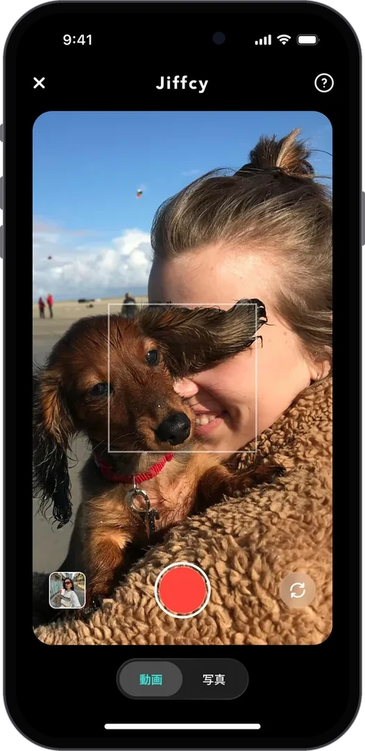
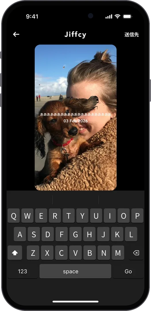
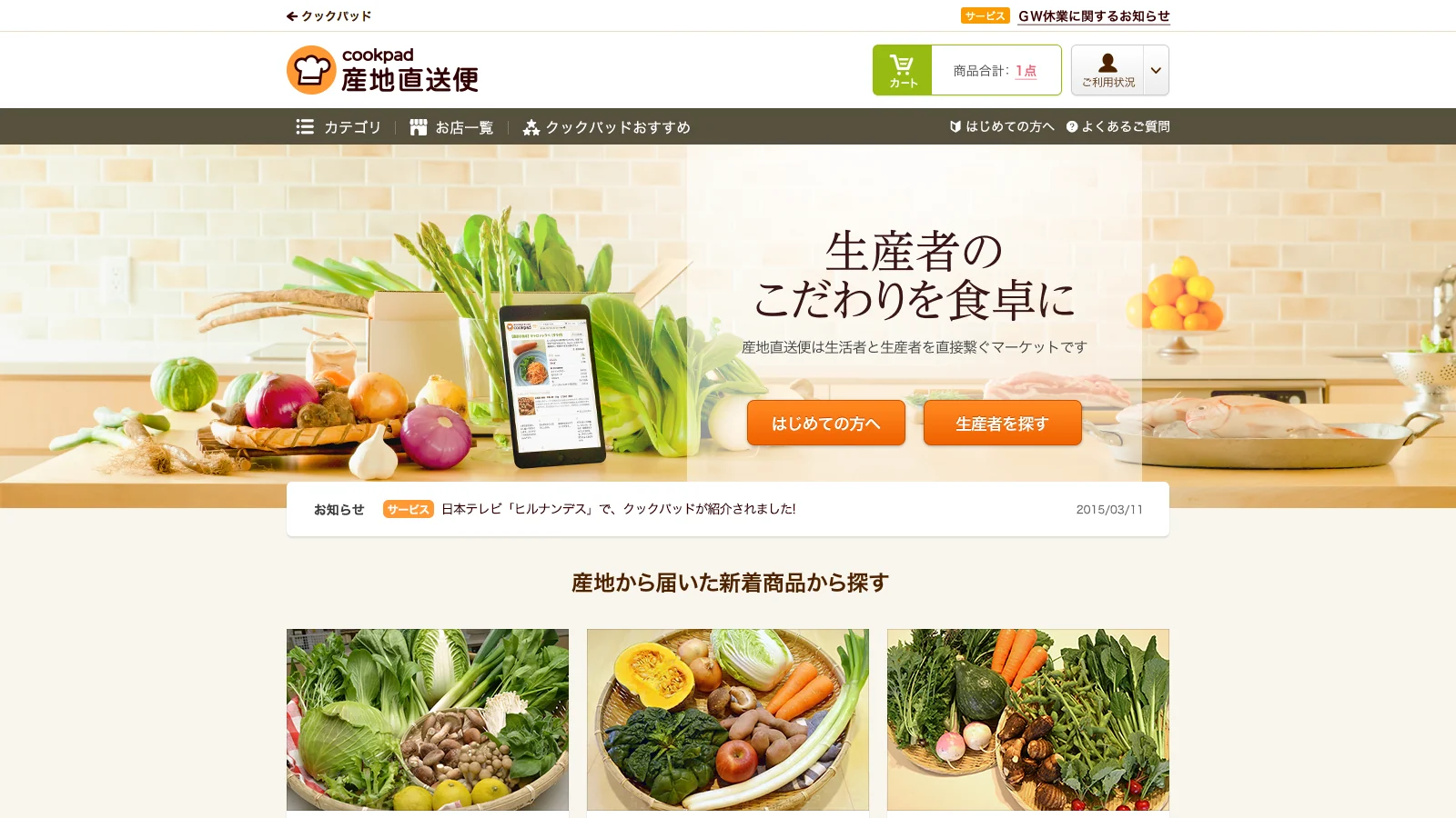
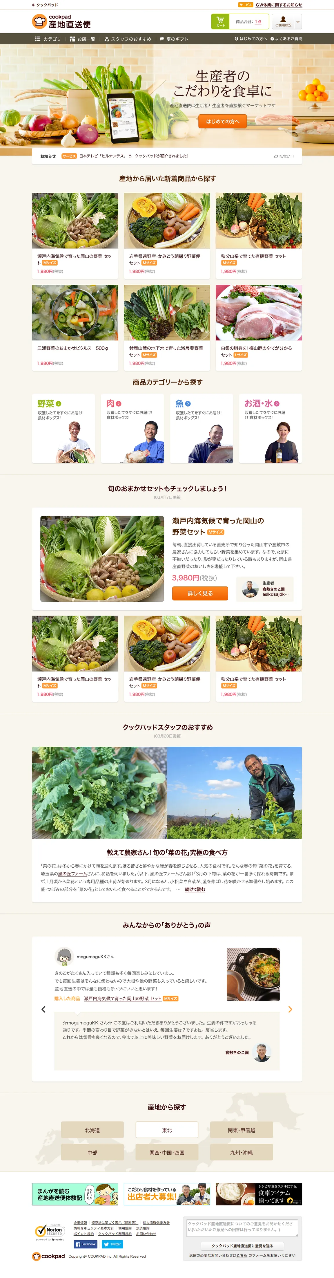
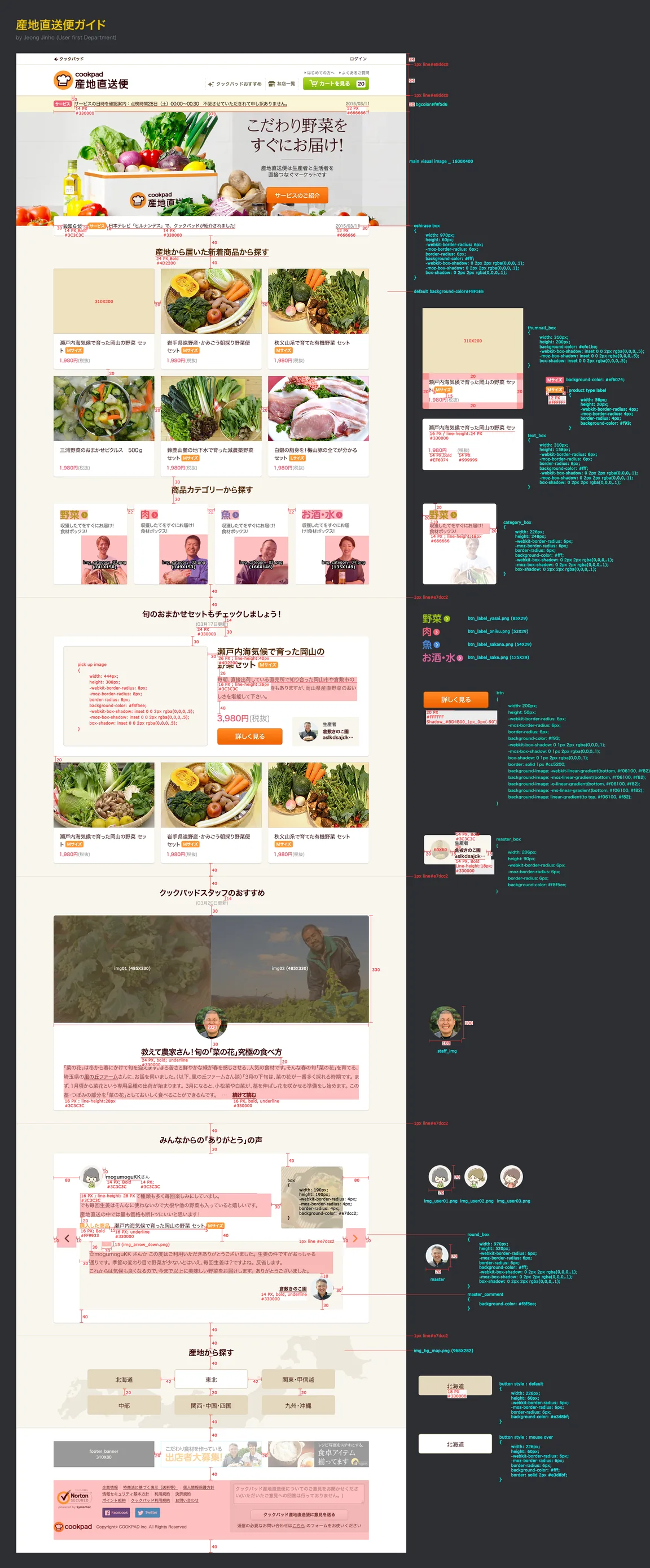
Onboarding demo · Figma Make prototype (tap a step to jump)
Camera: today's DotAdding a one-line captionPreview before sending
Dots · Camera → caption → preview
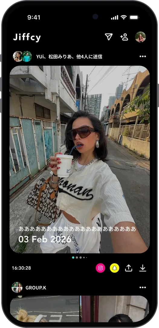
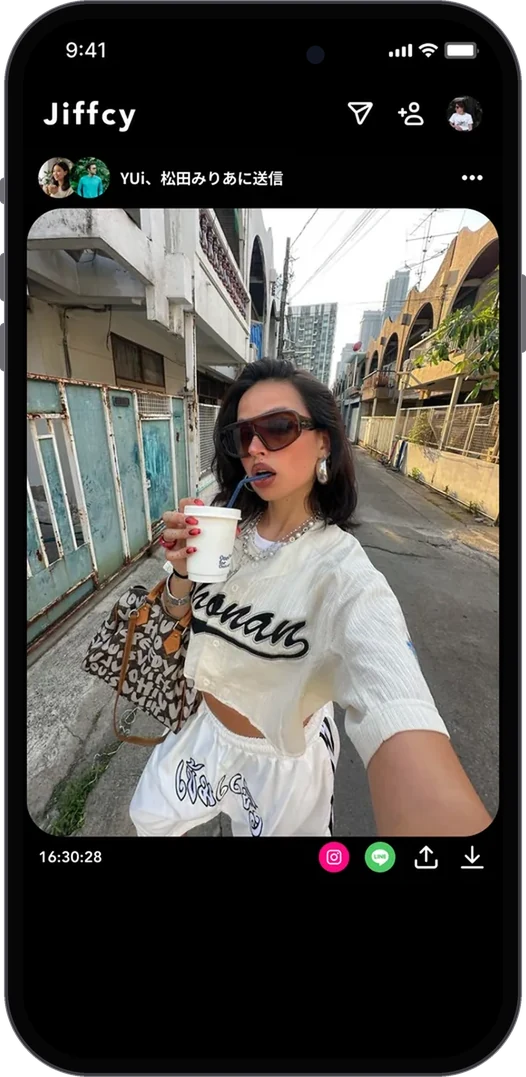
Dots feed with an auto-generated collageDots sent to two friends1:1 talk room
Feed · Collages and the talk room
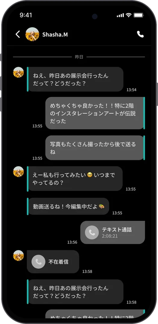
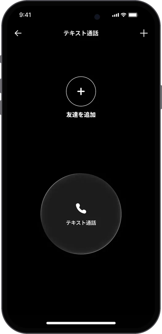
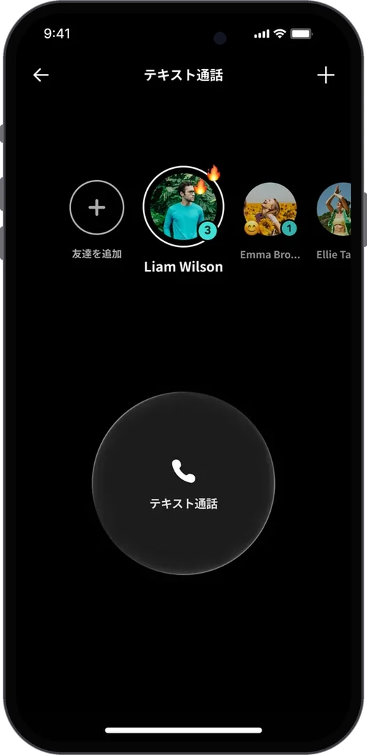
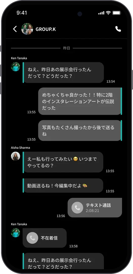
Text Call with zero friendsText Call with friends onlineGroup talk room
Text Call · From zero friends to a group
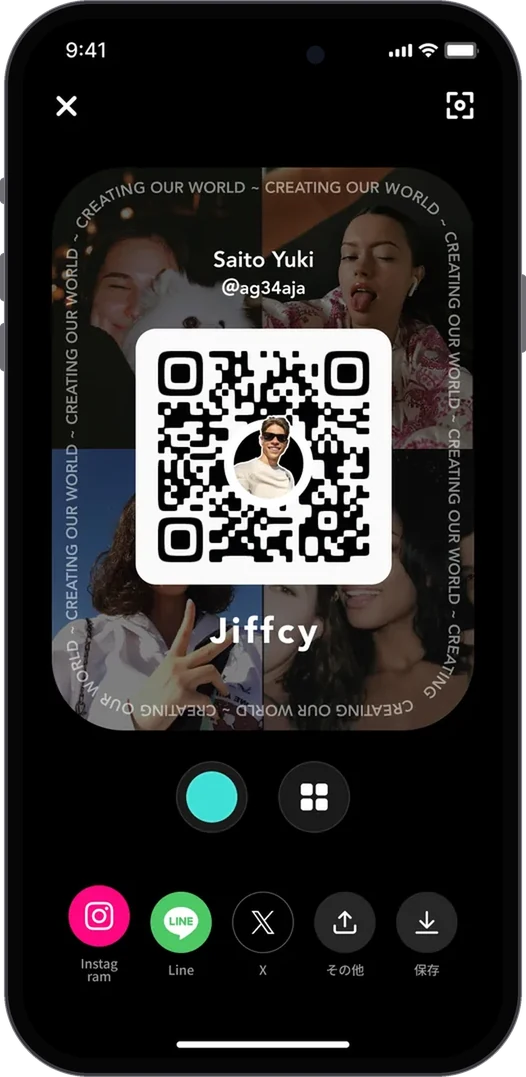
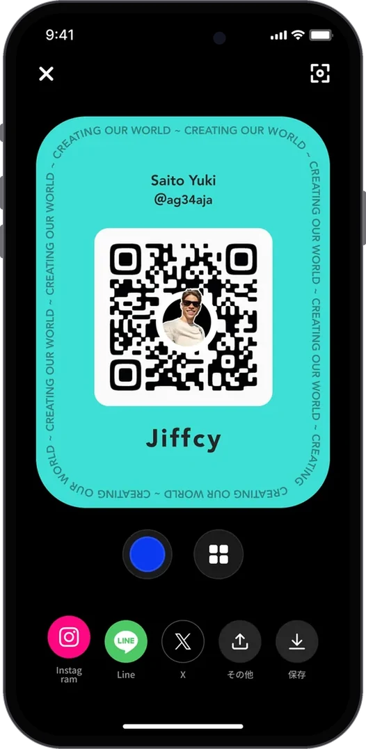
QR code card over your DotsQR code card, color variation
QR · Add friends
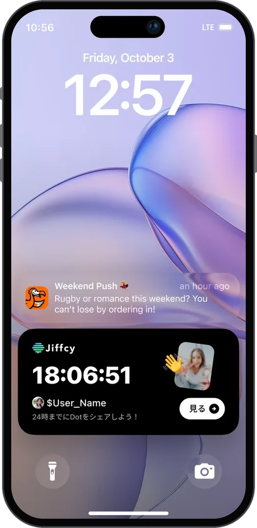
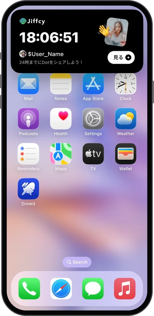
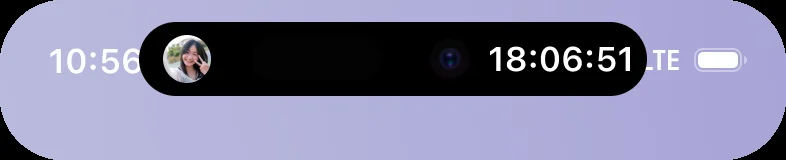
Live Activity on the lock screenLive Activity on the home screenLive Activity: minimal and compact Dynamic Island
Live Activity · Lock screen, Home screen and Dynamic Island
  1. 01問題定義Problem문제정의

    Jiffcyでは、QRコードで1人ずつ友だちを追加します。新規ユーザーは最初、友だちがいない状態から始まるため、価値を感じる前に離脱しやすい構造でした。

    On Jiffcy, you add friends one at a time by QR code. New users start with no friends at all, so they tend to leave before they feel any value.

    Jiffcy에서는 QR 코드로 친구를 한 명씩 추가한다. 새로 가입한 사용자는 친구가 한 명도 없는 상태에서 시작하기 때문에 앱의 재미를 느끼기도 전에 떠나기 쉬웠다.

  2. 02リサーチResearch리서치
    • 主な機能「Dots」は、友だち同士で写真・動画を送り合うと自動でコラージュができる。価値は「相手がいる」ことに依存している。
    • The core feature, Dots, turns photos and videos exchanged between friends into an automatic collage. Its value depends on having someone on the other side.
    • 핵심 기능 "Dots"는 친구와 사진·영상을 주고받으면 콜라주가 자동으로 만들어진다. 함께할 친구가 있어야 가치가 생긴다는 뜻이다.
  3. 03制約Constraints제약조건
    • 「クローズドであること」はプロダクトの核なので、公開タイムラインで空白を埋めることはできない。
    • 友だち追加はQRで対面が前提。オンボーディング中に必ず完了できるとは限らない。
    • Being closed is the core of the product, so an open public feed can't fill the empty state.
    • Adding friends by QR assumes meeting in person, so it can't always be completed during onboarding.
    • "폐쇄형"이라는 점이 이 서비스의 핵심이라, 공개 피드로 빈 화면을 채울 수는 없다.
    • 친구 추가는 QR로, 직접 만나서 하는 게 전제다. 가입하는 그 자리에서 꼭 끝낼 수 있는 건 아니다.
  4. 04決定Decision결정ケーススタディ要約Case summary케이스 스터디 요약

    一人でも続けて写真を投稿できる機能を加え、オンボーディングで紹介する

    Add solo continuous photo posting and introduce it in onboarding

    혼자서도 사진을 계속 올릴 수 있는 기능을 더하고, 온보딩에서 먼저 보여준다

    友だちがいなくても「自分の記録」として価値を感じられれば、友だちを誘う理由が後から生まれる。価値の順番を入れ替える判断。

    If people get value from it as their own record before they have friends, they find a reason to invite friends later. I flipped the order in which people get value.

    친구가 없어도 "나만의 기록"으로 재미를 느낄 수 있다면, 친구를 부를 이유는 그다음에 자연스럽게 생긴다. 가치를 느끼는 순서를 바꾼 판단.

    順番は「プロフィール写真 → 最初のDot → QR」

    Order: profile photo → first Dot → QR

    순서는 "프로필 사진 → 첫 Dot → QR"

    いきなり友だち追加を求めず、まず自分を表現し、Dotを一つ作ってからQRを見せる。友だちに見せたいものがある状態で追加をお願いするため。

    Don't ask for friends up front. Let people express themselves, make one Dot, then show the QR, so they have something worth showing when they're asked to add someone.

    처음부터 친구를 추가하라고 하지 않는다. 먼저 나를 표현하고 Dot을 하나 만든 다음 QR을 보여준다. 친구에게 보여줄 무언가가 생긴 뒤에 초대를 권하기 위해서다.

  5. 05改善Iteration개선

    導入後のオンボーディング完了率や友だち追加率を確認しながらチームと改善点を議論し、改善を続けています(現在進行中)。友だちがいない最初の画面をさらに埋めるための次の施策も開発中で、近くリリース予定です。

    We're tracking onboarding completion and friend-add rates after the change, and keep discussing and shipping improvements with the team (ongoing). The next step for the empty first screen is in development and due to ship soon.

    도입 후 온보딩 완료율과 친구 추가율을 확인하면서 개선할 점을 팀과 계속 논의하며 다듬어 가고 있다. (현재 진행 중) 친구가 없는 첫 화면을 더 채우기 위한 다음 기능도 개발 중이며, 곧 출시될 예정이다.
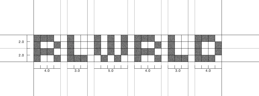

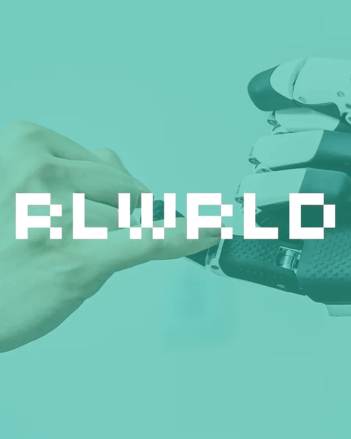
RLWRLD logo
Logo · Built only from pixels
Logo construction on a 4-unit grid: letter widths 4, 3, 5, 4, 3, 4
Construction · 4-unit height, widths 4 / 3 / 5 / 4 / 3 / 4
Key visual: a human hand and a robot hand with the RLWRLD logo
Key visual
Gradient key visual: We build Real World Intelligence
Concept · Real World Intelligence
Logo over a light gradient
Concept · Gradient, light
Logo over a blue gradient
Concept · Gradient, blue
Logo in a neon pixel scene
Concept · Neon pixels
Glitched pixel logo
Concept · Glitch
Checker pattern band
Pattern · Checker
Dot pattern with the logo
Pattern · Dots
Logo set on a highlight bar
Concept · Highlight
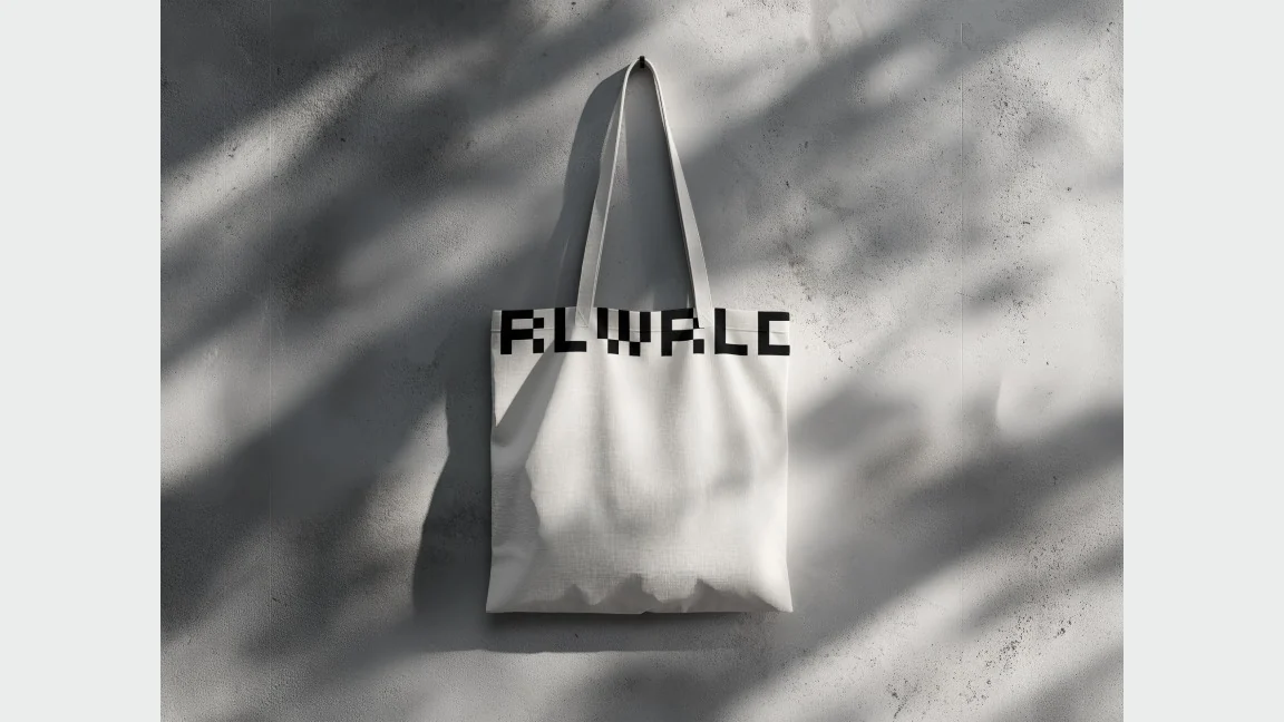
Tote bag
Merch · Tote bag
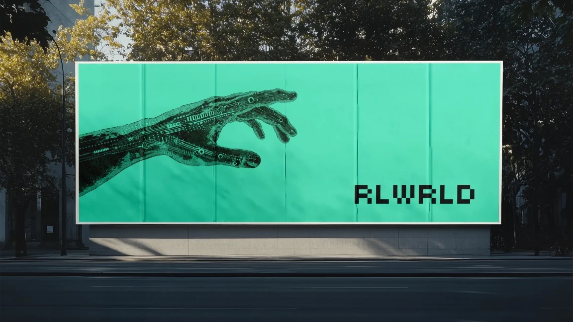
Billboard with the robot hand visual
Concept · Billboard
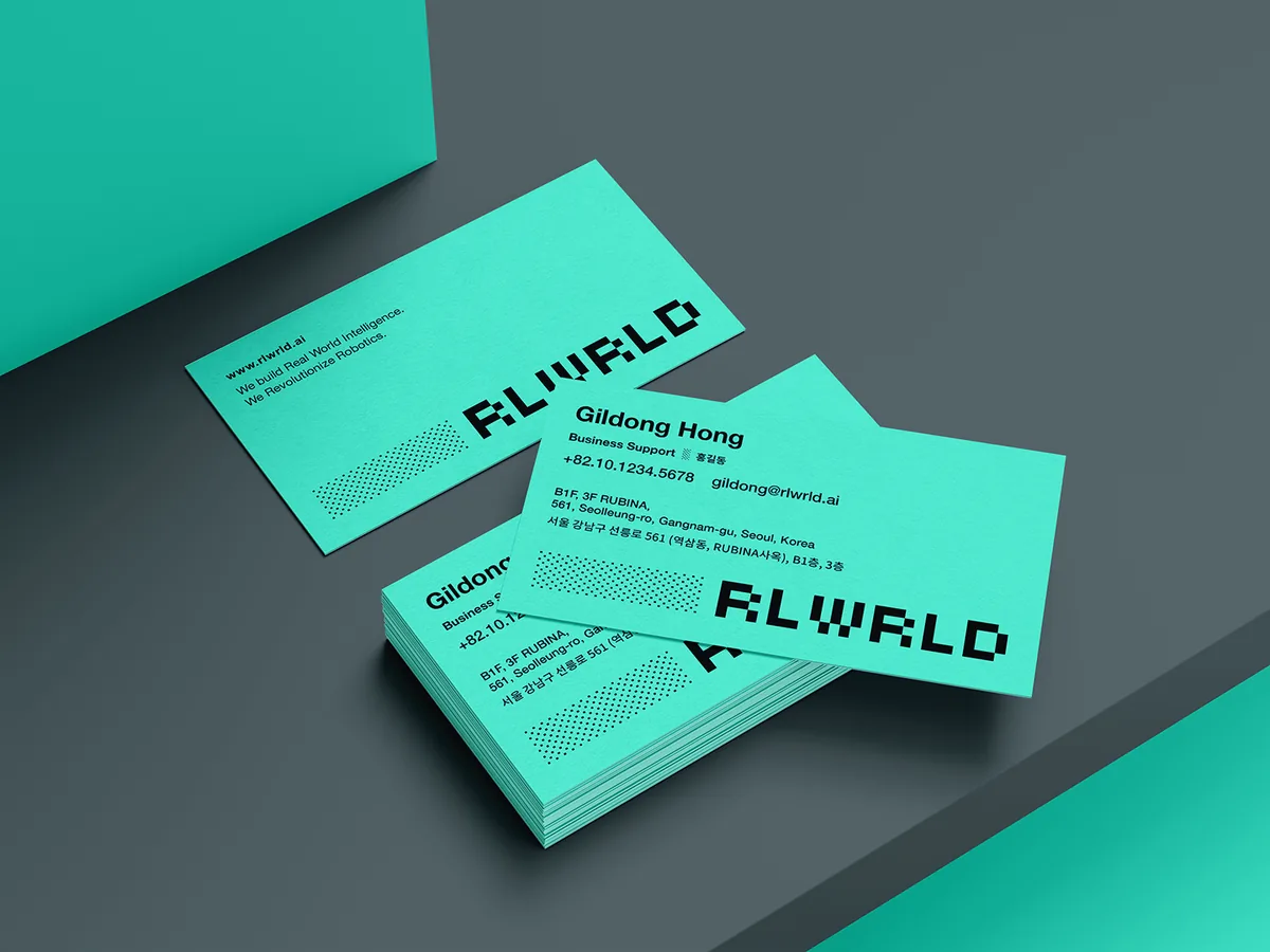
RLWRLD business cards in brand mint with a halftone pixel pattern
Business cards
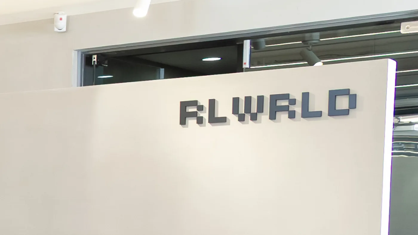
RLWRLD logo as dimensional office signage
Office signage
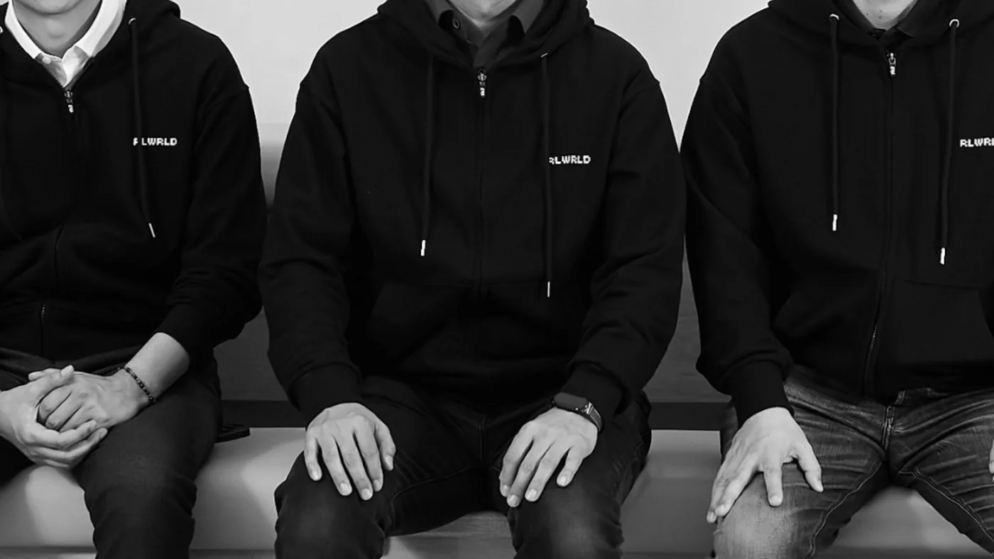
Team members wearing black hoodies with the RLWRLD logo
Team merch
  1. 01問題定義Problem문제정의

    RLWRLDは、独自の4D+モーションキャプチャデータと物理世界のために構築したフロンティア基盤モデルで、ロボットに精密な手の作業を学習させる会社です。依頼の時点でロゴはまだ存在しませんでした。

    RLWRLD trains robots to do precise hand work, using its own 4D+ motion capture data and a frontier foundation model built for the physical world. When I joined, the company had no logo yet.

    RLWRLD는 자체 4D+ 모션 캡처 데이터와 물리 세계를 위해 구축한 프론티어 파운데이션 모델로, 로봇이 정밀한 손 작업을 수행하도록 학습시키는 회사다. 의뢰 시점에는 아직 회사 로고가 없었다.

    精密な手の動きのために、基盤モデルを一から自分たちで作る。その職人のような姿勢を、ブランドに込めることが課題でした。

    They build their foundation model from scratch for precise hand motion. The task was to carry that craftsman-like attitude into the brand.

    정밀한 손 동작을 위해 파운데이션 모델을 처음부터 직접 만든다. 이런 장인 같은 태도를 브랜드에 녹여내야 했다.

  2. 02リサーチResearch리서치
    • クライアントは、ドットを使ったギークな表現を強く望んでいた。デジタルが生まれたころの「0か1か」の世界のように、AIの脳という根本をつくる会社であることを表したい、という意図だった。
    • デジタルのピクセルを使ったWebサイトや作品を幅広く参照した。
    • The client strongly wanted a geeky, dot-based look. Like the world of 0s and 1s at the dawn of digital, it would say they build the fundamentals: the brain of the AI.
    • Looked widely at websites and work built with digital pixels.
    • 클라이언트는 도트를 이용한 긱(Geek)한 표현을 강하게 원했다. 디지털이 처음 태동하던 "0 아니면 1"의 세계처럼, AI의 뇌라는 근본을 만드는 회사임을 드러내고 싶다는 의도였다.
    • 디지털 픽셀을 활용한 웹사이트와 작업물을 폭넓게 참고했다.
  3. 03制約Constraints제약조건
    • Webサイト制作と並行して、期間は約2か月。
    • BXからWebデザイン、パブリッシングまで一人で担当。
    • About two months, in parallel with building the website.
    • I handled everything from BX to web design and front-end build on my own.
    • 웹사이트 제작과 함께 진행해 기간은 약 2개월.
    • BX부터 웹 디자인, 퍼블리싱까지 혼자 담당했다.
  4. 04決定Decision결정ケーススタディ要約Case summary케이스 스터디 요약

    ロゴを、ピクセルのグリッドだけで組み立てる

    Build the logo from nothing but a pixel grid

    로고를 픽셀 그리드만으로 쌓아 올린다

    「根本をつくる」感覚を伝えたかった。デジタルの最小単位であるピクセルを一つずつ積み上げることで、基盤から自分たちで作る姿勢を表現した。ドットの組み方を変えた案を数十案つくり、その中から今の形が最終案に選ばれた。

    I wanted it to feel like building the fundamentals. I stacked pixels, the smallest unit of anything digital, one by one to show a team that builds from the foundation up. I made dozens of dot variations, and the current one was chosen as the final mark.

    "근본을 만든다"는 느낌을 주고 싶었다. 디지털의 가장 작은 단위인 픽셀을 하나씩 쌓아 올려 기반부터 직접 만드는 태도를 표현했다. 도트 구성을 달리한 안을 수십 개 만들었고, 그중 지금의 형태가 최종안으로 선택됐다.

  5. 05展開Rollout전개

    同じピクセルのロゴを、Webサイトと名刺に展開しました。

    I rolled out the same pixel logo across the website and business cards.

    같은 픽셀 로고를 웹사이트와 명함에 전개했다.

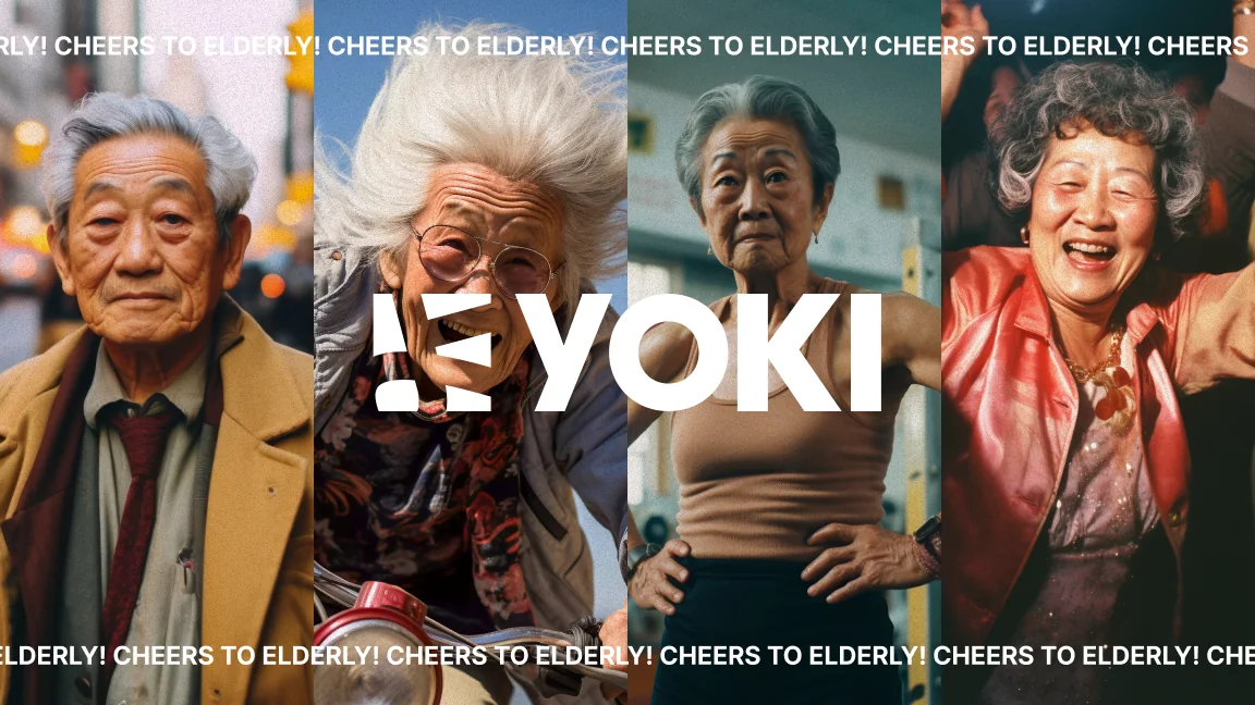
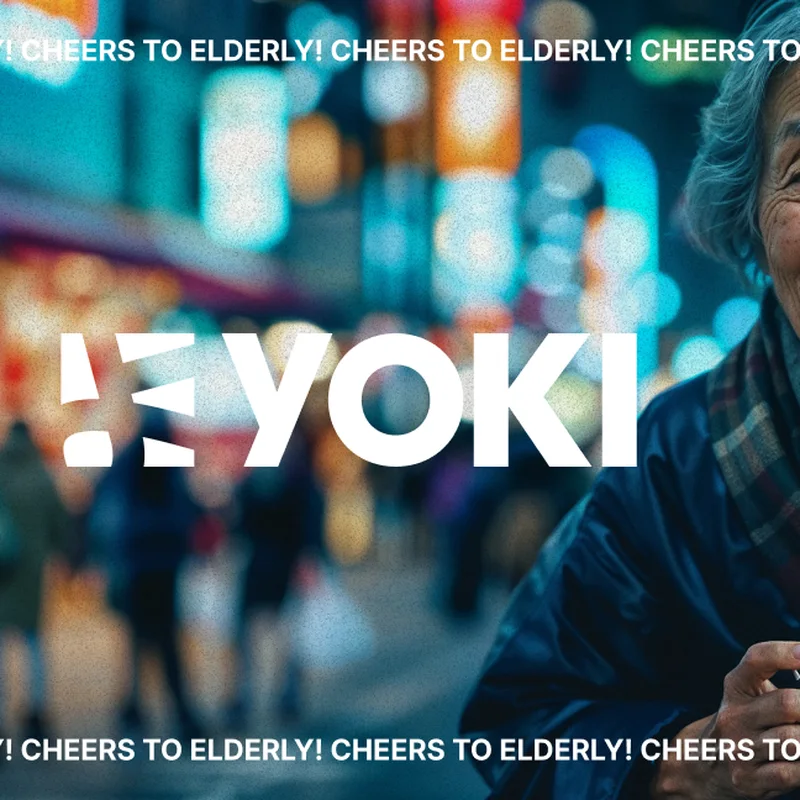
YOKI key visual: Cheers to Elderly!
Key visual · Cheers to Elderly!
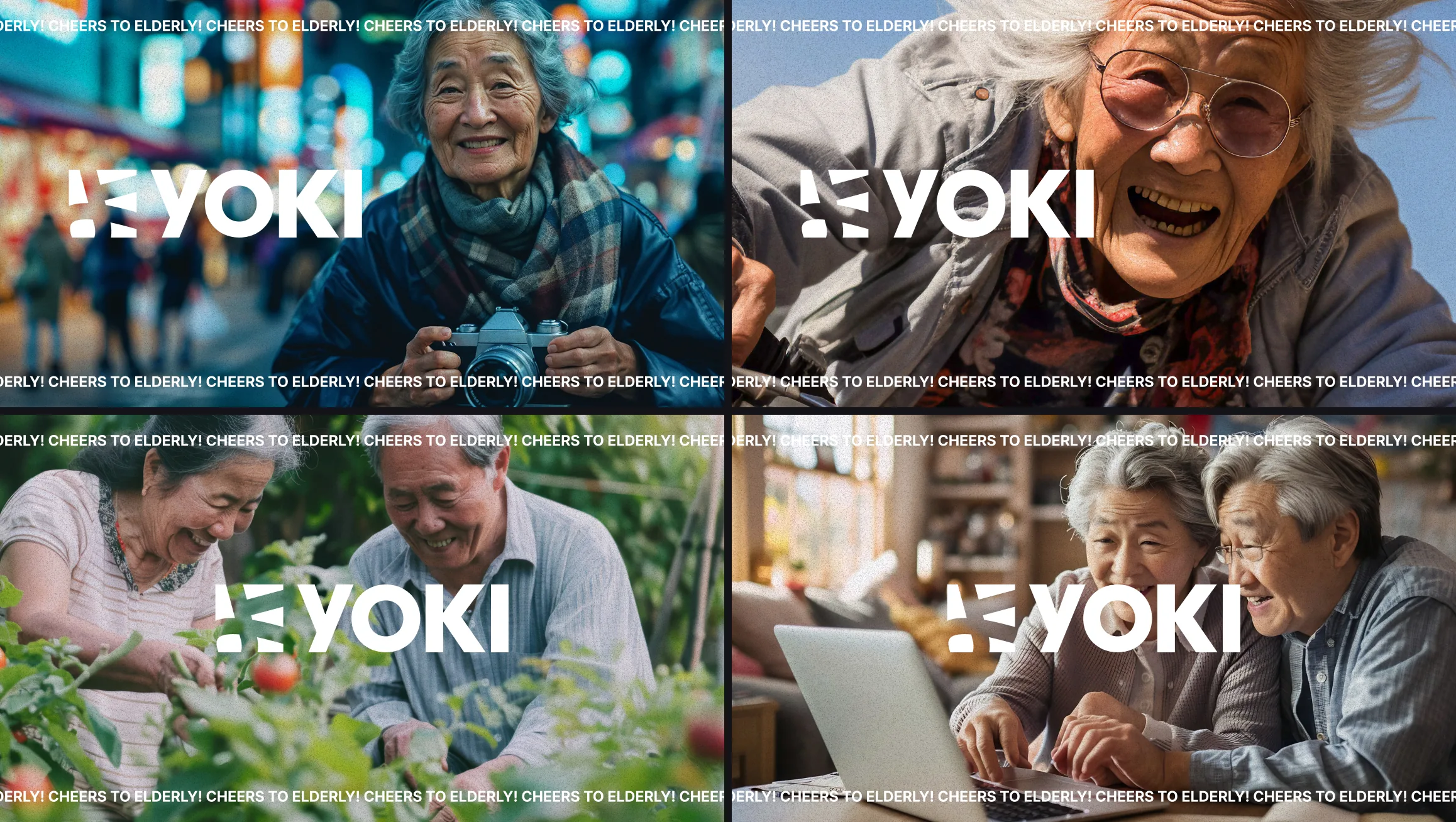
Four key visuals of active seniors with the YOKI logo
Key visuals · Seniors who laugh, make and go out
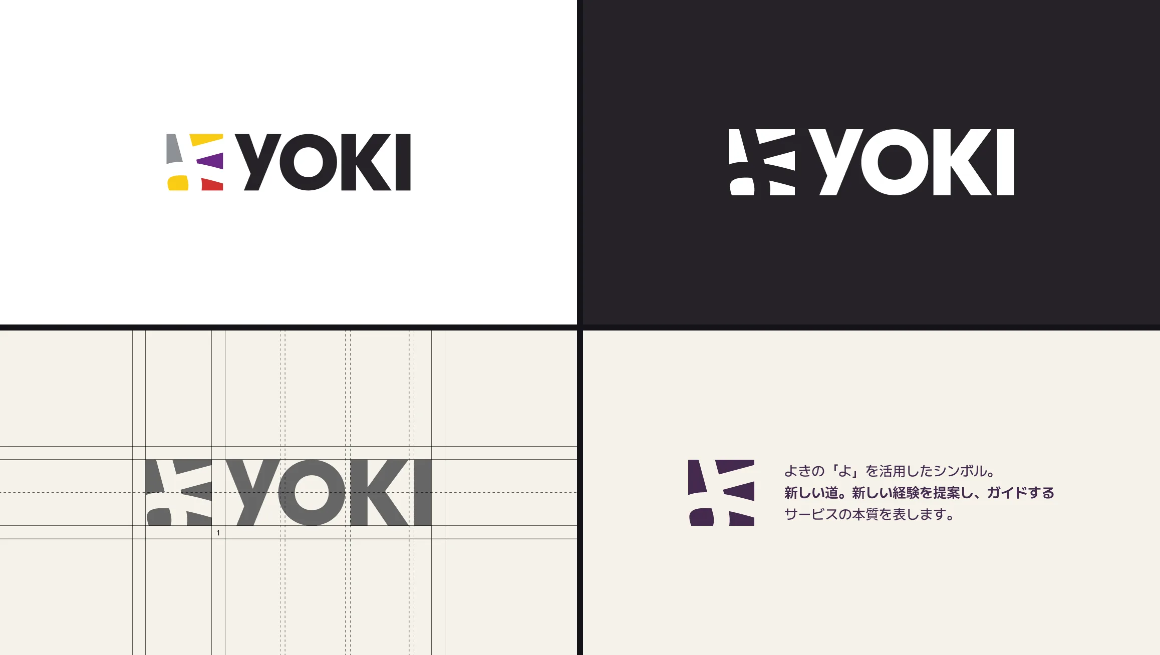
YOKI logo on white and dark, the grid, and the symbol
Logo · On white and dark, grid and symbol
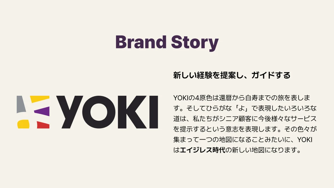
Brand story: the four colors and the paths of よ
Brand story
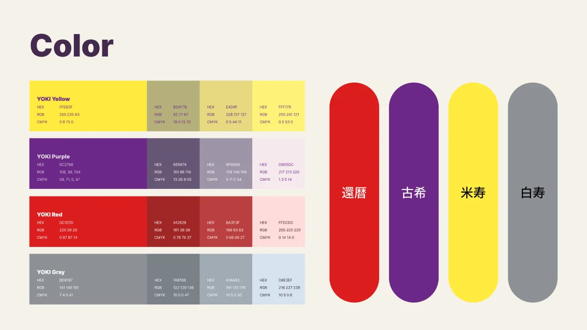
YOKI colors: red, purple, yellow and grey
Color · From 60 to 99
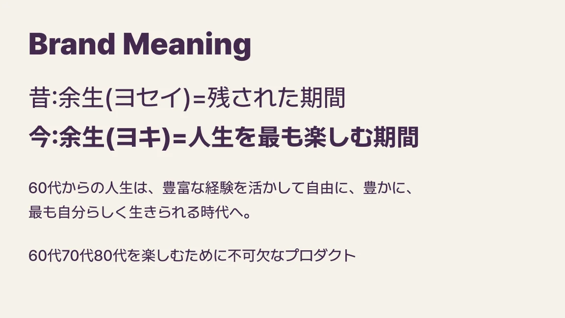
Brand meaning: yosei reread as yoki
Brand meaning
YOKI app icon
App icon
Home
Tour detail
Booking
Message from the guide
Service · Home, tour detail, booking, messages from the guide
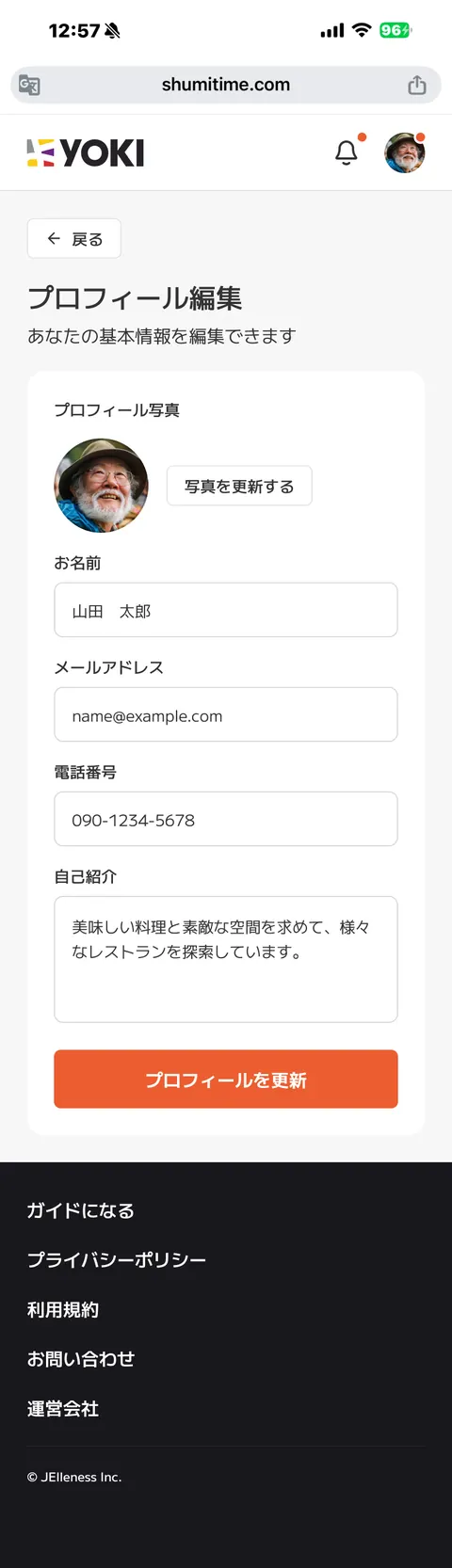
Date search
Profile edit
Service · Date search, profile
  1. 01問題定義Problem문제정의

    人生100年時代になり、引退後も活発に社会と関わりたいシニアが増えています。一方で「増えた時間をどう使えばいいかわからない」「毎日同じ場所ばかり」「同年代と会う機会が少ない」「時代遅れになりたくない」という声もあります。こうした人が自分でも知らなかった好みを見つけ、新しい一日を始められるサービスとブランドが必要でした。

    With 100-year lives, more seniors want to stay active and involved after they retire. Yet many say they do not know what to do with the extra time, keep going to the same places, rarely meet people their age, and do not want to fall behind. The service and its brand needed to help them find tastes they did not know they had, and start a new day.

    인생 100년 시대가 되면서 은퇴 후에도 활발하게 사회와 관계를 맺고 싶은 시니어가 늘고 있다. 한편 "늘어난 시간을 어떻게 써야 할지 모르겠다", "매일 같은 곳만 간다", "또래를 만날 기회가 적다", "시대에 뒤처지고 싶지 않다"는 목소리도 있다. 이런 사람들이 자신도 몰랐던 취향을 찾고 새로운 하루를 시작할 수 있는 서비스와 브랜드가 필요했다.

  2. 02リサーチResearch리서치
    • アクティブシニア(仕事・趣味・地域活動に意欲的なシニア層)は、健康意識が高く、好奇心が旺盛で、社会とのつながりを大切にし、情報収集にも長けている。
    • 今の65歳前後は、若い頃に日本がいちばん輝いた時代(高度経済成長期の後半からバブル期)を直接経験していて、それを誇りにしている。
    • 健康と社会とのつながりを同時に得られる趣味、一人ではなく誰かと一緒にする趣味に満足度が高い。スマートフォンなどデジタル機器への関心も広がっている。
    • Active seniors, who stay keen on work, hobbies and community, care about their health, are curious, value connection and are good at finding information.
    • People around 65 today lived their youth through Japan's brightest years, from late high growth to the bubble, and are proud of it.
    • They are most satisfied by hobbies that bring health and connection together, done with others rather than alone. Interest in smartphones and other devices is growing too.
    • 액티브 시니어(일, 취미, 지역 활동에 의욕적인 시니어층)는 건강 의식이 높고, 호기심이 왕성하며, 사회와의 연결을 중시하고, 정보 수집에도 능숙하다.
    • 지금의 65세 전후는 젊은 시절 일본이 가장 빛났던 시대(고도성장기 후반부터 버블기)를 직접 경험했고, 그것을 자랑으로 여긴다.
    • 건강과 사회적 연결을 함께 얻을 수 있는 취미, 혼자가 아니라 누군가와 함께하는 취미에 만족도가 높다. 스마트폰 같은 디지털 기기에 대한 관심도 넓어지고 있다.
  3. 03制約Constraints제약조건
    • デザインは自分一人で、ブランドからユーザー画面、管理画面までを担当。
    • 使う人はシニア。大きな文字、読みやすさ、迷わない操作が前提になる。
    • 「高齢者」という受け身なイメージを避け、年齢を重ねることを前向きに見せる必要があった。
    • I designed alone, from the brand to the user screens and the admin.
    • The users are seniors, so large type, legibility and a flow you cannot get lost in were a given.
    • The brand had to avoid the passive image of "the elderly" and show getting older as something positive.
    • 디자인은 혼자서 브랜드부터 사용자 화면, 관리자 화면까지 담당.
    • 쓰는 사람은 시니어. 큰 글자, 읽기 쉬움, 헤매지 않는 조작이 전제다.
    • "고령자"라는 수동적인 이미지를 피하고, 나이 드는 것을 긍정적으로 보여줘야 했다.
  4. 04決定Decision결정ケーススタディ要約Case summary케이스 스터디 요약

    「余生」を「ヨキ」と読み替え、名前と合言葉にする

    Reread "yosei" as "yoki", and make it the name and the rallying cry

    "여생"을 "요키"로 다시 읽고, 이름과 구호로 삼는다

    「余生(ヨセイ)」は残された期間という意味で使われがちです。それを「余生(ヨキ)」、人生をいちばん楽しむ期間と読み替え、サービス名にしました。スローガンは「Cheers to Elderly!」。年齢を重ねること自体を祝う言葉です。

    Yosei, "the rest of one's life", usually means the time that is left. I reread the same characters as yoki, the time to enjoy life most, and made it the service name. The slogan is "Cheers to Elderly!", a toast to getting older itself.

    "여생(요세이)"은 남은 기간이라는 뜻으로 쓰이기 쉽다. 이를 "여생(요키)", 인생을 가장 즐기는 기간으로 다시 읽어 서비스 이름으로 삼았다. 슬로건은 "Cheers to Elderly!". 나이 드는 것 자체를 축하하는 말이다.
    シンボルはひらがなの「よ」、4色は還暦から白寿まで

    The symbol is the hiragana よ, and the four colors run from 60 to 99

    심볼은 히라가나 "よ", 4색은 환갑부터 백수까지

    「よ」の線をいくつもの道に見立て、これからさまざまな体験を提案していく意志を込めました。赤・紫・黄・グレーの4色は、還暦・古希・米寿・白寿という長寿の節目を表し、その道が集まって一つの地図になるイメージです。

    The strokes of よ become several paths, standing for the many experiences YOKI will suggest. Red, purple, yellow and grey stand for the traditional longevity milestones at 60, 70, 88 and 99, and together the paths make one map.

    "よ"의 획을 여러 갈래의 길로 보고, 앞으로 다양한 경험을 제안하겠다는 의지를 담았다. 빨강·보라·노랑·회색 4색은 환갑·고희·미수·백수라는 장수의 고비를 나타내고, 그 길들이 모여 하나의 지도가 되는 이미지다.

    キービジュアルは、笑って動き出すシニアの姿

    Key visuals show seniors laughing and on the move

    키 비주얼은 웃으며 움직이는 시니어의 모습

    デザイン原則の一つは「活気のある」。カメラを持って街に出る人、声を上げて笑う人、畑で手を動かす人など、愉快で活発なシニアの姿に「Cheers to Elderly!」を流し、受け身な「高齢者」のイメージをくつがえしました。

    One design principle is "lively". The visuals show seniors out in the city with a camera, laughing out loud and working in a field, with "Cheers to Elderly!" running across them, to turn the passive image of the elderly around.

    디자인 원칙 중 하나는 "활기 있는". 카메라를 들고 거리에 나선 사람, 소리 내어 웃는 사람, 밭에서 손을 움직이는 사람처럼 유쾌하고 활발한 시니어의 모습에 "Cheers to Elderly!"를 흘려, 수동적인 "고령자" 이미지를 뒤집었다.

    画面は大きな文字と、迷わない予約の流れ

    Large type on screen, and a booking flow you cannot get lost in

    화면은 큰 글자와 헤매지 않는 예약 흐름

    もう一つの原則は「直感的でわかりやすい」。大きな文字と読みやすいフォントを使い、ツアー詳細から日程・人数、お客様情報、予約内容の確認、決済まで一本の流れにしました。ツアーには専属ガイドの顔と評価を載せ、参加後もガイドとメッセージでやりとりできます。

    The other principle is "intuitive and clear". Large type and a legible font carry a single flow from the tour detail to date and party size, contact details, a summary and payment. Each tour shows its guide's face and rating, and guests can message the guide after the tour.

    또 하나의 원칙은 "직관적이고 알기 쉬운". 큰 글자와 읽기 쉬운 폰트를 쓰고, 투어 상세에서 일정·인원, 고객 정보, 예약 내용 확인, 결제까지 하나의 흐름으로 이었다. 투어에는 전속 가이드의 얼굴과 평가를 싣고, 참가 후에도 가이드와 메시지를 주고받을 수 있다.

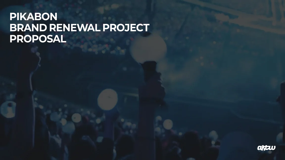
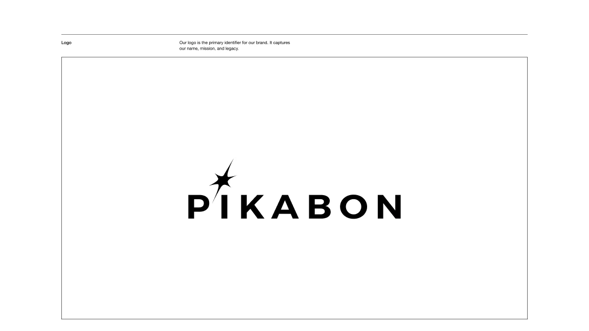
PIKABON brand renewal project proposal
Proposal · Brand renewal project
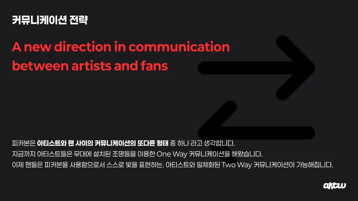
From one-way to two-way communication
Communication · From one-way to two-way
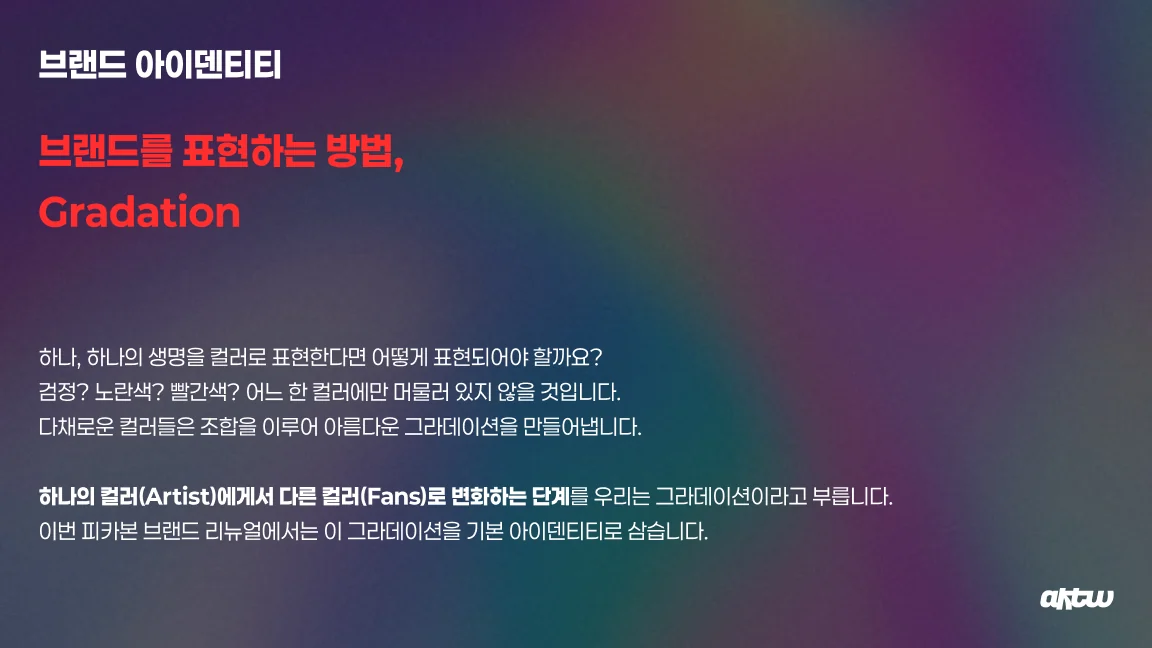
Gradation as the identity
Identity · Gradation
Born to light, made from light
Concept · Born to light
Light is move, make a wave
Concept · Make a wave
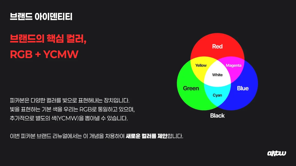
RGB plus YCMW
Color · RGB + YCMW
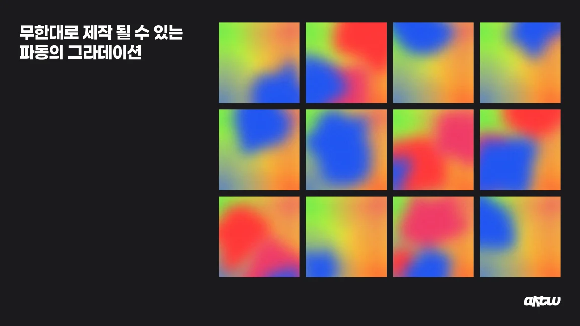
Gradients of waves
Gradients of waves
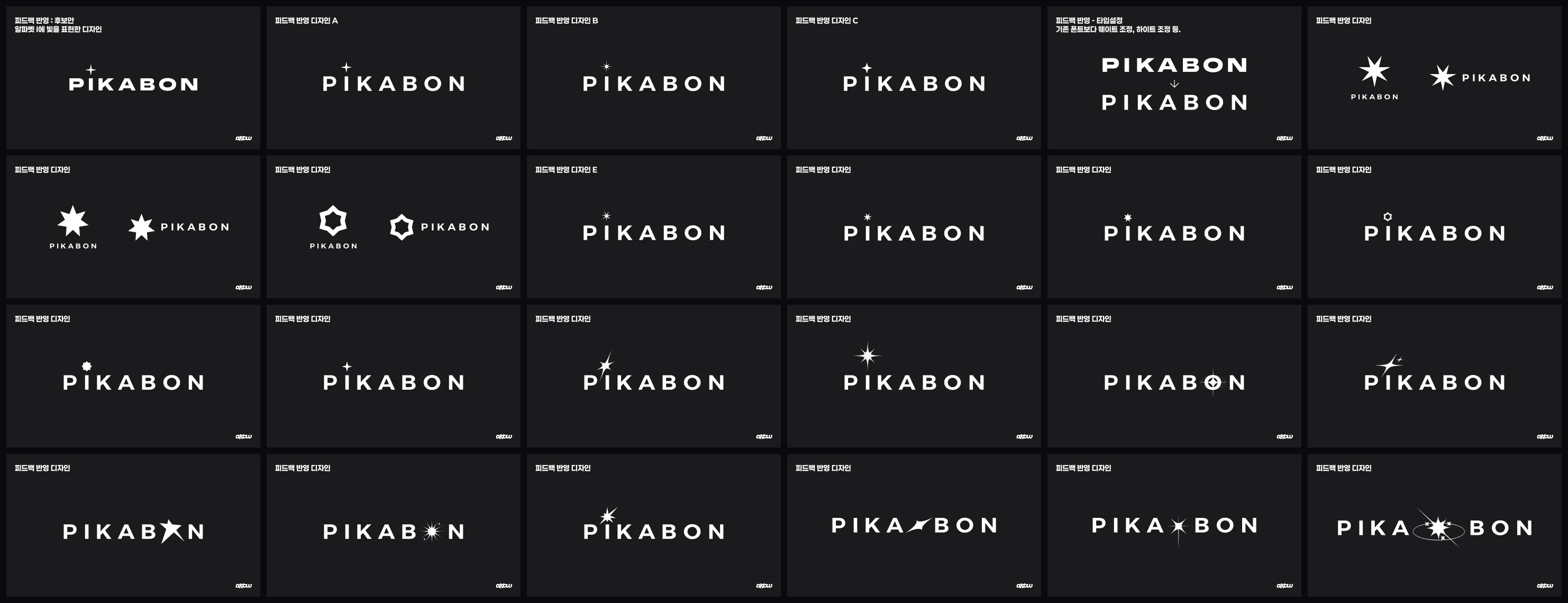
Two dozen logotype studies with different typefaces and effects
Logotype · Typefaces and effects, tested one by one
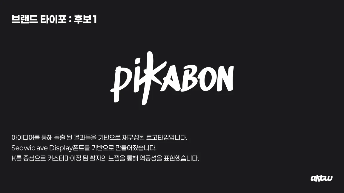
Candidate built from a script display face
Candidate · Script
The chosen PIKABON logo
Chosen · A spark over the i
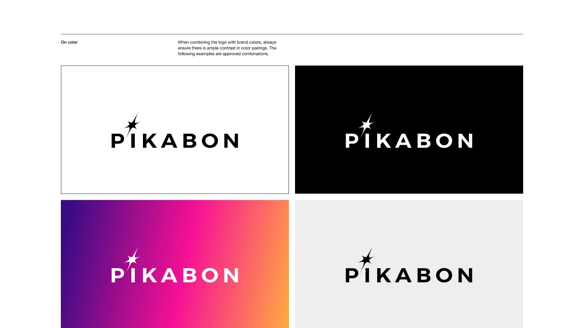
Logo on white, black, gradient and grey
Guideline · On colors
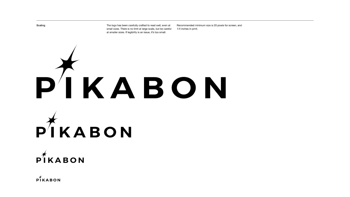
Logo at four sizes
Guideline · Scaling
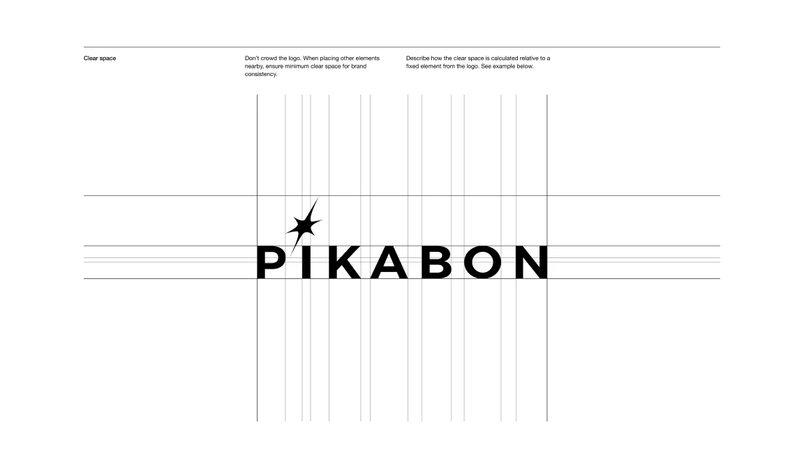
Clear space around the logo
Guideline · Clear space
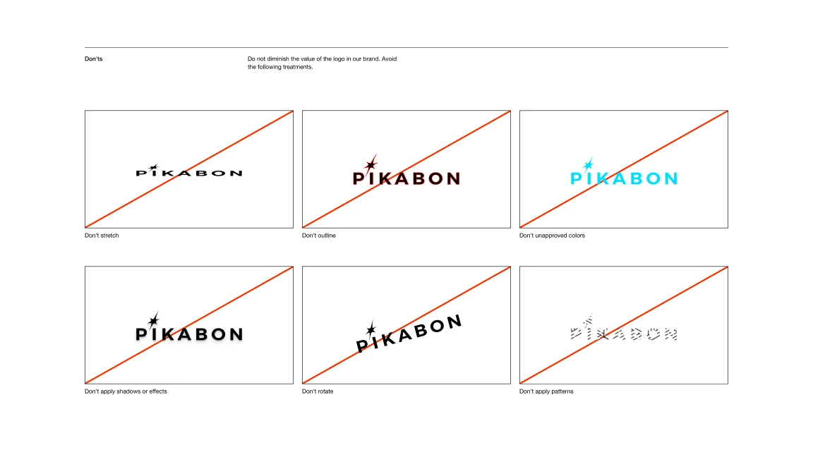
Ways not to use the logo
Guideline · Don'ts
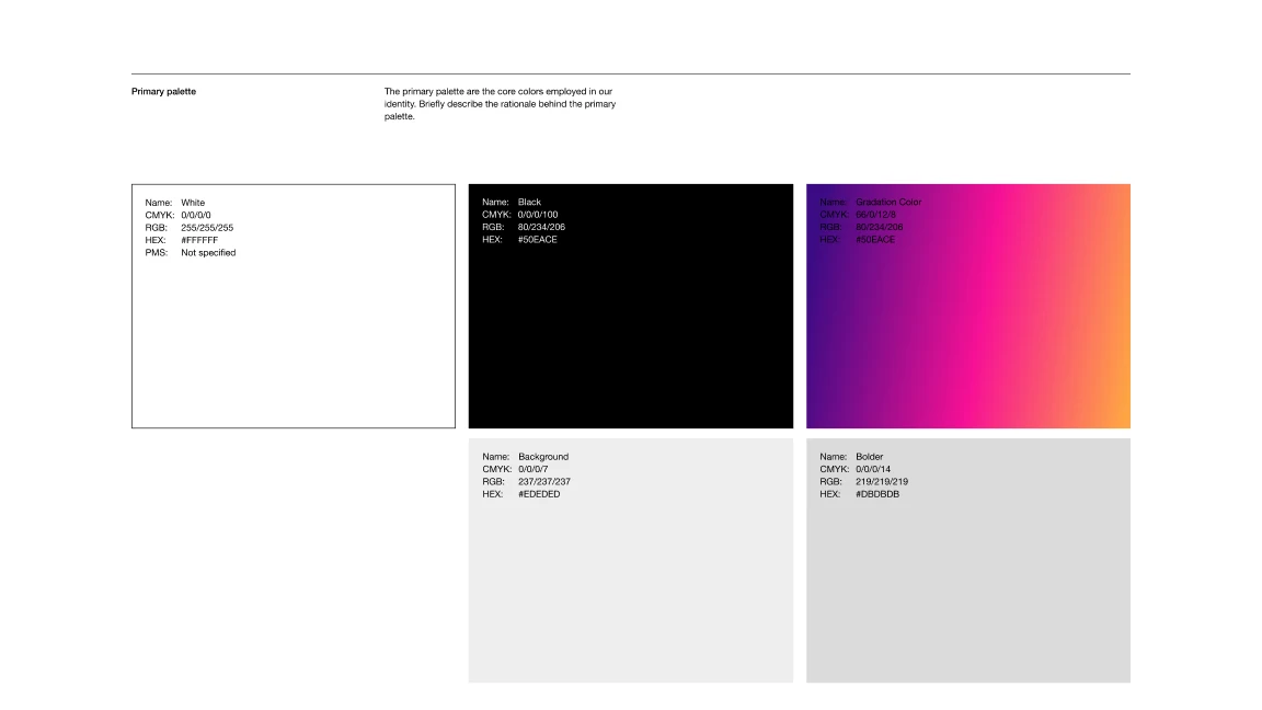
Primary palette
Guideline · Primary palette
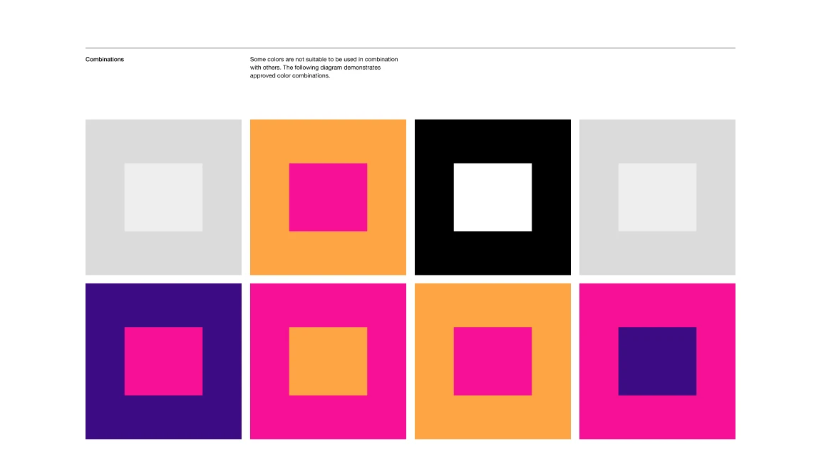
Color combinations
Guideline · Combinations
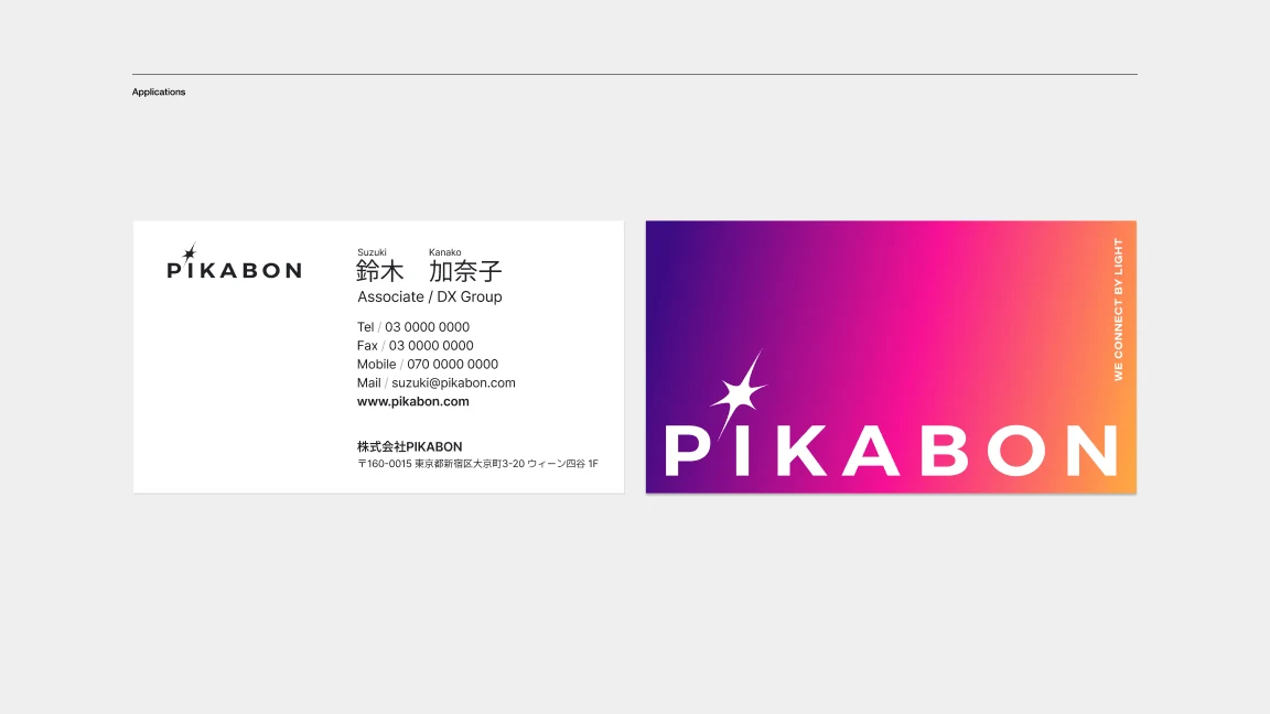
Business cards in white and gradient
Applications · Business cards
  1. 01問題定義Problem문제정의

    PIKABONは、コンサートで使うペンライトをつくる会社です。K-POPから始まった歴史を持ちながら、ブランドの見え方は製品の説明にとどまっていました。リニューアルでは、ペンライトがアーティストとファンをつなぐ、新しいコミュニケーションの形であることを伝える必要がありました。

    PIKABON makes light sticks for concerts. It grew up with K-pop, but the brand only ever described the product. The renewal had to show that a light stick is a new kind of communication between artists and fans.

    PIKABON은 콘서트에서 쓰는 응원봉을 만드는 회사다. K-POP에서 시작된 역사를 가졌지만, 브랜드가 보여주는 것은 제품 설명에 머물러 있었다. 리뉴얼에서는 응원봉이 아티스트와 팬을 잇는 새로운 커뮤니케이션의 형태라는 것을 전해야 했다.

  2. 02リサーチResearch리서치
    • これまでアーティストは、ステージの照明で観客に光を届ける一方通行のコミュニケーションをしてきた。ペンライトを持つと、ファンも自分で光を表現でき、双方向になる。
    • ペンライトはRGBで色をつくる装置で、そこからYCMWの色も引き出せる。
    • 光は音楽に反応して動き、たくさんのファンが集まると一つの波になる。
    • Until now artists sent light one way, from the stage lighting to the audience. With a light stick, fans express light themselves, and it becomes two-way.
    • A light stick makes color from RGB, and can draw YCMW from it too.
    • The light moves with the music, and when many fans gather it becomes a single wave.
    • 지금까지 아티스트는 무대 조명으로 관객에게 빛을 보내는 일방향 커뮤니케이션을 해왔다. 응원봉을 들면 팬도 스스로 빛을 표현할 수 있어 양방향이 된다.
    • 응원봉은 RGB로 색을 만드는 장치이고, 거기서 YCMW 색도 뽑아낼 수 있다.
    • 빛은 음악에 반응해 움직이고, 많은 팬이 모이면 하나의 물결이 된다.
  3. 03制約Constraints제약조건
    • ペンライト本体、パッケージ、名刺、ウェブまで、光る場面と光らない場面の両方で使えるロゴが必要だった。
    • 提案から、実際に使えるガイドラインまでをまとめる必要があった。
    • The logo had to work both where things glow and where they do not: on the light stick, packaging, business cards and the web.
    • It had to go from a proposal all the way to guidelines people could actually use.
    • 응원봉 본체, 패키지, 명함, 웹까지 빛나는 곳과 빛나지 않는 곳 양쪽에서 쓸 수 있는 로고가 필요했다.
    • 제안부터 실제로 쓸 수 있는 가이드라인까지 정리해야 했다.
  4. 04決定Decision결정ケーススタディ要約Case summary케이스 스터디 요약

    コンセプトは「Born to light, Made from light.」

    The concept: "Born to light, made from light."

    콘셉트는 "Born to light, Made from light."

    光で生まれ、光でつくられたブランドとして、アーティストの色からファンの色へ移り変わる「グラデーション」を基本のアイデンティティにしました。一つの鼓動が波になり、ファンが集まって大きな波になる、という物語でまとめています。

    As a brand born of light and made of light, its core identity is a gradient that shifts from the artist's color to the fans'. The story is a heartbeat that becomes a wave, and fans gathering into one big wave.

    빛으로 태어나고 빛으로 만들어진 브랜드로서, 아티스트의 색에서 팬의 색으로 변해 가는 "그라데이션"을 기본 아이덴티티로 삼았다. 하나의 박동이 파동이 되고, 팬이 모여 큰 물결이 된다는 이야기로 정리했다.

    ロゴは、たくさんの書体と効果を試してから

    The logo came after testing many typefaces and effects

    로고는 수많은 서체와 효과를 시험한 뒤에

    K-POPのルーツを残すために「K」を光で表す案や、波を表す筆記体の案など、書体と光の効果を一つずつ並べて比べました。最終的には、読みやすい幾何学的なロゴタイプに、「i」の上で光る星を一つだけ置く形に絞っています。

    I laid out typefaces and light effects one by one, including versions that turned the K into light to keep the K-pop roots and script versions that suggested waves. In the end it came down to a clean geometric logotype with a single spark of light over the i.

    K-POP의 뿌리를 남기기 위해 "K"를 빛으로 표현한 안, 물결을 나타내는 필기체 안 등 서체와 빛 효과를 하나씩 나란히 비교했다. 최종적으로는 읽기 쉬운 기하학적 로고타입에 "i" 위에서 빛나는 별 하나만 두는 형태로 좁혔다.

    ガイドラインで、どこでも同じ光り方に

    Guidelines so it shines the same everywhere

    가이드라인으로 어디서나 같은 빛으로

    白・黒・グラデーション・グレーでの使い方、サイズ、余白、やってはいけない使い方、メインの配色と組み合わせ、名刺までをガイドラインにまとめました。紫からピンク、オレンジへ移るグラデーションを、光るものを持たない場面でのブランドの光としています。

    The guidelines cover the logo on white, black, gradient and grey, its sizes, clear space, what not to do, the main palette and combinations, and the business cards. The gradient from purple through pink to orange is the brand's light wherever nothing actually glows.

    흰색·검정·그라데이션·회색에서의 사용법, 크기, 여백, 하면 안 되는 사용법, 메인 배색과 조합, 명함까지 가이드라인으로 정리했다. 보라에서 핑크, 오렌지로 변하는 그라데이션을, 빛나는 것이 없는 곳에서의 브랜드의 빛으로 삼았다.

  5. 05結果Outcome결과

    提案したロゴとガイドラインが採用され、現在も使われています。

    The logo and guidelines were adopted and are in use today.

    제안한 로고와 가이드라인이 채택되어 지금도 쓰이고 있다.

ULINE is a company that provides products for the next generation
Brief · Products for the next generation
Symbol design
Symbol
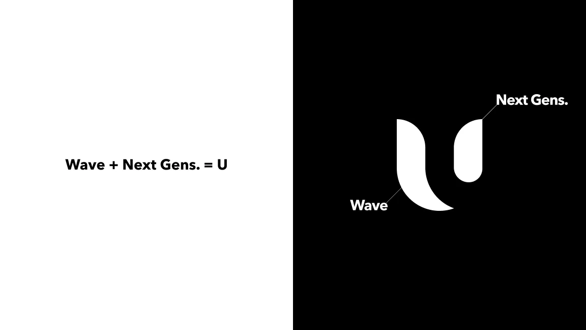
Wave plus next generations makes U
Wave + Next Gens. = U
Symbol studies
Symbol studies
A circle for the next generation platform
Circle · Next generation platform
Company color, Clear Purple
Color · Clear Purple
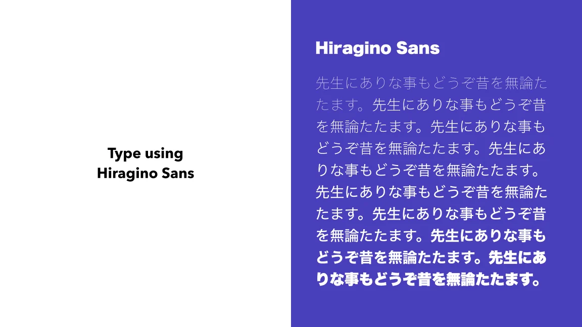
Type set in Hiragino Sans
Type · Hiragino Sans
Logo on dark
Logo · On dark
Logo on white and purple
Logo · On white and purple
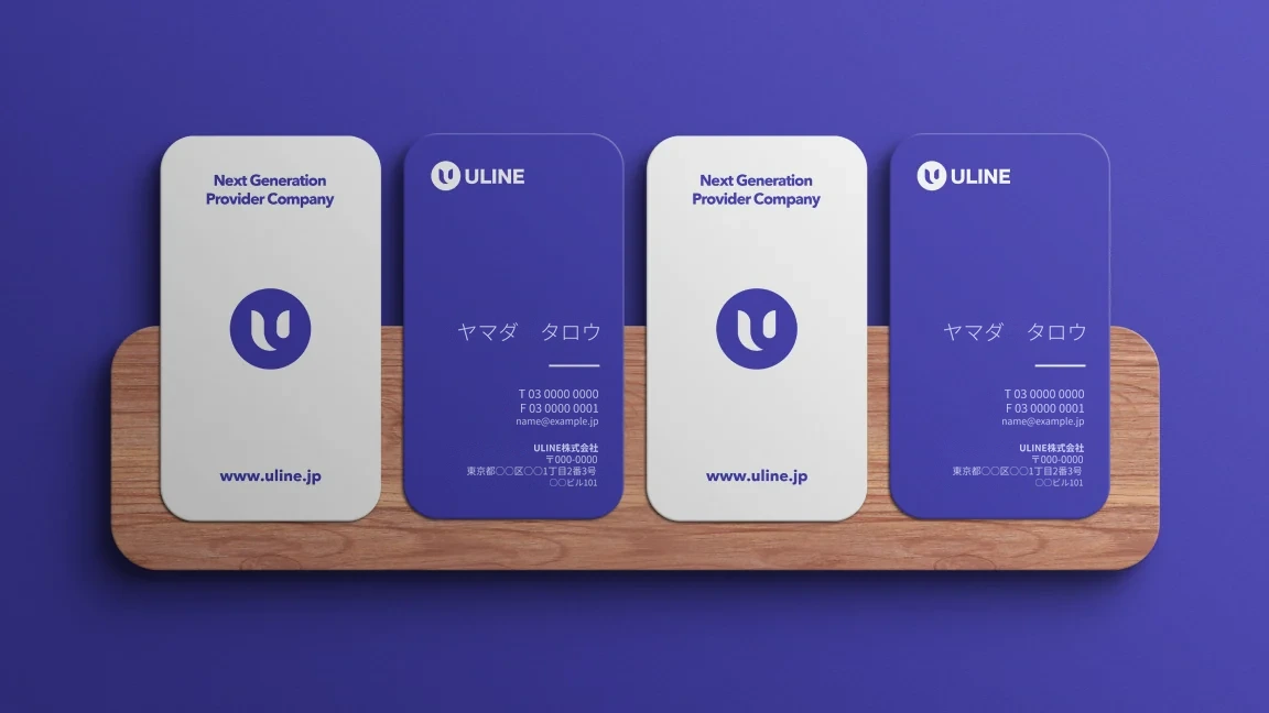
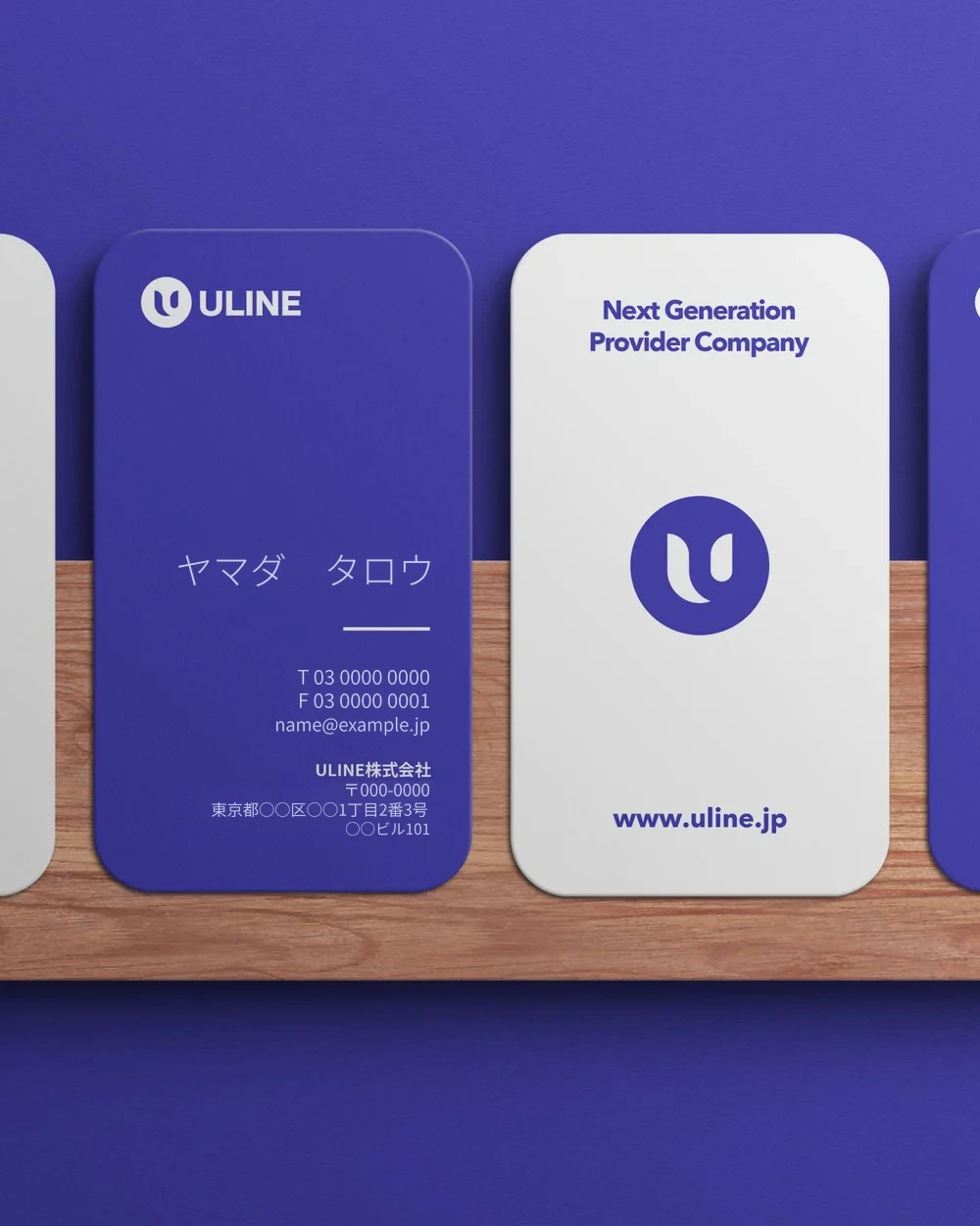
ULINE business cards
Applications · Business cards
Korean Culture with ULINE, on products
Korean Culture with ULINE
Korean Culture with ULINE, on fashion
Korean Culture with ULINE
  1. 01問題定義Problem문제정의

    ULINEは、次の世代のための製品を届ける会社として、韓国カルチャーの商品を日本で扱っています。新しい会社として、名前と事業の思いがひと目で伝わるロゴが必要でした。

    ULINE brings Korean culture products to Japan as a company providing products for the next generation. As a new company, it needed a logo that shows the name and what the business stands for at a glance.

    ULINE은 다음 세대를 위한 제품을 전하는 회사로서 한국 문화 상품을 일본에서 다루고 있다. 새로운 회사로서 이름과 사업의 뜻이 한눈에 전해지는 로고가 필요했다.

  2. 02リサーチResearch리서치
    • 会社が掲げるのは「次の世代のための製品」。新しい流れを広げていく姿勢を、形で表したかった。
    • 扱う商品はコスメやファッションなど幅広く、どの商品の隣に置いても邪魔をしないことが大事だった。
    • The company's promise is "products for the next generation", and I wanted a shape that shows it spreading a new current.
    • The products range from cosmetics to fashion, so the mark had to sit next to any of them without getting in the way.
    • 회사가 내건 것은 "다음 세대를 위한 제품". 새로운 흐름을 넓혀 가는 자세를 형태로 표현하고 싶었다.
    • 다루는 상품이 화장품부터 패션까지 폭넓어서, 어떤 상품 옆에 두어도 방해하지 않는 것이 중요했다.
  3. 03制約Constraints제약조건
    • 名刺や商品、ウェブなど、小さくても大きくても読めるシンボルが必要だった。
    • 日本語の文字と並んでも違和感のない書体を選ぶ必要があった。
    • The symbol had to read at any size, on business cards, products and the web.
    • The type had to sit naturally next to Japanese text.
    • 명함이나 상품, 웹 등 작아도 커도 읽히는 심볼이 필요했다.
    • 일본어 글자와 나란히 있어도 어색하지 않은 서체를 골라야 했다.
  4. 04決定Decision결정ケーススタディ要約Case summary케이스 스터디 요약

    「Wave」と「Next Gens.」で「U」

    Wave plus next generations makes a U

    "Wave"와 "Next Gens."로 "U"

    新しい流れを表す波と、次の世代を表す小さな形を組み合わせて、頭文字の「U」にしました。いくつかの形を描いて比べたうえで、円の中に収めて「次の世代のプラットフォーム」という意味を重ねています。

    A wave for the new current and a small shape for the next generation come together as the initial U. After sketching and comparing several shapes, I set it inside a circle to add the idea of a platform for the next generation.

    새로운 흐름을 나타내는 물결과 다음 세대를 나타내는 작은 형태를 조합해 머리글자 "U"로 만들었다. 여러 형태를 그려 비교한 뒤 원 안에 담아 "다음 세대의 플랫폼"이라는 의미를 겹쳤다.

    コーポレートカラーは「Clear Purple」

    The company color is Clear Purple

    코퍼레이트 컬러는 "Clear Purple"

    クリアなビジネス、中立で誰にでも開かれている、という思いを一色に込めました。ロゴタイプにはヒラギノ角ゴを使い、日本語と並べてもそろって見えるようにしています。

    One color carries the idea of clear business, neutral and open to everyone. The logotype uses Hiragino Sans so it lines up with Japanese text.

    깨끗한 비즈니스, 중립적이고 누구에게나 열려 있다는 생각을 한 색에 담았다. 로고타입에는 히라기노 산스를 써서 일본어와 나란히 놓아도 가지런해 보이게 했다.

    「Korean Culture with ULINE」

    "Korean Culture with ULINE"

    "Korean Culture with ULINE"

    商品や名刺では、白地と紫地の両方でロゴが使えるようにし、「Korean Culture with ULINE」の一文で、扱う商品と会社の関係を伝えています。

    The logo works on both white and purple for products and business cards, and the line "Korean Culture with ULINE" ties the products to the company.

    상품이나 명함에서는 흰 바탕과 보라 바탕 양쪽에서 로고를 쓸 수 있게 했고, "Korean Culture with ULINE"이라는 한 문장으로 다루는 상품과 회사의 관계를 전한다.

  5. 05結果Outcome결과

    提案したロゴが採用されました。

    The proposed logo was adopted.

    제안한 로고가 채택되었다.

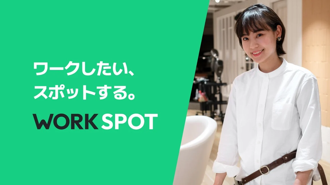
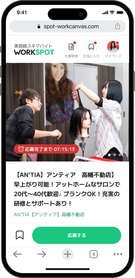
WORKSPOT key visual: work when you want, at a spot
Key visual · ワークしたい、スポットする。
WORKSPOT logotype
Logo
The W symbol: a handshake and working together
Symbol · Handshake and cooperation
Ripple graphic from a spot
Graphic · Ripples from a spot
Logo with graphic elements
Graphic elements
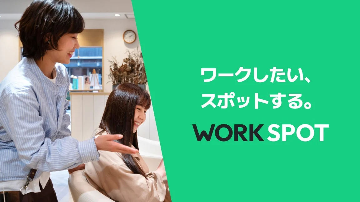
Banner with a hairdresser taking a photo
Banner · Color
Banner with a salon scene
Banner · Salon
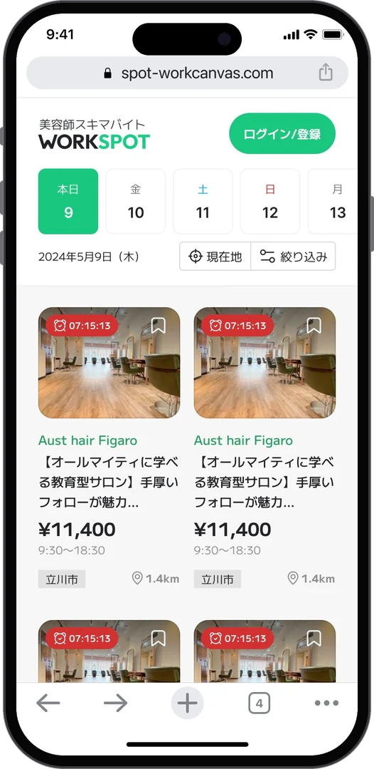
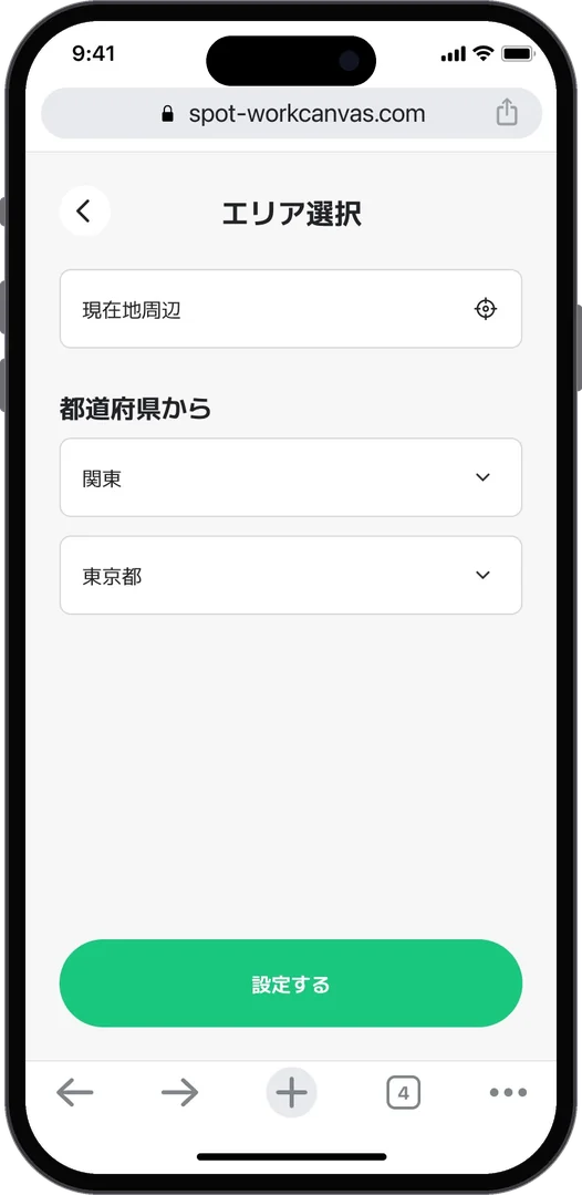
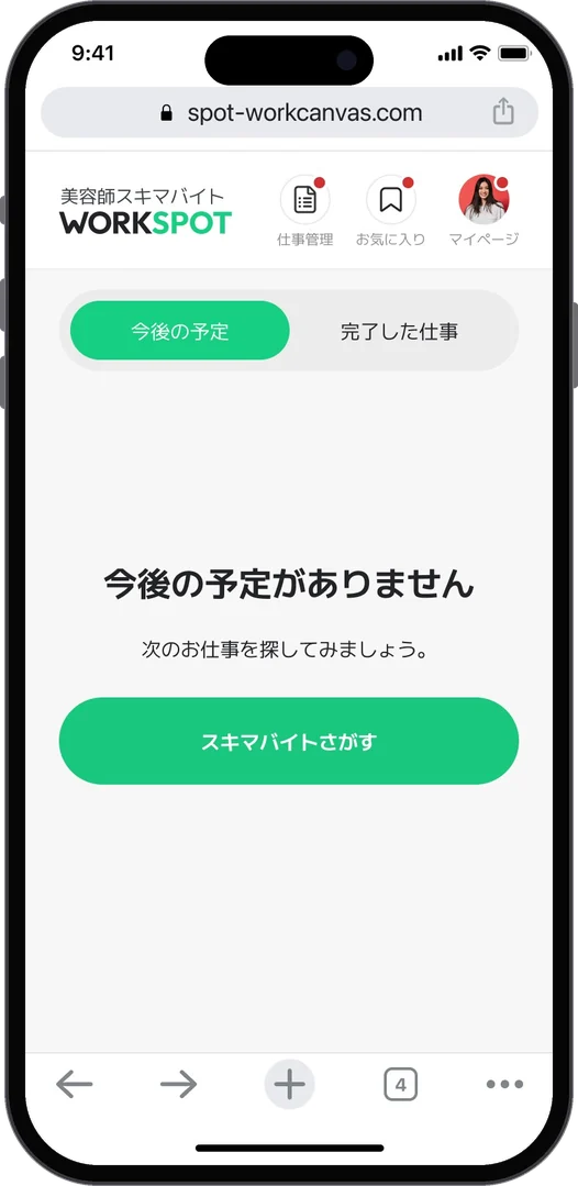
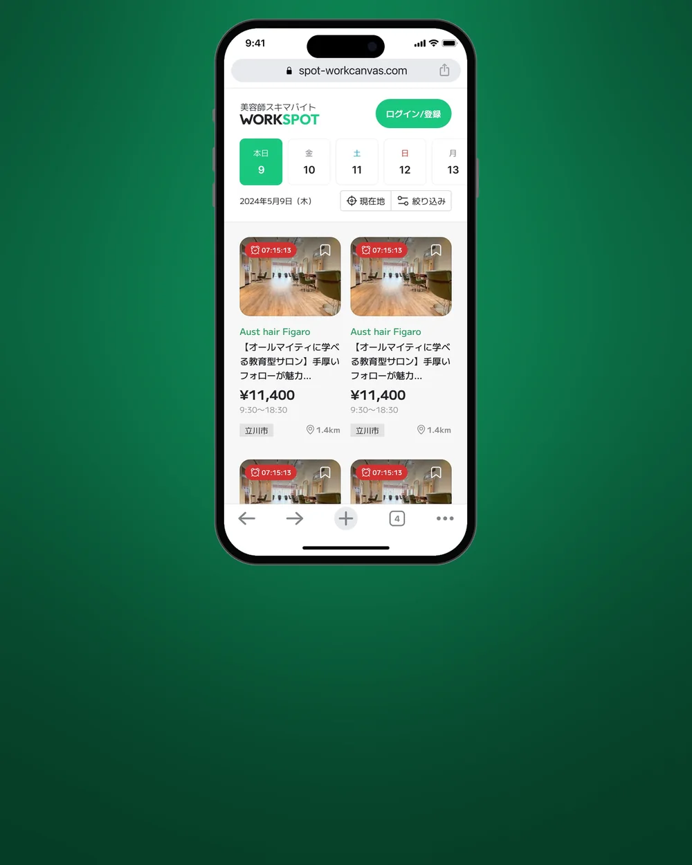
Jobs by date, with time left and payChoose an areaSalon job page
For hairdressers · Find a shift by date, area and salon
Job detail
My page
For hairdressers · Job detail and my page (each scrolls)
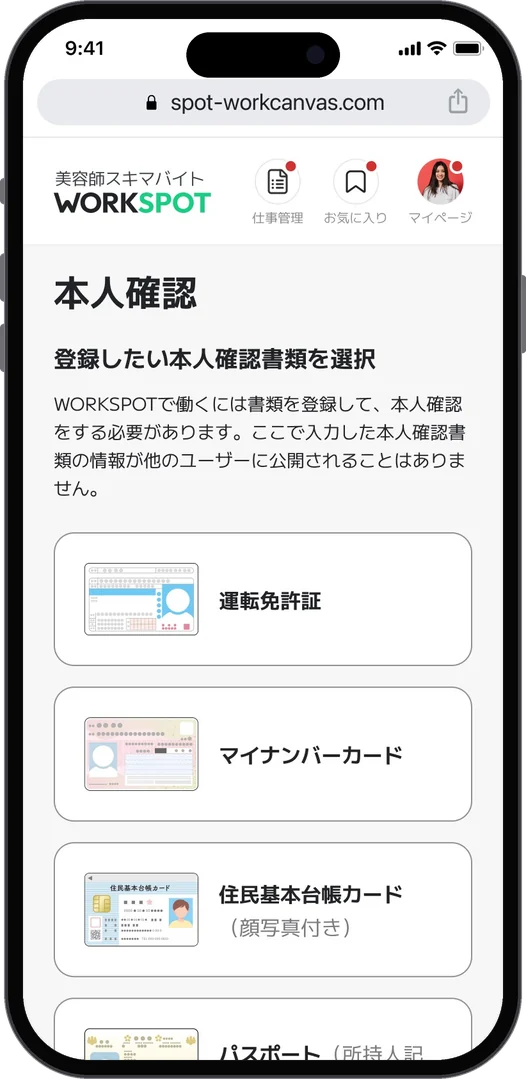
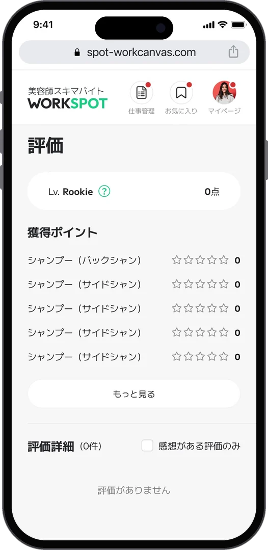
Identity check: choose a documentUpcoming workRatings by skill
For hairdressers · Identity check, work, ratings
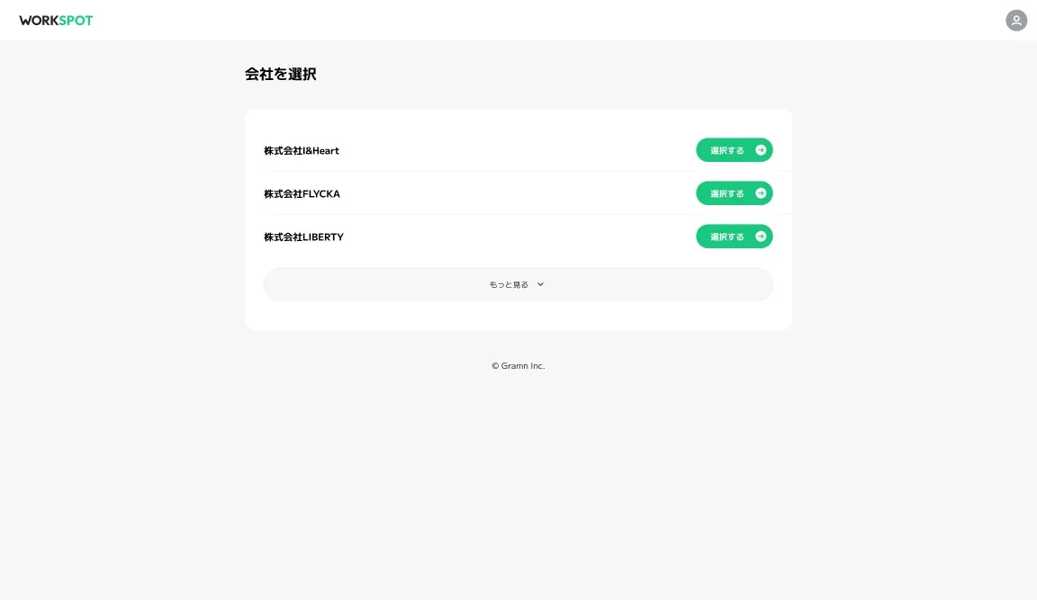
Choose a company
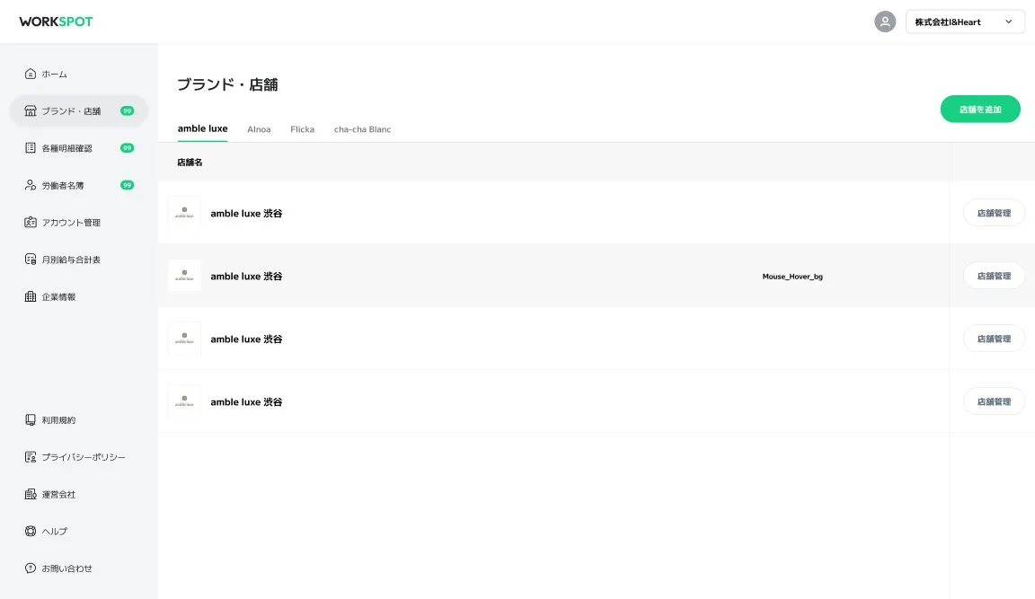
Brands and stores
For salons · Choose a company, then brand and store
Job postings
Create a posting
For salons · Postings and creating one
Workers and monthly pay
Store information
For salons · Workers and monthly pay, store information
  1. 01問題定義Problem문제정의

    美容師には、空いた時間に別のサロンで働きたい人がいます。サロンには、忙しい日だけ人手がほしいという悩みがあります。両方をつなぐスキマバイトのサービスを、PoC段階でまず形にして確かめる必要がありました。

    Some hairdressers want to work at another salon in their spare hours, and salons want extra hands only on busy days. A short-shift service connecting the two had to take shape quickly at the PoC stage so it could be tested.

    미용사 중에는 빈 시간에 다른 살롱에서 일하고 싶은 사람이 있고, 살롱에는 바쁜 날에만 일손이 필요하다는 고민이 있다. 둘을 잇는 짧은 아르바이트 서비스를 PoC 단계에서 먼저 형태로 만들어 확인해야 했다.

  2. 02リサーチResearch리서치
    • 美容師が知りたいのは「いつ、どこで、いくら」。日付と場所で探せて、給与総額がすぐに目に入ることが大事だった。
    • サロン側は、ひとつのメールアドレスに複数の企業がつながっていることがあり、企業、ブランド、店舗の順で管理する必要があった。
    • PoCの途中でもらうクライアントのフィードバックを、そのまま画面に反映していく進め方だった。
    • Hairdressers want to know when, where and how much. Searching by date and place, with the total pay in plain sight, mattered most.
    • On the salon side, one email address can belong to several companies, so management had to go company, then brand, then store.
    • Feedback from the client during the PoC went straight back into the screens.
    • 미용사가 알고 싶은 건 "언제, 어디서, 얼마". 날짜와 장소로 찾을 수 있고 급여 총액이 바로 눈에 들어오는 것이 중요했다.
    • 살롱 쪽은 하나의 메일 주소에 여러 회사가 연결된 경우가 있어, 회사, 브랜드, 매장 순으로 관리해야 했다.
    • PoC 도중에 받은 클라이언트의 피드백을 그대로 화면에 반영해 가는 방식이었다.
  3. 03制約Constraints제약조건
    • デザイナーは自分ひとり。ブランドと、求職者向け・サロン向けの両方を同時に進めた。
    • 求職者向けはLINEログインのスマートフォン向けWeb、サロン向けはPCの管理画面。
    • 本人確認の書類など、実際の運用ルールに合わせる必要があった。
    • I was the only designer, building the brand and both sides at the same time.
    • The job-seeker side was mobile web with LINE login; the salon side was a desktop admin.
    • Details such as identity documents had to follow the real operating rules.
    • 디자이너는 나 혼자. 브랜드와 구직자용·살롱용 양쪽을 동시에 진행했다.
    • 구직자용은 LINE 로그인의 스마트폰용 웹, 살롱용은 PC 관리자 화면.
    • 본인 확인 서류 등 실제 운영 규칙에 맞춰야 했다.
  4. 04決定Decision결정ケーススタディ要約Case summary케이스 스터디 요약

    「W」は、握手と協力の形

    A W shaped by a handshake and working together

    "W"는 악수와 협력의 형태

    サロンと美容師が手を取り合う「握手」と「協力」を重ねて、「W」のシンボルにしました。スポットから広がる波紋のグラフィックと、「ワークしたい、スポットする。」というコピーで、気軽に働ける印象をつくっています。

    The W symbol layers a handshake and working together, the salon and the hairdresser joining hands. Ripples spreading from a spot and the line "Want to work? Take a spot." make it feel easy to start.

    살롱과 미용사가 손을 맞잡는 "악수"와 "협력"을 겹쳐 "W" 심볼로 만들었다. 스팟에서 퍼지는 파문 그래픽과 "일하고 싶다면, 스팟하자."라는 카피로 가볍게 일할 수 있는 인상을 만들었다.

    探す画面は「日付」と「いくら」から

    Search starts with the date and the pay

    찾는 화면은 "날짜"와 "얼마"부터

    ホームは日付のタブから始まり、募集ごとに締め切りまでの時間、給与総額、勤務時間、場所と距離を並べました。フィードバックを受けて、給与総額をより目立たせ、店舗の写真を大きくし、現在地とエリアの絞り込みを加えています。

    Home opens with date tabs, and each posting shows the time left, total pay, hours, place and distance. After feedback, the total pay got more emphasis, salon photos got bigger, and filtering by current location and area was added.

    홈은 날짜 탭으로 시작하고, 모집마다 마감까지의 시간, 급여 총액, 근무 시간, 장소와 거리를 나열했다. 피드백을 받아 급여 총액을 더 눈에 띄게 하고, 매장 사진을 키우고, 현재 위치와 지역 필터를 더했다.

    サロン向けは「企業 → ブランド → 店舗」

    The salon side goes company, brand, store

    살롱용은 "회사 → 브랜드 → 매장"

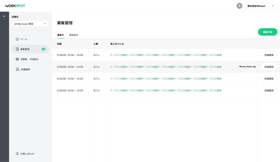
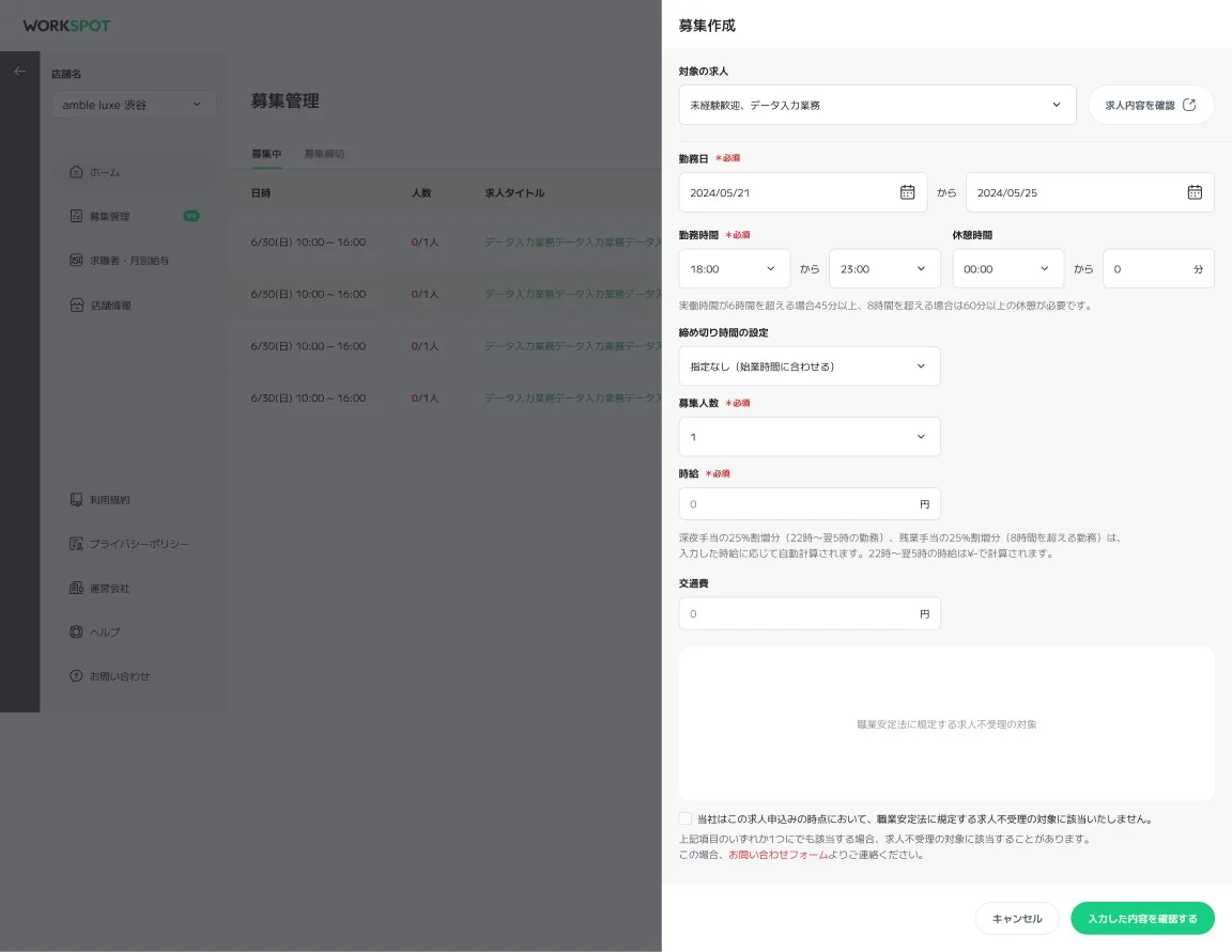
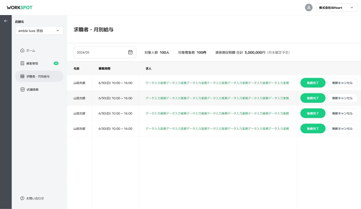
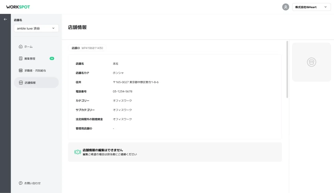
    ログイン後にまず企業を選び、ブランドと店舗の順に入れる構成にしました。募集の作成と確認、求職者と月別の給与、店舗情報を、店舗ごとに管理できます。

    After signing in you choose a company first, then a brand and a store. Postings, workers with monthly pay, and store information are managed per store.

    로그인 후 먼저 회사를 고르고, 브랜드와 매장 순으로 들어가는 구성으로 했다. 모집 작성과 확인, 구직자와 월별 급여, 매장 정보를 매장별로 관리할 수 있다.

  5. 05結果Outcome결과

    PoC段階で、ブランドと求職者向け・サロン向けの画面を設計し、フィードバックを重ねながら仕上げました。

    At the PoC stage I designed the brand and the screens for both job seekers and salons, refining them through rounds of feedback.

    PoC 단계에서 브랜드와 구직자용·살롱용 화면을 설계하고, 피드백을 거듭하며 다듬었다.

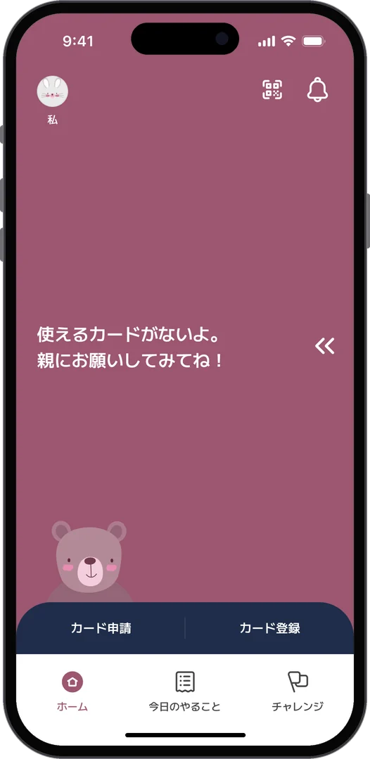
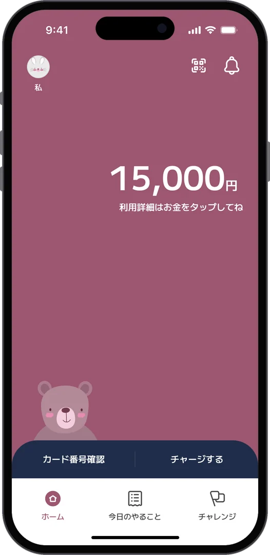
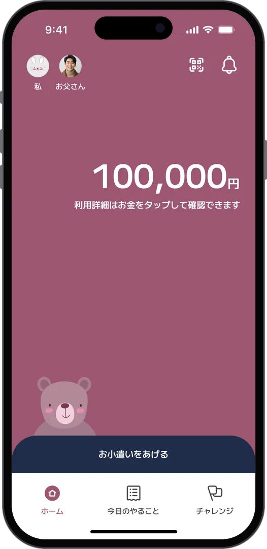
Child home before a card: apply for or register a cardChild home after registering: balance, card number and chargeParent home: balance and give allowance
Home · Child before the card, child after registering, parent
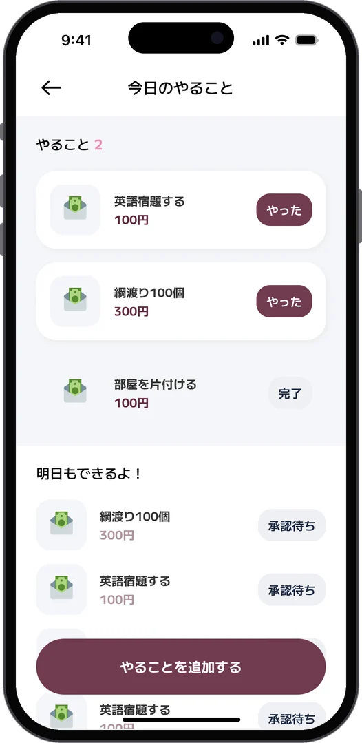
Challenges: one card per goal with its target amountToday's to-dos: tasks with a reward, waiting for approvalActivity: by purpose and by day
Challenges · Today's to-dos · Activity
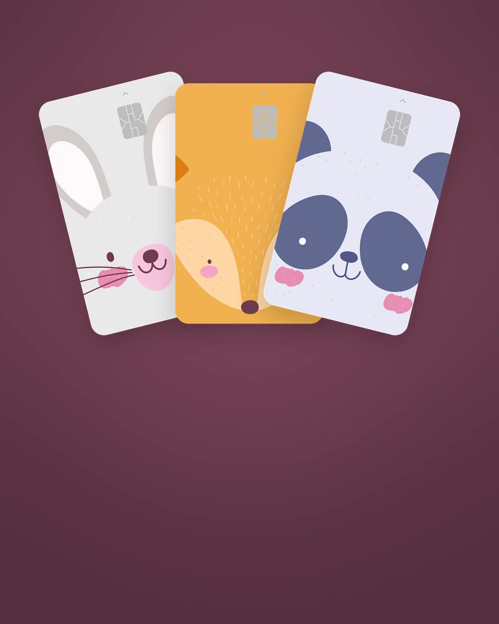
Numberless card design: rabbitNumberless card design: elephantNumberless card design: pandaNumberless card design: foxNumberless card design: koalaNumberless card design: logo
Card · Numberless designs with animals, and a plain one with the logo
  1. 01問題定義Problem문제정의

    シャトルペイは、親がアプリから子どものプリペイドカードにお金を送り、子どもがそのカードで支払う、子ども向けのキャッシュレスサービスです。採用課題として出されたのは、子どもの貯金機能の利用率が低いという課題でした。目的は子どもが貯金しやすくなること、ゴールは貯金の作成率を上げることです。

    ShuttlePay is a cashless service for children: parents send money from the app to their child's prepaid card, and the child pays with it. The hiring assignment was a single issue: children rarely used the savings feature. The aim was to make saving easier for children, and the goal was to raise the rate at which savings goals are created.

    셔틀페이는 부모가 앱에서 아이의 선불카드로 돈을 보내고, 아이가 그 카드로 결제하는 어린이용 캐시리스 서비스다. 채용 과제로 주어진 것은 아이의 저금 기능 이용률이 낮다는 문제였다. 목적은 아이가 저금하기 쉬워지는 것, 목표는 저금 생성률을 올리는 것이다.
  2. 02仮説Hypothesis가설
    • 課題では定量・定性のリサーチは求められず、自分の所感で仮説を立てることになっていた。
    • 「貯金」という言葉は、我慢や先の話を思わせる。子どもが動くのは「〇〇を買いたい」「〇〇に行きたい」という、目の前の目的があるとき。
    • お小遣いが「もらうもの」のままだと、貯める理由が生まれにくい。毎日の小さな「やること」とお金をつなげれば、たまっていく実感が持てる。
    • 10代は持ち物で自分らしさを出したい。カードそのものが「持ちたいもの」になれば、アプリを開くきっかけも増える。
    • The assignment asked for no quantitative or qualitative research; the hypothesis was to come from my own judgment.
    • The word "savings" suggests holding back and a far-off future. Children act when there is something right in front of them: I want to buy this, I want to go there.
    • If an allowance is only something you receive, there is little reason to save it. Tying money to small daily to-dos lets children feel it building up.
    • Teenagers want their things to say something about them. If the card itself is something they want to carry, they have more reasons to open the app.
    • 과제에서는 정량·정성 리서치를 요구하지 않았고, 내 판단으로 가설을 세우도록 되어 있었다.
    • "저금"이라는 말은 참는 것, 먼 미래를 떠올리게 한다. 아이가 움직이는 건 "이걸 사고 싶다", "저기에 가고 싶다"는 눈앞의 목적이 있을 때다.
    • 용돈이 "받는 것"으로만 남으면 모을 이유가 생기기 어렵다. 매일의 작은 "할 일"과 돈을 이으면 쌓여 가는 실감을 가질 수 있다.
    • 10대는 가진 물건으로 자기다움을 드러내고 싶어 한다. 카드 자체가 "갖고 싶은 것"이 되면 앱을 여는 계기도 늘어난다.
  3. 03制約Constraints제약조건
    • 既存のユーザーフローを参考に改修すること。
    • iOS版としてFigmaで作成すること。
    • ひとりで、限られた期間で、仮説から画面、カードまでをまとめる必要があった。
    • The redesign had to build on the existing user flow.
    • It had to be an iOS version, made in Figma.
    • I worked alone, in a short time, taking it from the hypothesis to the screens and the card.
    • 기존 사용자 플로를 참고해 개선할 것.
    • iOS 버전으로 Figma에서 만들 것.
    • 혼자서, 한정된 기간에 가설부터 화면, 카드까지 정리해야 했다.
  4. 04決定Decision결정ケーススタディ要約Case summary케이스 스터디 요약

    「貯金」ではなく「チャレンジ」

    Not "savings" but "challenges"

    "저금"이 아니라 "챌린지"

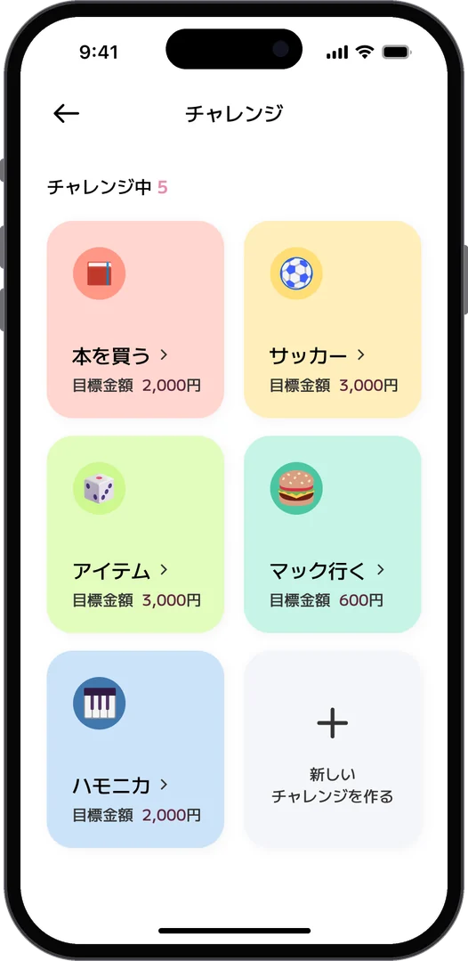
    貯金を、目的ごとの「チャレンジ」として作る形にしました。「本を買う 2,000円」「マック行く 600円」のように、目的と目標金額をカードにして並べ、色とアイコンで見分けられるようにしています。新しいチャレンジは一覧の最後からすぐ作れます。

    Savings are created as a "challenge" per goal. Each one is a tile with the goal and the target, such as "Buy a book, 2,000 yen" or "Go to McDonald's, 600 yen", told apart by color and icon. A new challenge can be started right from the end of the list.

    저금을 목적별 "챌린지"로 만드는 형태로 했다. "책 사기 2,000엔", "맥도날드 가기 600엔"처럼 목적과 목표 금액을 카드로 나열하고, 색과 아이콘으로 구분할 수 있게 했다. 새 챌린지는 목록 끝에서 바로 만들 수 있다.

    お小遣いは「今日のやること」から

    Allowance comes from "today's to-dos"

    용돈은 "오늘의 할 일"에서

    「英語の宿題をする 100円」「部屋を片付ける 100円」のように、毎日やることを子どもが自分で決めます。「やった」を押すと親の承認待ちになり、承認されると通知が届いてお金が入ります。毎日の行動がそのままチャレンジにつながる流れです。

    Children set their own daily to-dos, such as "Do my English homework, 100 yen" or "Tidy my room, 100 yen". Tapping "Done" sends it to a parent for approval; once approved, a notification arrives and the money comes in. Each day's actions feed straight into the challenges.

    "영어 숙제하기 100엔", "방 정리하기 100엔"처럼 매일 할 일을 아이가 스스로 정한다. "했어"를 누르면 부모의 승인 대기가 되고, 승인되면 알림이 오며 돈이 들어온다. 매일의 행동이 그대로 챌린지로 이어지는 흐름이다.

    ホームは、その人が今やることだけ

    Home shows only what that person needs to do now

    홈은 그 사람이 지금 할 일만

    子どものホームは、カードを持つ前は「カード申請」「カード登録」、登録後は「カード番号確認」「チャージする」に切り替わります。親のホームは残高をシンプルに見せ、「お小遣いをあげる」をいちばん大きく置きました。タブはホーム、今日のやること、チャレンジの三つです。

    A child's home shows "Apply for a card" and "Register a card" before they have one, then switches to "Card number" and "Charge" once it is registered. The parent's home shows the balance simply, with "Give allowance" as the biggest action. There are three tabs: home, today's to-dos and challenges.

    아이의 홈은 카드를 갖기 전에는 "카드 신청", "카드 등록", 등록 후에는 "카드 번호 확인", "충전하기"로 바뀐다. 부모의 홈은 잔액을 단순하게 보여주고, "용돈 주기"를 가장 크게 두었다. 탭은 홈, 오늘의 할 일, 챌린지 세 개다.

    持ちたくなるカード

    A card they want to carry

    갖고 싶어지는 카드

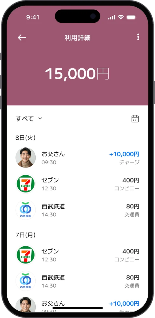
    10代が好きそうな動物のイラストを使った、番号を表に出さないナンバーレスのカードを提案しました。うさぎ、ぞう、パンダ、きつね、コアラの5種と、ロゴを使った無地のデザインです。利用詳細も「チャージ」「生活費」「交通費」と目的別に見られ、カレンダーから特定の日に移動できます。

    I proposed numberless cards, with no number on the face, using animal illustrations teenagers would like: rabbit, elephant, panda, fox and koala, plus a plain design with the logo. Activity can be filtered by purpose, such as charge, living costs and transport, and the calendar jumps to a given day.

    10대가 좋아할 만한 동물 일러스트를 쓴, 번호를 앞면에 드러내지 않는 넘버리스 카드를 제안했다. 토끼, 코끼리, 판다, 여우, 코알라 5종과 로고를 쓴 무지 디자인이다. 이용 내역도 "충전", "생활비", "교통비"처럼 목적별로 볼 수 있고, 캘린더에서 특정 날짜로 이동할 수 있다.

  5. 05結果Outcome결과

    採用課題として提出した提案で、実際のサービスには反映されていません。

    This was submitted as a hiring work sample and has not been built into the actual service.

    채용 과제로 제출한 제안이며, 실제 서비스에는 반영되지 않았다.

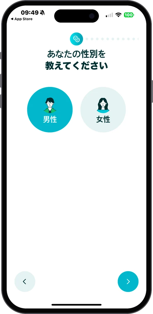
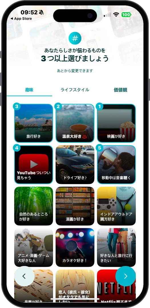
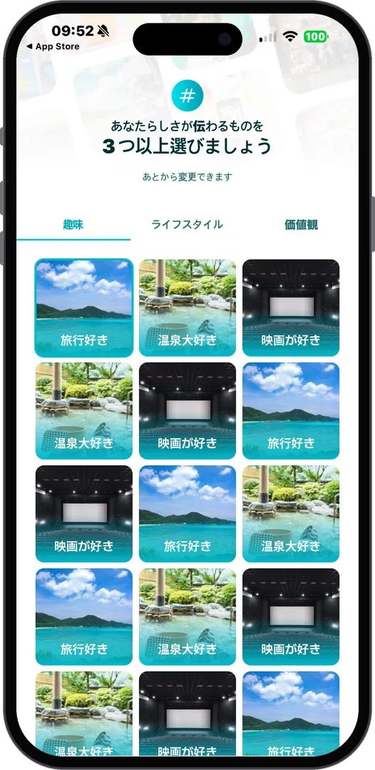
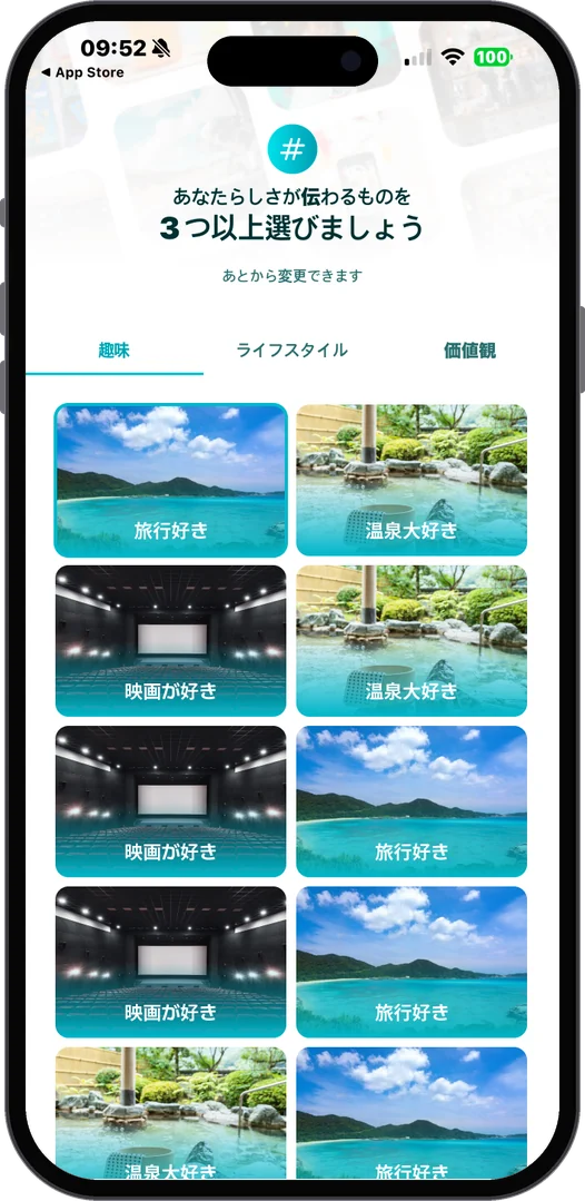
Current onboarding: genderCurrent onboarding: pick three interestsAlternative: brand color tilesAlternative: lighter tiles
Current design · Notes on onboarding, and two alternatives for the interest picker
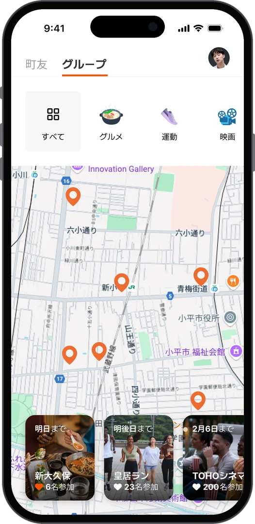
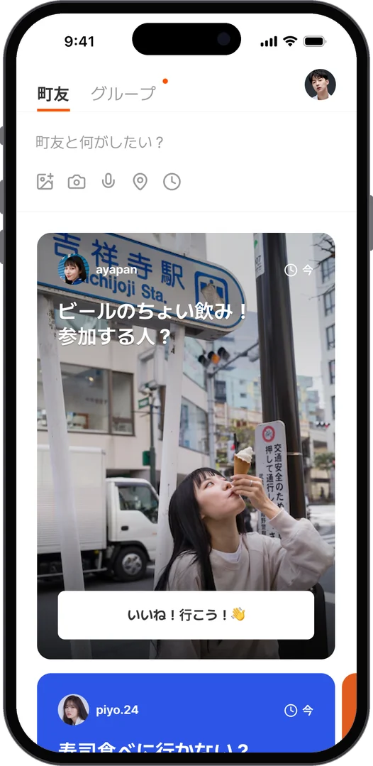
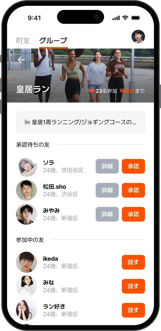
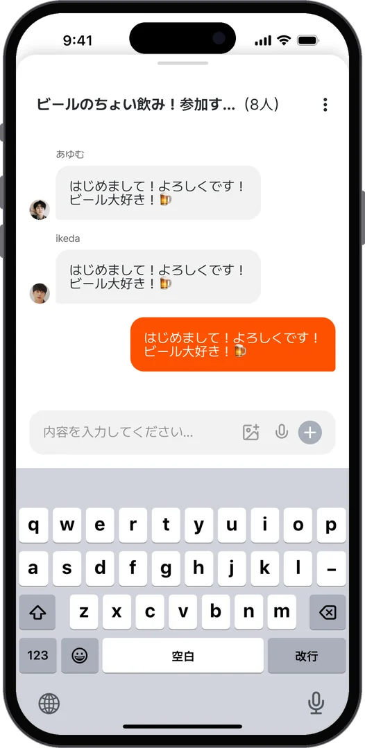
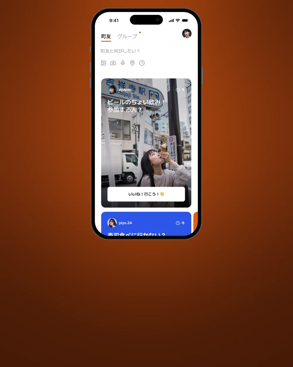
Groups by interest on a mapMachitomo: posts nearby, what do you want to doGroup detail with members to approve
Machitomo · Find, join a group
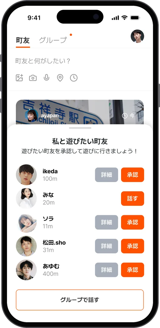
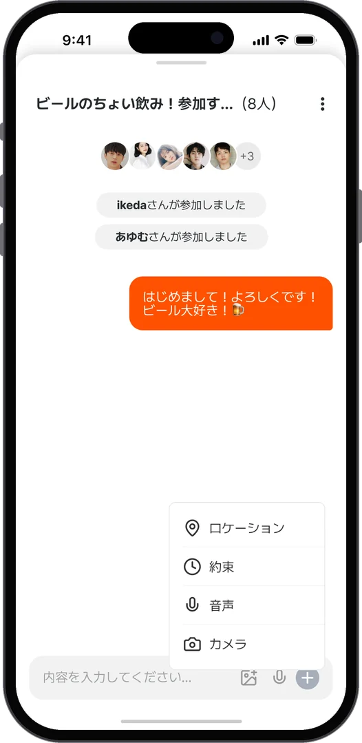
Approve the people who want to hang outGroup chatMessages
Approve, then talk
  1. 01問題定義Problem문제정의

    ペアーズは、恋愛や結婚につながる出会いのためのマッチングアプリです。採用課題として、今のユーザーの外側にいる人に向けた新しい機能を考えました。

    Pairs is a dating app for meeting people toward a relationship or marriage. As a hiring assignment, I worked on a new feature for people just outside its current users.

    페어즈는 연애나 결혼으로 이어지는 만남을 위한 매칭 앱이다. 채용 과제로서 지금의 사용자 바깥에 있는 사람을 위한 새로운 기능을 생각했다.

  2. 02仮説Hypothesis가설
    • まだ使っていない人として考えられるのは、恋愛や結婚が少し重く感じる、気持ちの軽い人たち。
    • そういう人でも「近くで誰かとビールを飲みたい」「犬の散歩を一緒に」くらいなら、出会うきっかけになる。
    • ただし誰とでもすぐ会えるだけでは、ほかのアプリと変わらない。少しの緊張感を残すことで違いが出せる。
    • あわせて今の画面も見直し、オンボーディングのボタンの数と、趣味を選ぶ画面の見え方に改善点を書き出した。
    • The people not yet using it are likely those with a lighter mindset, for whom romance or marriage feels a little heavy.
    • Even they might meet someone over "a beer nearby" or "walking the dog together".
    • But if anyone could meet anyone instantly, it would be like any other app. Keeping a little tension makes the difference.
    • I also went over the current screens and noted fixes for the number of buttons in onboarding and the look of the interest picker.
    • 아직 쓰지 않는 사람으로 생각할 수 있는 건, 연애나 결혼이 조금 무겁게 느껴지는 가벼운 마음의 사람들.
    • 그런 사람도 "근처에서 누군가와 맥주 한잔", "강아지 산책을 같이" 정도라면 만남의 계기가 된다.
    • 다만 누구와도 바로 만날 수 있기만 하면 다른 앱과 다르지 않다. 약간의 긴장감을 남기면 차이를 낼 수 있다.
    • 아울러 지금의 화면도 다시 보고, 온보딩의 버튼 수와 취미를 고르는 화면의 보이는 방식에 개선점을 적었다.
  3. 03制約Constraints제약조건
    • ペアーズのコンセプトとブランドから離れすぎないこと。
    • 今回のスコープは、探すことからメッセージを送るまでに絞った。
    • It could not stray too far from the Pairs concept and brand.
    • This time the scope stopped at finding people and sending a message.
    • 페어즈의 콘셉트와 브랜드에서 너무 멀어지지 않을 것.
    • 이번 범위는 찾기부터 메시지 보내기까지로 좁혔다.
  4. 04決定Decision결정ケーススタディ要約Case summary케이스 스터디 요약

    「町友と何がしたい?」から始める

    Start with "What do you want to do with a Machitomo?"

    "마치토모와 뭘 하고 싶어?"에서 시작

    設定した半径の中の投稿が、写真の大きなカードで並びます。「ビールのちょい飲み!参加する人?」のように、相手ではなく「やりたいこと」で探せるので、恋愛の重さを感じずに参加できます。自分から投稿することもできます。

    Posts within a set radius appear as cards with big photos. You search by what you want to do, such as "A quick beer, anyone in?", rather than by person, so joining does not feel like dating. You can post your own too.

    설정한 반경 안의 게시물이 사진이 큰 카드로 나열된다. "맥주 한잔! 참가할 사람?"처럼 상대가 아니라 "하고 싶은 것"으로 찾을 수 있어 연애의 무게를 느끼지 않고 참가할 수 있다. 직접 게시할 수도 있다.

    「いいね!行こう!」のあとに、承認を一つはさむ

    One approval step after "Like! Let's go!"

    "좋아요! 가자!" 다음에 승인을 하나 둔다

    「いいね!行こう!」を押すと、相手に届きます。投稿した人は、詳細を見ながら一緒に遊びたい人を承認し、承認してはじめてメッセージが送れます。マッチングの画面をなくして流れを短くしつつ、この一手間で少しの緊張感を残しました。

    Tapping "Like! Let's go!" sends it to the poster, who looks at the details and approves the people they want to hang out with; only then can messages be sent. Dropping the separate matching screen keeps the flow short, while this one extra step keeps a little tension.

    "좋아요! 가자!"를 누르면 상대에게 전해진다. 게시한 사람은 상세를 보면서 함께 놀고 싶은 사람을 승인하고, 승인해야 비로소 메시지를 보낼 수 있다. 매칭 화면을 없애 흐름을 짧게 하면서, 이 한 단계로 약간의 긴장감을 남겼다.

    趣味のグループと、地図

    Interest groups, and a map

    취미 그룹과 지도

    「皇居ラン」「新大久保」「TOHOシネマ」のように、場所や趣味ごとのグループを地図の上で探せます。期限と参加人数が見え、グループの中ではお知らせやグループでの会話もできます。

    Groups by place or interest, such as an Imperial Palace run, Shin-Okubo or a TOHO cinema, can be found on a map. Each shows its deadline and how many have joined, and inside a group there are notices and group chat.

    "고쿄 런", "신오쿠보", "TOHO 시네마"처럼 장소나 취미별 그룹을 지도 위에서 찾을 수 있다. 기한과 참가 인원이 보이고, 그룹 안에서는 공지나 그룹 대화도 할 수 있다.

  5. 05結果Outcome결과

    採用課題として提出した提案で、実際のサービスには反映されていません。

    This was submitted as a hiring work sample and has not been built into the actual service.

    채용 과제로 제출한 제안이며, 실제 서비스에는 반영되지 않았다.

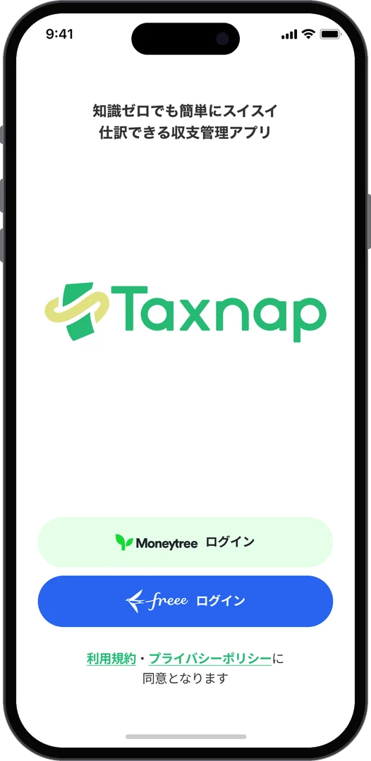
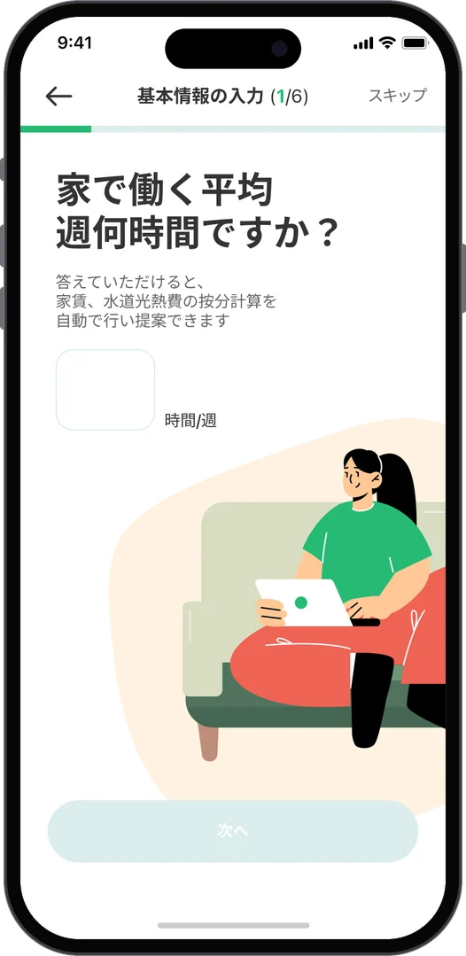
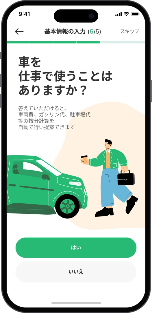
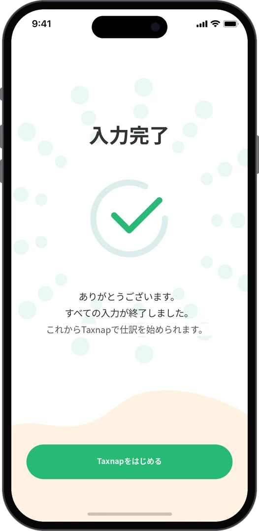
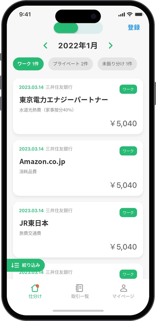
Sign in with Moneytree or freeeOnboarding: hours worked at homeOnboarding: do you use a car for workOnboarding complete
Onboarding · A few questions set the home-office split
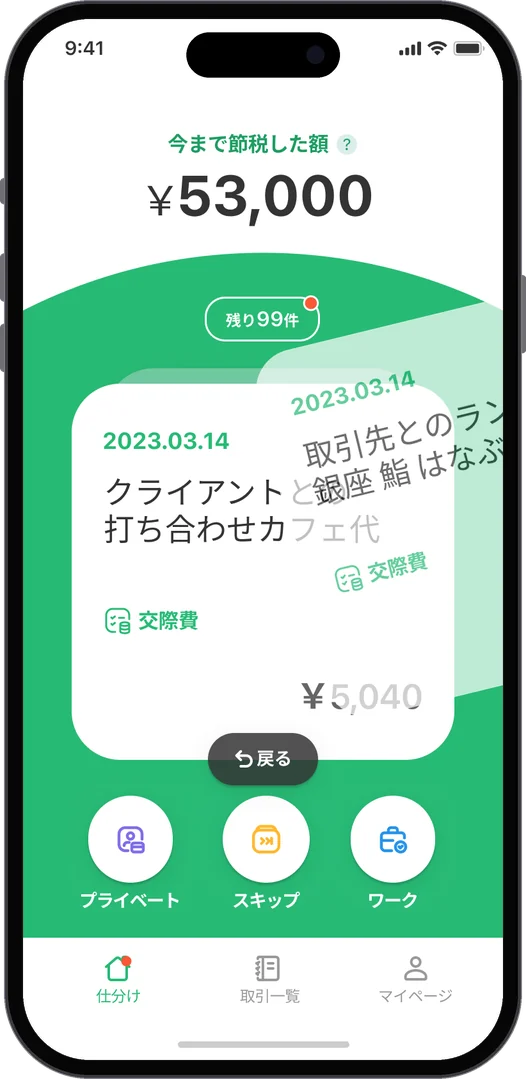
Swipe the card: private, skip or work
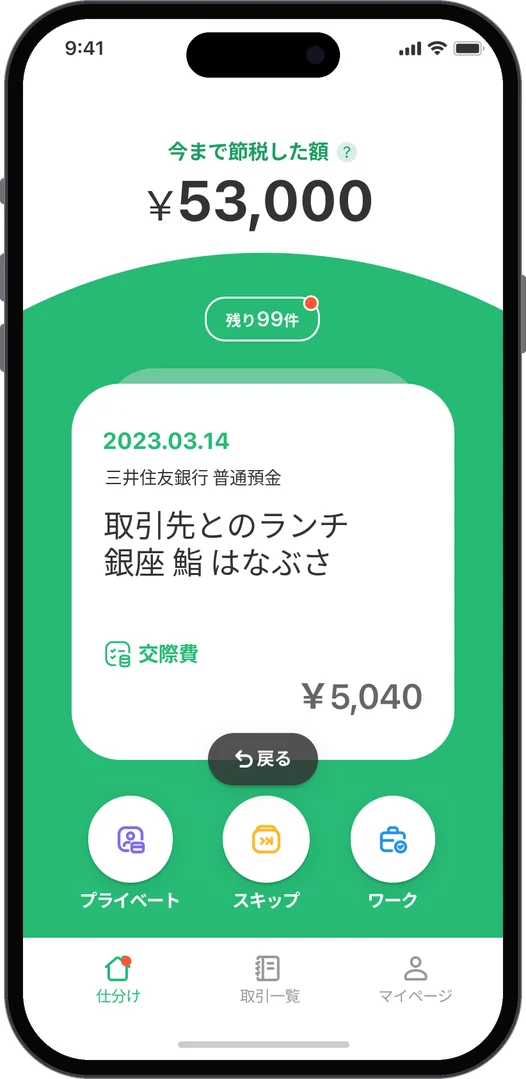
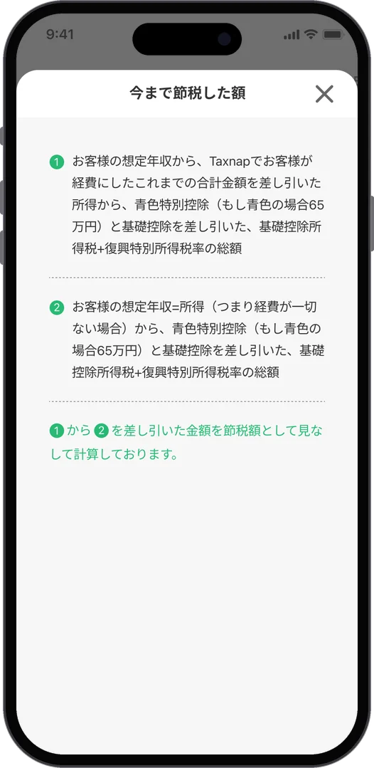
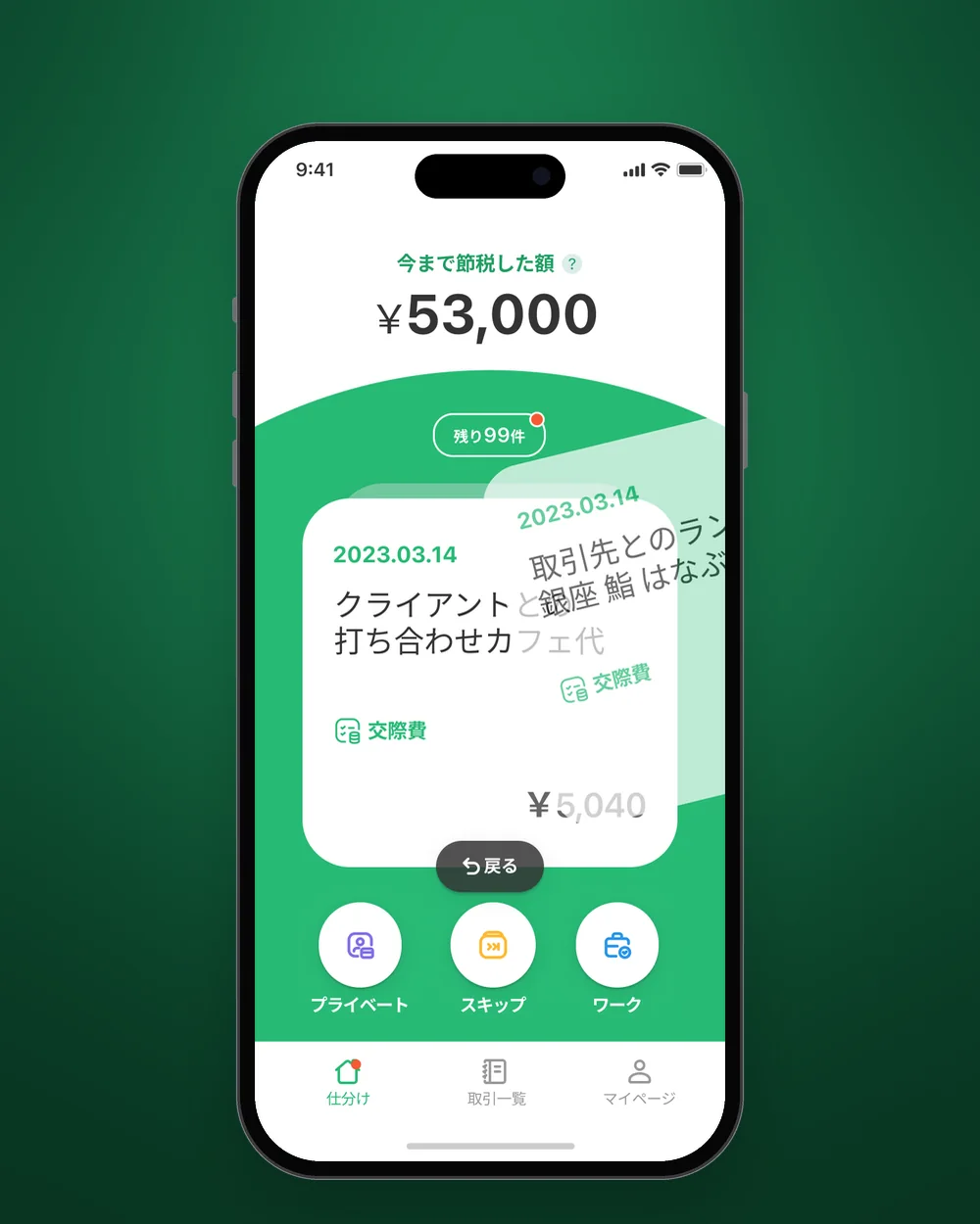
Home: tax saved so far and the card to sortHow the tax saved is worked out
Sorting · One card at a time, three choices
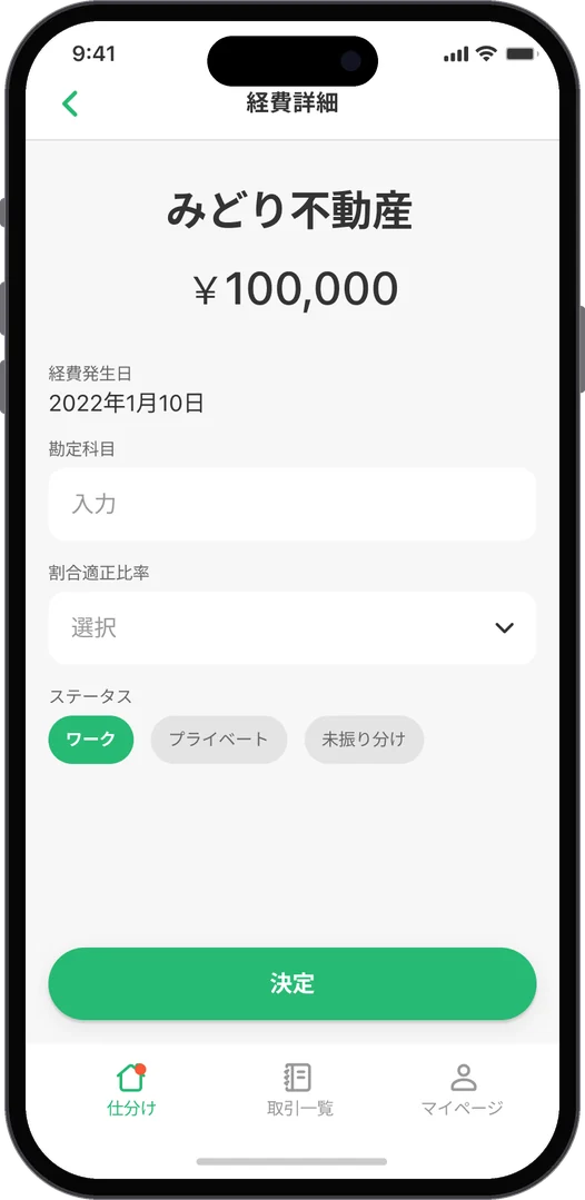
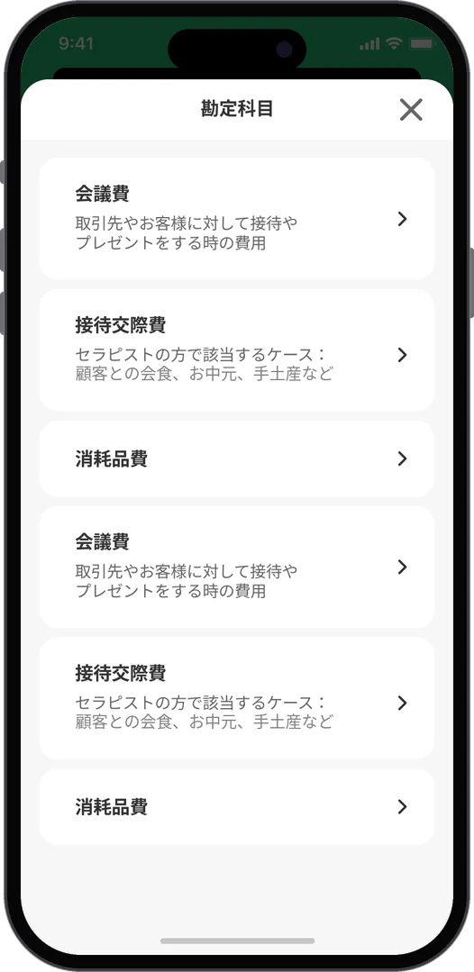
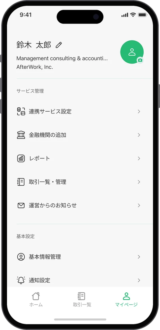
Transactions by month and statusExpense detailChoosing an accountMy page
Transactions, expense detail, accounts, my page
  1. 01問題定義Problem문제정의

    フリーランスや個人事業主にとって、確定申告は一年分の取引を勘定科目に分け、家事按分を計算する、面倒で後回しにしがちな作業です。会計の知識やパソコンがないと手が止まります。のちにTaxnapとなる「swiswi」では、知識がなくても、すき間時間にスマートフォンで仕分けが終わる体験が必要でした。

    For freelancers and sole proprietors, a tax return means sorting a year of transactions into accounts and working out how much of the home counts as business, a chore that is easy to put off. Without accounting knowledge or a computer, people stall. "swiswi", later renamed Taxnap, needed an experience where sorting gets done on a phone in spare moments, with no knowledge needed.

    프리랜서나 개인사업자에게 확정신고는 1년치 거래를 계정과목으로 나누고 가사 안분을 계산하는, 귀찮아서 미루기 쉬운 일이다. 회계 지식이나 PC가 없으면 손이 멈춘다. 나중에 Taxnap이 되는 "swiswi"에는 지식이 없어도 자투리 시간에 스마트폰으로 분류가 끝나는 경험이 필요했다.

  2. 02リサーチResearch리서치
    • カスタマージャーニーマップで、登録から仕分け、申告までの体験を一周たどり、つまずく場面と声を書き出した。
    • 取引は金融機関との連携で自動で入ってくる。人がやるべきなのは「これは仕事の支出か」を決めることだけだった。
    • 家事按分は、家で働く時間や、車・Wi-Fi・携帯を仕事で使う割合がわかれば計算できる。
    • A customer journey map traced one full round, from sign-up to sorting to filing, and wrote down where people stumble and what they say.
    • Transactions come in automatically through bank links. The only thing a person really has to decide is whether each one is a work expense.
    • The home-office split can be worked out from hours worked at home and how much the car, Wi-Fi and phone are used for work.
    • 고객 여정 지도로 가입부터 분류, 신고까지의 경험을 한 바퀴 따라가며 막히는 장면과 목소리를 적어냈다.
    • 거래는 금융기관 연동으로 자동으로 들어온다. 사람이 해야 할 일은 "이게 업무 지출인가"를 정하는 것뿐이었다.
    • 가사 안분은 집에서 일하는 시간과 차·Wi-Fi·휴대폰을 업무에 쓰는 비율을 알면 계산할 수 있다.
  3. 03制約Constraints제약조건
    • デザイナーは自分ひとり。β版から公式リリースまでの画面と、その土台になるスタイルを担当した。
    • iOSとAndroidの両方で使える、同じルールの画面が必要だった。
    • 金融機関の連携はMoneytreeやfreeeのログインを使うため、その流れに合わせる必要があった。
    • I was the only designer, covering the screens from beta to the official release and the style underneath them.
    • The screens had to follow one set of rules on both iOS and Android.
    • Bank links ran through Moneytree and freee sign-ins, so the flow had to fit around them.
    • 디자이너는 나 혼자. 베타부터 공식 릴리스까지의 화면과 그 토대가 되는 스타일을 담당했다.
    • iOS와 Android 양쪽에서 같은 규칙으로 쓸 수 있는 화면이 필요했다.
    • 금융기관 연동은 Moneytree나 freee 로그인을 쓰기 때문에 그 흐름에 맞춰야 했다.
  4. 04決定Decision결정ケーススタディ要約Case summary케이스 스터디 요약

    仕分けは、一枚ずつのカードをスワイプするだけ

    Sorting is just swiping one card at a time

    분류는 한 장씩 카드를 스와이프할 뿐

    ホームには取引を一枚のカードとして出し、「プライベート」「スキップ」「ワーク」の三つから選ぶだけにしました。勘定科目は自動で付き、違うときだけ直せます。考えることを一つに絞ると、すき間時間でも手が止まりません。

    Home shows each transaction as a single card with three choices: private, skip or work. The account is filled in automatically and only needs fixing when it is wrong. With just one decision to make, people keep going even in a spare minute.

    홈에는 거래를 한 장의 카드로 띄우고 "프라이빗", "스킵", "워크" 셋 중에서 고르기만 하게 했다. 계정과목은 자동으로 붙고, 다를 때만 고치면 된다. 생각할 것을 하나로 좁히면 자투리 시간에도 손이 멈추지 않는다.

    「今まで節税した額」を、いちばん上に

    "Tax saved so far" goes at the very top

    "지금까지 절세한 금액"을 맨 위에

    仕分けを進めるほど増える節税額を、ホームの最上部に大きく出しました。面倒な作業が「得している」実感に変わり、続ける理由になります。計算の根拠も、タップすればすぐに読めるようにしています。

    The tax saved, which grows as you sort, sits large at the top of home. A tedious job turns into the feeling of coming out ahead, which gives people a reason to keep going. Tapping it shows how the number is worked out.

    분류를 진행할수록 늘어나는 절세액을 홈 맨 위에 크게 띄웠다. 귀찮은 작업이 "이득 보고 있다"는 실감으로 바뀌어 계속할 이유가 된다. 계산 근거도 탭하면 바로 읽을 수 있게 했다.

    家事按分は、暮らしの質問に答えるだけ

    The home-office split comes from a few everyday questions

    가사 안분은 생활 질문에 답하기만

    「家で働く平均時間は?」「車を仕事で使うことはありますか?」のように、生活の言葉で数問だけ聞き、その答えから按分の割合を提案します。イラストとスライダーで、税の知識がなくても答えられるようにしました。

    A few questions in everyday words, such as "How many hours a week do you work at home?" or "Do you use a car for work?", and the split is suggested from the answers. Illustrations and sliders make them easy to answer with no tax knowledge.

    "집에서 일하는 평균 시간은?", "차를 업무에 쓰나요?"처럼 생활의 말로 몇 문항만 묻고, 그 답으로 안분 비율을 제안한다. 일러스트와 슬라이더로 세금 지식이 없어도 답할 수 있게 했다.

    スタイルは「勘定科目のアイコン」から

    A style that starts with account icons

    스타일은 "계정과목 아이콘"부터

    緑を基調に、余白の多いカードと丸いボタンでそろえました。勘定科目には一つずつアイコンを用意し、文字を読まなくても種類が見分けられるようにしています。ストアのスクリーンショットも、同じ緑と強調の黄色でまとめました。

    Green leads, with roomy cards and round buttons throughout. Every account category has its own icon, so you can tell them apart without reading. The store screenshots use the same green, with yellow for emphasis.

    초록을 기본으로, 여백이 많은 카드와 둥근 버튼으로 맞췄다. 계정과목마다 아이콘을 하나씩 준비해 글자를 읽지 않아도 종류를 구분할 수 있게 했다. 스토어 스크린샷도 같은 초록과 강조용 노란색으로 정리했다.

  5. 05結果Outcome결과

    2023年7月にApp StoreとGoogle Playで公式リリースされ、サービスは「Taxnap」として現在も運用されています。

    It launched on the App Store and Google Play in July 2023, and the service is still running today as Taxnap.

    2023년 7월 App Store와 Google Play에 공식 출시되었고, 서비스는 "Taxnap"으로 지금도 운영되고 있다.

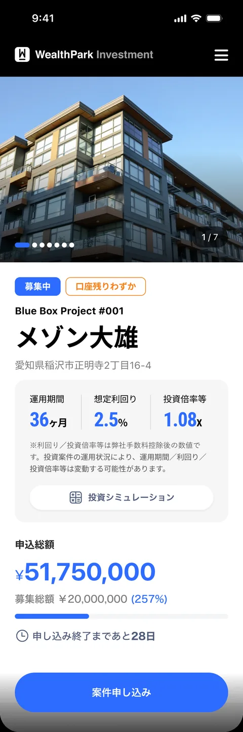
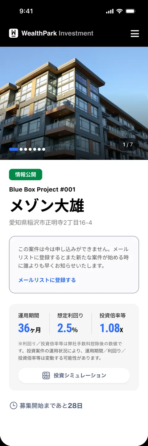
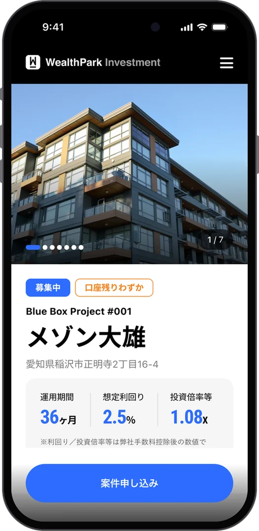
Product detail, open for applications

Product detail · First view

ファーストビューだけで、どんな商品かがわかるThe first view alone tells you what the product is첫 화면만으로 어떤 상품인지 알 수 있다

  1. 1タグで現在の状態をひと目でA tag shows the current state at a glance태그로 현재 상태를 한눈에
  2. 2テーマと案件名の文字サイズを分け、物件名から読めるようにTheme and project name at different sizes, so the property name reads first테마와 안건명의 글자 크기를 나눠 물건명이 먼저 읽히게
  3. 3住所を先に見せ、どこにある物件かすぐわかるようにThe address comes early, so you know where the property is주소를 먼저 보여줘 어디에 있는 물건인지 바로 알 수 있게
  4. 4運用期間・想定利回り・投資倍率等を3つの数字でPeriod, expected yield and multiple, as three numbers운용기간·예상 수익률·투자배율을 세 개의 숫자로
  5. 5その場で投資シミュレーションへStraight to an investment simulation그 자리에서 투자 시뮬레이션으로
  6. 6申込総額をグラフと金額で示し、参加したくなる状況をつくるApplications so far, as a bar and an amount, to show momentum신청 총액을 그래프와 금액으로 보여줘 참여하고 싶게 만든다
  7. 7CTAは画面下部に固定The CTA stays fixed at the bottomCTA는 화면 하단에 고정
Guideline · Product detail (scroll inside the phone)
Open state
募集中Open모집중
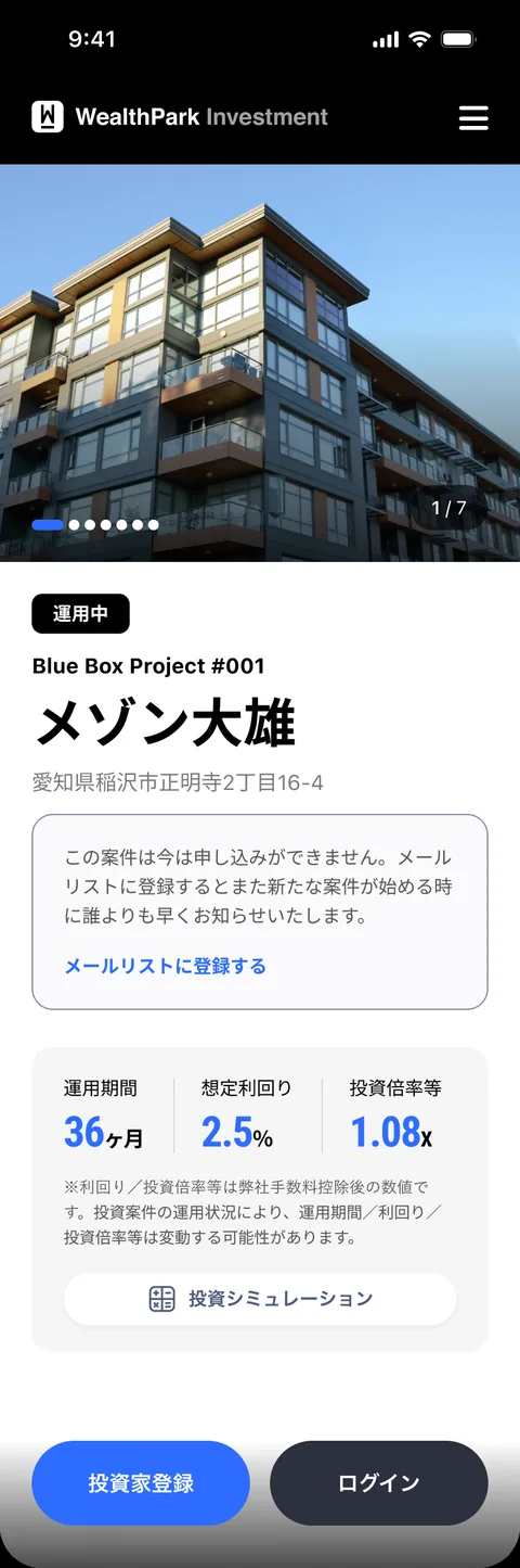
In operation state
運用中In operation운용중
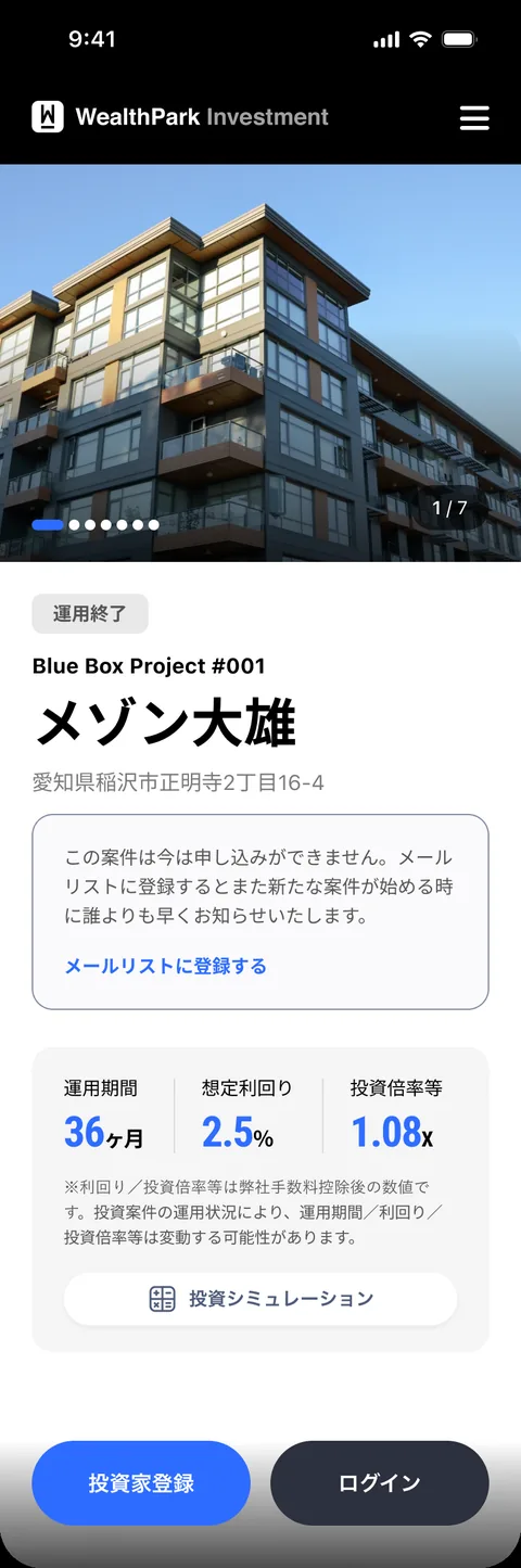
Ended state
運用終了Ended운용종료
Announced state
情報公開Announced정보공개
One page, four states · Tag, first view and CTA change with the state
Full product detail page
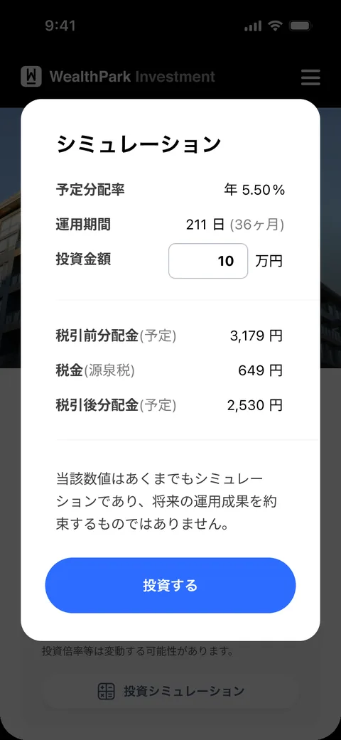
Investment simulation
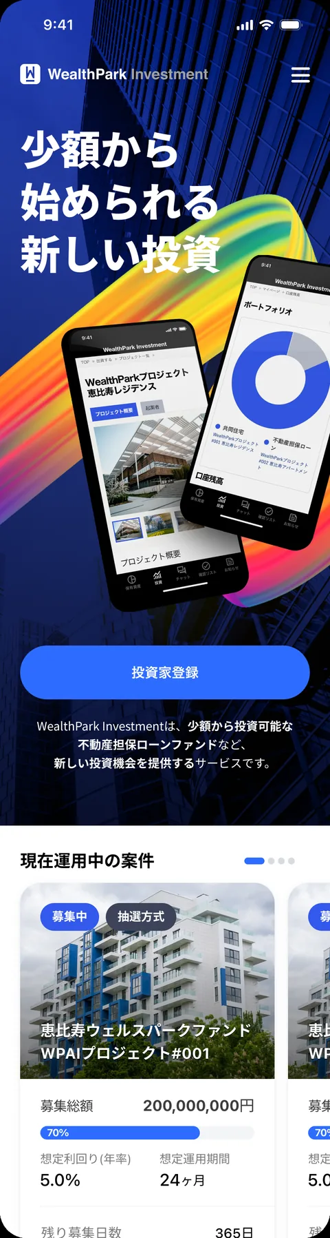
Home
Full detail page · Simulation · Home (each phone scrolls)
  1. 01問題定義Problem문제정의

    WealthPark Investmentは、少額から始められる不動産担保ローンファンドなど、新しい投資機会を提供するサービスです。買収後はサービス改善に手が回らず、ブログなどのコンテンツも古いまま、実際の運用は別のサイトで更新していました。投資を判断する場所である商品詳細ページから見直すことにしました。

    WealthPark Investment offers new ways to invest, such as real-estate-backed loan funds you can start with a small amount. After the acquisition, nobody had time to improve the service: content such as the blog was out of date, and the actual updates were happening on another site. I started with the page where people decide whether to invest: the product detail page.

    WealthPark Investment는 소액으로 시작할 수 있는 부동산 담보 대출 펀드 등 새로운 투자 기회를 제공하는 서비스다. 인수 후 서비스 개선에 손이 가지 못해 블로그 같은 콘텐츠도 오래된 채였고, 실제 운영은 다른 사이트에서 업데이트하고 있었다. 투자를 판단하는 자리인 상품 상세 페이지부터 다시 보기로 했다.

  2. 02リサーチResearch리서치
    • UX/UIの観点で課題を洗い出し、優先度を「商品詳細・一覧 → 投資家登録 → マイページ → トップページ」と決めた。投資家登録まわりはヒアリングが必要だった。
    • 商品詳細は、案件が募集中でも運用中でも同じ見せ方で、ファーストビューから商品の情報をすぐにつかめなかった。
    • 物件情報や投資スキームに直接移動できる動線がなかった。
    • 商品を説明する媒体が限られていて、投資する確信につながる材料が少なかった。
    • I listed the issues from a UX/UI point of view and set the order: product detail and list, then investor registration, then My Page, then the top page. Investor registration needed interviews first.
    • The product page looked the same whether an offering was open or already running, so the first view did not tell you much about the product.
    • There was no direct path to the property information or the investment scheme.
    • Products were explained with few kinds of media, so there was little to build confidence before investing.
    • UX/UI 관점에서 과제를 정리하고, 우선순위를 "상품 상세·목록 → 투자자 등록 → 마이페이지 → 톱페이지"로 정했다. 투자자 등록 쪽은 히어링이 필요했다.
    • 상품 상세는 안건이 모집중이든 운용중이든 같은 모습이라, 첫 화면에서 상품 정보를 바로 파악할 수 없었다.
    • 물건 정보나 투자 스킴으로 바로 이동할 수 있는 동선이 없었다.
    • 상품을 설명하는 매체가 한정적이라, 투자 확신으로 이어질 재료가 적었다.
  3. 03制約Constraints제약조건
    • 社内提案で、デザインと企画は自分一人。
    • 投資家登録の前の人も後の人も、同じページにやって来る。
    • 金融商品なので、利回りや投資倍率等が変動しうるといった注記は残したまま、情報を整理する必要があった。
    • An internal proposal, with design and planning done by me alone.
    • People arrive at the same page both before and after registering as investors.
    • It is a financial product, so notes such as "yields and multiples may change" had to stay while I reorganized the information.
    • 사내 제안이고, 디자인과 기획은 혼자.
    • 투자자 등록 전인 사람도 후인 사람도 같은 페이지로 들어온다.
    • 금융 상품이라 수익률이나 투자배율이 변동될 수 있다는 주석은 그대로 두고 정보를 정리해야 했다.
  4. 04決定Decision결정ケーススタディ要約Case summary케이스 스터디 요약

    ページの状態に合わせて、見せる内容とCTAを変える

    Change the content and the CTA with the state of the offering

    페이지 상태에 맞춰 보여주는 내용과 CTA를 바꾼다

    募集中・運用中・運用終了・情報公開をタグで示し、状態ごとにファーストビューを組み替えました。申し込めない状態ではメールリスト登録を置いて将来の顧客を先に確保し、画面下部に固定したCTAも「案件申し込み」と「投資家登録/ログイン」を切り替えます。

    A tag shows whether an offering is open, in operation, ended or announced, and the first view is rebuilt for each state. When you cannot apply, a mailing-list sign-up takes its place to win future customers early, and the CTA fixed at the bottom switches between "Apply" and "Register / Log in".

    모집중·운용중·운용종료·정보공개를 태그로 보여주고, 상태마다 첫 화면을 다시 짰다. 신청할 수 없는 상태에는 메일 리스트 등록을 둬서 미래의 고객을 먼저 확보하고, 화면 하단에 고정한 CTA도 "안건 신청"과 "투자자 등록/로그인"으로 바꾼다.

    ファーストビューだけで、どんな商品かがわかるようにする

    Let the first view alone explain the product

    첫 화면만으로 어떤 상품인지 알 수 있게 한다

    投資家登録の前でも後でも、最初の画面で投資商品の情報がすぐわかるようにしました。テーマと案件名の文字サイズを分け、住所、3つの主要な数字、申込総額のグラフと金額、締め切りまでの日数を順に並べました。

    Before or after registering, the first screen should tell you about the product right away. I split the theme and the project name into different sizes, then lined up the address, three key numbers, applications so far as a bar and an amount, and the days left.

    투자자 등록 전이든 후든, 첫 화면에서 투자 상품 정보를 바로 알 수 있게 했다. 테마와 안건명의 글자 크기를 나누고, 주소, 세 가지 주요 숫자, 신청 총액의 그래프와 금액, 마감까지 남은 날짜를 순서대로 배치했다.

    タブを今の状況に合わせ、物件と投資スキームへ直接行けるようにする

    Rework the tabs so the property and the scheme are one tap away

    탭을 지금 상황에 맞추고, 물건과 투자 스킴으로 바로 갈 수 있게 한다

    「プロジェクト概要/起案者」だったタブを「案件概要/物件情報/投資スキーム」に変え、知りたい情報へまっすぐ移動できるようにしました。

    The tabs went from "Project overview / Sponsor" to "Overview / Property / Investment scheme", so you can go straight to what you want to know.

    "프로젝트 개요/기안자"였던 탭을 "안건 개요/물건 정보/투자 스킴"으로 바꿔, 알고 싶은 정보로 곧장 이동할 수 있게 했다.

    様々な媒体とシミュレーションで、投資の確信を支える

    Support confidence with richer media and a simulation

    다양한 매체와 시뮬레이션으로 투자 확신을 뒷받침한다

    写真だけでなく動画などの媒体もテンプレートで扱えるようにし、商品の価値と理解を高めます。投資金額を入れると税引前・税金・税引後の分配金がわかる簡単なシミュレーションを加え、数字はあくまでシミュレーションであることも同じ画面で伝えます。

    Templates let each product use video and other media, not only photos, to explain its value. A simple simulation shows the distribution before tax, the tax and the distribution after tax for the amount you enter, and the same screen says the numbers are only a simulation.

    사진뿐 아니라 영상 같은 매체도 템플릿으로 다룰 수 있게 해 상품의 가치와 이해를 높인다. 투자 금액을 넣으면 세전·세금·세후 분배금을 알 수 있는 간단한 시뮬레이션을 더하고, 숫자는 어디까지나 시뮬레이션이라는 점도 같은 화면에서 전한다.

  5. 05結果Outcome결과

    提案はほぼ採用されましたが、社内の事情で事業として進めることはできませんでした。

    The proposal was mostly approved, but for internal reasons the business did not move forward.

    제안은 거의 채택됐지만, 사내 사정으로 사업을 진행하지는 못했다.

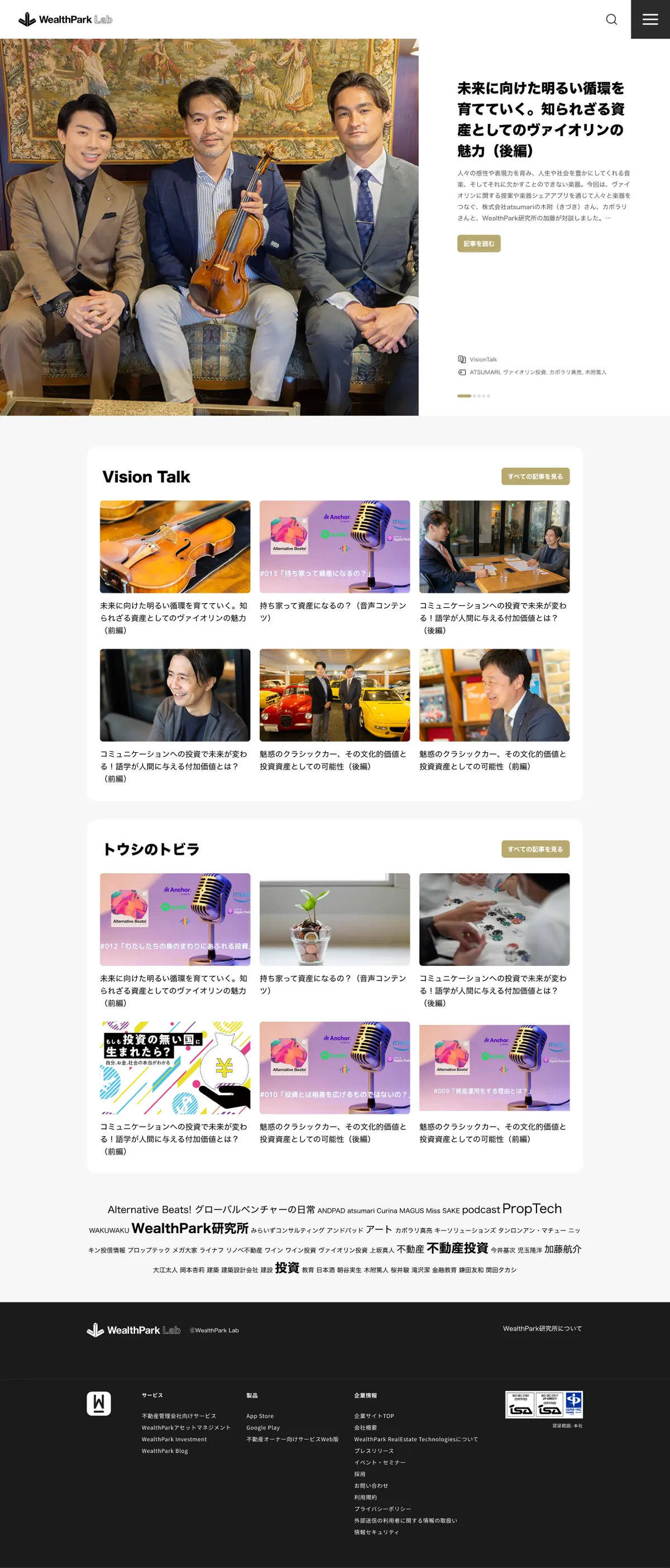
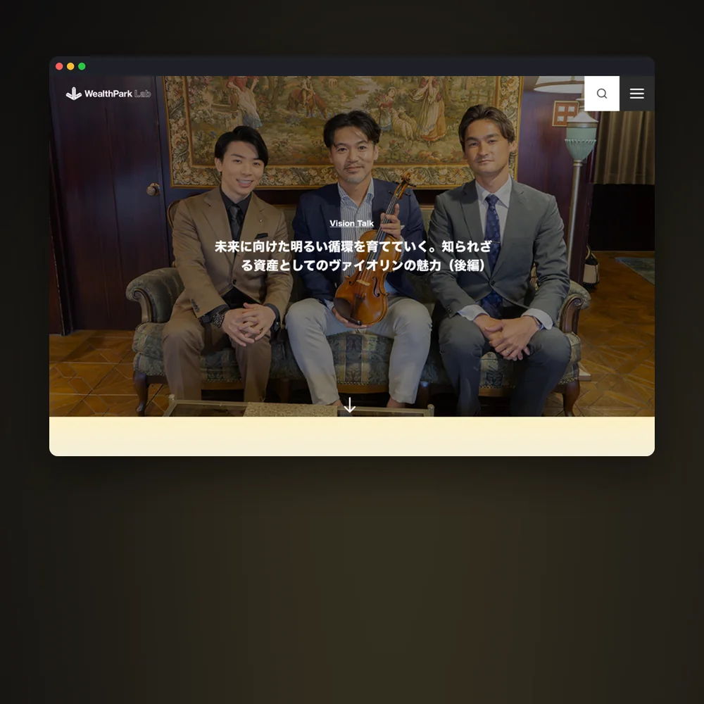
Article page
  1. 1ヒーローHero히어로全面写真にタイトルを重ねるA full-bleed photo with the title on it전면 사진 위에 타이틀
  2. 2プロローグPrologue프롤로그ゴールドのグラデーションで導入文を区切るA gold gradient sets off the lead골드 그라데이션으로 도입문을 구분
  3. 3本文セットMain contents본문 세트写真・キャプション・本文の基本の組みPhoto, caption and text, the basic unit사진·캡션·본문의 기본 조합
  4. 4スクロールギャラリーScroll gallery스크롤 갤러리2枚並びの写真が画面の外まで続くPaired photos that run past the edge두 장씩 이어진 사진이 화면 밖까지
  5. 5一枚写真One picture한 장 사진一枚を大きく見せて流れを切り替えるOne large photo to change the pace한 장을 크게 보여줘 흐름을 바꾼다
  6. 6キャッチコピーCatchcopy캐치카피大きな一文が横に流れるOne large line that scrolls sideways큰 한 문장이 옆으로 흐른다
  7. 7引用Pull quote인용話の核心をひと言で引き出すThe core of the talk, pulled out in one line이야기의 핵심을 한 줄로 끌어낸다
  8. 8クレジット・関連記事Credits & related크레디트·관련 기사読み終えたら次の記事へRead to the end, then on to the next다 읽으면 다음 기사로
Article · Built from content sets (scroll inside the window)
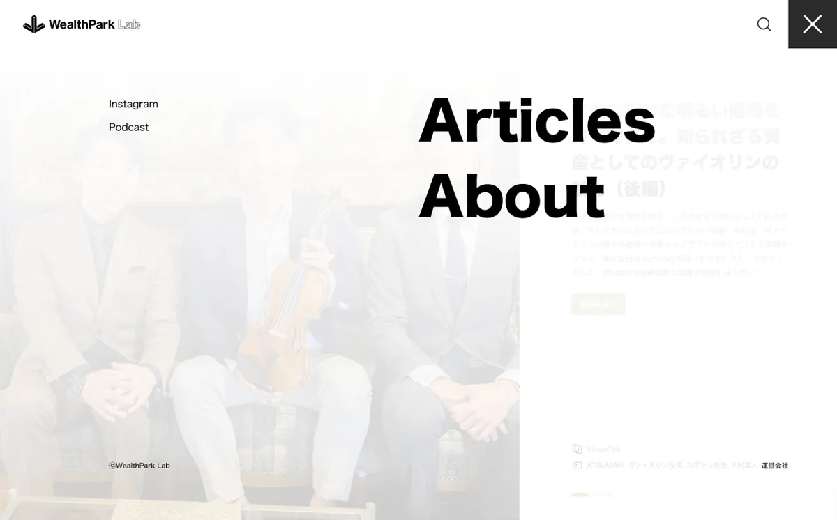
Top page
Menu
Top · Latest story first, then a shelf per series · Menu
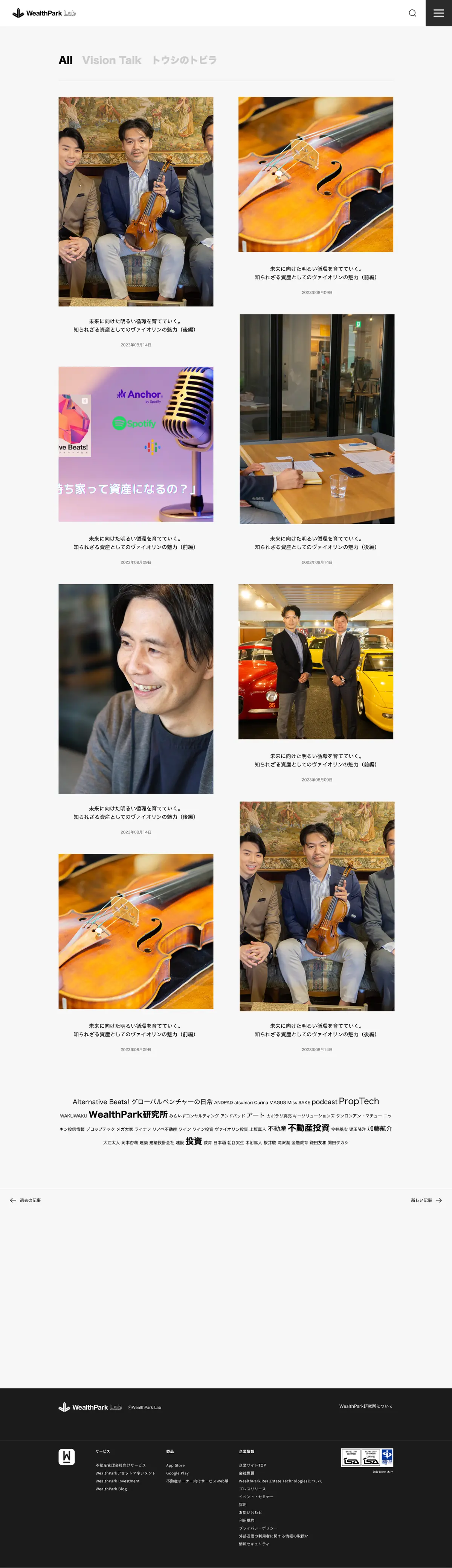
Article list
About WealthPark Lab
Articles, filtered by series · About
  1. 01問題定義Problem문제정의

    WealthParkのサービス改善で課題を洗い出したとき、ブログなどのコンテンツが古いまま止まり、実際の発信は別のサイトで更新されていることがわかりました。WealthPark研究所の対談やコラムを社外に届ける場所として、ブランドにふさわしい自前のメディア「WealthPark Lab」をつくり直すことにしました。

    When I listed the issues across WealthPark's services, I found that content such as the blog had stopped being updated, and the real publishing was happening on another site. I set out to rebuild "WealthPark Lab" as an owned media site worthy of the brand, a place to bring talks and columns from WealthPark's research institute to people outside the company.

    WealthPark 서비스 개선을 위해 과제를 정리하던 중, 블로그 같은 콘텐츠는 오래된 채 멈춰 있고 실제 발신은 다른 사이트에서 업데이트되고 있다는 걸 알게 됐다. WealthPark 연구소의 대담과 칼럼을 사외에 전하는 자리로서, 브랜드에 걸맞은 자체 미디어 "WealthPark Lab"을 다시 만들기로 했다.

  2. 02リサーチResearch리서치
    • 記事の中心は対談とインタビュー。人物や楽器、クラシックカーなど、写真そのものが読みどころになる素材がそろっていた。
    • 投資の情報は数字やグラフが前に出がちで、硬く、とっつきにくく見えやすい。
    • 連載(Vision Talk、トウシのトビラ)、音声(Podcast)、Instagramと、発信の形式が分かれていた。
    • 目指したのは、スタイリッシュでモダン、そして上質に見えるブログ。参考にしたのは、写真を大きく使う雑誌の誌面だった。
    • The core content was talks and interviews. People, violins, classic cars: the photos themselves were worth reading.
    • Investment content tends to lead with numbers and charts, which makes it look stiff and hard to approach.
    • Publishing was split across series (Vision Talk, Toushi no Tobira), audio (Podcast) and Instagram.
    • The goal was a blog that looks stylish, modern and premium. The reference was a magazine spread that uses photos large.
    • 기사의 중심은 대담과 인터뷰. 인물, 악기, 클래식카처럼 사진 자체가 읽을거리가 되는 소재가 갖춰져 있었다.
    • 투자 정보는 숫자나 그래프가 앞에 나서기 쉬워, 딱딱하고 다가가기 어렵게 보이기 쉽다.
    • 연재(Vision Talk, トウシのトビラ), 음성(Podcast), Instagram으로 발신 형식이 나뉘어 있었다.
    • 목표는 스타일리시하고 모던하면서 고급스럽게 보이는 블로그. 참고한 건 사진을 크게 쓰는 잡지의 지면이었다.
  3. 03制約Constraints제약조건
    • 社内提案で、デザインと企画は自分一人。
    • 記事ごとに写真の枚数や話の長さが変わる。毎回デザインし直さなくても誌面が組める仕組みが必要だった。
    • WealthParkの他のサービスやコーポレートサイトとつながっている必要があった。
    • An internal proposal, with design and planning done by me alone.
    • Every article has a different number of photos and a different length, so the pages had to come together without a new design each time.
    • It had to connect with WealthPark's other services and the corporate site.
    • 사내 제안이고, 디자인과 기획은 혼자.
    • 기사마다 사진 수와 이야기 길이가 달라, 매번 다시 디자인하지 않아도 지면을 짤 수 있는 구조가 필요했다.
    • WealthPark의 다른 서비스와 코퍼레이트 사이트와도 이어져 있어야 했다.
  4. 04決定Decision결정ケーススタディ要約Case summary케이스 스터디 요약

    雑誌をめくるように、写真を大きく見せる

    Show photos large, like turning the pages of a magazine

    잡지를 넘기듯 사진을 크게 보여준다

    記事のトップは全面写真にタイトルを重ね、本文の途中でも写真を画面幅いっぱい、または2枚並びで大きく置きました。投資の話でも、まず人と場面から入れるようにしています。

    Each article opens with a full-bleed photo and the title on top of it, and photos stay large in the body too: full width, or two side by side. Even a story about investing starts with people and places.

    기사 첫머리는 전면 사진 위에 타이틀을 얹고, 본문 중간에도 사진을 화면 폭 가득, 또는 두 장 나란히 크게 놓았다. 투자 이야기라도 먼저 사람과 장면에서 들어갈 수 있게 했다.

    記事を「セット」の組み合わせでつくる

    Build each article from content sets

    기사를 "세트"의 조합으로 만든다

    プロローグ、本文、スクロールギャラリー、一枚写真、横に流れるキャッチコピー、引用といったセットを用意しました。記事ごとに並べ替えるだけで誌面のリズムがつくれ、写真が多い回も少ない回も同じルールで組めます。

    I prepared sets: a prologue, main contents, a scroll gallery, a single large photo, a catchcopy that scrolls sideways and a pull quote. Rearranging them gives each article its own rhythm, and the same rules work whether an issue has many photos or few.

    프롤로그, 본문, 스크롤 갤러리, 한 장 사진, 옆으로 흐르는 캐치카피, 인용 같은 세트를 준비했다. 기사마다 순서만 바꿔도 지면의 리듬이 생기고, 사진이 많은 회차든 적은 회차든 같은 규칙으로 짤 수 있다.

    色はモノトーンに、落ち着いたゴールドを一色だけ

    Monotone, with a single muted gold

    컬러는 모노톤에 차분한 골드 하나만

    白・黒・グレーを基調に、ボタンやカテゴリ、プロローグ、関連記事の帯にだけゴールドを使いました。写真の色を邪魔せず、上質さを出すためです。

    White, black and grey carry the site, and gold appears only on buttons, categories, the prologue and the related-articles band. It adds a premium feel without fighting the colors of the photos.

    흰색·검정·회색을 기본으로 하고, 버튼과 카테고리, 프롤로그, 관련 기사 띠에만 골드를 썼다. 사진의 색을 방해하지 않으면서 고급스러움을 내기 위해서다.

    連載ごとに入口を分け、読み終えたら次へつなぐ

    Give each series its own door, and lead on to the next article

    연재마다 입구를 나누고, 다 읽으면 다음으로 잇는다

    トップは最新記事のヒーローの下に、Vision Talk、トウシのトビラと連載ごとの棚を置き、記事一覧は連載で絞り込めるようにしました。記事の最後にはクレジット、シェア、前後の記事、関連記事を置き、読み終えたところで次の記事へ進めます。

    Under the hero for the latest story, the top page has a shelf for each series, Vision Talk and Toushi no Tobira, and the article list can be filtered by series. Each article ends with credits, share links, previous and next, and related articles, so readers can go straight on to the next one.

    톱 페이지는 최신 기사 히어로 아래에 Vision Talk, トウシのトビラ처럼 연재별 선반을 두고, 기사 목록은 연재로 좁혀 볼 수 있게 했다. 기사 끝에는 크레디트, 공유, 이전·다음 기사, 관련 기사를 둬서 다 읽은 자리에서 다음 기사로 넘어갈 수 있다.

  5. 05結果Outcome결과

    デザインまで仕上げましたが、公開には至りませんでした。

    The design was finished, but the site did not launch.

    디자인까지 마무리했지만, 공개되지는 못했다.

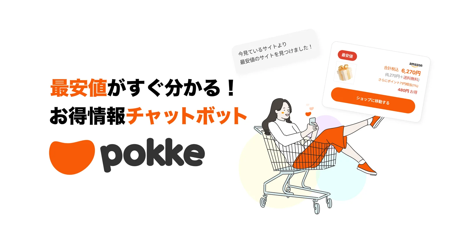
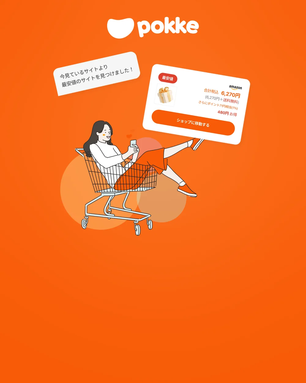
Pokke key visual: a woman in a shopping cart and a chat bubble showing the lowest price
Key visual · A chatbot for deals
Pokke logo in color on white
Logo · Color
Pokke logo on dark grey
Logo · On dark
Pokke wordmark inside the pocket symbol
Symbol and wordmark
Pokke logo in white on orange
Logo · On orange
Landing page
Landing page · Steps, the difference it makes, partner brands (scroll inside the window)
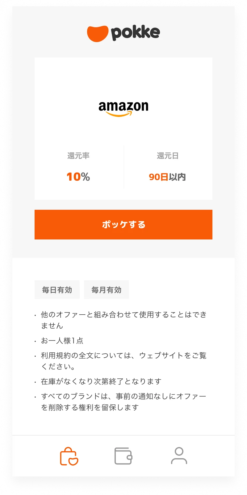
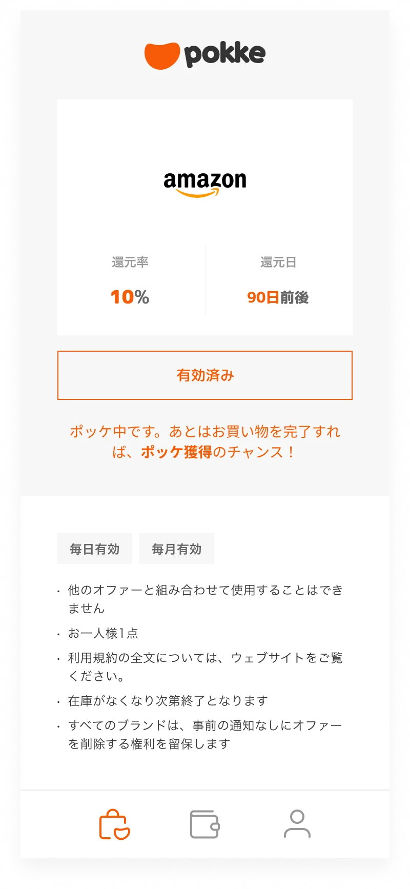
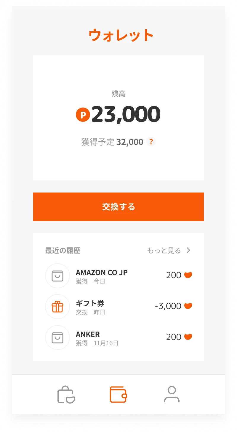
Extension popup: return rate and return date for AmazonExtension popup after activationExtension walletExtension my menu
Extension · Shop (before and after activation), wallet, my menu
Onboarding card 1Onboarding card 2Onboarding card 3Onboarding card 4Onboarding card 5Onboarding card 6
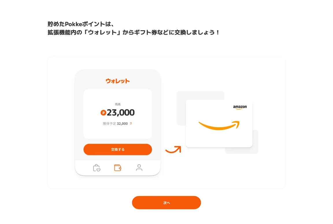
Onboarding · From pinning the extension to trying it out
Open a shop

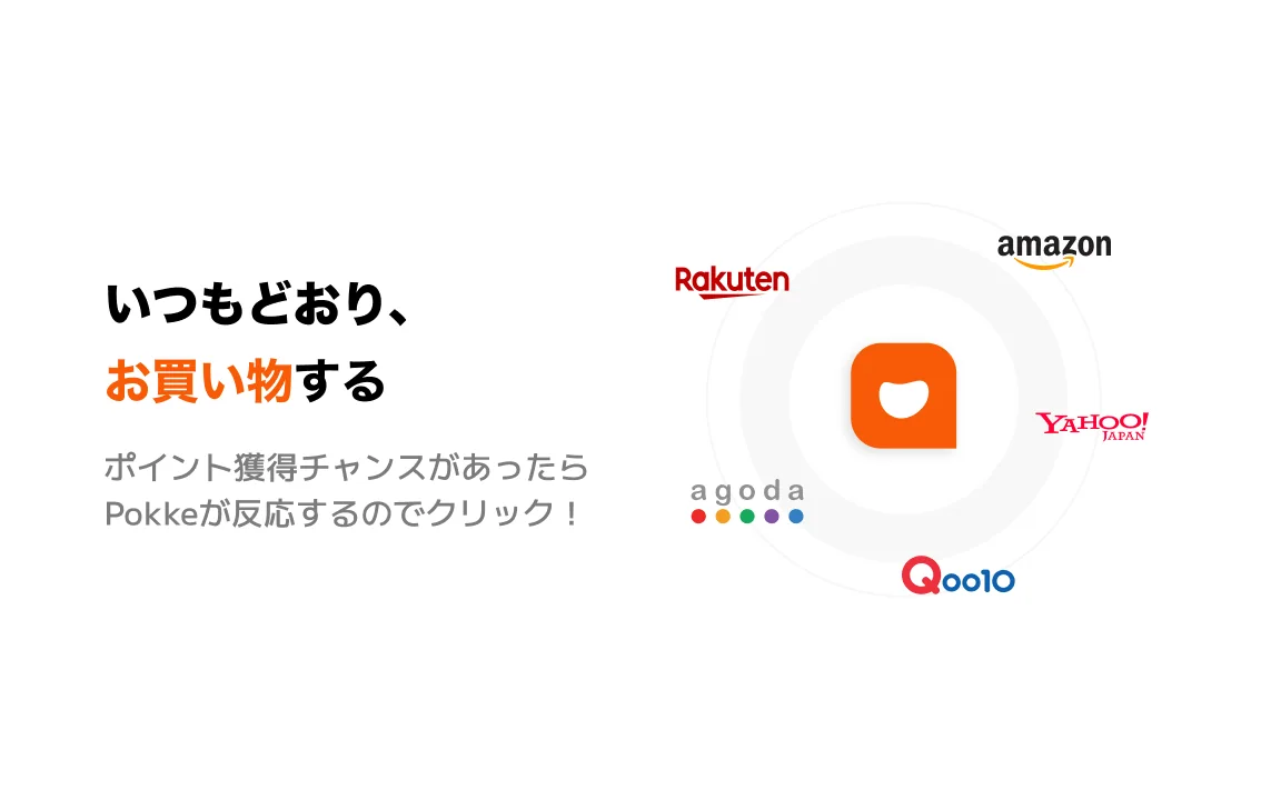
01ショップを開くOpen a shop쇼핑몰을 연다

Pokke lights up; open the points page

02Pokkeが反応、ポイント獲得ページへPokke lights up; open the points pagePokke가 반응, 포인트 획득 페이지로

Add to cart as usual

03いつもどおりカートへAdd to cart as usual평소처럼 카트에 담는다

Finish the purchase

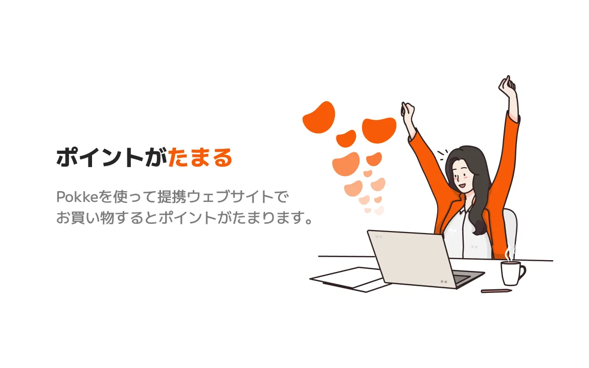
04購入を完了Finish the purchase구매를 완료한다

Get Pokke points

05PokkeポイントをGETGet Pokke pointsPokke 포인트 GET

Exchange for a gift card in the wallet

06ウォレットでギフト券に交換Exchange for a gift card in the wallet지갑에서 기프트 카드로 교환

Practice shop · The whole flow, once, before real shopping
Store screenshot: shop as usual
Store · Shop as usual
Store screenshot: the best page is suggested
The best page is suggested
Store screenshot: points add up
Store · Points add up
Store screenshot: spend your points
Spend your points
  1. 01問題定義Problem문제정의

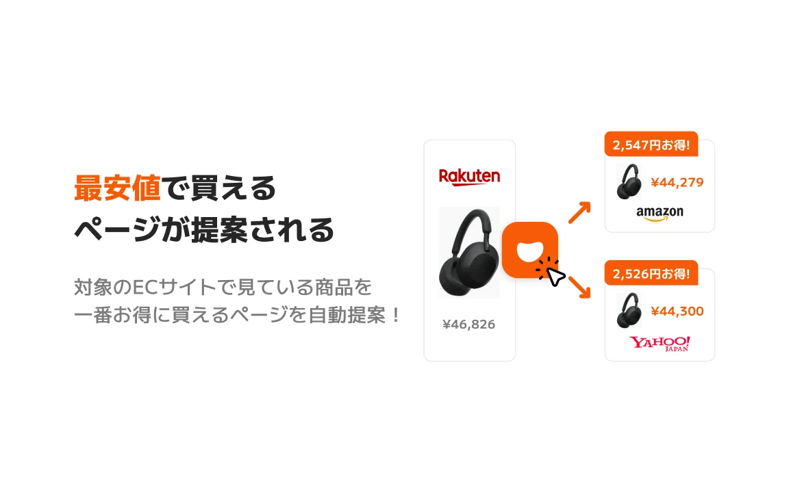
    ネットで買い物をするとき、同じ商品でも楽天、Amazon、Yahoo!ショッピングで値段やポイントが違います。いちばん得な店を探すにはタブをいくつも開いて比べるしかなく、ポイントサイトは先にそのサイトを経由しないとポイントがつきません。いつもの買い物を変えずに、得をする場所だけを教えてくれるサービスが必要でした。

    When you shop online, the same item has a different price and different points on Rakuten, Amazon and Yahoo! Shopping. Finding the best deal means opening tab after tab, and points sites only pay out if you remember to go through them first. The service needed to leave the usual shopping as it is, and only point out where the deal is.

    온라인 쇼핑을 할 때 같은 상품이라도 라쿠텐, 아마존, 야후 쇼핑마다 가격과 포인트가 다르다. 가장 이득인 곳을 찾으려면 탭을 여러 개 열어 비교할 수밖에 없고, 포인트 사이트는 먼저 그 사이트를 거쳐야 포인트가 붙는다. 평소 쇼핑은 바꾸지 않고, 이득이 되는 곳만 알려주는 서비스가 필요했다.

  2. 02リサーチResearch리서치
    • 海外のHoneyや日本のPLUGのように、ブラウザ拡張が買い物中のページに反応して、クーポンや還元を自動で知らせるサービスが広がっていた。
    • 一方で、拡張機能を入れたことがない人も多く、インストールして「ピン留め」するところで迷いやすい。
    • お得の中身は「最安値」と「ポイント還元」の二つ。ためたポイントはギフト券や電子マネーなど、使い道まで見えて初めて意味がある。
    • Services such as Honey abroad and PLUG in Japan had shown the pattern: a browser extension reacts to the page you are shopping on and tells you about coupons and cashback on its own.
    • But many people had never installed an extension, and they easily get lost at the point of installing and pinning it.
    • The deal comes in two parts: the lowest price and points back. Points only mean something once you can see what to spend them on, such as gift cards or e-money.
    • 해외의 Honey나 일본의 PLUG처럼, 브라우저 확장이 쇼핑 중인 페이지에 반응해 쿠폰과 환급을 자동으로 알려주는 서비스가 늘고 있었다.
    • 한편 확장 기능을 설치해 본 적 없는 사람도 많아서, 설치하고 "고정"하는 단계에서 헤매기 쉽다.
    • 이득의 내용은 "최저가"와 "포인트 환급" 두 가지. 모은 포인트는 기프트 카드나 전자 머니처럼 쓸 곳까지 보여야 비로소 의미가 있다.
  3. 03制約Constraints제약조건
    • デザイナーは自分ひとり。ブランド、LP、拡張機能、ウェブの画面、ストア素材までを担当。
    • 拡張機能のポップアップは幅360pxほど。その中で、店の還元率と還元日、ボタン、ウォレットまでを収める必要があった。
    • ChromeとSafariの拡張機能、ウェブのウォレットを、同じ見た目と言葉でそろえる必要があった。
    • I was the only designer, covering the brand, landing page, extension, web screens and store assets.
    • The extension popup is only about 360px wide, and it had to hold the shop's return rate and date, the button and the wallet.
    • The Chrome and Safari extensions and the web wallet had to share one look and one voice.
    • 디자이너는 나 혼자. 브랜드, LP, 확장 기능, 웹 화면, 스토어 소재까지 담당.
    • 확장 기능 팝업은 폭 360px 정도. 그 안에 쇼핑몰의 환급률과 환급일, 버튼, 지갑까지 담아야 했다.
    • Chrome과 Safari 확장 기능, 웹 지갑을 같은 모습과 말투로 맞춰야 했다.
  4. 04決定Decision결정ケーススタディ要約Case summary케이스 스터디 요약

    ポッケ(ポケット)に、お得がたまっていく

    Deals that build up in a pocket

    포켓(주머니)에 이득이 쌓여 간다

    名前は「ポケット」の幼い言い方「ポッケ」から。シンボルは、ものが入ってふくらんだポケットの形にしました。丸いロゴタイプとオレンジ一色で、身近で親しみやすいお得の印象をつくっています。

    The name comes from "pokke", the childlike way to say pocket in Japanese. The symbol is a pocket bulging with what has been put in it. A rounded logotype and a single orange make deals feel close and friendly.

    이름은 "포켓"을 귀엽게 부르는 일본어 "폿케"에서 왔다. 심볼은 무언가 들어가 불룩해진 주머니 모양으로 했다. 둥근 로고타입과 오렌지 한 색으로 가깝고 친근한 이득의 인상을 만들었다.

    通知ではなく、話しかけるチャットボットに

    Not a notification, a chatbot that talks to you

    알림이 아니라 말을 거는 챗봇으로

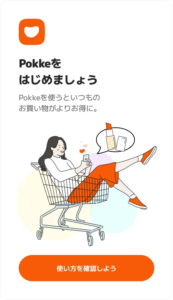
    「今見ているサイトより最安値のサイトを見つけました!」のように、吹き出しで話しかける形にしました。広告のように見せず、隣にいる友だちが教えてくれる感覚に近づけるためです。LPやストアのビジュアルも、この吹き出しとカートに乗った女性のイラストを軸にそろえています。

    It speaks in speech bubbles, such as "I found a site with a lower price than the one you are on!" Instead of looking like an ad, it should feel like a friend next to you pointing something out. The landing page and store visuals are built around the same bubble and the illustration of a woman riding in a shopping cart.

    "지금 보고 있는 사이트보다 최저가 사이트를 찾았어요!"처럼 말풍선으로 말을 거는 형태로 했다. 광고처럼 보이지 않고, 옆에 있는 친구가 알려주는 느낌에 가깝게 하기 위해서다. LP와 스토어 비주얼도 이 말풍선과 카트에 탄 여성 일러스트를 축으로 맞췄다.

    ポップアップは還元率と還元日、ボタンひとつ

    The popup shows the return rate, the date and one button

    팝업은 환급률과 환급일, 버튼 하나

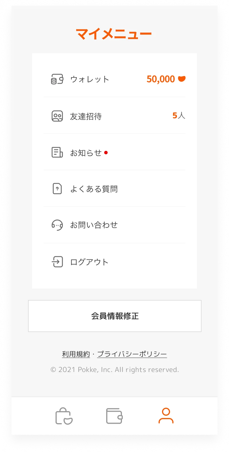
    ショップ、ウォレット、マイメニューの三つのタブに絞りました。ショップのタブでは、還元率と還元日を大きく見せて「ポッケする」ボタンをひとつだけ置き、押したあとは「有効済み」と、あとは買い物を終えるだけだと伝えます。ウォレットでは、残高と獲得予定ポイントを分けて見せています。

    I kept it to three tabs: shop, wallet and my menu. The shop tab shows the return rate and date large, with a single "Pokke it" button; once pressed, it reads "Active" and tells you all that is left is to finish shopping. The wallet shows the balance and the points still on their way separately.

    쇼핑몰, 지갑, 마이 메뉴 세 개의 탭으로 좁혔다. 쇼핑몰 탭에서는 환급률과 환급일을 크게 보여주고 "폿케하기" 버튼 하나만 두었으며, 누른 뒤에는 "활성화됨"과 함께 이제 쇼핑만 마치면 된다고 알려준다. 지갑에서는 잔액과 획득 예정 포인트를 나눠 보여준다.

    使う前に、練習用のショップで一度体験してもらう

    Try it once in a practice shop before real shopping

    실제로 쓰기 전에 연습용 쇼핑몰에서 한 번 체험한다

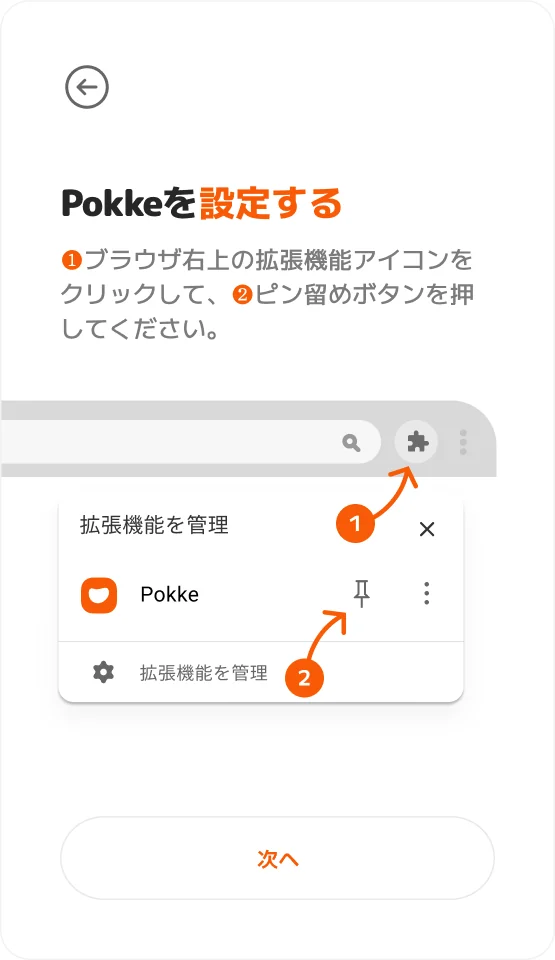
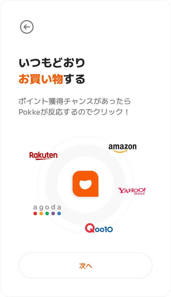
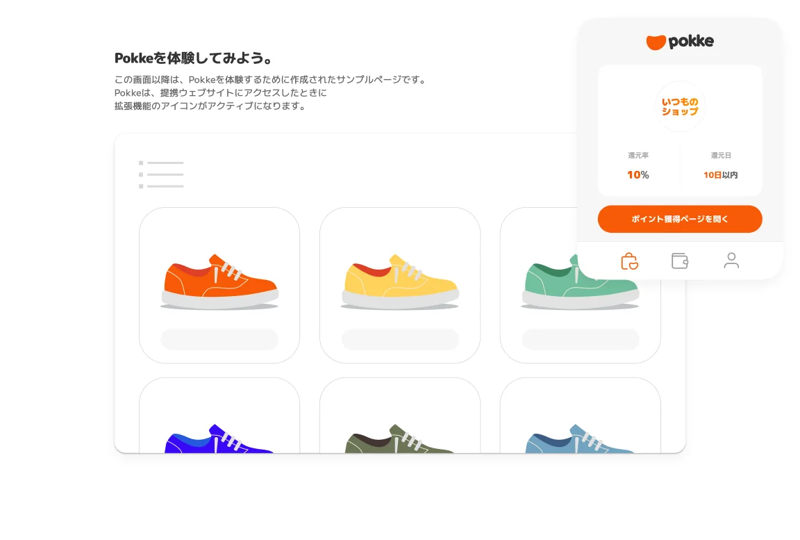
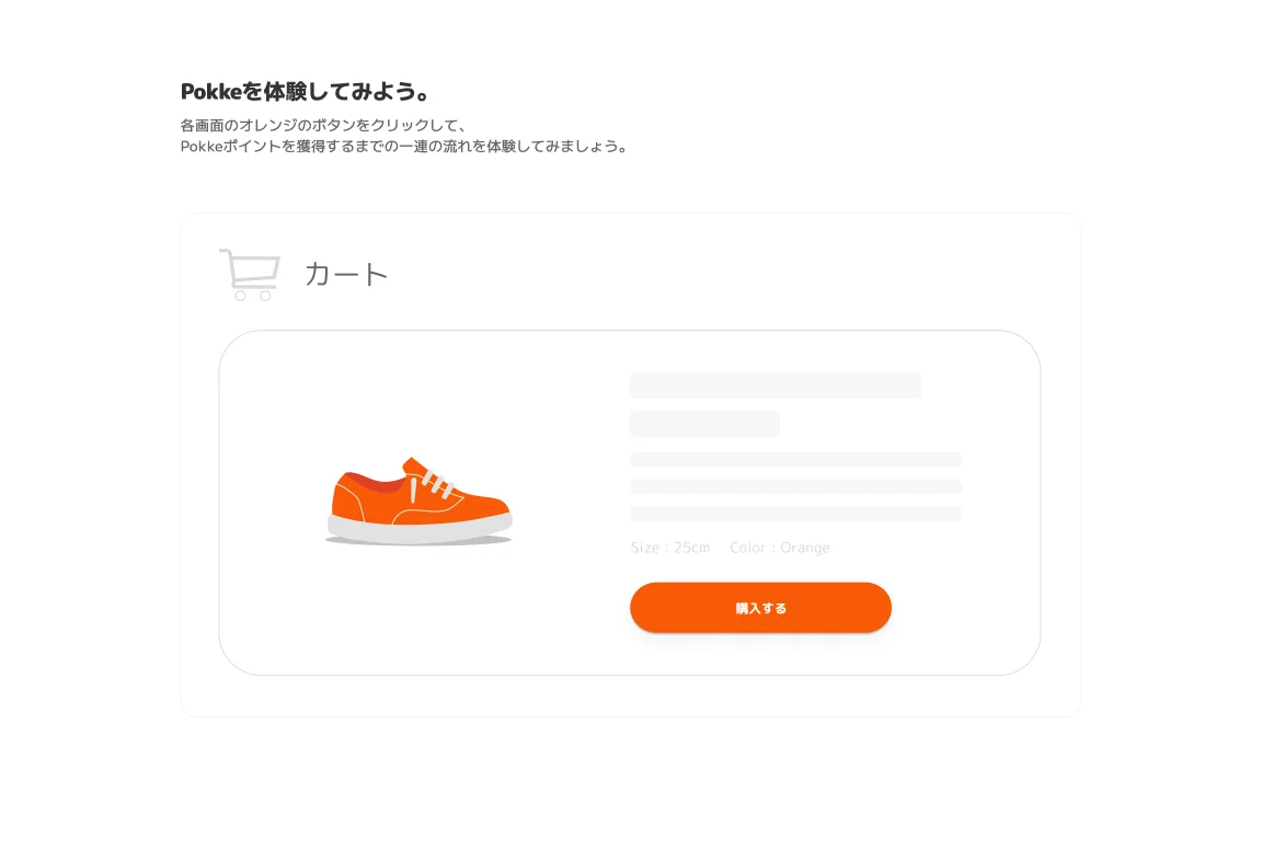
    インストール直後のガイドは、拡張機能のピン留めから始めて、ためる・つかうまでをカードで順に見せます。そのあと、スニーカーを並べた練習用のショップで、Pokkeが反応してからポイントをギフト券に交換するまでの流れを、実際に手を動かして一度通せるようにしました。

    Right after installing, the guide starts with pinning the extension and walks through earning and spending, card by card. Then a practice shop full of sneakers lets you go through the whole flow by hand once, from Pokke lighting up to exchanging points for a gift card.

    설치 직후 가이드는 확장 기능 고정부터 시작해 모으기·쓰기까지 카드로 차례로 보여준다. 그다음 스니커즈를 진열한 연습용 쇼핑몰에서, Pokke가 반응하고 나서 포인트를 기프트 카드로 바꾸기까지의 흐름을 직접 손으로 한 번 해볼 수 있게 했다.

  5. 05結果Outcome결과

    サービスは公開され運用されましたが、現在は終了しています。

    The service launched and ran for a while, and has since closed.

    서비스는 공개되어 운영되었지만, 현재는 종료되었다.

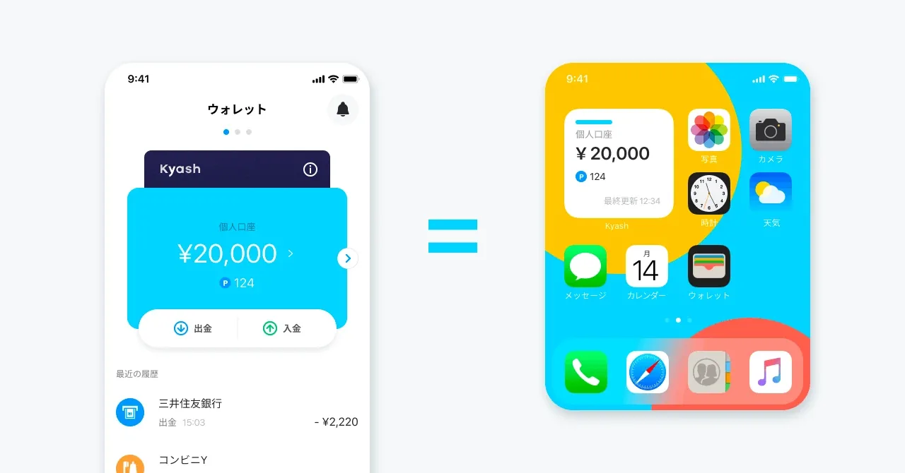
Kyash wallet balance shown as a home screen widget
Wallet = Widget
Hand-drawn widget layout sketches
Early sketches · Card image, balance with top-up and withdraw, recent history

よく使う、確認できて嬉しい機能をウィジェットにするTurn what people use often and are glad to check into the widget자주 쓰고, 확인하면 반가운 기능을 위젯으로

Phase 1
  • 残高表示Balance잔액 표시
  • 支払口座表示Payment account결제 계좌 표시
Phase 2〜
  • 履歴表示Recent history이용 내역 표시
  • fund source表示Fund sourcefund source 표시
  • 今月のカテゴリ表示This month by category이번 달 카테고리 표시
  • 支払口座切り替えSwitch payment account결제 계좌 전환
  • カードロックCard lock카드 잠금
Scope · What goes in first
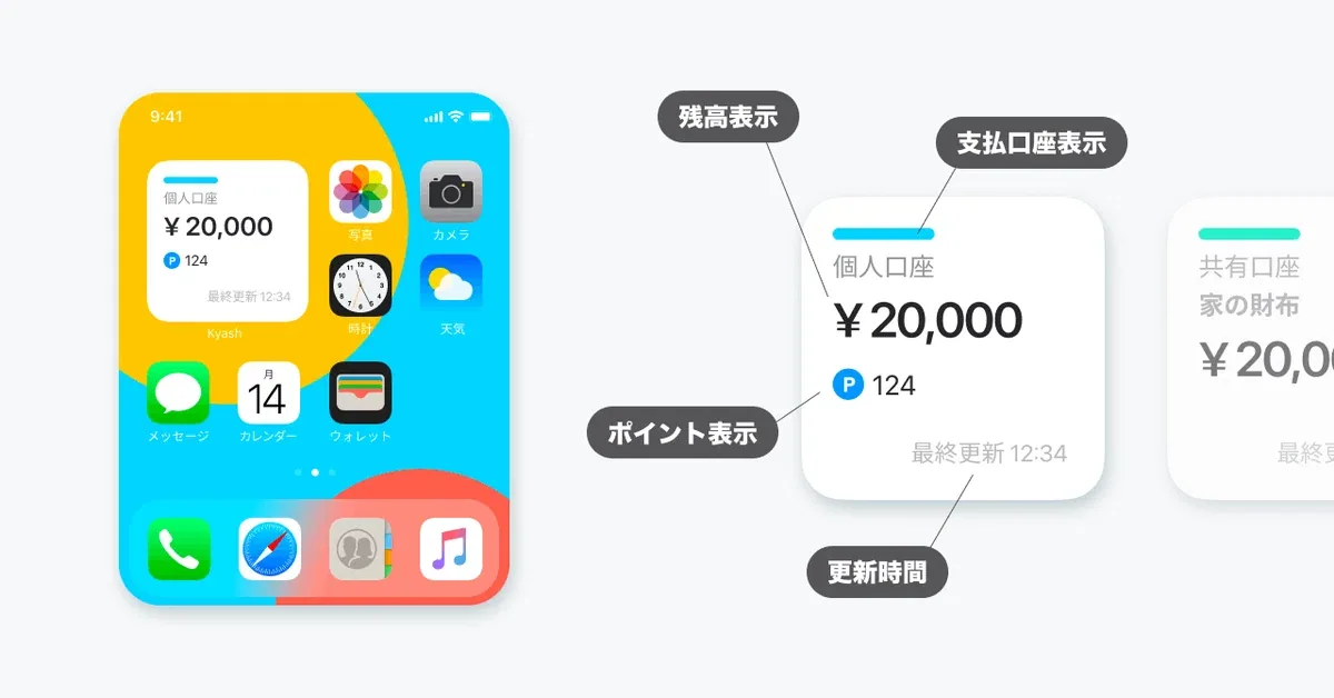
Widget anatomy: balance, account, points, last updated
Widget anatomy
  1. 01問題定義Problem문제정의

    支払いの前に残高と支払い元を確認するには、毎回アプリを開く必要がありました。確認を省くと、残高不足や支払い元の切り替え忘れで決済が失敗します。

    To check the balance and funding source before paying, users had to open the app every time. Skipping the check led to failed payments from low balance or a forgotten account switch.

    결제하기 전에 잔액이나 결제 수단을 확인하려면 매번 앱을 열어야 했다. 그 과정을 건너뛰면 잔액이 모자라거나 결제 수단을 바꾸는 걸 깜빡해서 결제에 실패하는 경우가 많았다.

  2. 02リサーチResearch리서치
    • 「自分が毎日使って満足できるか」を判断の軸にしている。Kyashのユーザーとして、レジ前で同じ迷いを繰り返していた。
    • ウィジェットに載せる候補として、残高、最近の利用履歴、カード番号の表示などを並べ、「今ユーザーがいちばん欲しいものは何か」をチームで話し合って優先順位を決めた。
    • 方向を決めたあと、社内インタビューで使い方を確かめ、最終的なUXを決めた。
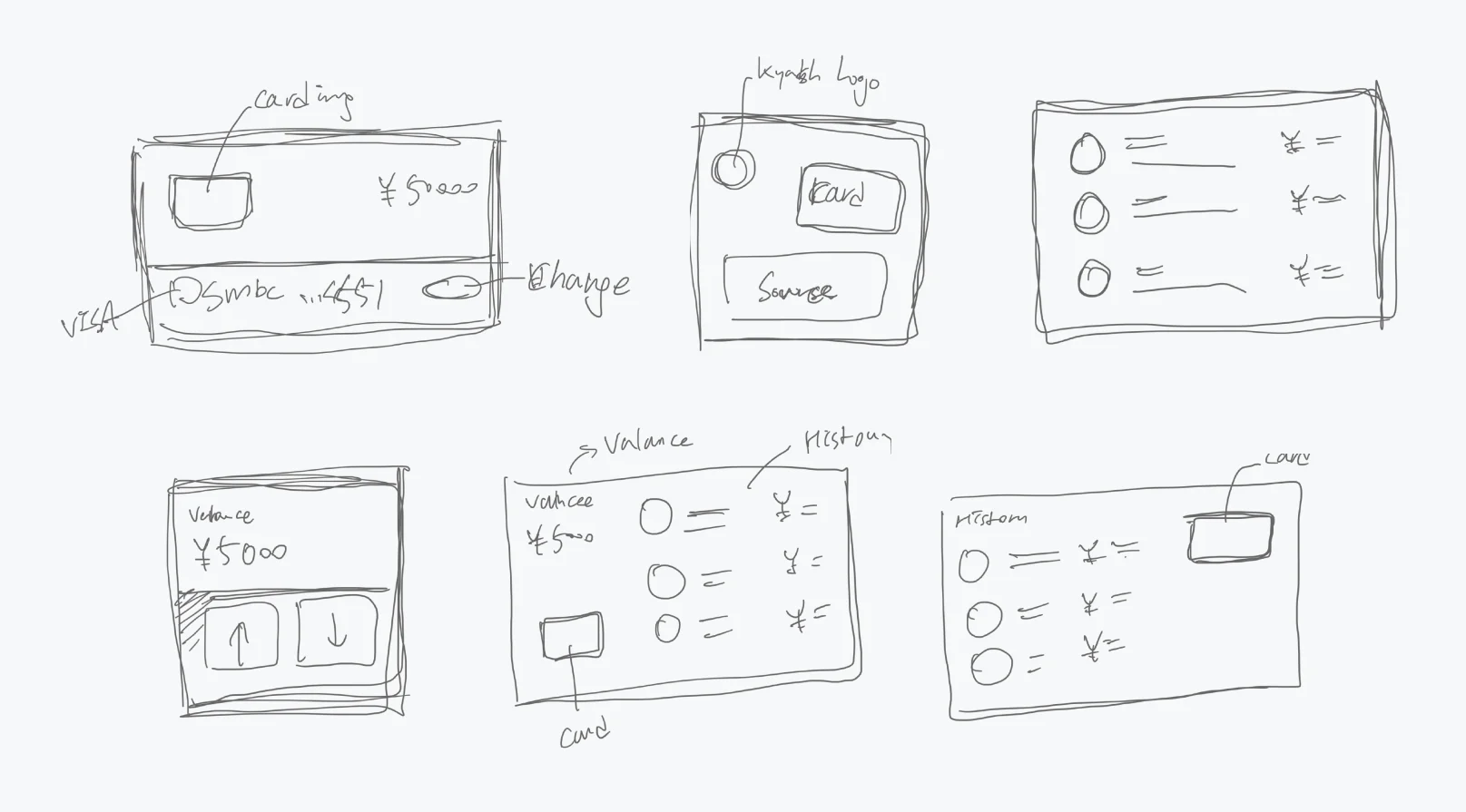
    • ペンでラフを描き、カード画像と残高、残高と入金・出金ボタン、最近の利用履歴など、いくつものレイアウトを並べて比べた。
    • My test is whether I'd be happy using it every day. As a Kyash user myself, I kept hitting the same hesitation at the register.
    • We listed what the widget could show, including the balance, recent transactions and the card number, and agreed as a team on what users wanted most right now.
    • Once the direction was set, internal interviews confirmed how people would use it and settled the final UX.
    • I sketched by hand and compared several layouts side by side: a card image with the balance, the balance with top-up and withdraw buttons, a list of recent history and more.
    • "내가 매일 쓰면서 만족할 수 있는가"를 판단의 기준으로 삼는다. Kyash 사용자로서 계산대 앞에서 같은 망설임을 몇 번이고 겪었다.
    • 위젯에 넣을 후보로 잔액, 최근 이용 내역, 카드 번호 표시 등을 나열하고, "지금 사용자가 가장 원하는 것은 무엇인가"를 팀에서 논의해 우선순위를 정했다.
    • 방향을 정한 뒤 사내 인터뷰로 사용 방식을 확인하고 최종 UX를 결정했다.
    • 손으로 러프를 그려 카드 이미지와 잔액, 잔액과 입금·출금 버튼, 최근 이용 내역 등 여러 레이아웃을 나란히 놓고 비교했다.
  3. 03制約Constraints제약조건
    • 事業の優先度は低く、正式なロードマップには載っていない。
    • Mobileチームの「10%ルール」(業務時間の一部を自由に使える制度)の中で進める。
    • ウィジェットは表示領域と操作が限られる。小〜大サイズでもアプリらしさを保つ必要がある。
    • Low business priority; not on the official roadmap.
    • Built within the Mobile team's "10% rule," time set aside for self-directed work.
    • Widgets have little space and limited interaction, and every size from small to large still had to feel like Kyash.
    • 사업 우선순위가 낮아 공식 로드맵에는 올라 있지 않았다.
    • Mobile 팀의 "10% 룰"(업무 시간 일부를 자율적으로 쓸 수 있는 제도) 안에서 진행했다.
    • 위젯은 보여줄 수 있는 공간도, 조작할 수 있는 방법도 제한적이다. 작은 크기부터 큰 크기까지 어디서든 Kyash다운 느낌을 지켜야 했다.
  4. 04決定Decision결정ケーススタディ要約Case summary케이스 스터디 요약

    作る前に「なぜ作るのか」を一文にしてチームと合わせる

    Agree on "why we're building this" in one sentence before building

    만들기 전에 "왜 만드는가"를 한 문장으로 정리해 팀과 공유한다

    10%ルールの時間は限られていて、機能を詰め込むと完成しません。「支払い前の迷いをなくし、決済失敗を減らす」という目的が、何を入れないかの判断基準になりました。

    10% time is limited, and a feature-stuffed widget would never ship. We used one purpose to decide what to leave out: "remove the hesitation before paying and reduce failed payments."

    10% 룰로 쓸 수 있는 시간은 한정적이라, 이것저것 넣다 보면 끝내 완성하지 못한다. "결제 직전의 망설임을 없애고, 결제가 막히는 일을 줄인다"는 목적이 무엇을 빼야 할지 정하는 기준이 되었다.

    表示は残高だけ。利用履歴やカード番号は載せない

    Show only the balance, not recent transactions or the card number

    화면엔 잔액만. 이용 내역과 카드 번호는 넣지 않는다

    利用履歴やカード番号も候補にありましたが、レジ前で知りたいのは「今いくら使えるか」だけです。一目で読めることを最優先にし、毎回は必要ない支払い元の切り替えは長押しに回しました。

    Recent transactions and the card number were on the list, but at the register the only question is "how much can I spend right now?" Glanceability came first, and switching the funding source, which isn't needed every time, went behind a long press.

    최근 이용 내역이나 카드 번호도 후보였지만, 계산대 앞에서 알고 싶은 건 "지금 얼마를 쓸 수 있는가"뿐이다. 한눈에 읽히는 걸 가장 우선하고, 매번 하지 않는 결제 수단 변경은 길게 누르면 나오도록 했다.

    最初のフェーズは残高と支払口座の表示に絞る

    Keep the first phase to the balance and the payment account

    첫 페이즈는 잔액과 결제 계좌 표시로 좁힌다

    方針は「よく使う、確認できて嬉しい機能をウィジェットにする」。履歴、fund source、今月のカテゴリ、支払口座の切り替え、カードロックも候補でしたが、次のフェーズ以降に並べ、最初のリリースで何を約束するかをはっきりさせました。

    The rule was to turn what people use often and are glad to check into the widget. History, fund source, this month by category, switching the payment account and card lock were all candidates, but I lined them up for later phases so the first release made one clear promise.

    원칙은 "자주 쓰고, 확인하면 반가운 기능을 위젯으로". 이용 내역, fund source, 이번 달 카테고리, 결제 계좌 전환, 카드 잠금도 후보였지만 다음 페이즈 이후로 배치해, 첫 릴리스에서 무엇을 약속할지 분명히 했다.

    個人の口座に加えて、共有口座の残高も表示できるようにする

    Show shared-account balances alongside the personal one

    개인 계좌와 함께 공유 계좌 잔액도 보이게 한다

    Kyashには家族やカップルで使う共有口座があります。自分の残高だけでは「今いくら使えるか」に答えきれないので、共有口座も同じウィジェットで確認できるようにしました。

    Kyash has shared accounts for families and couples. The personal balance alone can't answer "how much can I spend right now?", so shared accounts show in the same widget.

    Kyash에는 가족이나 커플이 함께 쓰는 공유 계좌가 있다. 내 잔액만으로는 "지금 얼마를 쓸 수 있는가"에 다 답할 수 없어서, 공유 계좌도 같은 위젯에서 확인할 수 있게 했다.

    決済の失敗を減らす施策としてKPIに結びつけて説明する

    Frame it as a payment-failure fix tied to KPIs

    "결제가 막히는 일을 줄이는 기능"으로, KPI와 엮어서 설명한다

    「便利な機能」だと優先度は上がりません。決済失敗の減少は取扱高に直結するので、事業側と同じ言葉で話せます。

    "Convenient" doesn't raise a priority. Fewer failed payments means more transaction volume, so I could talk to the business side in their terms.

    "있으면 편한 기능"이라는 말로는 우선순위가 올라가지 않는다. 결제가 막히는 일이 줄면 거래액이 곧바로 늘어나니, 사업 쪽과 같은 언어로 대화할 수 있었다.

  5. 05改善Iteration개선

    アプリを開かずに残高を確認できるウィジェットとしてリリース。リリース後、App StoreやXには次のような声が届きました。

    Released as a widget that shows the balance without opening the app. After launch, App Store reviews and posts on X said things like:

    앱을 열지 않아도 잔액을 바로 볼 수 있는 위젯으로 출시했다. 출시 후 App Store와 X에는 이런 반응이 이어졌다.

    • 家計簿アプリの代わりになる。アプリを開かなくても、個人と共有口座の残高がホーム画面で分かり、支出の管理が直感的になった。
    • 共有口座を使うカップルや家族から、相手がお金を使ったときに残高の変化をすぐ確認できて便利という声が多かった。
    • すっきりしたデザインとグラフ表示が、ホーム画面をカスタマイズするユーザーにも受け入れられた。
    • It can replace a budgeting app: personal and shared balances on the home screen, without opening the app, made spending easy to keep track of.
    • Couples and families using shared accounts liked seeing the balance change as soon as the other person spent.
    • The clean design and the graph view met the standards of people who customize their home screens.
    • 가계부 앱을 대신할 수 있다. 앱을 열지 않아도 개인 계좌와 공유 계좌 잔액을 홈 화면에서 바로 볼 수 있어 지출 관리가 직관적이 됐다.
    • 공유 계좌를 쓰는 커플과 가족에게서, 상대가 돈을 쓰면 잔액 변화를 바로 확인할 수 있어 편하다는 반응이 많았다.
    • 깔끔한 디자인과 그래프 표시가 홈 화면을 꾸미는 사용자들의 눈높이도 만족시켰다.

    リリース後の数値は追えていません。次に作るなら、決済失敗率をリリース前後で比べられるよう、最初から計測を組み込みます。

    I couldn't track numbers after launch. Next time, I'd build in measurement from the start so the payment-failure rate can be compared before and after.

    출시 후 수치는 추적하지 못했다. 다음에 만든다면 결제 실패율을 출시 전후로 비교할 수 있도록 처음부터 측정을 설계해 두겠다.

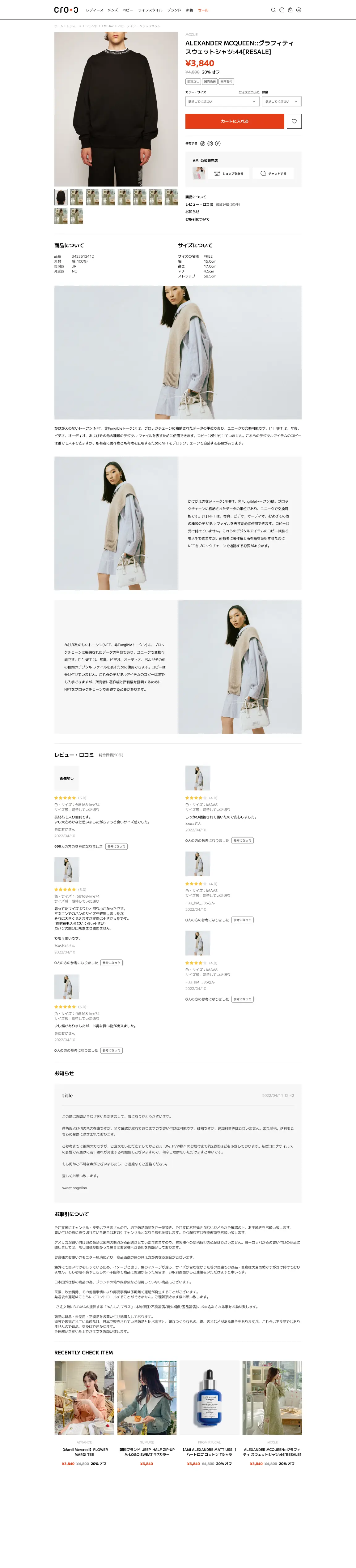
cro-c logo on white, dark and orange
Logo · White, dark and orange

C*CC*CC*Cショップとお客さま、二つの「C」が向き合うTwo Cs face each other: the shop and the customer숍과 고객, 두 개의 "C"가 마주 본다

シンボルSymbol심볼ファビコンやアプリアイコンに使うFor the favicon and app icon파비콘과 앱 아이콘에 쓴다

ベースのロゴタイプBase logotype기본 로고타입Nova Roundをもとにした基本形The base form, built on Nova RoundNova Round를 바탕으로 한 기본형

採用:アスタリスクChosen: asterisk채택: 별표ポイントであり「広がり」の意味。重ねると鎖のようにもつながるA point that also means expansion; overlapped, the Cs link like a chain포인트이자 "확장"의 의미. 겹치면 쇠사슬처럼 이어진다

案:スラッシュOption: slash안: 슬래시直線で洗練された印象を出す案A cleaner look from a straight line직선으로 세련된 인상을 주는 안

Logo · Concept and the options compared
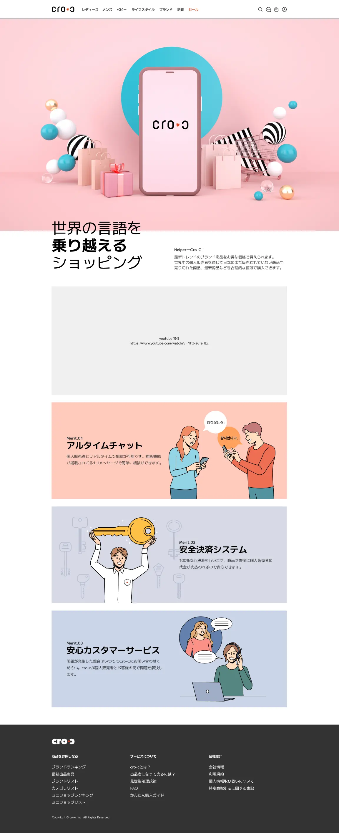
Top page
Buyer · Top (scroll inside the window)
Item page
About the service
Buyer · Item page with the seller's shop and chat · About the service
Smartphone item page
Seller shop page
Shopping cart
About the service on smartphone
Buyer · Smartphone: item, seller shop, cart, about
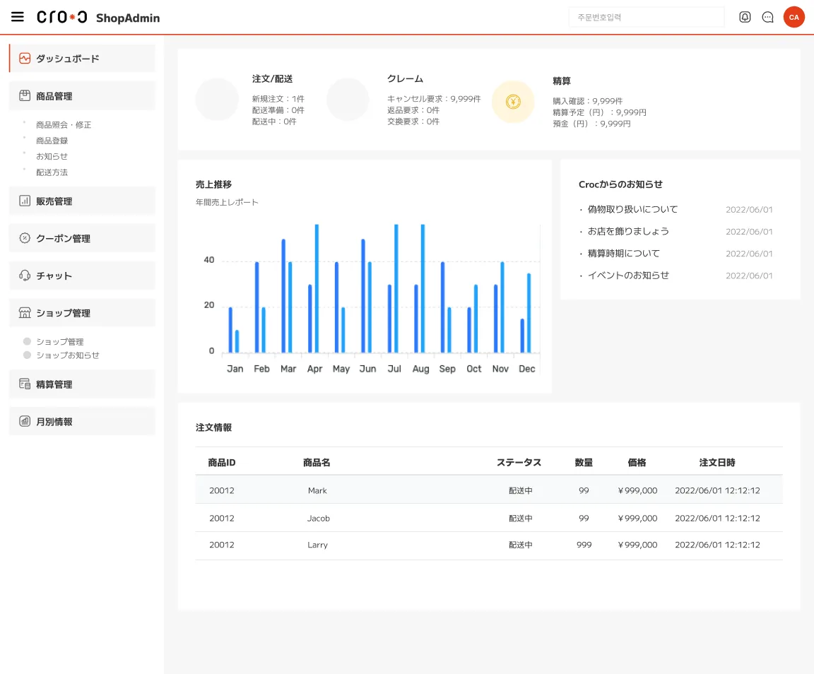
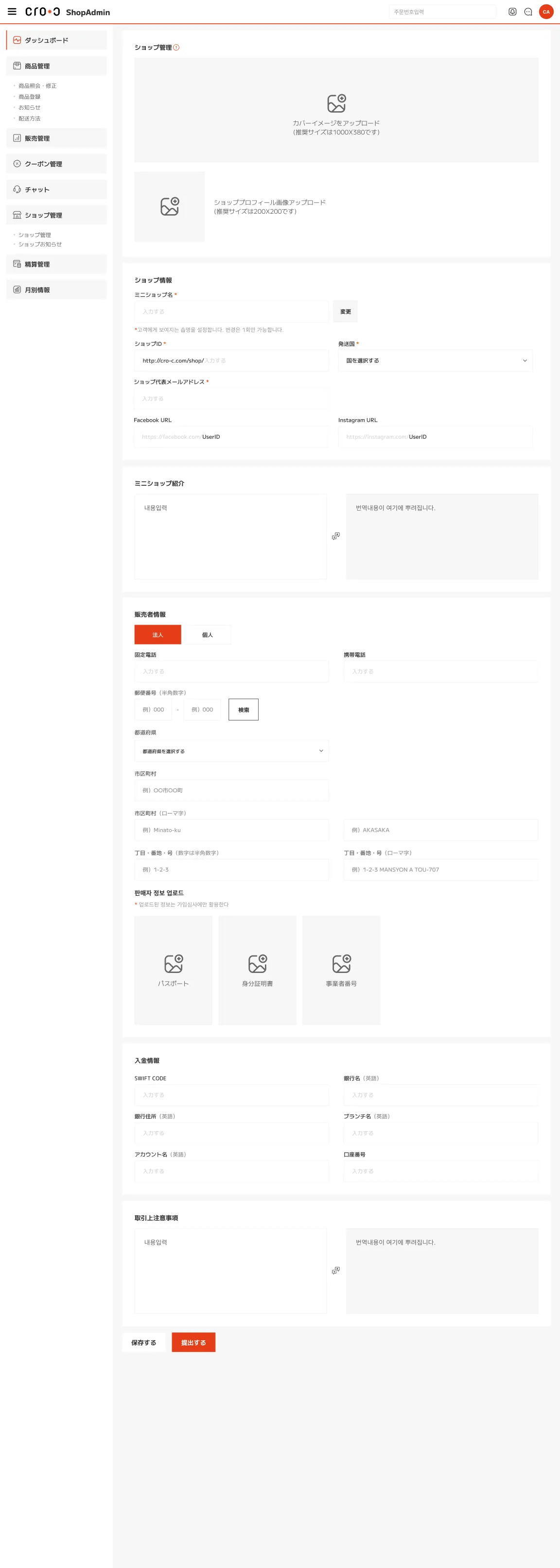
Shop admin dashboard
Seller · ShopAdmin dashboard: orders, claims and settlement at a glance
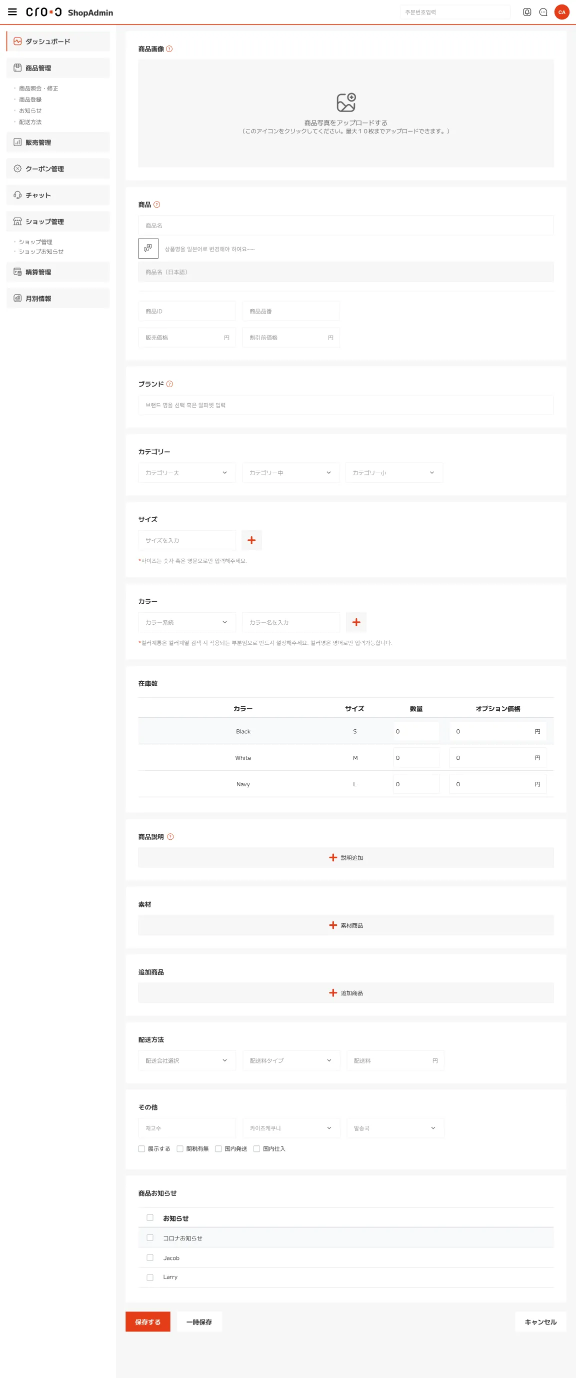
Item registration
Shop settings
Seller · Item registration · Shop settings
  1. 01問題定義Problem문제정의

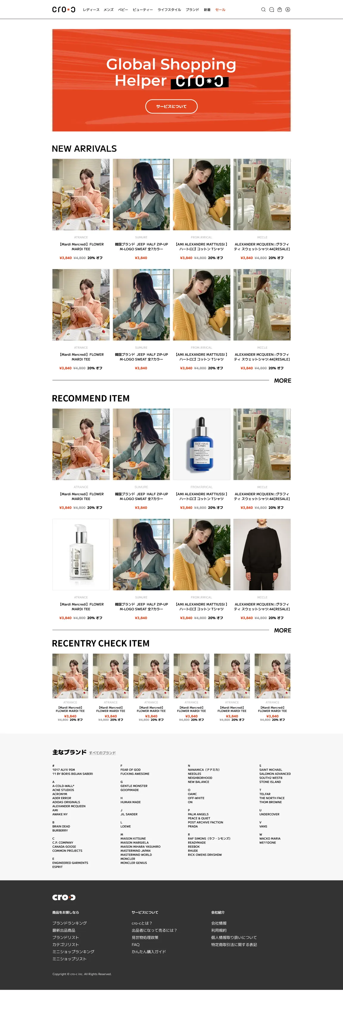
    海外の個人販売者が日本の買い手に売るには、言葉、決済、問い合わせの壁があります。買う側にとっても、知らない海外の販売者から買うのは不安です。両者をつなぐ越境EC「cro-c」を立ち上げるにあたり、ブランドと、買う人・売る人それぞれの画面が必要でした。

    For an overseas seller, selling to buyers in Japan means getting past language, payment and support. For buyers, buying from an unknown seller abroad feels risky. Launching "cro-c", a cross-border marketplace connecting the two, needed a brand and screens for both the people who buy and the people who sell.

    해외 개인 판매자가 일본 구매자에게 팔려면 언어, 결제, 문의의 벽이 있다. 사는 쪽도 모르는 해외 판매자에게서 사는 건 불안하다. 둘을 잇는 크로스보더 EC "cro-c"를 시작하면서, 브랜드와 사는 사람·파는 사람 각각의 화면이 필요했다.

  2. 02リサーチResearch리서치
    • 買い手の不安は「言葉が通じるか」「払ったお金で本当に届くか」「困ったとき誰に聞けるか」の三つにまとまった。
    • 売り手は日本語がわからなくても、出品から販売までできる必要があった。
    • 扱う商品は海外のファッションブランドが中心で、ブランドから探す人が多い。
    • Buyers' worries came down to three: will we understand each other, will what I pay for actually arrive, and who can I ask when something goes wrong.
    • Sellers had to be able to list and sell without knowing Japanese.
    • Most items were fashion brands from abroad, and many people search by brand.
    • 구매자의 불안은 "말이 통할까", "낸 돈만큼 정말 도착할까", "곤란할 때 누구에게 물어볼까" 세 가지로 정리됐다.
    • 판매자는 일본어를 몰라도 출품부터 판매까지 할 수 있어야 했다.
    • 다루는 상품은 해외 패션 브랜드가 중심이라, 브랜드로 찾는 사람이 많다.
  3. 03制約Constraints제약조건
    • チームの中でデザインを担当。
    • 買い手向けのPC・スマートフォンと、販売者向けのショップ管理画面を、同じルールでつくる必要があった。
    • 立ち上げ前のサービスで、ブランドも画面と並行してつくる必要があった。
    • I handled design within the team.
    • The buyer screens on desktop and smartphone and the seller's shop admin had to follow the same rules.
    • The service had not launched yet, so the brand had to be made alongside the screens.
    • 팀 안에서 디자인을 담당.
    • 구매자용 PC·스마트폰 화면과 판매자용 숍 관리자 화면을 같은 규칙으로 만들어야 했다.
    • 출시 전 서비스라 브랜드도 화면과 병행해서 만들어야 했다.
  4. 04決定Decision결정ケーススタディ要約Case summary케이스 스터디 요약

    ロゴは向かい合う二つの「C」と、その間の「*」

    A logo of two Cs facing each other, with an asterisk between them

    로고는 마주 보는 두 개의 "C"와 그 사이의 "*"

    ショップ(Client)とお客さま(Customer)が向き合う形を残し、間にアスタリスクを置きました。アスタリスクはポイントであり「広がり」の意味で、二つのCを重ねると鎖のようにつながります。Nova Roundのベース案、スラッシュ案と並べて比べ、この案に決めました。

    I kept the shop (client) and the customer facing each other, and put an asterisk between them. The asterisk is an accent that also stands for expansion, and when the two Cs overlap they link like a chain. I chose it after comparing it with a Nova Round base and a slash version.

    숍(Client)과 고객(Customer)이 마주 보는 형태를 유지하고, 그 사이에 별표를 뒀다. 별표는 포인트이자 "확장"의 의미이고, 두 C를 겹치면 쇠사슬처럼 이어진다. Nova Round 기본안, 슬래시안과 나란히 비교해 이 안으로 정했다.

    色は白と黒に、オレンジを一色だけ

    White and black, with a single orange

    컬러는 흰색과 검정에 오렌지 하나만

    ロゴのアスタリスク、カートに入れるボタン、セール価格にだけオレンジを使いました。商品写真が主役のサイトで、押す場所と安くなっている場所だけが目に入るようにするためです。

    Orange appears only on the logo's asterisk, the add-to-cart button and sale prices. On a site where the product photos lead, only the places to tap and the places with a deal stand out.

    로고의 별표, 카트 담기 버튼, 세일 가격에만 오렌지를 썼다. 상품 사진이 주인공인 사이트에서 누를 곳과 싸진 곳만 눈에 들어오게 하기 위해서다.

    買い手の三つの不安に、画面の中で先に答える

    Answer the three worries on the screen, before they are asked

    구매자의 세 가지 불안에 화면 안에서 먼저 답한다

    サービス紹介では、翻訳機能つきのリアルタイムチャット、安全な決済、安心のカスタマーサービスを三つの約束として並べました。商品ページでは販売者のショップとチャットへの入口を商品のすぐ近くに置き、レビューも同じページで読めるようにしています。

    The about page lists three promises: real-time chat with translation, safe payment and reliable customer service. On the item page, the way into the seller's shop and chat sits right next to the item, and reviews are on the same page.

    서비스 소개에서는 번역 기능이 있는 실시간 채팅, 안전한 결제, 안심 고객 서비스를 세 가지 약속으로 나열했다. 상품 페이지에서는 판매자의 숍과 채팅 입구를 상품 바로 옆에 두고, 리뷰도 같은 페이지에서 읽을 수 있게 했다.

    ショップ管理画面は「今日やること」から始める

    Start the shop admin with what needs doing today

    숍 관리자 화면은 "오늘 할 일"에서 시작한다

    ダッシュボードの最初に、新規注文・配送準備・配送中、キャンセル・返品・交換の要求、精算をまとめました。左のメニューは商品管理、販売管理、クーポン、チャットと、販売者の仕事の順に並べています。

    The dashboard opens with new orders, items to ship and in transit, cancel, return and exchange requests, and settlement. The menu on the left follows the seller's work: items, sales, coupons and chat.

    대시보드 첫머리에 신규 주문·배송 준비·배송 중, 취소·반품·교환 요청, 정산을 모았다. 왼쪽 메뉴는 상품 관리, 판매 관리, 쿠폰, 채팅처럼 판매자의 일 순서대로 나열했다.

  5. 05結果Outcome결과

    デザインは仕上げましたが、サービスの公開には至りませんでした。

    The design was finished, but the service did not launch.

    디자인은 마무리했지만, 서비스 공개에는 이르지 못했다.

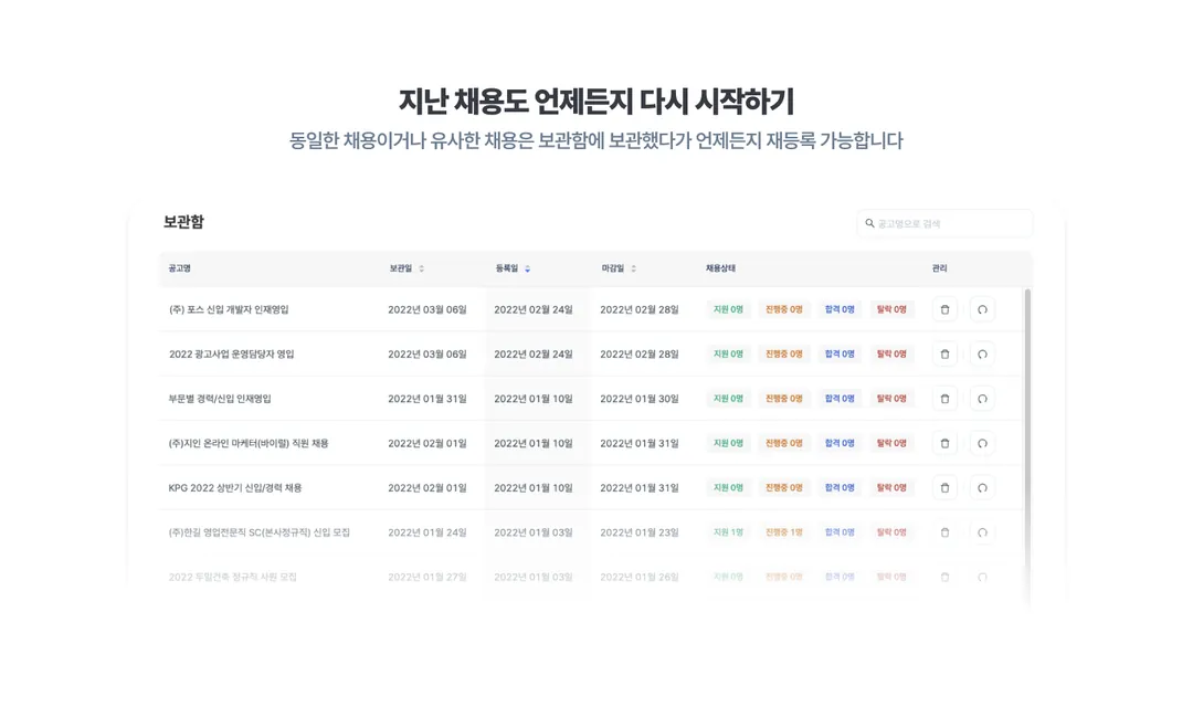
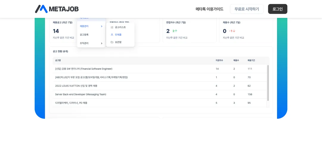
METAJOB logo
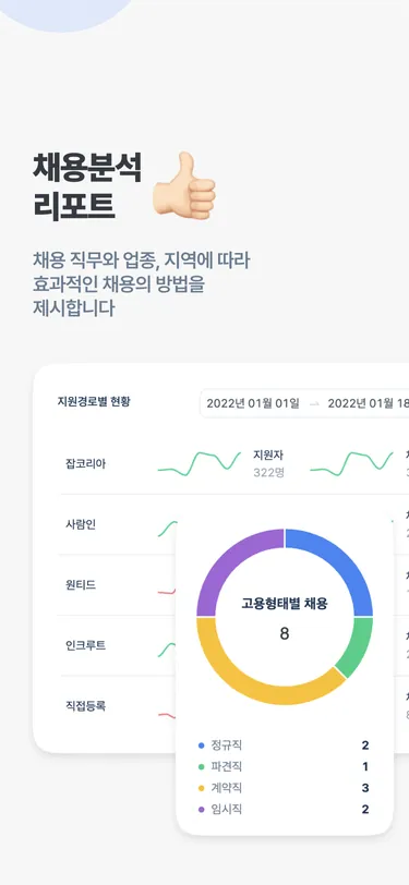
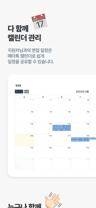
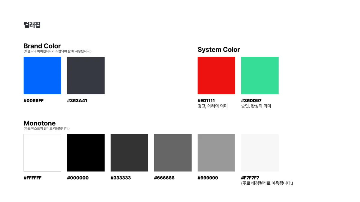
ユニット(きっかけ)Unit (the trigger)유닛(계기)相生・上昇Mutual growth, rising상생·오름
Symbol · A unit meets METAJOB and rises
METAJOB ad on a digital billboard in a shopping mall
Brand · Digital signage
METAJOB business cards, front and back, on a desk
Business cards
METAJOB app icon on a phone with the brand line
Symbol in use
METAJOB landing page, full length
Landing page on mobile
Mobile
Landing page · Hover the page to scroll
01 / 10
  • Every applicant in one place

    01応募者を一か所でEvery applicant in one place지원자 통합 관리

  • Talk to candidates directly

    02候補者と直接やりとりTalk to candidates directly메타톡으로 직접 소통

  • Real-time notifications

    03リアルタイム通知Real-time notifications실시간 알림톡

  • Online interviews inside METAJOB

    04オンライン面接もMETAJOBでOnline interviews inside METAJOB비대면 면접

  • All hiring data at a glance

    05採用データを一目でAll hiring data at a glance채용 데이터 한눈에

  • Hiring reports

    07採用分析レポートHiring reports채용분석 리포트

  • Interview scores, together

    09一緒に進める面接評価Interview scores, together함께하는 면접 평가

  • A shared calendar

    10みんなのカレンダーA shared calendar다 함께 캘린더

  • Restart past postings anytime

    12過去の採用をいつでも再開Restart past postings anytime지난 채용 다시 시작하기

  • A shadow separates the nav on scroll

    Detailスクロール時は影でナビを区切るA shadow separates the nav on scroll스크롤 시 그림자로 내비 구분

Landing page · Sections, one work situation each (swipe or use the arrows)
Mobile: real-time notificationsMobile: online interviewsMobile: hiring reportsMobile: shared calendar
Landing page · Mobile sections
Color chips: brand, system and monotone colors
Color · metablue #0066FF
Illustration style guide
Illustration guide
  1. 01問題定義Problem문제정의

    METAJOBは、いくつもの採用サイトから届く応募者とデータを一か所で管理する採用管理SaaSです。新規事業でロゴもトーンもない状態から、サービスの顔になるアイデンティティと、サービスを案内する窓口になるLPを同時に作る必要がありました。

    METAJOB is a recruiting SaaS that brings applicants and data from many job sites into one place. It was a new business with no logo and no tone yet, so it needed an identity to be its face and a landing page to introduce the service, both at the same time.

    METAJOB는 여러 채용 사이트에서 들어오는 지원자와 데이터를 한곳에서 관리하는 채용관리 SaaS다. 로고도 톤도 없는 신규 사업이라, 서비스의 얼굴이 될 아이덴티티와 서비스를 안내하는 창구가 될 LP를 동시에 만들어야 했다.

  2. 02リサーチResearch리서치
    • 採用担当者は、いくつもの求人サイトから届く応募者をそれぞれの画面で管理していた。これがサービスの出発点。
    • SaaSのLPで問われるのは「他のサービスと何が違うか」と「使うと仕事の何が楽になるか」の2点だと考えた。
    • Recruiters were managing applicants from several job sites, each in its own screen. That was the starting point of the service.
    • A SaaS landing page has to answer two questions: how is this different from other services, and what part of my work gets easier?
    • 채용 담당자는 여러 채용 사이트에서 들어오는 지원자를 각각의 화면에서 따로 관리하고 있었다. 이것이 서비스의 출발점이다.
    • SaaS의 LP가 답해야 할 질문은 "다른 서비스와 무엇이 다른가"와 "쓰면 업무의 어떤 부분이 편해지는가" 두 가지라고 봤다.
  3. 03制約Constraints제약조건
    • デザインと企画は自分一人、エンジニアは2名。
    • ゼロからの立ち上げで、ブランドとLPを並行して作る必要があった。
    • まず出して、公開後の反応を見ながら直していく前提だった。
    • I handled design and planning alone, with two engineers.
    • Starting from zero, the brand and the LP had to be built in parallel.
    • The plan was to ship first and adjust based on how people responded.
    • 디자인과 기획은 혼자, 개발자는 2명.
    • 0에서 시작하는 상황이라 브랜드와 LP를 병행해서 만들어야 했다.
    • 먼저 출시하고, 공개 후 반응을 보면서 고쳐 나간다는 전제였다.
  4. 04決定Decision결정ケーススタディ要約Case summary케이스 스터디 요약

    シンボルは「ユニット」と「上昇」の二つの形で組む

    Build the symbol from two shapes: a unit and a rise

    심볼은 "유닛"과 "오름" 두 형태로 짠다

    人材や顧客企業という「きっかけ」がMETAJOBと出会い、新しいシナジーを生む。サービスが目指す関係を、そのまま形にしました。

    A trigger, a candidate or a client company, meets METAJOB and creates a new synergy. I turned the relationship the service aims for directly into the mark.

    인재나 고객사라는 "계기"가 METAJOB을 만나 새로운 시너지를 만든다. 서비스가 지향하는 관계를 그대로 형태로 옮겼다.

    ブランドカラーはmetablue一色。システムカラーとモノトーンは分ける

    One brand color, metablue, kept apart from system colors and monotones

    브랜드 컬러는 metablue 하나. 시스템 컬러와 모노톤은 따로 둔다

    metablue(#0066FF)には「人材のために、顧客企業のために深く研究し、新しい価値をつくる共生の青」という意味を込めました。エラーの赤や承認の緑、文字と背景のグレーを別に定義し、LPでもプロダクトの画面でも同じルールで使えるようにしました。

    Metablue (#0066FF) stands for "a blue of mutual growth that researches deeply for candidates and clients and creates new value." Error red, approval green and the greys for text and backgrounds were defined separately, so the LP and the product screens follow the same rules.

    metablue(#0066FF)에는 "인재를 위해, 고객사를 위해 깊이 연구하고 새로운 가치를 만드는 상생의 블루"라는 의미를 담았다. 에러의 빨강, 승인의 초록, 텍스트와 배경의 그레이를 따로 정의해, LP와 프로덕트 화면 어디서든 같은 규칙으로 쓸 수 있게 했다.

    フォントはPretendard、アイコンは既製のライブラリを使う

    Use Pretendard for type and an existing library for icons

    폰트는 Pretendard, 아이콘은 기존 라이브러리를 쓴다

    少人数でゼロから作るので、作る量を減らすことを優先しました。システムフォントを置き換えられる完成度のオープンフォントと、1万点以上をそろえた手頃な価格のアイコンを選びました。アイコンの丸みはシンボルとも合います。

    With a small team starting from zero, making less came first. I chose an open font complete enough to replace system fonts, and an affordable icon set of over 10,000 icons whose rounded style matches the symbol.

    적은 인원으로 0부터 만드는 상황이라 만들어야 할 양을 줄이는 걸 우선했다. 시스템 폰트를 대체할 만큼 완성도 높은 오픈 폰트와, 1만 개 이상을 갖춘 부담 없는 가격의 아이콘을 골랐다. 아이콘의 둥근 형태는 심볼과도 잘 맞는다.

    LPは機能の一覧ではなく、仕事の場面ごとに章を立てる

    Structure the LP by work situations, not a feature list

    LP는 기능 나열이 아니라 업무 장면별로 구성한다

    「応募者を一か所で管理」「候補者と直接やりとり」「オンライン面接もMETAJOBで」のように、何が違い、仕事の何が楽になるかを一章ずつ実際の画面と一緒に見せました。「無料で始める」は最初と最後に置き、読み終えたところで迷わず始められるようにしました。

    Each section shows, with the real screens, one thing that is different and one part of the job that gets easier: managing every applicant in one place, talking to candidates directly, interviewing online inside METAJOB. "Start for free" sits at the top and the bottom, so readers can start as soon as they finish.

    "지원자를 한곳에서 관리", "구직자와 직접 소통", "비대면 면접도 METAJOB에서"처럼, 무엇이 다르고 업무의 어떤 부분이 편해지는지를 한 섹션씩 실제 화면과 함께 보여줬다. "무료로 시작하기"는 처음과 마지막에 둬서, 다 읽은 자리에서 바로 시작할 수 있게 했다.

  5. 05展開Rollout전개

    ロゴ、カラー、フォント、イラスト、アイコンのガイドをまとめ、LP(PC・モバイル)、ファビコン、OG画像、ガイドサイトのカバー、名刺まで同じルールで展開しました。サービスはベータ版として公開しました。

    I put together guides for the logo, color, type, illustration and icons, and applied the same rules to the LP (desktop and mobile), the favicon, OG images, the guide site covers and business cards. The service launched as a beta.

    로고, 컬러, 폰트, 일러스트, 아이콘 가이드를 정리하고, LP(PC·모바일), 파비콘, OG 이미지, 가이드 사이트 커버, 명함까지 같은 규칙으로 전개했다. 서비스는 베타 버전으로 공개됐다.

ONE splash screenHome: receipts being boughtReceipt captureAppraisal result: 10 yenWallet balance and activityBank withdrawal request
App · Splash → Home → Receipt → Result → Wallet → Withdraw
Key visual: turn a photo into money
Key visual · Turn a photo into money
SplashWalkthrough 1: items into moneyWalkthrough 2: cash when you need itWalkthrough 3: vouchers into moneyWalkthrough 4: receipts into money
Walkthrough · Splash and four cards that explain the idea
First viewPhone numberSMS codePasswordSign-up complete
Sign up · Phone number, SMS code, password, done
Home: what is being bought nowHome: categoriesHome: notice modalHome v2.5: recommendations
Home · What ONE is buying today
Wallet: balance
Wallet: activityActivity detailPurchase history detail
Wallet · Balance and every movement of money
Withdrawal: choose a bankWithdrawal: register an accountWithdrawal: amountWithdrawal requested
Withdrawal settings · Bank, account, amount, done
TicketsTicket detailBuy a ticketPurchase complete
My tickets · Spend the balance on gift tickets
Friends listChoose friendsSend money with a messageEnter the amount
Send to a friend · Pick a friend, write a message, send
RankingAccountPersonal detailsInvite friends
Account · Profile, ranking, invitations
ONE card concepts
Card · Concepts for a physical ONE card
ONE card variations
Card · Variations of the logo and pattern
Press visual
Press visual · Take a photo, get money
Press visual: how it works
Press visual · How it works
  1. 01問題定義Problem문제정의

    ONEは「レシートを買い取り、購買データを企業のマーケティングに使う」事業です。お金を払うのは企業、アプリを使うのは一般ユーザー。同じプロダクトで2種類の相手を納得させる必要がありました。

    ONE bought receipts from consumers and turned the purchase data into a marketing tool for companies. Companies paid; consumers used the app. One product had to win over two different audiences.

    ONE은 소비자에게 영수증을 사들이고, 그 구매 데이터를 기업의 마케팅에 활용하는 사업이었다. 돈을 내는 쪽은 기업이고 앱을 쓰는 쪽은 일반 사용자. 하나의 프로덕트로 성격이 전혀 다른 두 고객을 동시에 설득해야 했다.

    ユーザー側の問いは「本当にすぐお金がもらえるのか」、企業側の問いは「このデータで何ができるのか」でした。

    The consumer's question was "do I really get paid right away?" The company's question was "what can I do with this data?"

    사용자는 "정말 바로 돈을 주는 걸까?"를, 기업은 "이 데이터로 뭘 할 수 있을까?"를 궁금해했다.

  2. 02リサーチResearch리서치
    • 先行する「ポイント・お小遣い系」アプリは、報酬が届くまで数日かかり、途中で離脱されやすい。
    • 企業側が知りたかったのは「自社の商品が、どこで、どんな性別の人に、どのタイミングで買われているのか」。ONEはこの問いに明確に答えられるソリューションを目指した。
    • Existing points and rewards apps took days to pay out, and users dropped off along the way.
    • Companies wanted to know where their products were bought, by what gender, and at what time of day. ONE aimed to be the clear answer to that question.
    • 기존 포인트·용돈 앱은 보상이 들어오기까지 며칠씩 걸려, 그 사이에 떠나는 사용자가 많았다.
    • 기업이 정말 알고 싶었던 건 "우리 제품이 어디서, 어떤 성별의 사람에게, 몇 시쯤 팔리는가"였다. ONE은 이 질문에 분명한 답을 주는 솔루션을 목표로 했다.
  3. 03制約Constraints제약조건
    • 創業者・エンジニア・デザイナーの3人チーム。デザインは自分ひとり。
    • お金を扱うため、単純さと同時に「怪しくない」信頼感が必要。
    • 営業は企業向けの説明材料を必要としていた。
    • A three-person team: founder, engineer and me as the only designer.
    • It handled money, so it had to feel simple and trustworthy at the same time.
    • Sales needed material to explain the product to corporate clients.
    • 창업자, 엔지니어, 디자이너 세 명뿐인 팀. 디자인은 혼자 맡았다.
    • 돈이 오가는 서비스라, 쉬우면서도 "수상해 보이지 않는" 신뢰감이 필요했다.
    • 영업팀에는 기업 고객에게 보여줄 설명 자료가 필요했다.
  4. 04決定Decision결정ケーススタディ要約Case summary케이스 스터디 요약

    一般ユーザー向けのランディングページを作らず、App Storeに直接送る

    Skip the consumer landing page and send people straight to the App Store

    일반 사용자용 랜딩 페이지 대신 App Store로 곧장 연결한다

    ユーザーが最終判断するのはストアの画面です。LPを挟むとタップが1回増え、「お金がすぐ届く」という約束から一歩遠ざかります。代わりに、LPは企業クライアント向けに作り直し、営業ツールとして使えるようにしました。

    People make the final call on the store page. A landing page added one more tap between the user and the promise of instant money. I rebuilt the landing page for corporate clients instead, as a sales tool.

    사용자가 최종적으로 설치를 결정하는 곳은 스토어 화면이다. 랜딩 페이지를 한 번 더 거치면 그만큼 탭이 늘고 "바로 돈이 들어온다"는 약속 앞에 걸림돌이 생긴다. 대신 랜딩 페이지는 기업 고객용으로 새로 만들어 영업 도구로 쓰도록 했다.

    撮影から入金までの画面を、細部まで最短にする

    Make the path from photo to payout as short as possible, down to the details

    촬영부터 입금까지 걸리는 단계를 끝까지 줄인다

    このアプリの価値は「瞬時にお金が届く」体験そのものです。機能説明を増やすより、体験の速さを説明の代わりにしました。

    The product's value was the instant payout itself. Instead of explaining features, I let the fast payout explain the product.

    이 앱의 가치는 "찍자마자 돈이 들어오는" 경험 그 자체였다. 기능을 길게 설명하기보다, 빠른 경험이 곧 설명이 되도록 했다.

  5. 05改善Iteration개선

    App Store 総合1位。TechCrunch、Business Insider、THE BRIDGEなどで紹介。

    #1 overall on the Japanese App Store. Covered by TechCrunch, Business Insider and THE BRIDGE.

    일본 App Store 종합 1위를 기록했고, TechCrunch, Business Insider, THE BRIDGE 등에 소개되었다.

ONE PAYMENT splash screenAmount entry keypadCard scan with the iPhone cameraPayment complete
App · Amount → card scan → done
Verify the phone numberEnter the code sent by SMSEnter shop details, step by stepDone: your phone is now the register
Flow 1 · Sign up: phone number, SMS code, shop details, ready
Scan the card with the camera
Enter the amount on the registerChoose how to take the paymentOr type in the card details
Flow 2 · Take a payment: amount, method, card scan or manual entry
Pick from registered itemsIssue a receipt by SMSReceipt sentThe customer receives it by SMS
Flow 3 · Items and receipts
Wallet: balance and historyTransaction detailRequest a withdrawalWithdrawal requested
Flow 4 · Wallet and withdrawal
ONE PAYMENT landing page
ONE PAYMENT landing page on smartphone
Landing page · Desktop and smartphone (each scrolls)
ONE PAYMENT merchant window sticker
Merchant kit · Window sticker
  1. 01問題定義Problem문제정의

    小さなお店や個人がカード決済を始めるには、専用のカードリーダーを用意する必要がありました。リーダーの費用に加え、複雑な審査と高い手数料が、「まず売ってみたい」人の入口をふさいでいました。

    For small shops and individuals, accepting cards meant buying a dedicated card reader. The reader cost, a complicated approval process and high fees blocked people who wanted to try selling first.

    작은 가게나 개인이 카드 결제를 받으려면 전용 카드 리더기가 있어야 했다. 리더기 비용에 까다로운 심사, 높은 수수료까지 겹치면서 "일단 한번 팔아보고 싶은" 사람들에게 카드 결제는 문턱이 너무 높았다.

  2. 02リサーチResearch리서치
    • Squareなど先行するスマホ決済は、磁気ストライプを読むためのリーダーが前提だった。
    • 対象は、現金決済しかできない小規模事業者と個人。カード決済は導入までの審査が複雑で手数料も高く、導入をためらっていた。
    • お客さん側は、その店でカードが使えるかを店頭で判断している。
    • Existing mobile payment services such as Square depended on a reader for the magnetic stripe.
    • The target was small businesses and individuals that only took cash. Card payments meant a complicated approval process and high fees, so they held back.
    • Customers decide at the storefront whether a shop takes cards.
    • Square 같은 기존 스마트폰 결제 서비스는 카드 마그네틱을 읽는 리더기가 있어야만 쓸 수 있었다.
    • 주요 대상은 현금 결제만 받던 소상공인과 개인 판매자. 카드 결제는 도입 심사가 복잡하고 수수료도 높아서 선뜻 들이지 못하고 있었다.
    • 손님은 가게 앞에서 이미 카드를 쓸 수 있는지 없는지를 보고 판단한다.
  3. 03制約Constraints제약조건
    • 創業者・エンジニア・デザイナーの3人チーム。デザインは自分ひとり。
    • カード情報を扱うため、使う側にも払う側にも「安心」が伝わる必要がある。
    • ITに慣れていない店主でも、その場ですぐ使えること。
    • A three-person team: founder, engineer and me as the only designer.
    • It handled card data, so both the merchant and the paying customer had to feel safe.
    • Shop owners who aren’t comfortable with tech had to be able to use it on the spot.
    • 창업자, 엔지니어, 디자이너 세 명뿐인 팀. 디자인은 혼자 맡았다.
    • 카드 정보를 다루는 만큼, 결제를 받는 사람과 내는 사람 모두 안심할 수 있어야 했다.
    • IT에 익숙하지 않은 가게 주인도 그 자리에서 바로 쓸 수 있어야 했다.
  4. 04決定Decision결정ケーススタディ要約Case summary케이스 스터디 요약

    iPhoneのカメラでカードを撮影し、OCRで読み取る

    Read the card with the iPhone camera and OCR

    iPhone 카메라로 카드를 찍으면 OCR로 읽어 들이게 한다

    リーダーこそが入口をふさいでいた原因でした。スマホはすでに広く普及しています。リーダーの同梱やNFC端末のように別の機器を配る案は、最初から選びませんでした。申し込んでから端末が届くまでの間、サービスを始められないからです。アプリを入れたその場で使えること、そして「あなたのスマホがレジになる」というメッセージを崩さないことを優先しました。

    The reader was what kept people out, and almost everyone already had a smartphone. I ruled out shipping a reader or an NFC terminal from the start: people would have to wait for the device before they could sell anything. Being usable the moment the app was installed, and keeping the promise of "your phone becomes the register," came first.

    문턱을 만든 주범이 바로 리더기였다. 스마트폰은 이미 널리 보급되어 있었다. 리더기를 동봉하거나 NFC 단말을 보내는 식으로 별도 기기를 나눠주는 안은 처음부터 택하지 않았다. 신청하고 단말기가 도착할 때까지 서비스를 시작할 수 없기 때문이다. 앱을 받은 그 자리에서 바로 쓸 수 있다는 점, 그리고 "당신의 스마트폰이 레지가 된다"는 메시지를 지키는 것을 우선했다.

    ロゴは「リング」一つに絞る

    Reduce the logo to a single ring

    로고는 "링" 하나로 단순하게

    リングは無限の拡張と機会の象徴です。ロゴを単純にすることで、サービスの単純さも伝わるようにしました。

    The ring stands for endless expansion and opportunity. I kept the logo simple so the service would read as simple too.

    링에는 끝없이 넓어지는 가능성과 기회라는 의미를 담았다. 서비스가 단순하다는 것을 로고에서부터 보여주고 싶었다.

    加盟店向けのステッカーキットを作る

    Make a sticker starter kit for merchants

    가맹점용 스티커 키트를 만든다

    対面決済では、お客さんが店頭で「カードが使える」と分からなければ使われません。学園祭の模擬店のような小さな売り手でも、貼るだけで始められるようにしました。

    In person, customers pay by card only when they can see at the storefront that cards are accepted. A school festival stall could start by putting up a sticker.

    대면 결제는 손님이 가게 앞에서 "여기 카드 되네"라고 알아봐야 비로소 쓰인다. 학교 축제 부스 같은 작은 판매자도 스티커만 붙이면 바로 시작할 수 있게 했다.

  5. 05改善Iteration개선

    Incubate FundからプレシリーズAで1億円を調達。THE BRIDGE、GIZMODO、PR TIMESなどで紹介されました。

    Raised ¥100M in a pre-Series A from Incubate Fund. Covered by THE BRIDGE, GIZMODO and PR TIMES.

    Incubate Fund에서 프리시리즈 A로 1억 엔을 투자받았고, THE BRIDGE, GIZMODO, PR TIMES 등에 소개되었다.

    その後「1分でできる商品ページ作成機能」を追加し、対面に加えてオンラインでの決済にも広げました。

    Later added a one-minute product page builder, extending payments from in person to online.

    이후 "1분이면 만드는 상품 페이지" 기능을 더해, 대면 결제에 더해 온라인 결제까지 쓸 수 있게 넓혔다.

Top page
Top · One service at a time, shown large (scroll inside the window)
Business
Company
Business · Company
Careers
News
Careers, led by the digital shift · News
Smartphone top
Smartphone menu
Smartphone business page
Smartphone careers page
Smartphone · Top, full-screen menu, Business, Careers
  1. 01問題定義Problem문제정의

    イオンドットコムは、イオングループの中期経営計画にある「デジタルシフト」を担うために生まれた会社です。2016年4月にイオンリンクから社名を変え、デジタル人材の採用も強めていました。新しい社名で何をする会社なのかを伝え、一緒に働く仲間を集めるためのコーポレートサイトが必要でした。

    AEON.com was set up to drive the "digital shift" in the AEON Group's mid-term plan. In April 2016 it changed its name from AEON Link and was hiring more digital talent. Under the new name it needed a corporate site that explained what the company does and brought in people to work with.

    이온닷컴은 이온 그룹 중기 경영 계획의 "디지털 시프트"를 맡기 위해 생긴 회사다. 2016년 4월 이온링크에서 사명을 바꾸고, 디지털 인재 채용도 강화하고 있었다. 새 사명으로 무엇을 하는 회사인지 알리고, 함께 일할 사람을 모으기 위한 코퍼레이트 사이트가 필요했다.

  2. 02リサーチResearch리서치
    • 事業はEコマースポータル、キュレーションメディア、ソリューション、物流・オムニチャネル、カタログ通販、BtoBと幅広く、ひと言では伝わりにくかった。
    • 渋谷オフィスを開発拠点にして、エンジニアやデザイナーなど多くの職種を募集していた。
    • ニュースリリースや重要なお知らせを、決まった場所で更新し続ける必要があった。
    • The business was broad: an e-commerce portal, a curation media site, solutions, logistics and omnichannel, catalog shopping and B2B. It was hard to say in one line.
    • With the Shibuya office as its development base, the company was hiring for many roles, from engineers to designers.
    • News releases and important notices needed a fixed place where they could keep being updated.
    • 사업이 이커머스 포털, 큐레이션 미디어, 솔루션, 물류·옴니채널, 카탈로그 통판, BtoB로 넓어서 한마디로 전하기 어려웠다.
    • 시부야 오피스를 개발 거점으로 엔지니어와 디자이너 등 많은 직군을 채용하고 있었다.
    • 뉴스 릴리스와 중요 공지를 정해진 자리에서 계속 업데이트해야 했다.
  3. 03制約Constraints제약조건
    • デザインは自分一人で、PCとスマートフォンの両方を担当。
    • イオングループのサイトとして、グループ共通のリンク(イオンの基本理念、グループ主要企業一覧など)や個人情報まわりのページを備える必要があった。
    • お問い合わせはエラーや送信完了まで、状態ごとの画面が必要だった。
    • I was the only designer and covered both desktop and smartphone.
    • As an AEON Group site it needed the group's shared links (the AEON Basic Principles, the list of group companies and more) and the privacy pages.
    • The contact form needed a screen for every state, through errors and the sent message.
    • 디자인은 혼자서 PC와 스마트폰 모두 담당.
    • 이온 그룹 사이트로서 그룹 공통 링크(이온 기본 이념, 그룹 주요 기업 목록 등)와 개인정보 관련 페이지를 갖춰야 했다.
    • 문의는 에러와 전송 완료까지 상태별 화면이 필요했다.
  4. 04決定Decision결정ケーススタディ要約Case summary케이스 스터디 요약

    トップは「いちばん近い」の一文と、サービスを一つずつ大きく見せる

    Open with one line about being closest, then show the services one at a time, large

    톱은 "가장 가까운"이라는 한 문장과, 서비스를 하나씩 크게 보여준다

    「あなたに、いちばん近いAEONをつくる。」を店舗の写真に重ね、その下でサービスを一つずつ、デバイスの画面と説明文、「サイトを見る」でスライド表示しました。幅広い事業を、まず一つずつ知ってもらうためです。

    The line "Building the AEON closest to you" sits on a photo of a store. Below it, the services come one at a time in a slider, each with its screens, a short description and a link to the site, so the broad business is met one piece at a time.

    "당신에게 가장 가까운 AEON을 만든다."를 매장 사진 위에 얹고, 그 아래에서 서비스를 하나씩 디바이스 화면과 설명, "사이트 보기"와 함께 슬라이드로 보여줬다. 넓은 사업을 먼저 하나씩 알 수 있게 하기 위해서다.

    マゼンタを差し色に、ページごとのヘッダーを写真でそろえる

    Use magenta as the accent, and give every page the same photo header

    마젠타를 포인트 컬러로, 페이지마다 사진 헤더를 맞춘다

    ボタンやリンク、現在地の下線にイオンのマゼンタを使い、各ページの見出しは紫のトーンをかけた写真の帯にそろえました。会社情報、事業内容、お知らせ、採用情報のどこにいても、同じサイトだとわかります。

    Buttons, links and the current-page underline use AEON's magenta, and every page heading sits on a photo band with a purple tone. On Company, Business, News or Careers, it is clearly the same site.

    버튼과 링크, 현재 위치 밑줄에 이온의 마젠타를 쓰고, 각 페이지 제목은 보라색 톤을 입힌 사진 띠로 맞췄다. 회사 정보, 사업 내용, 공지, 채용 정보 어디에 있어도 같은 사이트라는 걸 알 수 있다.

    採用ページは「デジタルシフト」のメッセージから入る

    Start the careers page with the digital-shift message

    채용 페이지는 "디지털 시프트" 메시지에서 시작한다

    「イオングループ、本気のデジタルシフトへ」という見出しで会社の役割を説明してから、幕張・渋谷のオフィスごとに募集職種を並べました。職種を探す前に、なぜこの会社で働くのかが伝わる順番です。

    The heading "The AEON Group, serious about the digital shift" explains the company's role first, then the open roles are listed by office, Makuhari and Shibuya. Readers learn why to work here before they look for a role.

    "이온 그룹, 진심으로 디지털 시프트로"라는 제목으로 회사의 역할을 먼저 설명하고, 마쿠하리·시부야 오피스별로 모집 직군을 나열했다. 직군을 찾기 전에 왜 이 회사에서 일하는지가 전해지는 순서다.

    スマートフォンは同じ構成を1カラムに組み直し、メニューは全画面で開く

    On smartphones, rebuild the same structure in one column and open the menu full screen

    스마트폰은 같은 구성을 1단으로 다시 짜고, 메뉴는 전체 화면으로 연다

    PCと同じ情報を、スマートフォンでは1カラムに組み直しました。メニューは全画面で開き、会社情報の下に社長メッセージ・会社概要・アクセスを並べて、目的のページへすぐ移動できるようにしています。

    The same content as desktop is rebuilt in one column on smartphones. The menu opens full screen, with the president's message, company profile and access listed under Company, so readers can jump straight to the page they want.

    PC와 같은 정보를 스마트폰에서는 1단으로 다시 짰다. 메뉴는 전체 화면으로 열리고, 회사 정보 아래에 사장 메시지·회사 개요·오시는 길을 나열해 원하는 페이지로 바로 이동할 수 있게 했다.

  5. 05結果Outcome결과

    PCとスマートフォンのコーポレートサイトとして公開しました。

    The corporate site launched on desktop and smartphone.

    PC와 스마트폰 코퍼레이트 사이트로 공개했다.

Top page
PC · Top: filter menu, pickup video, video lists (scroll inside the window)
Category page
Video page
PC · Category and video pages
New layout design guide: basic areas, menu, sub category title, detail and common parts
Design guide · Areas, menu, titles, video view and common parts
Smartphone top: pickup videoPickup recipesFavorite videosVideo page with channel subscribe
Smartphone · Top, pickup recipes, favorites, video page
  1. 01問題定義Problem문제정의

    クックパッドの料理動画は、話題のレシピや料理の裏ワザを短い動画で紹介するサービスです。動画が増えるにつれて、たくさんの動画の中から見たいものにすぐたどり着けるレイアウトと、PCとスマートフォンでそろった見せ方が必要になっていました。

    Cookpad's cooking videos show popular recipes and kitchen tricks in short clips. As the number of videos grew, the service needed a layout that gets people to the video they want quickly, and a consistent look on PC and smartphone.

    쿡패드 요리 동영상은 화제의 레시피와 요리 꿀팁을 짧은 영상으로 소개하는 서비스다. 영상이 늘어나면서 많은 영상 중에서 보고 싶은 것에 바로 닿을 수 있는 레이아웃과 PC·스마트폰에서 통일된 보여주기가 필요해졌다.

  2. 02リサーチResearch리서치
    • 見る人は「一品料理」「材料」「朝・昼・夕」のように、作りたいものの切り口で探している。
    • ニュースや裏ワザ、つくれぽ100人など、クックパッドならではの特集動画も入口として大事だった。
    • サービスの運営には広告枠が欠かせず、動画の一覧と広告が同じ画面で無理なく並ぶ必要があった。
    • People search by what they want to cook: by dish, by ingredient, or by breakfast, lunch and dinner.
    • Cookpad's own special videos, such as news, kitchen tricks and recipes with 100 cooked reports, were important ways in too.
    • Ad space was essential to running the service, so the video lists and ads had to sit together on the same screen comfortably.
    • 보는 사람은 "한 그릇 요리", "재료", "아침·점심·저녁"처럼 만들고 싶은 것의 관점으로 찾고 있다.
    • 뉴스나 꿀팁, 쓰쿠레포 100명 등 쿡패드다운 특집 영상도 입구로서 중요했다.
    • 서비스 운영에는 광고 영역이 빠질 수 없어, 영상 목록과 광고가 같은 화면에 무리 없이 나란히 놓여야 했다.
  3. 03制約Constraints제약조건
    • クックパッド共通のグローバルナビとフッターの中で、サービス独自の画面をつくる必要があった。
    • PCとスマートフォンの両方を、同じルールでそろえる必要があった。
    • エンジニアが迷わず実装できるよう、寸法や色をそのまま渡せる形にする必要があった。
    • The service's own screens had to live inside Cookpad's shared global navigation and footer.
    • PC and smartphone had to follow one set of rules.
    • Sizes and colors had to be handed to engineers in a form they could build from without guessing.
    • 쿡패드 공통 글로벌 내비와 푸터 안에서 서비스만의 화면을 만들어야 했다.
    • PC와 스마트폰 양쪽을 같은 규칙으로 맞춰야 했다.
    • 엔지니어가 헤매지 않고 구현할 수 있도록 치수와 색을 그대로 넘길 수 있는 형태로 만들어야 했다.
  4. 04決定Decision결정ケーススタディ要約Case summary케이스 스터디 요약

    画面を「絞り込み・動画・広告」の三列に

    Three columns: filters, videos, ads

    화면을 "필터·영상·광고" 세 열로

    左に一品料理・材料・用途からの絞り込みメニューと特設動画、中央にピックアップ動画と動画一覧、右に広告と特集をまとめました。どのページでも同じ位置に同じ役割があるので、迷わずに探せます。

    Filters by dish, ingredient and purpose plus the special videos sit on the left, the pickup video and video lists in the middle, and ads and features on the right. Every page keeps the same roles in the same places, so people never get lost.

    왼쪽에 한 그릇 요리·재료·용도 필터 메뉴와 특설 영상, 가운데에 픽업 영상과 영상 목록, 오른쪽에 광고와 특집을 모았다. 어느 페이지든 같은 위치에 같은 역할이 있어 헤매지 않고 찾을 수 있다.

    サムネイルに、再生時間とお気に入り数

    Duration and favorites on every thumbnail

    썸네일에 재생 시간과 즐겨찾기 수

    動画のサムネイルには再生時間とお気に入りの数を重ね、タイトルは長さの上限を決めて省略するルールにしました。一覧のどこを見ても、同じ情報が同じ場所で読めます。

    Each thumbnail carries the duration and the number of favorites, and titles follow a set maximum length before they are cut off. Anywhere in a list, the same information is read in the same place.

    영상 썸네일에는 재생 시간과 즐겨찾기 수를 겹치고, 제목은 길이 상한을 정해 생략하는 규칙으로 했다. 목록 어디를 봐도 같은 정보를 같은 자리에서 읽을 수 있다.

    デザインガイドで、実装まで同じ見え方に

    A design guide so it looks the same once built

    디자인 가이드로 구현까지 같은 모습으로

    エリアの構成、メニューの余白と文字サイズ、サブカテゴリのタイトル、動画詳細、ピックアップ動画などの共通パーツを、寸法と色の変数つきでガイドにまとめました。スマートフォンでは、同じ要素をタブと縦一列の一覧に組み直しています。

    The guide covers the area layout, menu spacing and type sizes, sub-category titles, the video view and shared parts such as the pickup video, with measurements and color variables. On smartphone, the same elements are rearranged into tabs and a single-column list.

    영역 구성, 메뉴의 여백과 글자 크기, 하위 카테고리 타이틀, 영상 상세, 픽업 영상 같은 공통 부품을 치수와 색 변수와 함께 가이드로 정리했다. 스마트폰에서는 같은 요소를 탭과 세로 한 줄 목록으로 다시 짰다.

  5. 05結果Outcome결과

    PCとスマートフォンのレイアウトとデザインガイドをまとめ、実装まで同じルールで進められるようにしました。

    The PC and smartphone layouts and the design guide were finished, so the build could follow the same rules.

    PC와 스마트폰 레이아웃과 디자인 가이드를 정리해, 구현까지 같은 규칙으로 진행할 수 있게 했다.

Key visual: vegetables and a tablet on a kitchen counter
Result · Key visual
Concept visual 01
Concept visual 01
Concept visual 02
Concept visual 02
Renewed top page, full length
Top page before the renewal
Before
Top page after the renewal
After
Renewal · Hover the page to scroll
New design: top page key visual, the producers' care on your table
New design · Top
New design, full top page
Design guideline for the top page
New design · Full top page and the design guideline (each scrolls)
  1. 01問題定義Problem문제정의

    旬の野菜や産地の食材を届けるEC。ユーザーから「注文までの流れが難しい」という声が続いていました。

    An e-commerce service delivering seasonal produce straight from farms. Users kept saying the path to ordering felt difficult.

    제철 채소와 산지의 식재료를 집까지 보내주는 EC 서비스. 사용자들 사이에서 "주문하는 과정이 어렵다"는 의견이 꾸준히 나오고 있었다.

  2. 02リサーチResearch리서치
    • チームに届いていたユーザーの声を整理し、つまずく場所を特定。
    • アクセス解析で、どの画面で離脱が多いかを確認した。
    • 「産地直送」という価値が、最初の画面で伝わっていないことが分かった。
    • Sorted the user feedback the team had collected to find where people got stuck.
    • Checked analytics to find the pages with the most drop-off.
    • Found that the value of "direct from the farm" wasn't coming through on the first screen.
    • 팀에 쌓여 있던 사용자 의견을 정리해, 사람들이 어디서 막히는지를 찾아냈다.
    • 접속 데이터를 분석해 이탈이 많은 화면을 확인했다.
    • "산지 직송"이라는 가치가 첫 화면에서 제대로 전달되지 않는다는 걸 알게 됐다.
  3. 03制約Constraints제약조건
    • Cookpadの中の一事業で、少人数チーム。
    • 既存のシステム環境を維持したまま、新しい画面を提示しなければならなかった。
    • 生鮮食品は「誰が、どこで」の信頼がないと買われない。
    • A small team running one business inside Cookpad.
    • We had to keep the existing system and still present a new set of screens.
    • People don't buy fresh food without trusting who grew it and where.
    • Cookpad 안에서 운영되는 하나의 사업으로, 팀 규모가 작았다.
    • 기존 시스템 환경을 유지하면서도 새로운 화면을 제시해야만 했다.
    • 신선식품은 "누가, 어디서 키웠는지" 믿을 수 있어야 팔린다.
  4. 04決定Decision결정ケーススタディ要約Case summary케이스 스터디 요약

    「サービスが一目で分かる」ビジュアルを最優先にする

    Put "understand the service at a glance" visuals first

    "서비스가 한눈에 이해되는" 비주얼을 가장 먼저 챙긴다

    注文が難しく感じる原因は、手順の多さだけでなく「何を買っているのか分からない」ことにもありました。産地や旬の意味、信頼性が伝わって初めて、手順が短く感じられます。

    Ordering felt hard because of the steps and because people weren't sure what they were buying. Once the origin, the season and the trust came through, the same steps felt shorter.

    단계가 많은 것 말고도, "내가 뭘 사는 건지 잘 모르겠다"는 점이 주문을 어렵게 느끼게 했다. 산지와 제철이 주는 의미, 그리고 믿음이 먼저 전해지면 같은 단계도 훨씬 짧게 느껴진다.

    全体の流れを整理し、サイト全体のスタイルを統一する

    Reorganize the whole flow and unify the site's styling

    주문 흐름 전체를 다시 짜고, 사이트 전체의 스타일을 하나로 맞춘다

    UIを部分的に直しながら数値を見ていく案もありました。ただ、さまざまな情報が画面のあちこちに散らばっていて、一度まとめて整理する必要がありました。ブランドを強める意味でも、チームで話し合って全体のリニューアルを選びました。

    We could have fixed the UI piece by piece and watched the numbers. But information was scattered all over the screens and needed to be sorted out in one pass. To strengthen the brand as well, the team chose a full renewal.

    UI를 부분적으로 고치면서 수치를 지켜보는 방법도 있었다. 하지만 여러 정보가 화면 곳곳에 흩어져 있어서 한 번은 크게 정리할 필요가 있었다. 브랜드를 강화한다는 의미에서도, 팀에서 논의해 전체 리뉴얼을 택했다.

  5. 05改善Iteration개선

    リニューアル後、PVが増え、離脱率が下がりました。

    その後このサービスは、Cookpadが生鮮食品事業に乗り出すうえで貴重なPoCとなり、現在のさまざまなオフライン事業の展開にも活かされています。

    After the renewal, page views went up and the bounce rate went down.

    The service later became a valuable proof of concept for Cookpad's fresh food business, and its lessons carried into the many offline businesses Cookpad runs today.

    리뉴얼 후 페이지뷰는 늘고 이탈률은 줄었다.

    이후 이 서비스는 Cookpad가 신선식품 사업에 나서는 데 귀중한 PoC 경험이 되었고 지금의 다양한 오프라인 사업 전개에도 밑거름이 되었다.

大切にしていることWhat I value중요하게 생각하는 점

プロジェクトの規模が違っても、決めるときに立ち返る問いは同じです。ここまでのケーススタディはすべて、この3つのどれかで説明できます。

Project sizes vary, but the questions I return to when deciding stay the same. Every case study above traces back to one of these three.

프로젝트 규모는 제각각이어도 결정을 내릴 때 스스로에게 던지는 질문은 늘 같습니다. 위의 케이스 스터디도 모두 이 세 가지 중 하나에서 출발했습니다.

01

「なぜ作るのか」を先に言葉にする

Put "why build this" into words first

"왜 만드는가"부터 말로 정리한다

優先度が低い案件ほど、目的を一文で言えるかが通るかどうかを決めます。機能より先に、ユーザーの迷いとKPIのつながりを示します。

The lower a project's priority, the more its survival depends on stating its purpose in one sentence. I link the user's hesitation to a KPI before talking about features.

우선순위가 낮은 프로젝트일수록, 목적을 한 문장으로 설명할 수 있는지가 성패를 가릅니다. 기능 이야기보다 먼저 사용자가 어디서 망설이고 그 망설임이 어떤 지표를 움직이는지 보여줍니다.

02

速さは、足すより削ることで作る

Speed comes from removing things

속도는 덜어낼 때 생긴다

体験の価値が「すぐに届くこと」なら、その間にあるものはすべて疑います。ランディングページのような「あって当然」のものも例外にしません。

When the value of an experience is how fast it arrives, I question each step in between, including the ones teams assume they need, like a landing page.

빨리 닿는 것 자체가 가치인 경험이라면, 그 사이에 놓인 것을 하나하나 다시 봅니다. 랜딩 페이지처럼 "당연히 있어야 한다"고 여기는 것도 예외는 아닙니다.

03

自分が抜けても、組織に残る形にする

Build what stays with the team after I leave

사람이 떠나도 조직에 남게 만든다

ツールの導入、デザインシステム、KPIの定義。自分がいなくても判断が再現される仕組みまでをデザインの範囲と考えています。

Tooling, design systems, KPI definitions. I count the structures that let a team repeat good decisions without me as part of the design work.

툴 도입, 디자인 시스템, KPI 정의까지. 제가 없어도 팀이 좋은 판단을 이어갈 수 있는 구조를 만드는 것도 디자인의 일이라고 생각합니다.

いま取り組んでいることNow지금 하고 있는 일

2026年4月から株式会社medimoのUI/UXデザイナー。医療×AIの領域で、画面だけでなく事業側との合意づくりまでを担当しています。

UI/UX Designer at medimo since April 2026. In medical AI, I work on the screens and also on building agreement with the business side.

2026년 4월부터 medimo에서 UI/UX 디자이너로 일하고 있습니다. 의료 AI 분야에서 화면 설계는 물론, 사업 쪽과 방향을 맞추는 일까지 함께 맡고 있습니다.

medimo · Team

BPMNで業務フローを描き、KPIで「なぜ必要か」を合意する

Map the workflow in BPMN, agree on "why it matters" with KPIs

BPMN으로 업무 흐름을 그리고, KPI로 "왜 필요한지" 합의한다

事業上の優先度が高い機能のBPMNを自ら作成し、PdMとともにKPIと成果指標を整理しました。この機能がなぜ必要で、何を変えるのかを事業側に説明する資料として活用しています。

I drew the BPMN for high-priority features myself and worked with the PdM to define KPIs and outcome metrics. We use them to show the business side why each feature is needed and what it changes.

사업 우선순위가 높은 기능의 BPMN을 직접 그리고, PdM과 함께 KPI와 성과 지표를 정리했습니다. 이 기능이 왜 필요하고 무엇을 바꾸는지 사업 쪽에 설명하는 자료로 쓰고 있습니다.

medimo · Success

顧客のニーズから、いまのプロダクトを磨き込む

Refining the product from what customers need

고객의 니즈에서 출발해 지금의 제품을 다듬는다

Successチームに所属し、顧客のニーズを把握しながら、現在のプロダクトのUI/UXをさらに高度化しています。

As part of the Success team, I learn what customers need and use it to keep raising the UI/UX of the current product.

Success팀에서 고객의 니즈를 파악하고 현재 제품의 UI/UX를 고도화하고 있습니다.

AI × UX

AIを、機能より体験として設計する

Designing AI as an experience first

AI를 기능보다 경험으로 설계한다

Prompt → UX Flow → UI → 信頼の設計 → フォールバック → 人への引き継ぎ。説明可能性、エラー時の体験、プライバシーを最初から設計に含めます。

Prompt → UX flow → UI → trust → fallback → human handoff. Explainability, error states and privacy are part of the design from the start.

Prompt → UX 흐름 → UI → 신뢰 설계 → 대체 동작(Fallback) → 사람에게 넘기기. 설명 가능성, 오류가 났을 때의 경험, 개인정보 보호를 처음부터 설계에 담습니다.

その他の仕事Other work그 밖의 작업

YearProjectType判断のポイントThe call판단 포인트
2025Findy ConferenceEvent platform0→1フェーズでサービスを設計し、事業は10→50フェーズへ成長。Designed the service at 0→1; the business grew into the 10→50 phase.0에서 1을 만드는 단계부터 서비스를 설계했고 사업은 10에서 50으로 커지는 단계까지 성장했다.
2024KT JapanCorporate site, Leaflet韓国大手通信の日本法人が日本市場でどう見えるべきかを、クライアントと綿密に話し合いながらWebサイトのリニューアルを担当。その後、展示会向けのリーフレット制作なども手がけた。Worked closely with the client on how a Korean telecom's Japan arm should come across in the Japanese market, and led the website renewal. Later also made leaflets for trade shows.한국 대형 통신사의 일본 법인이 일본 시장에서 어떤 모습으로 보여야 할지 고객과 면밀히 소통하며 웹사이트 리뉴얼을 담당했고 이후 전시회용 리플렛 제작 등도 맡았다.
2024SwitchiOS call recording日本市場への初期のソフトランディングに向けて、日本向けのUI/UXを担当。課金率は着実に上昇した。Designed the UI/UX for Japanese users to help the app land softly in the Japanese market. The paid conversion rate rose steadily.일본 시장에 안정적으로 안착하기 위한 초기 단계에서 일본 사용자에 맞춘 UI/UX를 담당했고 결제율이 꾸준히 상승했다.
2023GNUS NetworkService site renewal既存のサービスページのリニューアルを担当した。Renewed the existing service pages.기존 서비스 페이지를 새롭게 리뉴얼하는 작업을 담당했다.
2023oroundLanding pageOh Print Meの新規事業サービスのランディングページを担当。主な事業内容をどうアピールできるかを提案した。Landing page for a new service from Oh Print Me. Proposed how to present the core of the business.Oh Print Me의 신규 사업 서비스 랜딩 페이지를 담당했다. 주요 사업 내용을 어떻게 어필할 수 있을지 제안했다.
2023AruyoShared office · Landing page小田原市にあるシェアオフィスのランディングページを担当。小田原市と連携してさまざまな社会活動ができる場所なので、その魅力をどう表現するかを考えて設計した。Landing page for a shared office in Odawara. It's a place for all kinds of community activities in partnership with the city, so I designed it around how to express that appeal.오다와라시에 위치한 셰어오피스의 랜딩 페이지를 담당했다. 오다와라시와 연계해 다양한 사회 활동을 할 수 있는 공간이라, 그 매력을 어떻게 표현할지 고민하며 설계했다.
2015CompathyTravel planning写真の日時・位置から旅程を自動生成するサービスのリブランドと計画機能を設計。社内事情で未リリース。Rebrand and trip-planning feature for a service that builds itineraries from photo time and location. Not released due to company circumstances.사진의 촬영 시간과 위치로 여행 일정을 자동으로 만들어 주는 서비스. 리브랜딩과 여행 계획 기능을 설계했지만 회사 사정으로 출시되지는 못했다.
2013LINE for WindowsDesktop messengerスマホ前提のメッセンジャーを、デスクトップの使い方に合わせて再設計。Redesigned a phone-first messenger for how people work on a desktop.스마트폰에 맞춰진 메신저를, 데스크톱에서 일하는 방식에 맞게 다시 설계했다.
2013LINE AntivirusAndroid security審査の緩いAndroidで、専門知識のない人にも「安心」が伝わる画面に。Made security understandable for non-experts on Android, where app review is looser.앱 심사가 느슨한 Android 환경에서, 보안을 잘 모르는 사람도 "안심"하고 쓸 수 있는 화면을 만들었다.
2011BIGBANGOfficial artist appファンとアーティストが直接交流できる場を設計。KARA、w-indsなどのアーティストアプリ基盤に発展。Designed a space for fans to talk with the artist directly. It grew into a platform for KARA, w-inds and other artists.팬과 아티스트가 직접 소통하는 공간을 설계했고 이후 KARA, w-inds 등 여러 아티스트 앱의 플랫폼으로 확장되었다.

経歴Career경력

ソウルで始まり、東京で15年以上。大手企業、初期スタートアップ、フリーランスとして、事業の意思決定の現場にいました。

Started in Seoul, 15+ years in Tokyo. In large companies, early startups and as a freelancer, I've worked close to the people making business decisions.

서울에서 시작해 도쿄에서 15년 넘게 일했습니다. 대기업, 초기 스타트업, 프리랜서로 일하며 늘 사업의 의사결정 가까이에 있었습니다.

  1. 2026.04 —
    medimoUI/UX デザイナーUI/UX DesignerUI/UX 디자이너

    医療AIカルテのB2BサービスB2B AI medical records service의료 AI 차트 B2B 서비스

    • UI/UX設計、UXリサーチUI/UX design and UX researchUI/UX 설계, UX 리서치
    • Successチームとして顧客ニーズを把握し、現行プロダクトのUI/UXを高度化On the Success team, turning customer needs into UI/UX improvements to the current productSuccess팀에서 고객 니즈를 파악하며 현재 제품의 UI/UX 고도화
    • 事業優先度の高い機能のBPMN作成と、PdMとのKPI・成果指標の整理BPMN for high-priority features and KPI/outcome metrics with the PdM사업 우선순위가 높은 기능의 BPMN 작성과 PdM과의 KPI·성과 지표 정리
  2. 2024.08 —
    フリーランスFreelance프리랜스 · aftworksプロダクト / BXデザイナーProduct / BX Designer프로덕트 / BX 디자이너

    スタートアップの0→1を中心に、プロダクト、ブランド、コーポレートサイトを担当Product, brand and corporate sites, mostly for startups at 0→1주로 0에서 1을 만드는 스타트업의 프로덕트, 브랜드, 기업 사이트를 맡고 있다

    Jiffcy2025.07 —
    10代後半〜20代前半の女性向けメッセージ&通話アプリのデザインアーキテクチャとブランディングをリード。写真機能「Dots」のUI/UX設計Led design architecture and branding for a messaging and calling app for women in their late teens to early 20s. UI/UX for the photo feature Dots10대 후반~20대 초반 여성을 위한 메시지·통화 앱의 디자인 구조와 브랜딩을 이끌었다. 사진 기능 "Dots"의 UI/UX도 설계했다
    Findy2025.02 — 11
    Findy Conferenceのサービスデザイン。0→1で設計し、事業は10→50フェーズへ成長Service design for Findy Conference, from 0→1 through the business's growth into the 10→50 phaseFindy Conference의 서비스 디자인. 0에서 1을 만드는 단계부터 맡았고 사업은 10에서 50으로 커지는 단계까지 성장했다
    JELLNESS2025.07 — 11
    50〜60代のアクティブシニア向け旅行サービス。ユーザーインタビューをもとにサービス、ブランド、管理ツール、コーポレートサイトを設計Travel service for active seniors in their 50s and 60s. Designed the service, brand, admin tool and corporate site from user interviews50~60대 액티브 시니어를 위한 여행 서비스. 사용자 인터뷰를 바탕으로 서비스, 브랜드, 관리 툴, 기업 사이트를 설계했다
    RLWRLD2025.04 — 10
    ロゴ、Webサイト、名刺、リーフレットなど、事業初期に必要なアセット一式Logo, website, business cards and leaflets: the full early-stage brand kit로고, 웹사이트, 명함, 리플렛 등 사업 초기에 필요한 브랜드 요소 전반
    KT Japan2024.09 — 2026.01
    韓国大手通信KTの日本法人のWebサイトとリーフレットWebsite and leaflets for the Japan arm of Korean telecom KT한국 대형 통신사 KT의 일본 법인 웹사이트와 리플렛
    Switch2024.09 — 2025.02
    通話録音アプリのUI/UX改善とマーケティングUI/UX improvements and marketing for a call recording app통화 녹음 앱의 UI/UX 개선과 마케팅
    PIKABON2024.11 — 2025.01
    グローバルなファンライト制作会社のコーポレートサイトCorporate site for a global fan-light maker글로벌 응원봉 제작사의 기업 사이트
  3. 2023.11 — 2024.08
    Relicデザインチームマネージャー 兼 プレイヤーDesign team manager and hands-on designer디자인 팀 매니저 겸 실무 디자이너

    イノベーションマネジメント・プラットフォームInnovation management platform이노베이션 매니지먼트 플랫폼

    • 「MetaMe」(B2C)のグロースデザイン、新機能の設計・提案Growth design and new features for MetaMe (B2C)"MetaMe"(B2C)의 그로스 디자인, 새 기능 설계와 제안
    • Gramn社の新規サービス(B2B2C)「WORKSPOT」のデザインNew B2B2C service WORKSPOT for GramnGramn의 신규 서비스(B2B2C) "WORKSPOT" 디자인
    • 韓国企業の日本支社設立支援Supported Korean companies setting up in Japan한국 기업의 일본 지사 설립 지원
  4. 2023.02 — 2023.10
    WealthParkプロダクトデザイナー(Fintech事業部)Product Designer, Fintech프로덕트 디자이너 (핀테크 사업부)

    海外投資家向けアセットマネジメント、不動産DXAsset management and real estate DX해외 투자자를 위한 자산 관리, 부동산 DX

    • 不動産オーナーの家賃収入を投資に回せる機能(B2B2C)を、ゼロベースで仮説を立てて設計Designed a feature that lets property owners invest their rental income (B2B2C), from zero-based hypotheses부동산 오너가 월세 수입을 바로 투자로 돌릴 수 있는 기능(B2B2C)을, 백지에서 가설을 세워 설계했다
  5. 2020.06 — 2023.01
    KyashプロダクトデザイナーProduct Designer프로덕트 디자이너

    デジタルウォレットアプリDigital wallet app디지털 월렛 앱

    • アプリ(iOS/Android)の新機能設計。あと払い、残高ウィジェットなどNew app features for iOS and Android, including buy-now-pay-later and the balance widgetiOS/Android 앱의 새 기능 설계. 후불 결제, 잔액 위젯 등
    • サービスサイトのリニューアルService site renewal서비스 사이트 리뉴얼
  6. 2019.02 — 2020.05
    BUILDサービスデザイナーService Designer서비스 디자이너

    外国人向け不動産サービス「3FLOOR」3FLOOR, a real estate service for foreign residents외국인을 위한 부동산 서비스 "3FLOOR"

    • サービス全体のデザインDesign across the whole service서비스 전반의 디자인
  7. 2017.11 — 2019.01
    ONE FinancialチーフデザイナーChief Designer치프 디자이너

    ショッピングアプリ、売上管理クラウドShopping app and sales management cloud쇼핑 앱, 매출 관리 클라우드

    • 「ONE PAYMENT」カードリーダー不要の対面決済アプリを設計・リリース。Incubate FundからPre-Aで1億円を調達Designed and launched ONE PAYMENT, an in-person card payment app with no reader. ¥100M Pre-A from Incubate Fund리더기 없이 대면 결제를 받을 수 있는 앱 "ONE PAYMENT"를 설계·출시. Incubate Fund에서 프리시리즈 A 1억 엔 투자 유치
    • 「ONE」へ事業転換。データ買取型マーケティングプラットフォーム。アプリ、コーポレートサイト、営業サイト。App Store 1位Pivoted to ONE, a data-buying marketing platform: app, corporate site and sales site. #1 on the App Store"ONE"으로 사업을 전환. 데이터를 사들이는 마케팅 플랫폼으로, 앱·기업 사이트·영업 사이트를 디자인했다. App Store 1위
  8. 2016.03 — 2017.10
    AEON.comデザイン総括Head of Design디자인 총괄

    イオンのECサイト運営AEON's e-commerce operator이온그룹의 EC 사이트 운영사

    • トップ、決済、商品詳細、検索結果画面の改善(PC/SP)Improved the home, checkout, product and search pages (PC/SP)메인, 결제, 상품 상세, 검색 결과 화면 개선(PC/모바일)
    • コーポレートサイト。Sketch+Zeplinの導入で業務スピード3割以上改善Corporate site; introduced Sketch and Zeplin, speeding up work by 30%+기업 사이트 디자인. Sketch와 Zeplin을 도입해 작업 속도를 30% 넘게 높였다
  9. 2015.07 — 2016.02
    WanderlustデザイナーDesigner디자이너

    旅行記共有サービス「Compathy」Compathy, a travel log sharing service여행기 공유 서비스 "Compathy"

    • 旅行プラン作成機能(Beta)のプロダクトデザインProduct design for the trip planner (beta)여행 계획 만들기 기능(베타)의 프로덕트 디자인
    • Compathy Magazine、コーポレートサイトのデザインとHTML/CSSDesign and HTML/CSS for Compathy Magazine and the corporate siteCompathy Magazine과 기업 사이트의 디자인, HTML/CSS 작업
  10. 2014.03 — 2015.06
    Cookpadプロダクトデザイナー(User First Team)Product Designer, User First Team프로덕트 디자이너 (User First Team)

    料理レシピ投稿・検索サービスRecipe sharing and search service요리 레시피 공유·검색 서비스

    • 「産地直送便」「撮るレシピ」「料理動画」のプロダクトデザインProduct design for 産地直送便, 撮るレシピ and cooking videos"산지직송편", "찍는 레시피", "요리 동영상"의 프로덕트 디자인
    • サイト運営と新機能設計、コーポレートサイトSite operations, new features and the corporate site사이트 운영과 새 기능 설계, 기업 사이트
  11. 2013.02 — 2014.03
    CROOZデザイナーDesigner디자이너

    ファッションECを中心としたネットサービスInternet services centered on fashion e-commerce패션 EC를 중심으로 한 인터넷 서비스

    • Webブラウザ型TCG「ラグナブレイク・サーガ」のUIとイベントロゴUI and event logos for the browser card game Ragna Break Saga웹 브라우저 카드 게임 "라그나 브레이크 사가"의 UI와 이벤트 로고
    • SHOPLIST.comのブランディング再構築提案Rebranding proposal for SHOPLIST.comSHOPLIST.com 브랜드 리뉴얼 제안
  12. 2010.11 — 2013.02
    NAVER JAPAN (LINE)UIデザイナーUI DesignerUI 디자이너

    来日のきっかけThe job that brought me to Japan일본으로 오게 된 계기가 된 회사

    • LINE:アンチウイルス(Android)、アプリ内通知、シークレットセール、Windows版LINE: Antivirus (Android), in-app notifications, secret sale, Windows appLINE: 안티바이러스(Android), 앱 내 알림, 시크릿 세일, Windows 버전
    • BIGBANG公式アプリ、NAVERまとめ、K-style、Appmax、Pick2などBIGBANG official app, NAVER Matome, K-style, Appmax, Pick2 and moreBIGBANG 공식 앱, NAVER 마토메, K-style, Appmax, Pick2 등
  13. 2007.10 — 2010.10
    Vi-nyl (Seoul)UI/UXデザイナーUI/UX DesignerUI/UX 디자이너

    新規事業のUI/UXデザイン。大手企業のUI提案と運用UI/UX for new businesses; UI proposals and operations for large companies신규 사업의 UI/UX 디자인, 대기업 대상 UI 제안과 운영

  14. 2000.09 — 2005.05
    Thiat (Seoul)創業メンバーFounding member창업 멤버

    学生ベンチャーとして自社サービスの企画・運営Planned and ran our own services as a student venture학생 벤처에서 자체 서비스를 기획하고 운영했다

得意なことStrengths강점

  • 定量・定性データから仮説を立て、課題解決のUIを提案Forming hypotheses from quantitative and qualitative data and proposing UI that solves the problem정량·정성 데이터로 가설을 세우고 문제를 푸는 UI를 제안한다
  • ブランド戦略に基づくデザイン設計とクリエイティブディレクションBrand-strategy-driven design and creative direction브랜드 전략을 바탕으로 한 디자인 설계와 크리에이티브 디렉션
  • スマートフォンアプリのUI/UX、プロトタイプ、ストーリーボードMobile app UI/UX, prototypes and storyboards스마트폰 앱 UI/UX, 프로토타입, 스토리보드
  • アジャイル開発(Scrum、User Story Mapping)、Lean Startup、デザイン思考Agile (Scrum, user story mapping), Lean Startup and design thinking애자일 개발(Scrum, User Story Mapping), 린 스타트업, 디자인 씽킹
  • 複雑な情報を図解で分かりやすく伝えるMaking complex information clear through diagrams복잡한 정보를 도식으로 쉽게 풀어내기
  • HTML、CSS、JavaScript、GitHubの実務経験Hands-on HTML, CSS, JavaScript and GitHubHTML, CSS, JavaScript, GitHub 실무 경험

ツールTools툴

  • Figma
  • Adobe CC
  • STUDIO
  • Claude
  • Vercel

登壇・コミュニティTalks & community발표 · 커뮤니티

  • 2014.07東京デモデー by Startup Alliance(登壇)Tokyo Demo Day by Startup Alliance (speaker)도쿄 데모데이 by Startup Alliance (연사)
  • 2015.04「シリコンバレーの韓国人」ソウル by Startup Alliance(登壇)“Koreans in Silicon Valley” Seoul by Startup Alliance (speaker)“실리콘밸리의 한국인” 서울 by Startup Alliance (연사)
  • 2015 —Korean Meetup Party in Tokyo 運営(日韓スタートアップ支援)Organizer, Korean Meetup Party in Tokyo, supporting Korea–Japan startupsKorean Meetup Party in Tokyo 운영 (한일 스타트업 교류)
  • 2015.11Compathy Magazine インタビューInterview, Compathy MagazineCompathy Magazine 인터뷰
  • —EO Planetに韓国スタートアップの日本進出について寄稿Columns on EO Planet about Korean startups entering JapanEO Planet에 한국 스타트업의 일본 진출에 대한 글 기고

言語Languages언어

韓国語(ネイティブ)・日本語(ビジネス)Korean (native), Japanese (business)한국어 (모국어), 일본어 (비즈니스)

連絡先Contact연락처 面談を予約するBook a 1:1면담 예약하기CVをダウンロードDownload CVCV 다운로드