
Jeong Jinho
Jeong Jinho
Jeong Jinho 鄭 珍昊정진호 Product Designer · Tokyo

画面ではなく、事業の判断をデザインする。

Designing decisions,not just screens.

화면이 아니라사업의 판단을디자인합니다.

ソウルで2000年に学生ベンチャーの創業メンバーとしてキャリアを始め、2010年にLINE(旧Naver Japan)入社を機に来日。大企業からシードのスタートアップまで、0→1のプロダクトづくりを中心に20年以上デザインをしてきました。

I started in 2000 as a founding member of a student venture in Korea and moved to Tokyo in 2010 to join LINE (then Naver Japan). For 20+ years I have designed products from zero to one, for large Japanese companies and seed-stage startups alike.

2000년 학생 벤처 창업 멤버로 디자인을 시작했고 2010년 LINE(당시 Naver Japan)에 입사하면서 일본으로 건너왔습니다. 일본의 대기업부터 시드 단계 스타트업까지, 주로 0에서 1을 만드는 프로덕트를 20년 넘게 디자인해 왔습니다.

このポートフォリオは成果の大きさよりも「なぜそう決めたか」を中心にまとめています。どのプロジェクトも「問題定義 → リサーチ → 制約 → 決定 → 改善」の順に読めます。

This portfolio focuses less on the size of outcomes and more on why I made each call. Every project reads in the same order: problem, research, constraints, decision, iteration.

이 포트폴리오는 성과가 얼마나 컸는지보다 "왜 그렇게 결정했는지"에 초점을 맞췄습니다. 모든 프로젝트를 문제정의 → 리서치 → 제약조건 → 결정 → 개선 순서로 정리했습니다.

20+年のデザイン経験years designing년 디자인 경력
2010来日・LINE入社moved to Tokyo, LINE일본으로 · LINE 입사
30+社のクライアントclient companies곳의 클라이언트
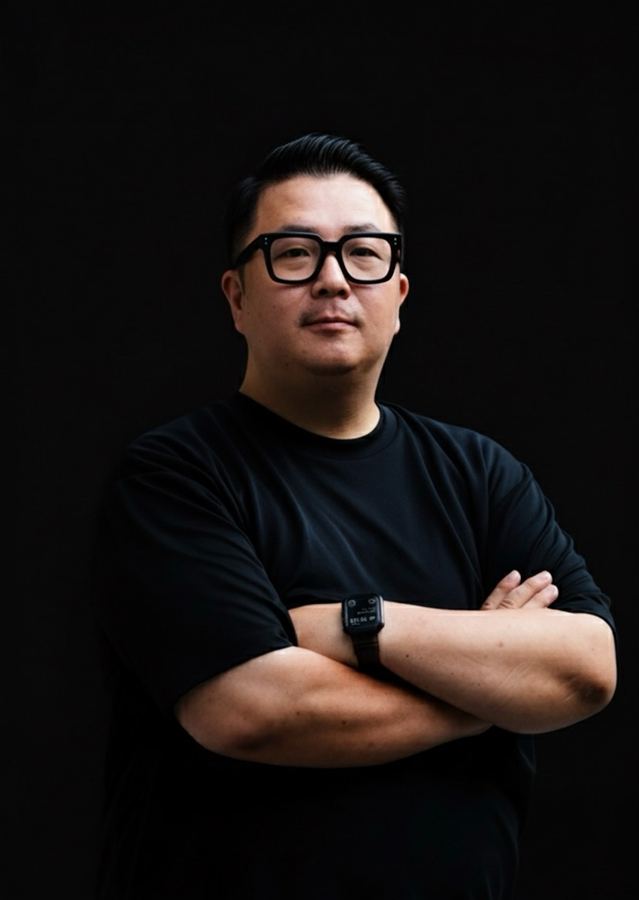
Jeong Jinho portrait

大切にしていることWhat I value중요하게 생각하는 점

プロジェクトの規模が違っても、決めるときに立ち返る問いは同じです。下のケーススタディはすべて、この3つのどれかで説明できます。

Project sizes vary, but the questions I return to when deciding stay the same. Every case study below traces back to one of these three.

프로젝트 규모는 제각각이어도 결정을 내릴 때 스스로에게 던지는 질문은 늘 같습니다. 아래 케이스 스터디도 모두 이 세 가지 중 하나에서 출발했습니다.

01

「なぜ作るのか」を先に言葉にする

Put "why build this" into words first

"왜 만드는가"부터 말로 정리한다

優先度が低い案件ほど、目的を一文で言えるかが通るかどうかを決めます。機能より先に、ユーザーの迷いとKPIのつながりを示します。

The lower a project's priority, the more its survival depends on stating its purpose in one sentence. I link the user's hesitation to a KPI before talking about features.

우선순위가 낮은 프로젝트일수록, 목적을 한 문장으로 설명할 수 있는지가 성패를 가릅니다. 기능 이야기보다 먼저 사용자가 어디서 망설이고 그 망설임이 어떤 지표를 움직이는지 보여줍니다.

02

速さは、足すより削ることで作る

Speed comes from removing things

속도는 덜어낼 때 생긴다

体験の価値が「すぐに届くこと」なら、その間にあるものはすべて疑います。ランディングページのような「あって当然」のものも例外にしません。

When the value of an experience is how fast it arrives, I question each step in between, including the ones teams assume they need, like a landing page.

빨리 닿는 것 자체가 가치인 경험이라면, 그 사이에 놓인 것을 하나하나 다시 봅니다. 랜딩 페이지처럼 "당연히 있어야 한다"고 여기는 것도 예외는 아닙니다.

03

自分が抜けても、組織に残る形にする

Build what stays with the team after I leave

사람이 떠나도 조직에 남게 만든다

ツールの導入、デザインシステム、KPIの定義。自分がいなくても判断が再現される仕組みまでをデザインの範囲と考えています。

Tooling, design systems, KPI definitions. I count the structures that let a team repeat good decisions without me as part of the design work.

툴 도입, 디자인 시스템, KPI 정의까지. 제가 없어도 팀이 좋은 판단을 이어갈 수 있는 구조를 만드는 것도 디자인의 일이라고 생각합니다.

ケーススタディCase studies케이스 스터디

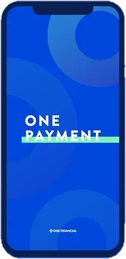
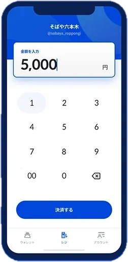
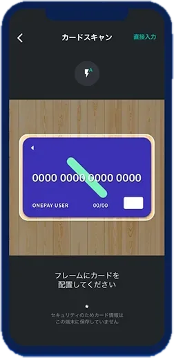
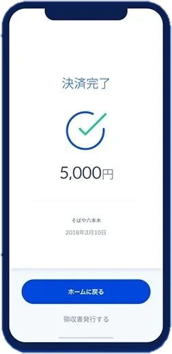
ONE PAYMENT splash screenAmount entry keypadCard scan with the iPhone cameraPayment complete
App · Amount → card scan → done
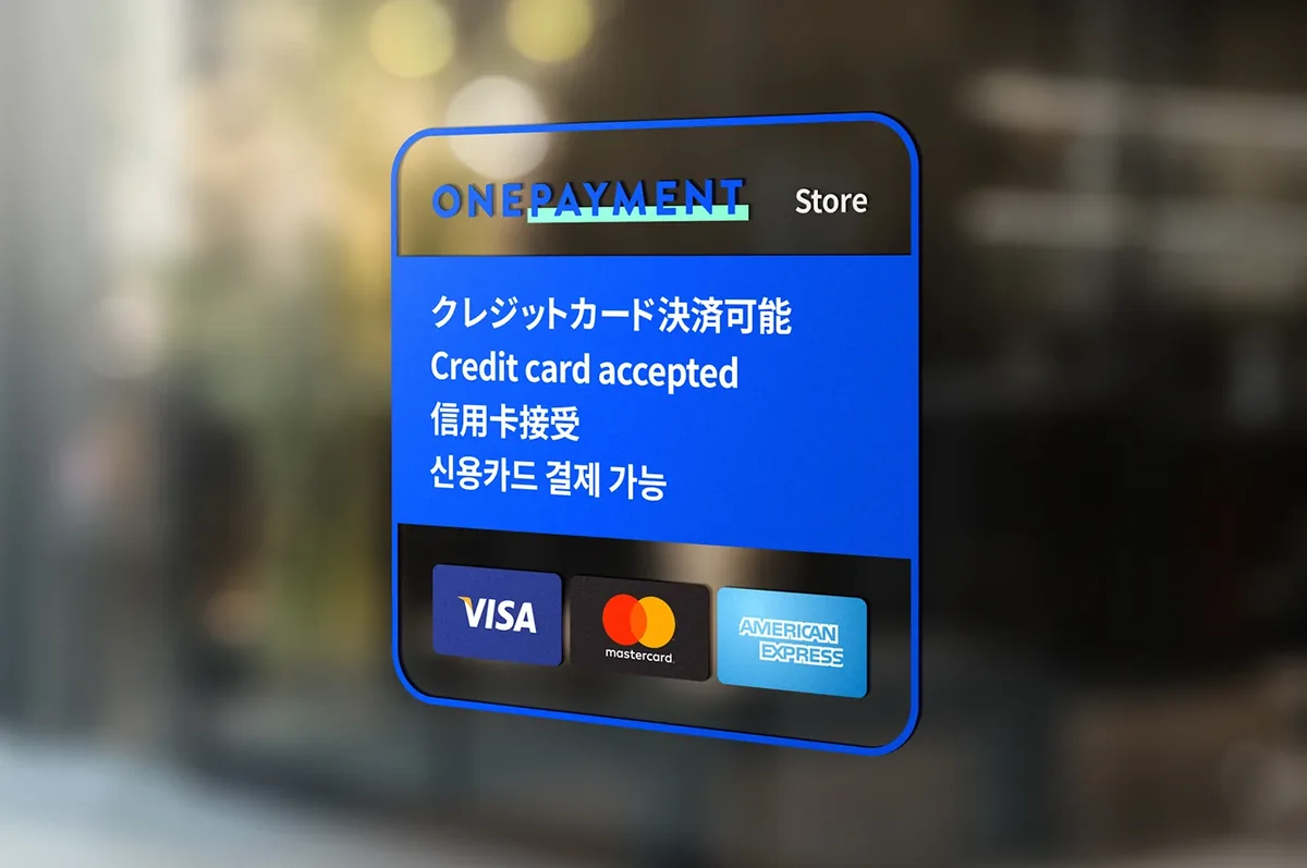
ONE PAYMENT merchant window sticker
Merchant kit · Window sticker
  1. 01問題定義Problem문제정의

    小さなお店や個人がカード決済を始めるには、専用のカードリーダーを用意する必要がありました。リーダーの費用に加え、複雑な審査と高い手数料が、「まず売ってみたい」人の入口をふさいでいました。

    For small shops and individuals, accepting cards meant buying a dedicated card reader. The reader cost, a complicated approval process and high fees blocked people who wanted to try selling first.

    작은 가게나 개인이 카드 결제를 받으려면 전용 카드 리더기가 있어야 했습니다. 리더기 비용에 까다로운 심사, 높은 수수료까지 겹치면서 "일단 한번 팔아보고 싶은" 사람들에게 카드 결제는 문턱이 너무 높았습니다.

  2. 02リサーチResearch리서치
    • Squareなど先行するスマホ決済は、磁気ストライプを読むためのリーダーが前提だった。
    • 対象は、現金決済しかできない小規模事業者と個人。カード決済は導入までの審査が複雑で手数料も高く、導入をためらっていた。
    • お客さん側は、その店でカードが使えるかを店頭で判断している。
    • Existing mobile payment services such as Square depended on a reader for the magnetic stripe.
    • The target was small businesses and individuals that only took cash. Card payments meant a complicated approval process and high fees, so they held back.
    • Customers decide at the storefront whether a shop takes cards.
    • Square 같은 기존 스마트폰 결제 서비스는 카드 마그네틱을 읽는 리더기가 있어야만 쓸 수 있었다.
    • 주요 대상은 현금 결제만 받던 소상공인과 개인 판매자. 카드 결제는 도입 심사가 복잡하고 수수료도 높아서 선뜻 들이지 못하고 있었다.
    • 손님은 가게 앞에서 이미 카드를 쓸 수 있는지 없는지를 보고 판단한다.
  3. 03制約Constraints제약조건
    • 創業者・エンジニア・デザイナーの3人チーム。デザインは自分ひとり。
    • カード情報を扱うため、使う側にも払う側にも「安心」が伝わる必要がある。
    • ITに慣れていない店主でも、その場ですぐ使えること。
    • A three-person team: founder, engineer and me as the only designer.
    • It handled card data, so both the merchant and the paying customer had to feel safe.
    • Shop owners who aren’t comfortable with tech had to be able to use it on the spot.
    • 창업자, 엔지니어, 디자이너 세 명뿐인 팀. 디자인은 혼자 맡았다.
    • 카드 정보를 다루는 만큼, 결제를 받는 사람과 내는 사람 모두 안심할 수 있어야 했다.
    • IT에 익숙하지 않은 가게 주인도 그 자리에서 바로 쓸 수 있어야 했다.
  4. 04決定Decision결정ケーススタディ要約Case summary케이스 스터디 요약

    iPhoneのカメラでカードを撮影し、OCRで読み取る

    Read the card with the iPhone camera and OCR

    iPhone 카메라로 카드를 찍으면 OCR로 읽어 들이게 한다

    リーダーこそが入口をふさいでいた原因でした。手元のスマホだけで完結させることが、最大の差別化であり、最大のハードルの解消でした。

    The reader was what kept people out. Letting them finish everything on the phone in hand set us apart and removed the biggest hurdle.

    문턱을 만든 주범이 바로 리더기였습니다. 손에 든 스마트폰 하나로 끝나게 만드는 것이 가장 큰 차별점이자 가장 높은 장벽을 허무는 방법이었습니다.

    ロゴは「リング」一つに絞る

    Reduce the logo to a single ring

    로고는 "링" 하나로 단순하게

    リングは無限の拡張と機会の象徴です。ロゴを単純にすることで、サービスの単純さも伝わるようにしました。

    The ring stands for endless expansion and opportunity. I kept the logo simple so the service would read as simple too.

    링에는 끝없이 넓어지는 가능성과 기회라는 의미를 담았습니다. 서비스가 단순하다는 것을 로고에서부터 보여주고 싶었습니다.

    加盟店向けのステッカーキットを作る

    Make a sticker starter kit for merchants

    가맹점용 스티커 키트를 만든다

    対面決済では、お客さんが店頭で「カードが使える」と分からなければ使われません。学園祭の模擬店のような小さな売り手でも、貼るだけで始められるようにしました。

    In person, customers pay by card only when they can see at the storefront that cards are accepted. A school festival stall could start by putting up a sticker.

    대면 결제는 손님이 가게 앞에서 "여기 카드 되네"라고 알아봐야 비로소 쓰입니다. 학교 축제 부스 같은 작은 판매자도 스티커만 붙이면 바로 시작할 수 있게 했습니다.

  5. 05改善Iteration개선

    Incubate FundからプレシリーズAで1億円を調達。THE BRIDGE、GIZMODO、PR TIMESなどで紹介されました。

    Raised ¥100M in a pre-Series A from Incubate Fund. Covered by THE BRIDGE, GIZMODO and PR TIMES.

    Incubate Fund에서 프리시리즈 A로 1억 엔을 투자받았고, THE BRIDGE, GIZMODO, PR TIMES 등에 소개되었습니다.

    その後「1分でできる商品ページ作成機能」を追加し、対面に加えてオンラインでの決済にも広げました。

    Later added a one-minute product page builder, extending payments from in person to online.

    이후 "1분이면 만드는 상품 페이지" 기능을 더해, 대면 결제에 더해 온라인 결제까지 쓸 수 있게 넓혔습니다.
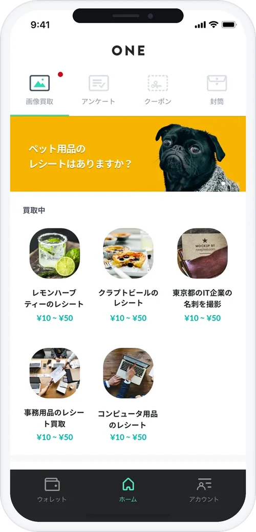
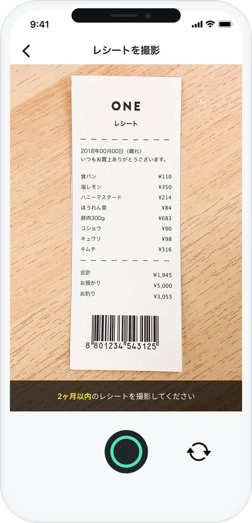
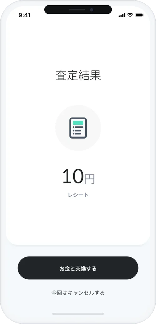
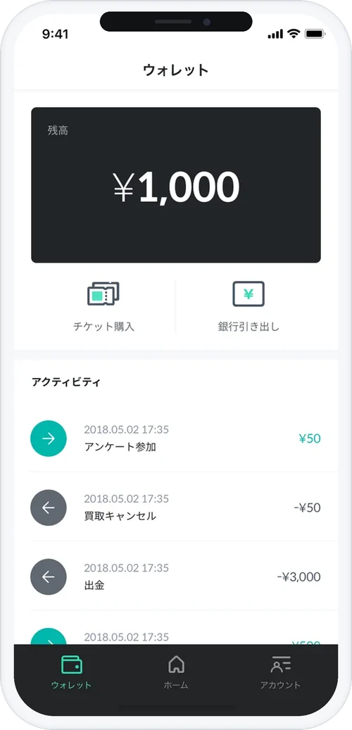
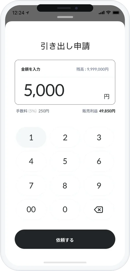
ONE splash screenHome: receipts being boughtReceipt captureAppraisal result: 10 yenWallet balance and activityBank withdrawal request
App · Splash → Home → Receipt → Result → Wallet → Withdraw
  1. 01問題定義Problem문제정의

    ONEは「レシートを買い取り、購買データを企業のマーケティングに使う」事業です。お金を払うのは企業、アプリを使うのは一般ユーザー。同じプロダクトで2種類の相手を納得させる必要がありました。

    ONE bought receipts from consumers and turned the purchase data into a marketing tool for companies. Companies paid; consumers used the app. One product had to win over two different audiences.

    ONE은 소비자에게 영수증을 사들이고, 그 구매 데이터를 기업의 마케팅에 활용하는 사업이었습니다. 돈을 내는 쪽은 기업이고 앱을 쓰는 쪽은 일반 사용자. 하나의 프로덕트로 성격이 전혀 다른 두 고객을 동시에 설득해야 했습니다.

    ユーザー側の問いは「本当にすぐお金がもらえるのか」、企業側の問いは「このデータで何ができるのか」でした。

    The consumer's question was "do I really get paid right away?" The company's question was "what can I do with this data?"

    사용자는 "정말 바로 돈을 주는 걸까?"를, 기업은 "이 데이터로 뭘 할 수 있을까?"를 궁금해했습니다.

  2. 02リサーチResearch리서치
    • 先行する「ポイント・お小遣い系」アプリは、報酬が届くまで数日かかり、途中で離脱されやすい。
    • 企業側が知りたかったのは「自社の商品が、どこで、どんな性別の人に、どのタイミングで買われているのか」。ONEはこの問いに明確に答えられるソリューションを目指した。
    • Existing points and rewards apps took days to pay out, and users dropped off along the way.
    • Companies wanted to know where their products were bought, by what gender, and at what time of day. ONE aimed to be the clear answer to that question.
    • 기존 포인트·용돈 앱은 보상이 들어오기까지 며칠씩 걸려, 그 사이에 떠나는 사용자가 많았다.
    • 기업이 정말 알고 싶었던 건 "우리 제품이 어디서, 어떤 성별의 사람에게, 몇 시쯤 팔리는가"였다. ONE은 이 질문에 분명한 답을 주는 솔루션을 목표로 했다.
  3. 03制約Constraints제약조건
    • 創業者・エンジニア・デザイナーの3人チーム。デザインは自分ひとり。
    • お金を扱うため、単純さと同時に「怪しくない」信頼感が必要。
    • 営業は企業向けの説明材料を必要としていた。
    • A three-person team: founder, engineer and me as the only designer.
    • It handled money, so it had to feel simple and trustworthy at the same time.
    • Sales needed material to explain the product to corporate clients.
    • 창업자, 엔지니어, 디자이너 세 명뿐인 팀. 디자인은 혼자 맡았다.
    • 돈이 오가는 서비스라, 쉬우면서도 "수상해 보이지 않는" 신뢰감이 필요했다.
    • 영업팀에는 기업 고객에게 보여줄 설명 자료가 필요했다.
  4. 04決定Decision결정ケーススタディ要約Case summary케이스 스터디 요약

    一般ユーザー向けのランディングページを作らず、App Storeに直接送る

    Skip the consumer landing page and send people straight to the App Store

    일반 사용자용 랜딩 페이지 대신 App Store로 곧장 연결한다

    ユーザーが最終判断するのはストアの画面です。LPを挟むとタップが1回増え、「お金がすぐ届く」という約束から一歩遠ざかります。代わりに、LPは企業クライアント向けに作り直し、営業ツールとして使えるようにしました。

    People make the final call on the store page. A landing page added one more tap between the user and the promise of instant money. I rebuilt the landing page for corporate clients instead, as a sales tool.

    사용자가 최종적으로 설치를 결정하는 곳은 스토어 화면입니다. 랜딩 페이지를 한 번 더 거치면 그만큼 탭이 늘고 "바로 돈이 들어온다"는 약속 앞에 걸림돌이 생깁니다. 대신 랜딩 페이지는 기업 고객용으로 새로 만들어 영업 도구로 쓰도록 했습니다.

    撮影から入金までの画面を、細部まで最短にする

    Make the path from photo to payout as short as possible, down to the details

    촬영부터 입금까지 걸리는 단계를 끝까지 줄인다

    このアプリの価値は「瞬時にお金が届く」体験そのものです。機能説明を増やすより、体験の速さを説明の代わりにしました。

    The product's value was the instant payout itself. Instead of explaining features, I let the fast payout explain the product.

    이 앱의 가치는 "찍자마자 돈이 들어오는" 경험 그 자체였습니다. 기능을 길게 설명하기보다, 빠른 경험이 곧 설명이 되도록 했습니다.

  5. 05改善Iteration개선

    App Store 総合1位。TechCrunch、Business Insider、THE BRIDGEなどで紹介。

    #1 overall on the Japanese App Store. Covered by TechCrunch, Business Insider and THE BRIDGE.

    일본 App Store 종합 1위를 기록했고, TechCrunch, Business Insider, THE BRIDGE 등에 소개되었습니다.

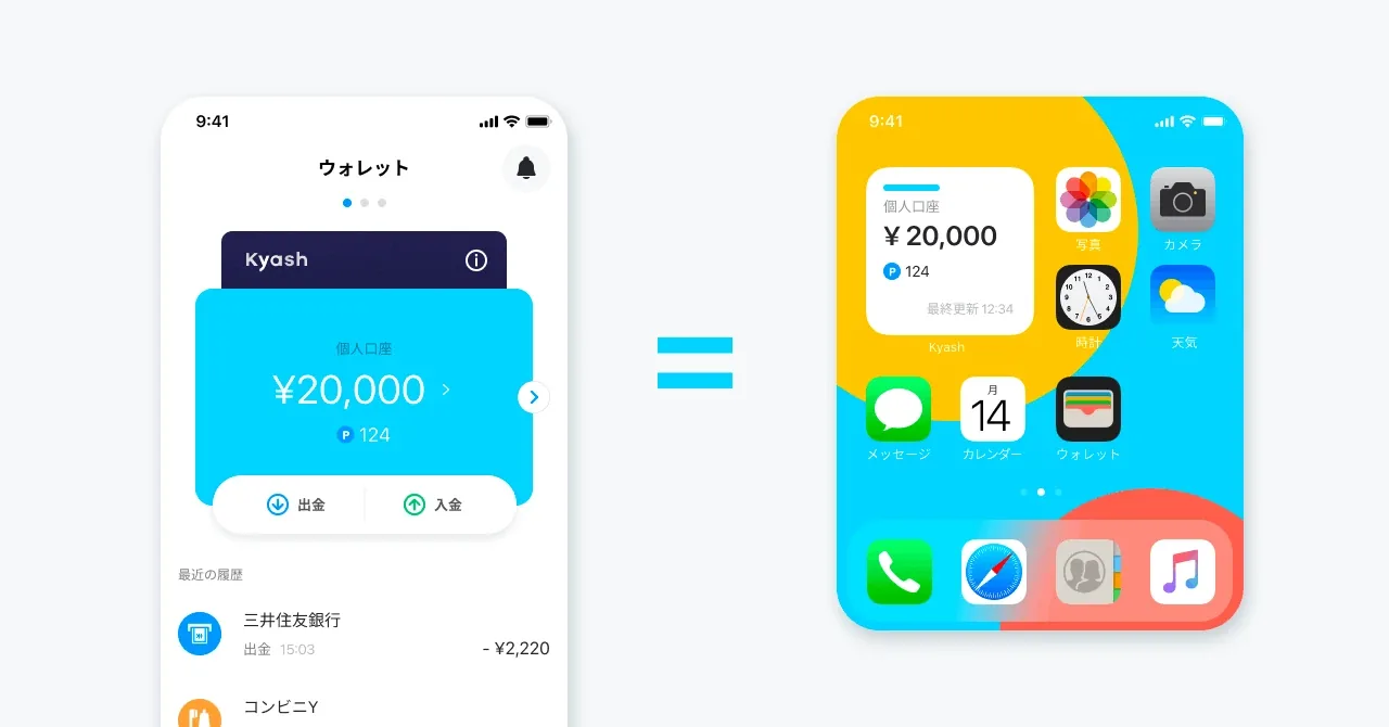
Kyash wallet balance shown as a home screen widget
Wallet = Widget
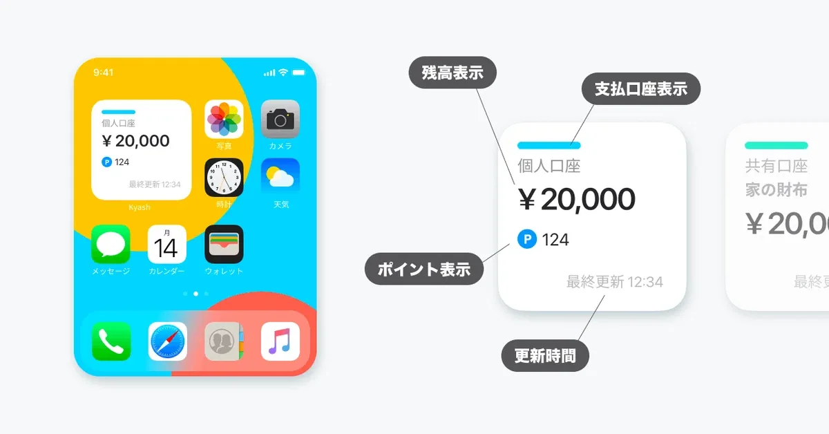
Widget anatomy: balance, account, points, last updated
Widget anatomy
  1. 01問題定義Problem문제정의

    支払いの前に残高と支払い元を確認するには、毎回アプリを開く必要がありました。確認を省くと、残高不足や支払い元の切り替え忘れで決済が失敗します。

    To check the balance and funding source before paying, users had to open the app every time. Skipping the check led to failed payments from low balance or a forgotten account switch.

    결제하기 전에 잔액이나 결제 수단을 확인하려면 매번 앱을 열어야 했습니다. 그 과정을 건너뛰면 잔액이 모자라거나 결제 수단을 바꾸는 걸 깜빡해서 결제에 실패하는 경우가 많았습니다.

  2. 02リサーチResearch리서치
    • 自分自身がKyashのユーザーとして、レジ前で同じ迷いを繰り返していた。
    • ウィジェットが効くのは「頻繁に使い、一瞬の確認で満足が得られる機能」。複数の候補を比べ、残高表示が最も価値が高いと判断。
    • As a Kyash user myself, I kept hitting the same hesitation at the register.
    • Widgets work best for features used often, where a glance is enough. I compared several candidates and chose the balance as the most valuable.
    • 저 역시 Kyash 사용자로서, 계산대 앞에서 같은 망설임을 몇 번이고 겪었다.
    • 위젯은 "자주 쓰고, 잠깐 확인하는 것만으로 충분한 기능"에서 빛을 발한다. 여러 후보를 견줘 본 끝에 잔액 표시가 가장 쓸모 있다고 판단했다.
  3. 03制約Constraints제약조건
    • 事業の優先度は低く、正式なロードマップには載っていない。
    • Mobileチームの「10%ルール」(業務時間の一部を自由に使える制度)の中で進める。
    • ウィジェットは表示領域と操作が限られる。小〜大サイズでもアプリらしさを保つ必要がある。
    • Low business priority; not on the official roadmap.
    • Built within the Mobile team's "10% rule," time set aside for self-directed work.
    • Widgets have little space and limited interaction, and every size from small to large still had to feel like Kyash.
    • 사업 우선순위가 낮아 공식 로드맵에는 올라 있지 않았다.
    • Mobile 팀의 "10% 룰"(업무 시간 일부를 자율적으로 쓸 수 있는 제도) 안에서 진행했다.
    • 위젯은 보여줄 수 있는 공간도, 조작할 수 있는 방법도 제한적이다. 작은 크기부터 큰 크기까지 어디서든 Kyash다운 느낌을 지켜야 했다.
  4. 04決定Decision결정ケーススタディ要約Case summary케이스 스터디 요약

    作る前に「なぜ作るのか」を一文にしてチームと合わせる

    Agree on "why we're building this" in one sentence before building

    만들기 전에 "왜 만드는가"를 한 문장으로 정리해 팀과 공유한다

    10%ルールの時間は限られていて、機能を詰め込むと完成しません。「支払い前の迷いをなくし、決済失敗を減らす」という目的が、何を入れないかの判断基準になりました。

    10% time is limited, and a feature-stuffed widget would never ship. We used one purpose to decide what to leave out: "remove the hesitation before paying and reduce failed payments."

    10% 룰로 쓸 수 있는 시간은 한정적이라, 이것저것 넣다 보면 끝내 완성하지 못합니다. "결제 직전의 망설임을 없애고, 결제가 막히는 일을 줄인다"는 목적이 무엇을 빼야 할지 정하는 기준이 되었습니다.

    表示は残高だけ。支払い元の切り替えは長押しに

    Show only the balance; switch funding source with a long press

    화면엔 잔액만 보여주고, 결제 수단 변경은 길게 눌러서

    一目で読めることを最優先にしました。切り替えは毎回必要な操作ではないので、画面には出さず長押しに回しました。

    Glanceability came first. Switching isn't needed every time, so I kept it off the surface and put it behind a long press.

    한눈에 읽히는 게 가장 중요했습니다. 결제 수단 변경은 매번 하는 동작이 아니어서, 화면에 꺼내 두지 않고 길게 누르면 나오도록 했습니다.

    決済の失敗を減らす施策としてKPIに結びつけて説明する

    Frame it as a payment-failure fix tied to KPIs

    "결제가 막히는 일을 줄이는 기능"으로, KPI와 엮어서 설명한다

    「便利な機能」だと優先度は上がりません。決済失敗の減少は取扱高に直結するので、事業側と同じ言葉で話せます。

    "Convenient" doesn't raise a priority. Fewer failed payments means more transaction volume, so I could talk to the business side in their terms.

    "있으면 편한 기능"이라는 말로는 우선순위가 올라가지 않습니다. 결제가 막히는 일이 줄면 거래액이 곧바로 늘어나니, 사업 쪽과 같은 언어로 대화할 수 있었습니다.

  5. 05改善Iteration개선

    アプリを開かずに残高を確認できるウィジェットとしてリリース。

    Released as a widget that shows the balance without opening the app.

    앱을 열지 않아도 잔액을 바로 볼 수 있는 위젯으로 출시했습니다.

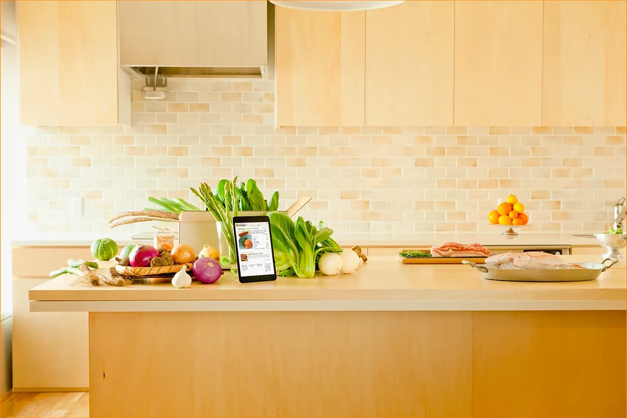
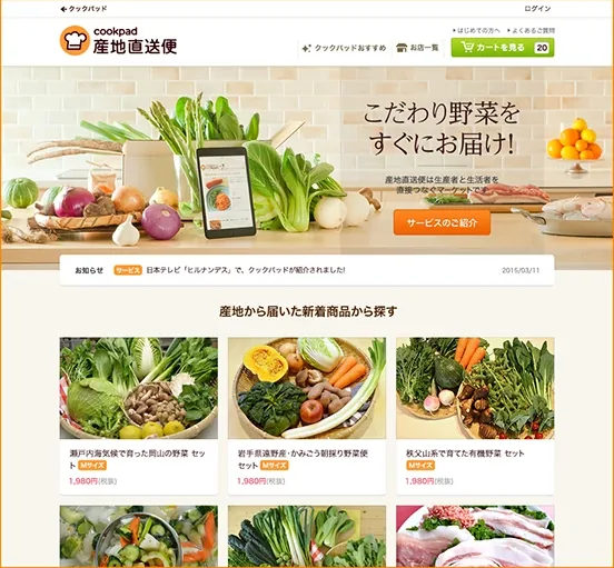
Key visual: vegetables and a tablet on a kitchen counter
Result · Key visual
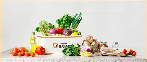
Concept visual 01
Concept visual 01
Concept visual 02
Concept visual 02
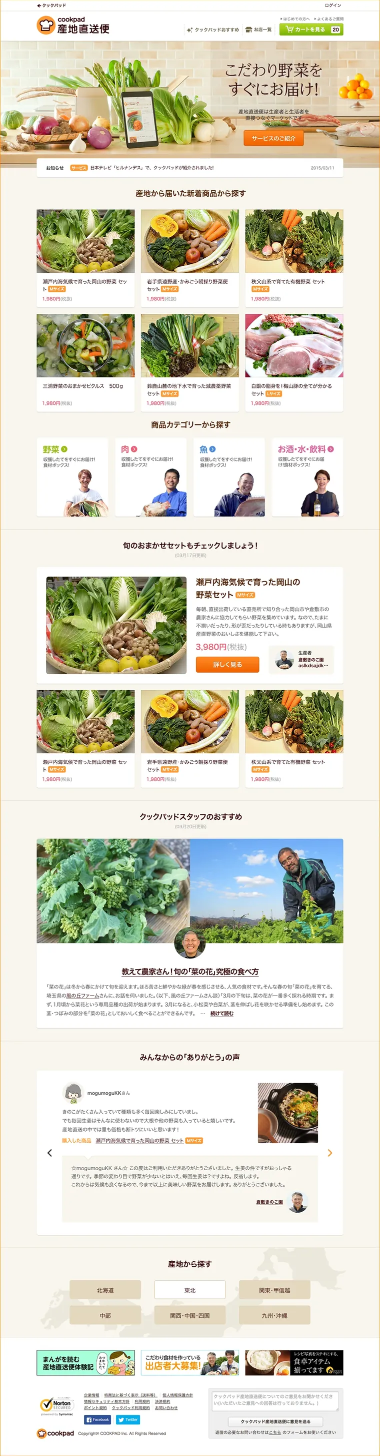
Renewed top page, full length
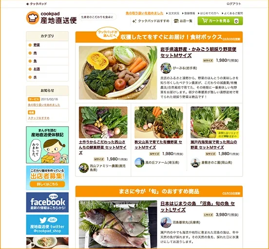
Top page before the renewal
Before
Top page after the renewal
After
Renewal · Hover the page to scroll
  1. 01問題定義Problem문제정의

    旬の野菜や産地の食材を届けるEC。ユーザーから「注文までの流れが難しい」という声が続いていました。

    An e-commerce service delivering seasonal produce straight from farms. Users kept saying the path to ordering felt difficult.

    제철 채소와 산지의 식재료를 집까지 보내주는 EC 서비스. 사용자들 사이에서 "주문하는 과정이 어렵다"는 의견이 꾸준히 나오고 있었습니다.

  2. 02リサーチResearch리서치
    • チームに届いていたユーザーの声を整理し、つまずく場所を特定。
    • アクセス解析で、どの画面で離脱が多いかを確認した。
    • 「産地直送」という価値が、最初の画面で伝わっていないことが分かった。
    • Sorted the user feedback the team had collected to find where people got stuck.
    • Checked analytics to find the pages with the most drop-off.
    • Found that the value of "direct from the farm" wasn't coming through on the first screen.
    • 팀에 쌓여 있던 사용자 의견을 정리해, 사람들이 어디서 막히는지를 찾아냈다.
    • 접속 데이터를 분석해 이탈이 많은 화면을 확인했다.
    • "산지 직송"이라는 가치가 첫 화면에서 제대로 전달되지 않는다는 걸 알게 됐다.
  3. 03制約Constraints제약조건
    • Cookpadの中の一事業で、少人数チーム。
    • 既存のシステム環境を維持したまま、新しい画面を提示しなければならなかった。
    • 生鮮食品は「誰が、どこで」の信頼がないと買われない。
    • A small team running one business inside Cookpad.
    • We had to keep the existing system and still present a new set of screens.
    • People don't buy fresh food without trusting who grew it and where.
    • Cookpad 안에서 운영되는 하나의 사업으로, 팀 규모가 작았다.
    • 기존 시스템 환경을 유지하면서도 새로운 화면을 제시해야만 했다.
    • 신선식품은 "누가, 어디서 키웠는지" 믿을 수 있어야 팔린다.
  4. 04決定Decision결정ケーススタディ要約Case summary케이스 스터디 요약

    「サービスが一目で分かる」ビジュアルを最優先にする

    Put "understand the service at a glance" visuals first

    "서비스가 한눈에 이해되는" 비주얼을 가장 먼저 챙긴다

    注文が難しく感じる原因は、手順の多さだけでなく「何を買っているのか分からない」ことにもありました。産地や旬の意味、信頼性が伝わって初めて、手順が短く感じられます。

    Ordering felt hard because of the steps and because people weren't sure what they were buying. Once the origin, the season and the trust came through, the same steps felt shorter.

    단계가 많은 것 말고도, "내가 뭘 사는 건지 잘 모르겠다"는 점이 주문을 어렵게 느끼게 했습니다. 산지와 제철이 주는 의미, 그리고 믿음이 먼저 전해지면 같은 단계도 훨씬 짧게 느껴집니다.

    全体の流れを整理し、サイト全体のスタイルを統一する

    Reorganize the whole flow and unify the site's styling

    주문 흐름 전체를 다시 짜고, 사이트 전체의 스타일을 하나로 맞춘다

    部分的な修正を重ねるより、流れ全体を見直したほうが「分かりにくさ」の原因を一度に取り除けると考えました。

    I judged that reviewing the whole flow, rather than patching pages one by one, would remove the confusion at its source.

    한 곳씩 고쳐 나가기보다 흐름 전체를 다시 봐야 "어렵다"는 느낌의 원인을 한 번에 걷어낼 수 있다고 판단했습니다.

  5. 05改善Iteration개선

    リニューアル後、PVが増え、離脱率が下がりました。

    その後このサービスは、Cookpadが生鮮食品事業に乗り出すうえで貴重なPoCとなり、現在のさまざまなオフライン事業の展開にも活かされています。

    After the renewal, page views went up and the bounce rate went down.

    The service later became a valuable proof of concept for Cookpad's fresh food business, and its lessons carried into the many offline businesses Cookpad runs today.

    리뉴얼 후 페이지뷰는 늘고 이탈률은 줄었습니다.

    이후 이 서비스는 Cookpad가 신선식품 사업에 나서는 데 귀중한 PoC 경험이 되었고 지금의 다양한 오프라인 사업 전개에도 밑거름이 되었습니다.

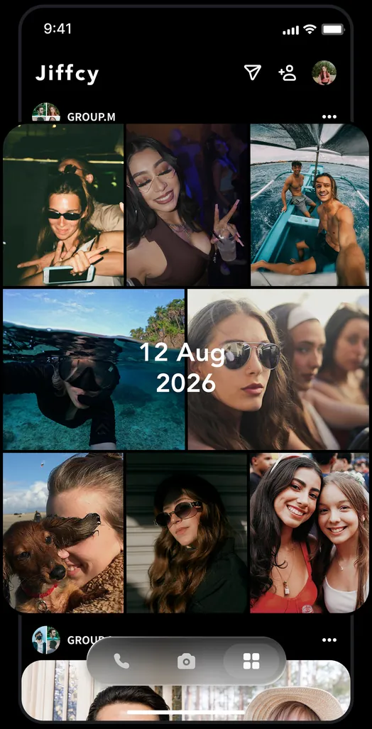
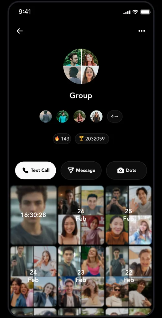
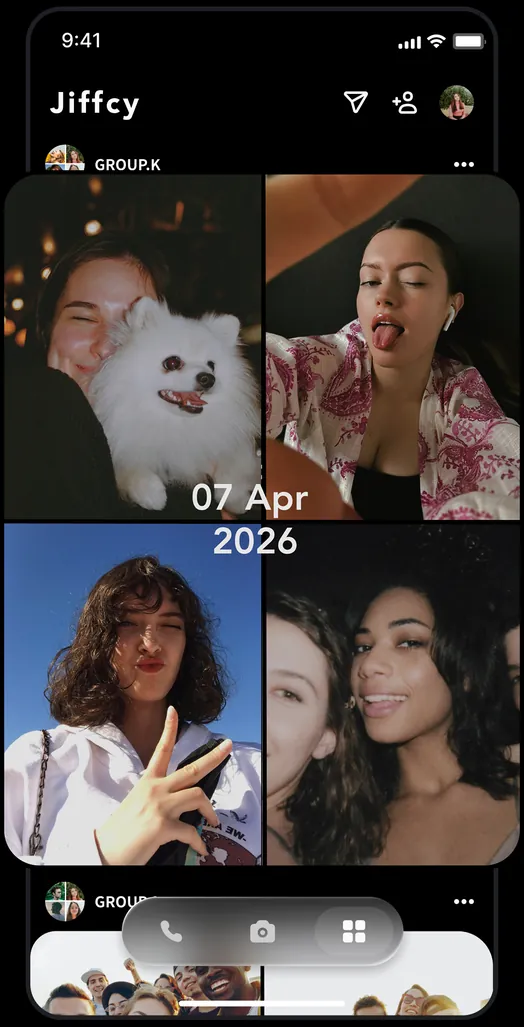
Jiffcy feed with an auto-generated Dots collageGroup screen with Text Call, Message and DotsAnother group collage in the feed
App · Dots collages, built from friends
  1. 01問題定義Problem문제정의

    Jiffcyでは、QRコードで1人ずつ友だちを追加します。新規ユーザーは最初、友だちがいない状態から始まるため、価値を感じる前に離脱しやすい構造でした。

    On Jiffcy, you add friends one at a time by QR code. New users start with no friends at all, so they tend to leave before they feel any value.

    Jiffcy에서는 QR 코드로 친구를 한 명씩 추가합니다. 새로 가입한 사용자는 친구가 한 명도 없는 상태에서 시작하기 때문에 앱의 재미를 느끼기도 전에 떠나기 쉬웠습니다.

  2. 02リサーチResearch리서치
    • 主な機能「Dots」は、友だち同士で写真・動画を送り合うと自動でコラージュができる。価値は「相手がいる」ことに依存している。
    • The core feature, Dots, turns photos and videos exchanged between friends into an automatic collage. Its value depends on having someone on the other side.
    • 핵심 기능 "Dots"는 친구와 사진·영상을 주고받으면 콜라주가 자동으로 만들어진다. 함께할 친구가 있어야 가치가 생긴다는 뜻이다.
  3. 03制約Constraints제약조건
    • 「クローズドであること」はプロダクトの核なので、公開タイムラインで空白を埋めることはできない。
    • 友だち追加はQRで対面が前提。オンボーディング中に必ず完了できるとは限らない。
    • Being closed is the core of the product, so an open public feed can't fill the empty state.
    • Adding friends by QR assumes meeting in person, so it can't always be completed during onboarding.
    • "폐쇄형"이라는 점이 이 서비스의 핵심이라, 공개 피드로 빈 화면을 채울 수는 없다.
    • 친구 추가는 QR로, 직접 만나서 하는 게 전제다. 가입하는 그 자리에서 꼭 끝낼 수 있는 건 아니다.
  4. 04決定Decision결정ケーススタディ要約Case summary케이스 스터디 요약

    一人でも続けて写真を投稿できる機能を加え、オンボーディングで紹介する

    Add solo continuous photo posting and introduce it in onboarding

    혼자서도 사진을 계속 올릴 수 있는 기능을 더하고, 온보딩에서 먼저 보여준다

    友だちがいなくても「自分の記録」として価値を感じられれば、友だちを誘う理由が後から生まれる。価値の順番を入れ替える判断。

    If people get value from it as their own record before they have friends, they find a reason to invite friends later. I flipped the order in which people get value.

    친구가 없어도 "나만의 기록"으로 재미를 느낄 수 있다면, 친구를 부를 이유는 그다음에 자연스럽게 생긴다. 가치를 느끼는 순서를 바꾼 판단.

    順番は「プロフィール写真 → 最初のDot → QR」

    Order: profile photo → first Dot → QR

    순서는 "프로필 사진 → 첫 Dot → QR"

    いきなり友だち追加を求めず、まず自分を表現し、Dotを一つ作ってからQRを見せる。友だちに見せたいものがある状態で追加をお願いするため。

    Don't ask for friends up front. Let people express themselves, make one Dot, then show the QR, so they have something worth showing when they're asked to add someone.

    처음부터 친구를 추가하라고 하지 않는다. 먼저 나를 표현하고 Dot을 하나 만든 다음 QR을 보여준다. 친구에게 보여줄 무언가가 생긴 뒤에 초대를 권하기 위해서다.

  5. 05改善Iteration개선

    導入後のオンボーディング完了率や友だち追加率を確認しながらチームと改善点を議論し、改善を続けています(現在進行中)。

    We're tracking onboarding completion and friend-add rates after the change, and keep discussing and shipping improvements with the team (ongoing).

    도입 후 온보딩 완료율과 친구 추가율을 확인하면서 개선할 점을 팀과 계속 논의하며 다듬어 가고 있습니다. (현재 진행 중)

RLWRLD logo
Logo · Built only from pixels
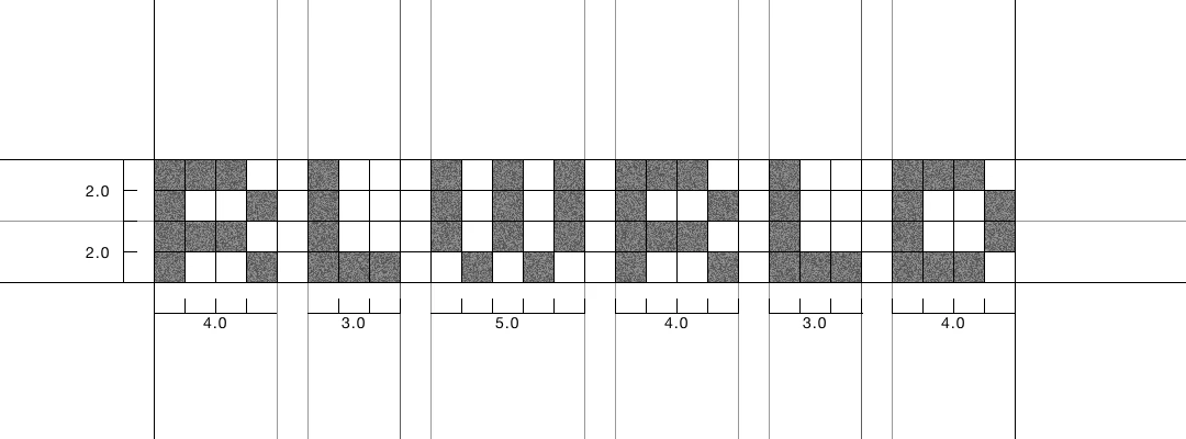
Logo construction on a 4-unit grid: letter widths 4, 3, 5, 4, 3, 4
Construction · 4-unit height, widths 4 / 3 / 5 / 4 / 3 / 4
Key visual: a human hand and a robot hand with the RLWRLD logo
Key visual
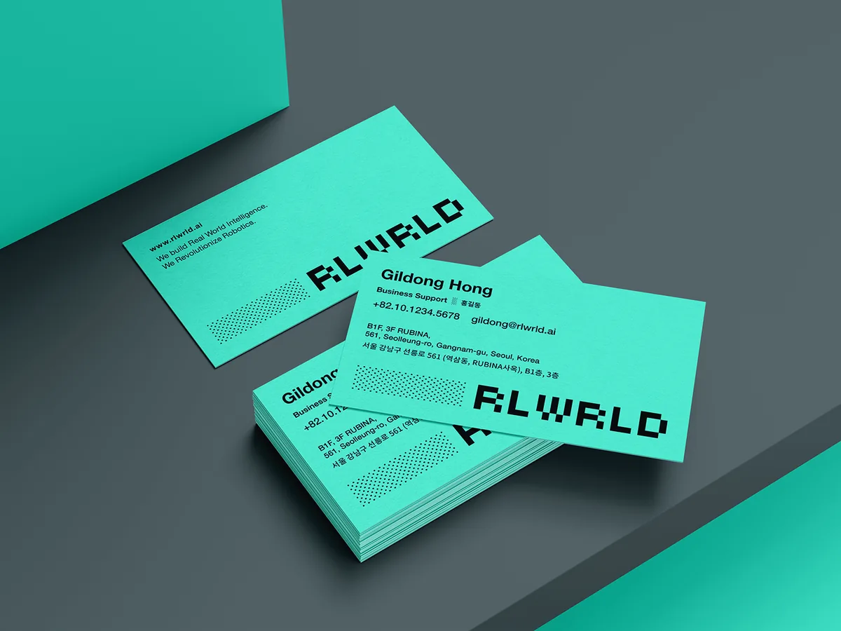
RLWRLD business cards in brand mint with a halftone pixel pattern
Business cards
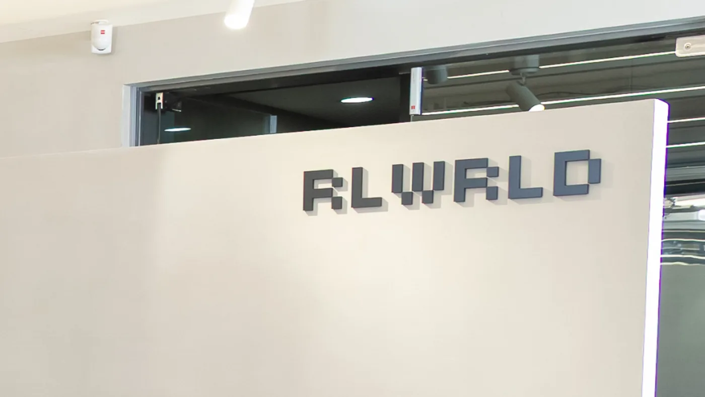
RLWRLD logo as dimensional office signage
Office signage
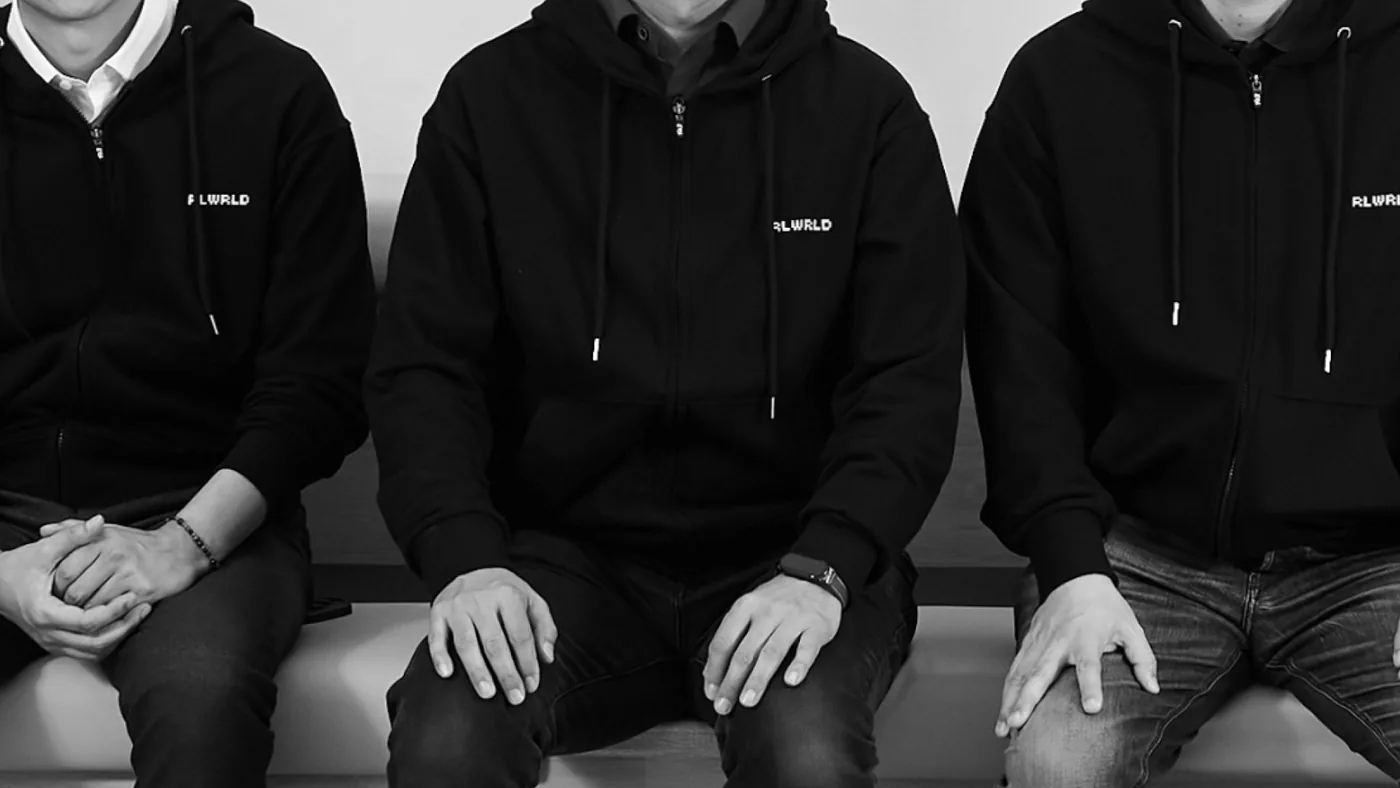
Team members wearing black hoodies with the RLWRLD logo
Team merch
  1. 01問題定義Problem문제정의

    RLWRLDは、独自の4D+モーションキャプチャデータと物理世界のために構築したフロンティア基盤モデルで、ロボットに精密な手の作業を学習させる会社です。依頼の時点でロゴはまだ存在しませんでした。

    RLWRLD trains robots to do precise hand work, using its own 4D+ motion capture data and a frontier foundation model built for the physical world. When I joined, the company had no logo yet.

    RLWRLD는 자체 4D+ 모션 캡처 데이터와 물리 세계를 위해 구축한 프론티어 파운데이션 모델로, 로봇이 정밀한 손 작업을 수행하도록 학습시키는 회사입니다. 의뢰 시점에는 아직 회사 로고가 없었습니다.

    精密な手の動きのために、基盤モデルを一から自分たちで作る。その職人のような姿勢を、ブランドに込めることが課題でした。

    They build their foundation model from scratch for precise hand motion. The task was to carry that craftsman-like attitude into the brand.

    정밀한 손 동작을 위해 파운데이션 모델을 처음부터 직접 만든다. 이런 장인 같은 태도를 브랜드에 녹여내야 했습니다.

  2. 02リサーチResearch리서치
    • デジタルのピクセルを使ったWebサイトや作品を幅広く参照した。
    • Looked widely at websites and work built with digital pixels.
    • 디지털 픽셀을 활용한 웹사이트와 작업물을 폭넓게 참고했다.
  3. 03制約Constraints제약조건
    • Webサイト制作と並行して、期間は約2か月。
    • BXからWebデザイン、パブリッシングまで一人で担当。
    • About two months, in parallel with building the website.
    • I handled everything from BX to web design and front-end build on my own.
    • 웹사이트 제작과 함께 진행해 기간은 약 2개월.
    • BX부터 웹 디자인, 퍼블리싱까지 혼자 담당했다.
  4. 04決定Decision결정ケーススタディ要約Case summary케이스 스터디 요약

    ロゴを、ピクセルのグリッドだけで組み立てる

    Build the logo from nothing but a pixel grid

    로고를 픽셀 그리드만으로 쌓아 올린다

    「根本をつくる」感覚を伝えたかった。デジタルの最小単位であるピクセルを一つずつ積み上げることで、基盤から自分たちで作る姿勢を表現した。

    I wanted it to feel like building the fundamentals. I stacked pixels, the smallest unit of anything digital, one by one to show a team that builds from the foundation up.

    "근본을 만든다"는 느낌을 주고 싶었다. 디지털의 가장 작은 단위인 픽셀을 하나씩 쌓아 올려 기반부터 직접 만드는 태도를 표현했다.

  5. 05展開Rollout전개

    同じピクセルのロゴを、Webサイトと名刺に展開しました。

    I rolled out the same pixel logo across the website and business cards.

    같은 픽셀 로고를 웹사이트와 명함에 전개했습니다.

いま取り組んでいることNow지금 하고 있는 일

2026年4月から株式会社medimoのUI/UXデザイナー。医療×AIの領域で、画面だけでなく事業側との合意づくりまでを担当しています。

UI/UX Designer at medimo since April 2026. In medical AI, I work on the screens and also on building agreement with the business side.

2026년 4월부터 medimo에서 UI/UX 디자이너로 일하고 있습니다. 의료 AI 분야에서 화면 설계는 물론, 사업 쪽과 방향을 맞추는 일까지 함께 맡고 있습니다.

medimo · Team

BPMNで業務フローを描き、KPIで「なぜ必要か」を合意する

Map the workflow in BPMN, agree on "why it matters" with KPIs

BPMN으로 업무 흐름을 그리고, KPI로 "왜 필요한지" 합의한다

事業上の優先度が高い機能のBPMNを自ら作成し、PdMとともにKPIと成果指標を整理しました。この機能がなぜ必要で、何を変えるのかを事業側に説明する資料として活用しています。

I drew the BPMN for high-priority features myself and worked with the PdM to define KPIs and outcome metrics. We use them to show the business side why each feature is needed and what it changes.

사업 우선순위가 높은 기능의 BPMN을 직접 그리고, PdM과 함께 KPI와 성과 지표를 정리했습니다. 이 기능이 왜 필요하고 무엇을 바꾸는지 사업 쪽에 설명하는 자료로 쓰고 있습니다.

medimo · Success

顧客のニーズから、いまのプロダクトを磨き込む

Refining the product from what customers need

고객의 니즈에서 출발해 지금의 제품을 다듬는다

Successチームに所属し、顧客のニーズを把握しながら、現在のプロダクトのUI/UXをさらに高度化しています。

As part of the Success team, I learn what customers need and use it to keep raising the UI/UX of the current product.

Success팀에서 고객의 니즈를 파악하고 현재 제품의 UI/UX를 고도화하고 있습니다.

AI × UX

AIを、機能より体験として設計する

Designing AI as an experience first

AI를 기능보다 경험으로 설계한다

Prompt → UX Flow → UI → 信頼の設計 → フォールバック → 人への引き継ぎ。説明可能性、エラー時の体験、プライバシーを最初から設計に含めます。

Prompt → UX flow → UI → trust → fallback → human handoff. Explainability, error states and privacy are part of the design from the start.

Prompt → UX 흐름 → UI → 신뢰 설계 → 대체 동작(Fallback) → 사람에게 넘기기. 설명 가능성, 오류가 났을 때의 경험, 개인정보 보호를 처음부터 설계에 담습니다.

その他の仕事Other work그 밖의 작업

YearProjectType判断のポイントThe call판단 포인트
2025Findy ConferenceEvent platform0→1フェーズでサービスを設計し、事業は10→50フェーズへ成長。Designed the service at 0→1; the business grew into the 10→50 phase.0에서 1을 만드는 단계부터 서비스를 설계했고 사업은 10에서 50으로 커지는 단계까지 성장했다.
2025JELLNESSTravel for seniors50〜60代へのインタビューから、サービス・ブランド・管理ツールを設計。Designed service, brand and admin tool from interviews with people in their 50s and 60s.50~60대 사용자 인터뷰를 바탕으로 서비스, 브랜드, 관리 툴을 설계했다.
2025RLWRLDBrand, Corporate siteロゴ、Web、名刺、リーフレットまで事業初期のアセットを一式で設計。Designed the full early-stage kit: logo, web, cards, leaflets.로고, 웹사이트, 명함, 리플렛까지 사업 초기에 필요한 브랜드 요소를 한 번에 설계했다.
2025PIKABONBrand, Corporate siteファンライト事業を展開する企業。第二創業期を記念した新しいロゴ、Webサイト、名刺までを担当した。A company in the fan-light business. Designed a new logo, website and business cards to mark its second founding.팬라이트 사업을 하는 회사로, 제2의 창업기를 기념한 새로운 로고, 웹사이트, 명함까지 담당했다.
2024KT JapanCorporate site, Leaflet韓国大手通信の日本法人が日本市場でどう見えるべきかを、クライアントと綿密に話し合いながらWebサイトのリニューアルを担当。その後、展示会向けのリーフレット制作なども手がけた。Worked closely with the client on how a Korean telecom's Japan arm should come across in the Japanese market, and led the website renewal. Later also made leaflets for trade shows.한국 대형 통신사의 일본 법인이 일본 시장에서 어떤 모습으로 보여야 할지 고객과 면밀히 소통하며 웹사이트 리뉴얼을 담당했고 이후 전시회용 리플렛 제작 등도 맡았다.
2024SwitchiOS call recording日本市場への初期のソフトランディングに向けて、日本向けのUI/UXを担当。課金率は着実に上昇した。Designed the UI/UX for Japanese users to help the app land softly in the Japanese market. The paid conversion rate rose steadily.일본 시장에 안정적으로 안착하기 위한 초기 단계에서 일본 사용자에 맞춘 UI/UX를 담당했고 결제율이 꾸준히 상승했다.
2024WORKSPOTGramn · Spot work for hairdressers美容師のためのスキマバイトサービス。PoC段階の上流工程から参画し、事業のブランディングからWebサイト設計までを担当した。A short-shift job service for hairdressers. Joined upstream at the PoC stage and handled everything from the business's branding to the website design.미용사들을 위한 스키마바이트(짧은 시간 단위 아르바이트) 서비스. PoC 단계의 상류 공정부터 참여해 사업의 브랜딩부터 웹사이트 설계까지 담당했다.
2023WealthParkFintech (B2B2C)家賃収入を投資に回す機能を、ゼロベースで仮説を立てて設計。Designed a rent-to-investment feature from zero-based hypotheses.부동산 월세 수입을 투자로 돌릴 수 있는 기능을, 백지에서 가설을 세워 설계했다.
2023GNUS NetworkService site renewal既存のサービスページのリニューアルを担当した。Renewed the existing service pages.기존 서비스 페이지를 새롭게 리뉴얼하는 작업을 담당했다.
2023oroundLanding pageOh Print Meの新規事業サービスのランディングページを担当。主な事業内容をどうアピールできるかを提案した。Landing page for a new service from Oh Print Me. Proposed how to present the core of the business.Oh Print Me의 신규 사업 서비스 랜딩 페이지를 담당했다. 주요 사업 내용을 어떻게 어필할 수 있을지 제안했다.
2023AruyoShared office · Landing page小田原市にあるシェアオフィスのランディングページを担当。小田原市と連携してさまざまな社会活動ができる場所なので、その魅力をどう表現するかを考えて設計した。Landing page for a shared office in Odawara. It's a place for all kinds of community activities in partnership with the city, so I designed it around how to express that appeal.오다와라시에 위치한 셰어오피스의 랜딩 페이지를 담당했다. 오다와라시와 연계해 다양한 사회 활동을 할 수 있는 공간이라, 그 매력을 어떻게 표현할지 고민하며 설계했다.
2016–17AEON.comCorporate site当時まだ珍しかったSketch+Zeplinを社内に導入。エンジニアとの受け渡しを変え、業務スピードを3割以上改善。Introduced Sketch and Zeplin when both were still rare in Japan, changing designer–engineer handoff and speeding up work by 30%+.당시 일본에서는 드물었던 Sketch와 Zeplin을 사내에 도입했다. 디자이너와 엔지니어가 결과물을 주고받는 방식을 바꿔 작업 속도를 30% 넘게 끌어올렸다.
2015CompathyTravel planning写真の日時・位置から旅程を自動生成するサービスのリブランドと計画機能を設計。社内事情で未リリース。Rebrand and trip-planning feature for a service that builds itineraries from photo time and location. Not released due to company circumstances.사진의 촬영 시간과 위치로 여행 일정을 자동으로 만들어 주는 서비스. 리브랜딩과 여행 계획 기능을 설계했지만 회사 사정으로 출시되지는 못했다.
2013LINE for WindowsDesktop messengerスマホ前提のメッセンジャーを、デスクトップの使い方に合わせて再設計。Redesigned a phone-first messenger for how people work on a desktop.스마트폰에 맞춰진 메신저를, 데스크톱에서 일하는 방식에 맞게 다시 설계했다.
2013LINE AntivirusAndroid security審査の緩いAndroidで、専門知識のない人にも「安心」が伝わる画面に。Made security understandable for non-experts on Android, where app review is looser.앱 심사가 느슨한 Android 환경에서, 보안을 잘 모르는 사람도 "안심"하고 쓸 수 있는 화면을 만들었다.
2011BIGBANGOfficial artist appファンとアーティストが直接交流できる場を設計。KARA、w-indsなどのアーティストアプリ基盤に発展。Designed a space for fans to talk with the artist directly. It grew into a platform for KARA, w-inds and other artists.팬과 아티스트가 직접 소통하는 공간을 설계했고 이후 KARA, w-inds 등 여러 아티스트 앱의 플랫폼으로 확장되었다.

経歴Career경력

ソウルで始まり、東京で15年以上。大手企業、初期スタートアップ、フリーランスとして、事業の意思決定の現場にいました。

Started in Seoul, 15+ years in Tokyo. In large companies, early startups and as a freelancer, I've worked close to the people making business decisions.

서울에서 시작해 도쿄에서 15년 넘게 일했습니다. 대기업, 초기 스타트업, 프리랜서로 일하며 늘 사업의 의사결정 가까이에 있었습니다.

  1. 2026.04 —
    medimoUI/UX デザイナーUI/UX DesignerUI/UX 디자이너

    医療AIカルテのB2BサービスB2B AI medical records service의료 AI 차트 B2B 서비스

    • UI/UX設計、UXリサーチUI/UX design and UX researchUI/UX 설계, UX 리서치
    • Successチームとして顧客ニーズを把握し、現行プロダクトのUI/UXを高度化On the Success team, turning customer needs into UI/UX improvements to the current productSuccess팀에서 고객 니즈를 파악하며 현재 제품의 UI/UX 고도화
    • 事業優先度の高い機能のBPMN作成と、PdMとのKPI・成果指標の整理BPMN for high-priority features and KPI/outcome metrics with the PdM사업 우선순위가 높은 기능의 BPMN 작성과 PdM과의 KPI·성과 지표 정리
  2. 2024.08 —
    フリーランスFreelance프리랜스 · aftworksプロダクト / BXデザイナーProduct / BX Designer프로덕트 / BX 디자이너

    スタートアップの0→1を中心に、プロダクト、ブランド、コーポレートサイトを担当Product, brand and corporate sites, mostly for startups at 0→1주로 0에서 1을 만드는 스타트업의 프로덕트, 브랜드, 기업 사이트를 맡고 있다

    Jiffcy2025.07 —
    10代後半〜20代前半の女性向けメッセージ&通話アプリのデザインアーキテクチャとブランディングをリード。写真機能「Dots」のUI/UX設計Led design architecture and branding for a messaging and calling app for women in their late teens to early 20s. UI/UX for the photo feature Dots10대 후반~20대 초반 여성을 위한 메시지·통화 앱의 디자인 구조와 브랜딩을 이끌었다. 사진 기능 "Dots"의 UI/UX도 설계했다
    Findy2025.02 — 11
    Findy Conferenceのサービスデザイン。0→1で設計し、事業は10→50フェーズへ成長Service design for Findy Conference, from 0→1 through the business's growth into the 10→50 phaseFindy Conference의 서비스 디자인. 0에서 1을 만드는 단계부터 맡았고 사업은 10에서 50으로 커지는 단계까지 성장했다
    JELLNESS2025.07 — 11
    50〜60代のアクティブシニア向け旅行サービス。ユーザーインタビューをもとにサービス、ブランド、管理ツール、コーポレートサイトを設計Travel service for active seniors in their 50s and 60s. Designed the service, brand, admin tool and corporate site from user interviews50~60대 액티브 시니어를 위한 여행 서비스. 사용자 인터뷰를 바탕으로 서비스, 브랜드, 관리 툴, 기업 사이트를 설계했다
    RLWRLD2025.04 — 10
    ロゴ、Webサイト、名刺、リーフレットなど、事業初期に必要なアセット一式Logo, website, business cards and leaflets: the full early-stage brand kit로고, 웹사이트, 명함, 리플렛 등 사업 초기에 필요한 브랜드 요소 전반
    KT Japan2024.09 — 2026.01
    韓国大手通信KTの日本法人のWebサイトとリーフレットWebsite and leaflets for the Japan arm of Korean telecom KT한국 대형 통신사 KT의 일본 법인 웹사이트와 리플렛
    Switch2024.09 — 2025.02
    通話録音アプリのUI/UX改善とマーケティングUI/UX improvements and marketing for a call recording app통화 녹음 앱의 UI/UX 개선과 마케팅
    PIKABON2024.11 — 2025.01
    グローバルなファンライト制作会社のコーポレートサイトCorporate site for a global fan-light maker글로벌 응원봉 제작사의 기업 사이트
  3. 2023.11 — 2024.08
    Relicデザインチームマネージャー 兼 プレイヤーDesign team manager and hands-on designer디자인 팀 매니저 겸 실무 디자이너

    イノベーションマネジメント・プラットフォームInnovation management platform이노베이션 매니지먼트 플랫폼

    • 「MetaMe」(B2C)のグロースデザイン、新機能の設計・提案Growth design and new features for MetaMe (B2C)"MetaMe"(B2C)의 그로스 디자인, 새 기능 설계와 제안
    • Gramn社の新規サービス(B2B2C)「WORKSPOT」のデザインNew B2B2C service WORKSPOT for GramnGramn의 신규 서비스(B2B2C) "WORKSPOT" 디자인
    • 韓国企業の日本支社設立支援Supported Korean companies setting up in Japan한국 기업의 일본 지사 설립 지원
  4. 2023.02 — 2023.10
    WealthParkプロダクトデザイナー(Fintech事業部)Product Designer, Fintech프로덕트 디자이너 (핀테크 사업부)

    海外投資家向けアセットマネジメント、不動産DXAsset management and real estate DX해외 투자자를 위한 자산 관리, 부동산 DX

    • 不動産オーナーの家賃収入を投資に回せる機能(B2B2C)を、ゼロベースで仮説を立てて設計Designed a feature that lets property owners invest their rental income (B2B2C), from zero-based hypotheses부동산 오너가 월세 수입을 바로 투자로 돌릴 수 있는 기능(B2B2C)을, 백지에서 가설을 세워 설계했다
  5. 2020.06 — 2023.01
    KyashプロダクトデザイナーProduct Designer프로덕트 디자이너

    デジタルウォレットアプリDigital wallet app디지털 월렛 앱

    • アプリ(iOS/Android)の新機能設計。あと払い、残高ウィジェットなどNew app features for iOS and Android, including buy-now-pay-later and the balance widgetiOS/Android 앱의 새 기능 설계. 후불 결제, 잔액 위젯 등
    • サービスサイトのリニューアルService site renewal서비스 사이트 리뉴얼
  6. 2019.02 — 2020.05
    BUILDサービスデザイナーService Designer서비스 디자이너

    外国人向け不動産サービス「3FLOOR」3FLOOR, a real estate service for foreign residents외국인을 위한 부동산 서비스 "3FLOOR"

    • サービス全体のデザインDesign across the whole service서비스 전반의 디자인
  7. 2017.11 — 2019.01
    ONE FinancialチーフデザイナーChief Designer치프 디자이너

    ショッピングアプリ、売上管理クラウドShopping app and sales management cloud쇼핑 앱, 매출 관리 클라우드

    • 「ONE PAYMENT」カードリーダー不要の対面決済アプリを設計・リリース。Incubate FundからPre-Aで1億円を調達Designed and launched ONE PAYMENT, an in-person card payment app with no reader. ¥100M Pre-A from Incubate Fund리더기 없이 대면 결제를 받을 수 있는 앱 "ONE PAYMENT"를 설계·출시. Incubate Fund에서 프리시리즈 A 1억 엔 투자 유치
    • 「ONE」へ事業転換。データ買取型マーケティングプラットフォーム。アプリ、コーポレートサイト、営業サイト。App Store 1位Pivoted to ONE, a data-buying marketing platform: app, corporate site and sales site. #1 on the App Store"ONE"으로 사업을 전환. 데이터를 사들이는 마케팅 플랫폼으로, 앱·기업 사이트·영업 사이트를 디자인했다. App Store 1위
  8. 2016.03 — 2017.10
    AEON.comデザイン総括Head of Design디자인 총괄

    イオンのECサイト運営AEON's e-commerce operator이온그룹의 EC 사이트 운영사

    • トップ、決済、商品詳細、検索結果画面の改善(PC/SP)Improved the home, checkout, product and search pages (PC/SP)메인, 결제, 상품 상세, 검색 결과 화면 개선(PC/모바일)
    • コーポレートサイト。Sketch+Zeplinの導入で業務スピード3割以上改善Corporate site; introduced Sketch and Zeplin, speeding up work by 30%+기업 사이트 디자인. Sketch와 Zeplin을 도입해 작업 속도를 30% 넘게 높였다
  9. 2015.07 — 2016.02
    WanderlustデザイナーDesigner디자이너

    旅行記共有サービス「Compathy」Compathy, a travel log sharing service여행기 공유 서비스 "Compathy"

    • 旅行プラン作成機能(Beta)のプロダクトデザインProduct design for the trip planner (beta)여행 계획 만들기 기능(베타)의 프로덕트 디자인
    • Compathy Magazine、コーポレートサイトのデザインとHTML/CSSDesign and HTML/CSS for Compathy Magazine and the corporate siteCompathy Magazine과 기업 사이트의 디자인, HTML/CSS 작업
  10. 2014.03 — 2015.06
    Cookpadプロダクトデザイナー(User First Team)Product Designer, User First Team프로덕트 디자이너 (User First Team)

    料理レシピ投稿・検索サービスRecipe sharing and search service요리 레시피 공유·검색 서비스

    • 「産地直送便」「撮るレシピ」「料理動画」のプロダクトデザインProduct design for 産地直送便, 撮るレシピ and cooking videos"산지직송편", "찍는 레시피", "요리 동영상"의 프로덕트 디자인
    • サイト運営と新機能設計、コーポレートサイトSite operations, new features and the corporate site사이트 운영과 새 기능 설계, 기업 사이트
  11. 2013.02 — 2014.03
    CROOZデザイナーDesigner디자이너

    ファッションECを中心としたネットサービスInternet services centered on fashion e-commerce패션 EC를 중심으로 한 인터넷 서비스

    • Webブラウザ型TCG「ラグナブレイク・サーガ」のUIとイベントロゴUI and event logos for the browser card game Ragna Break Saga웹 브라우저 카드 게임 "라그나 브레이크 사가"의 UI와 이벤트 로고
    • SHOPLIST.comのブランディング再構築提案Rebranding proposal for SHOPLIST.comSHOPLIST.com 브랜드 리뉴얼 제안
  12. 2010.11 — 2013.02
    NAVER JAPAN (LINE)UIデザイナーUI DesignerUI 디자이너

    来日のきっかけThe job that brought me to Japan일본으로 오게 된 계기가 된 회사

    • LINE:アンチウイルス(Android)、アプリ内通知、シークレットセール、Windows版LINE: Antivirus (Android), in-app notifications, secret sale, Windows appLINE: 안티바이러스(Android), 앱 내 알림, 시크릿 세일, Windows 버전
    • BIGBANG公式アプリ、NAVERまとめ、K-style、Appmax、Pick2などBIGBANG official app, NAVER Matome, K-style, Appmax, Pick2 and moreBIGBANG 공식 앱, NAVER 마토메, K-style, Appmax, Pick2 등
  13. 2007.10 — 2010.10
    Vi-nyl (Seoul)UI/UXデザイナーUI/UX DesignerUI/UX 디자이너

    新規事業のUI/UXデザイン。大手企業のUI提案と運用UI/UX for new businesses; UI proposals and operations for large companies신규 사업의 UI/UX 디자인, 대기업 대상 UI 제안과 운영

  14. 2000.09 — 2005.05
    Thiat (Seoul)創業メンバーFounding member창업 멤버

    学生ベンチャーとして自社サービスの企画・運営Planned and ran our own services as a student venture학생 벤처에서 자체 서비스를 기획하고 운영했다

得意なことStrengths강점

  • 定量・定性データから仮説を立て、課題解決のUIを提案Forming hypotheses from quantitative and qualitative data and proposing UI that solves the problem정량·정성 데이터로 가설을 세우고 문제를 푸는 UI를 제안한다
  • ブランド戦略に基づくデザイン設計とクリエイティブディレクションBrand-strategy-driven design and creative direction브랜드 전략을 바탕으로 한 디자인 설계와 크리에이티브 디렉션
  • スマートフォンアプリのUI/UX、プロトタイプ、ストーリーボードMobile app UI/UX, prototypes and storyboards스마트폰 앱 UI/UX, 프로토타입, 스토리보드
  • アジャイル開発(Scrum、User Story Mapping)、Lean Startup、デザイン思考Agile (Scrum, user story mapping), Lean Startup and design thinking애자일 개발(Scrum, User Story Mapping), 린 스타트업, 디자인 씽킹
  • 複雑な情報を図解で分かりやすく伝えるMaking complex information clear through diagrams복잡한 정보를 도식으로 쉽게 풀어내기
  • HTML、CSS、JavaScript、GitHubの実務経験Hands-on HTML, CSS, JavaScript and GitHubHTML, CSS, JavaScript, GitHub 실무 경험

ツールTools툴

  • Figma
  • Adobe CC
  • STUDIO
  • Claude
  • Vercel

登壇・コミュニティTalks & community발표 · 커뮤니티

  • 2014.07東京デモデー by Startup Alliance(登壇)Tokyo Demo Day by Startup Alliance (speaker)도쿄 데모데이 by Startup Alliance (연사)
  • 2015.04「シリコンバレーの韓国人」ソウル by Startup Alliance(登壇)“Koreans in Silicon Valley” Seoul by Startup Alliance (speaker)“실리콘밸리의 한국인” 서울 by Startup Alliance (연사)
  • 2015 —Korean Meetup Party in Tokyo 運営(日韓スタートアップ支援)Organizer, Korean Meetup Party in Tokyo, supporting Korea–Japan startupsKorean Meetup Party in Tokyo 운영 (한일 스타트업 교류)
  • 2015.11Compathy Magazine インタビューInterview, Compathy MagazineCompathy Magazine 인터뷰
  • —EO Planetに韓国スタートアップの日本進出について寄稿Columns on EO Planet about Korean startups entering JapanEO Planet에 한국 스타트업의 일본 진출에 대한 글 기고

言語Languages언어

韓国語(ネイティブ)・日本語(ビジネス)Korean (native), Japanese (business)한국어 (모국어), 일본어 (비즈니스)

連絡先Contact연락처 30分の1on1を予約するBook a 30-min 1:130분 1:1 면담 예약하기